• Templates
  • Freebies
  • Blog
  • Contact
  • About
  • FAQ
  • Create Video
VDEESIGN
  • Templates
  • Freebies
  • Blog
  • Contact
  • About
  • FAQ
  • Create Video

Design Trend: Mono Gradients

Written by Carrie Cousins on 3.30.2020 / Design Shack

Monotone color palettes have always been popular. It’s a classic colour scheme that never really goes out of style. Most recently, we’ve seen plenty of white or dark monotone palettes dominate this style.

But there’s a new take on monotone colors that’s trending: mono gradients. Here’s a look at the trend and how designers are making the most of it.

We’re sharing different examples of mono gradients in action, and sharing tips for how you can use it in your own designs.

What is a Mono Gradient?

Mono gradients are just an extension of using a monotone color palette.

Two colors that are similar in hue and saturation are used to create a fade that can be used in the design. The mono gradient might be subtle, such as two blues that you almost don’t see the fade, or more distinct, such as the red to purple gradient above.

Mono gradients are an extension of two trends – monotone color palettes and use of gradients. It’s almost a natural evolution of these design trends. And the result can be quite stunning!

Traditional Monotone

quads.jpg

A traditional monotone gradient is a fade between similar colors. (Click through the example from Quadangles, above, to see four different mono gradients – red, blue, green, and pink.)

The beauty in this simple gradient is subtlety. Depending on the variation of hues, the gradient can be so soft that you might not notice it at a glance. (And that’s ok.)

This style of mono gradient can work for a lot of things from the background color to button fill.

Multiple Mono Gradients

danki.jpg

Mono gradients can be interesting enough to combine and layer in a design.

Danki uses a mono gradient in two ways in the example above.

  • As a mono gradient accent to highlight key words and phrases in the text

  • With an overprint effect to create multiple degrees of color with the mono gradient

Both uses have a beautiful simplicity that’s interesting and does not overwhelm users. (The green color choice is exceptionally nice as well.)

Mono Gradient as an Accent

prsol.jpg

A mono gradient element can be a complementary accent in a fully monotone color scheme.

EPR Solutions does this with a blue design that includes a mono gradient inside the tablet screen. The mono gradient helps draw the eye with a little extra color – and also motion in this example – to create a flow through the design.

This design uses that same concept with other colors throughout the scroll. (You should definitely go take a look, the different uses of mono gradients – black and violet – are exceptionally well done.)

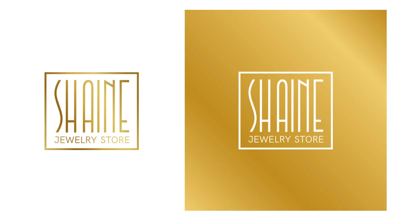
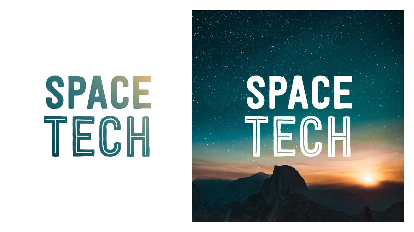
Mono Gradient Overlay

atlanta.jpg

Gradient overlays were a trend of their own at one time. Many of these designs included bright hues with an almost rainbow style to them.

Today’s gradient overlay is more subtle with a mono color scheme – even if the hues are bright, such as the example above.

This style of mono gradient can work as a full image overlay or for smaller parts as you see here. On this scroll, this design uses the gradient overlay for other full photos to create impact.

What’s nice about a mono gradient overlay is that it can add a little more pop to photos that aren’t quite doing the trick for the design; it can create a distinct eye-tracking path with color, and help tie a brand to an event or new design.

And it’s fun. Play with different brand colors uses for a gradient overlay with photos or videos in your design.

Mono Gradient with Animation

pokemn.jpg

This might sound like a lot going on at once – a monotone gradient and animation. But you can make it work.

In the example above, the mono gradient is a pale yellow that fades into the white background. It spins and has a pulsing yellow overlay in the center. While a lot of things are happening here, the color choice saves the design.

Because the yellow is soft and the rest of the design is very simple, it doesn’t overwhelm you at all.

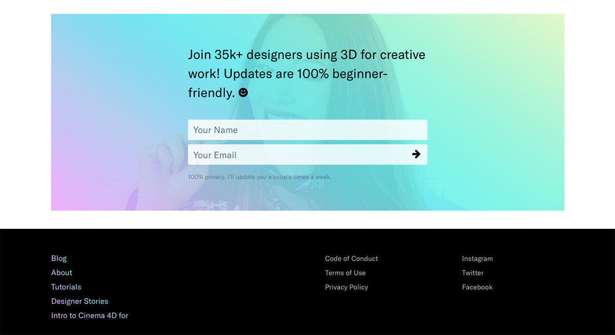
Mono Gradient Background

luc.jpg

Gradients aren’t the easiest thing to use when it comes to a background color scheme. That’s often due to variations in color that can make foreground elements difficult to read (particularly text).

A mono gradient solves this problem. Using a monotone palette will ensure that the background has a dark or light feel, making contrasting text in the foreground a lot easier to accommodate.

You get the visual interest of a gradient without the challenge of readability.

Luc Hohler does a nice job of this with his portfolio website, above. Monotone gradient blocks create a nice background pattern that has more depth than if he had options for a single mono gradient for the full canvas.

Almost-Mono Gradient

arbi.jpg

You can’t miss the gradients for Arbitraer.

The colors bleed into each other naturally

The orange to red gradient isn’t quite a mono gradient, but it is close. (Keep scrolling and the design offers a few more almost-gradient pairs.)

It’s is a little bolder than some of the purely mono options above, but isn’t in that more rainbow style that we’ve seen either.

What keeps this color scheme in the mono gradient family is the use of colors that are close on the color wheel and have similar saturations. The colors bleed into each other naturally as you would expect for any other mono gradient.

This option can be a little more of a challenge to use because you may have to use colors outside your brand palette or consider how to incorporate other elements with bolder hues. As this design shows, it works nicely with a more minimal design that doesn’t have much color elsewhere. (That can be said of many mono gradient styles.)

Conclusion

Mono gradients are a fun design trend that we are seeing a lot of right now. There are plenty of ways to use them.

Most notably when looking at these designs collectively, is that many of them don’t feature other art elements (images, videos, or illustrations). This technique is strong enough in most cases to stand on its own and can be a good solution if you are contemplating an art-less project.


This article was taken from Design Shack.

Friday 09.04.20
Posted by Arianne Grace Amado
 

16 Super Fire CSS Gradient Examples

We know why you’re here – you love gradients just as much as we do, and you want to see more! If you’ve read our blog, we’ve showed you a ton of gradient tutorials, had a lot of CSS gradient discussions, and we’ve even dived deep into why CSS gradients matter. If you haven’t read our other posts, give them a look-see when you can, but for now, we’re here to do something super cool – give you examples of awesome gradients in action. Join us as we walk through 16 awesome examples of CSS Gradients that – we think – will help you catch the CSS Gradient fever.

1) Scale API Homepage

scale-homepage-43b0cdc9.jpg

Scale doesn't just make a sweet API, they go HAM on those homepage gradients. Those pinks, those purples, that satisfying progression of beautiful, rich colors along a straight line – if you can’t tell, we get all the feels with this site. Can you identify what kind of gradient this is? Don't let those diagonal cards fool you, it’s a linear gradient starting from the top and moving to the bottom.


2) Stripe Homepage

stripe-homepage-78286d08.jpg

Can you blame us for loving this homepage? Stripe's gradient game is unparalleled. They implement several linear gradients in a rotated, grid pattern to capture dark blue hues that gradually fade into light greens and aquamarines. They’ve managed to define sharp lines in some spots to create angles and color separation (by manipulating the transparency of the directions and color stops) and allowing other colors to fade into new ones seamlessly.


3) Stripe Connect Page

stripe-connect-5ef5488d.jpg

We couldn’t get away from Stripe right away – they’re all about the gradient, and we love the way they’ve designed their site. The connect page is especially unique. Notice how they keep a similar style consistently throughout each of their pages but implement subtle differences. That’s what we call engaging design. Here, they manipulate a blue-white gradient, starting with dark blues at the top and gradually fading into a white color toward the bottom and for the rest of the scroll. As with their homepage, they’ve implemented a few sharp lines within their gradient to separate the colors and create a wavy, line pattern that appears random.


4) Stripe Payments Page

stripe-payments-7d1a4258.jpg

We. Love. Stripe. Gradients. There, we said it. And because we’ve said it, we’ve used their site as another example. Check out their payment page. That background is simply stunning! Not only do they implement a beautiful transition from dark green, to light green, to white, they also play with and manipulate the patterns within the linear pattern down the page. They’ve mixed in sharp color stops to separate the colors and creating unique angles, and even have a section of the gradient with tiny, angled vertical stripes.


5) Mixpanel Homepage

mixpanel-homepage-475e197e.jpg

GUYS. Mixpanel is the ultimate linear gradient design we’ve been trying to explain. Check out what we’re talking about. See how that dark blue (almost purple) fades so gradually into progressively lighter blues so seamlessly that you can’t tell where one color begins and another ends? That’s the linear gradient we’re talking about. It continues for a bit as you scroll, then gradually gives way to an all-white background. It catches your eye as soon as the page loads, one of the biggest advantages of including a gradient in your site design.


6) Instagram Logo

instagram-logo-b6af74d3.jpg

Perhaps the most famous and well-known gradient of all, the Instagram logo. Simple, stunning, and aesthetic, Instagram took the radial gradient idea and mastered it. The genius is in its simplicity — you could easily design the logo with the radial-gradient techniques we’ve taught you. The radial gradient starts with a light yellow, orange at the bottom left corner of the logo and moves gradually toward the top right corner of the logo progressing to light purple, fuchsia, pink. It’s impossible to not be drawn to this simple gradient within their camera logo.


7) Instagram Guidelines Page

instagram-brand-d62a0257.jpg

We’re not done with Instagram yet. In the nature of consistent branding (a lesson we should all learn), they’ve taken the gradient from their logo and added it to their branding guidelines page. The same lovely linear gradient along a straight line leading from the top right corner to the bottom left corner. The same, beautiful, straightforward design. You really can’t go wrong with this linear design.


8) Spectrum Background

spectrum-chat-homepage-8a13ae1c.jpg

We can’t get over how simple gradient patterns can do so much for a web page. Check out the spectrum background on their homepage. Moving from a soft, translucent purple and gradually, and ever so slightly, moving toward a deeper purple, this gradient is a simple top to radial gradient. A sinuous curve cuts off the gradient from the rest of the page, giving way to a simpler white background. We think this is a clever way to draw your eye to the top of the page while not overwhelming the entire site with a dark gradient pattern.


9) Spectrum Community Search

spectrum-chat-search-601dfd67.jpg

In the middle of Spectrum’s homepage, you’ll find a clever little wavy box that’s filled with, you guessed it, another gradient. This is a fantastic way to implement a second gradient on the same page. Taking a monochromatic approach, spectrum has used a linear gradient this time, starting at the top of the wavy box with a light blue and moving toward that darker purplish-blue.


10) 3D For Designers Header

3d-for-designers-header-4555967b.jpg

Something so simple can be so effective and captivating, and that’s exactly what 3D for Designers has done with their home page. Devon the founder doesn't implement an entire gradient background, instead, she put a simple, thin line at the top of the page gradually transitioning color from light purple to a light green. In the code Devon calls this "rainbow header" which is a perfect description of these fun pastels. It matches the color scheme of her brand, engages the audience, and doesn’t overwhelm.


11) 3D For Designers Email Form

Scroll to the bottom of the page, and you’ve got it again. That beautiful, technicolor gradient, but this time, super transparent and transposed over an image. We love this design! It goes great with the theme of the brand and implements a fun way to include an image on the page. That linear gradient color selection is super engaging, too. From the bright purple leading all the way up to the transparent, lime green, we’re certainly captivated.


12) EthWorks

ethworks-93e51c42.jpg

Ethworks knew what it was doing when it designed the sliding parallelogram (using Rellax 😎) design at the top of their homepage. This is a gradient unlike others we’ve seen, and a creative way to implement the simple coding we’ve been working through in a unique, intricate way. Check out their use of light, pastel colors with sharp angles and distinctions, as well as their gradual color progressions from the top of the page to the bottom.


13) Baremetrics

baremetrics-b9ff4589.jpg

What we like best about the Baremetrics gradient is its simple and subtle design. When you look at the page on full screen, you see a wiggly line dividing the background between two colors – white and purple. This simple divider creates a pull toward the text and makes for a beautiful, uncomplicated way to engage your audience and draw them in to your website.


14) Polygon

polygon-f4aa72cf.jpg

The Polygon gradient design is a bit reminiscent of the gradient style we see in the Instagram logo and page, but it uses it in a different way. It still has that gradual progression of colors along a linear line, but this time, it moves horizontally on their navigation strip at the top of the homepage, and they even implement the gradient over the images on their site! Using gradients as a mask over images is a great idea and can be accomplished simply with transparency!


15) Algolia

algolia-button-03fd1304.jpg

This website uses their gradients in such a simple, subtle, and eye-catching way. Instead of throwing a gradient across their entire background or masking it over their images, they use it on their buttons, instead! We love this innovative design. It gives their clean page a splash of color and brings a unique take on linear gradients to website design.


16) Indie Hackers

indie-hackers-button-cf2e5e6c.jpg

Gradient buttons galore! Courtland really wants to emphasize the calls to actions on the page and what better way than some sweet, candied buttons. For the most part, the user interface of the website is a subduded deep blue, but scrolling around the site, your eye is immediately pulled into the gorgeous prominent buttons. Marketing + design + development brilliance.


Closing

We love all of those examples, and we bet you do, too. The end idea here is that CSS Gradients are everywhere, and we can guarantee that you’ll start noticing them a lot more, too! Keep an eye out for your favorite gradients across your web travels!


© Article taken from CSS Gradient Blog

Friday 09.04.20
Posted by Arianne Grace Amado
 

Web Design: How to Create the Perfect Gradient

By Warren Fowler

User experience is one of the crucial components of modern business. An average customer wants to browse your website smoothly and enjoy aesthetically pleasing features, which maximizes the importance of design and colors.

According to the report, more than 90% of first impressions about a business are design-related. At the same time, almost 60% of users say they don’t want to recommend a company that has a poorly-designed site.

It is the reason why marketers invest more time in website creation, trying to find color solutions that can inspire visitors to stick around longer. This is exactly where gradients step in as the essential element of contemporary web design.

Gradient in web UI concept by Surja Sen Das Raj

Gradient in web UI concept by Surja Sen Das Raj

Gradients are slowly replacing flat colors because they look more natural and appealing. Let’s discuss how to create the perfect gradient.

The Logic of Making a Beautiful Gradient

Flat colors have been dominating design in the last decade, but the situation is now changing due to the emergence of gradient color schemes. The reason is simple – gradients give brands the opportunity to express ideas more freely, making subtle transitions between the pairs of basic colors.

Mark Greenberg, a UX specialist at Resumes Planet, explains it briefly: “After a long period of flat-focused design, gradients come as a natural choice because they offer a variety of styles and improvisations. They introduce another dimension and bring that much-needed depth, which becomes an anchor of modern web design.”

But how can you create the perfect gradient? The first thing to do is to look at the color wheel. It gives you a plethora of ideas, but almost always the most effective option is to pair neighboring colors. As you go down the wheel, you can notice how colors that stand next to each other represent a natural transition.

Color wheel infographic by Tubik

Color wheel infographic by Tubik

However, some designers don’t want to do it so simply or need to follow a specific branding requirement of a company. To put it simply, they have to mix colors that are far away from each other on the color wheel. In this case, it is necessary to introduce an in-between element to create a good-looking gradient.

It’s a so-called 3-stop gradient that uses a new color as the connecting point between the two original colors. You can experiment with transparency, shades, and opacity to find the ideal combination for your site.

Another option is to create soft linear gradients simply by adjusting RGB values of the primary colors. When you make a small change in color elements and bring them closer to each other, you get a perfectly polished soft linear gradient.

Grabient service by Unfold

Grabient service by Unfold

Things to Avoid in Gradient Creation

The worst thing to do is to create ugly gradients that simply cannot fulfill aesthetic norms. Feel free to go back to the color wheel and check all options – you will see that some colors just don’t fit together.

If you consider it, you will realize that it’s best to follow patterns that already exist in nature. For instance, you can hardly ever find a transition between red and green anywhere. The two colors just don’t fit, so you should try to act wisely in this case.

The same goes for orange and blue. Each one is incredibly eye-pleasing, but they just can’t function properly together. Therefore, you should stay away from controversial options and find a combination that can guarantee outstanding UX results.

Where to Find Inspiration for Gradients

There are two ways to find inspiration and ideas for gradients – observe nature or search for good examples online. The first option is easy because you can find some incredible scenes every day. We are talking about the sky, clouds, forests, flowers, etc.

Nature is so incredibly beautiful that you can’t find better examples of gradient colors anywhere else. Whenever you watch sunrise or sunset, you can see so many hues and shades that you can easily use in web design practice.

sunrise-photo.jpg

On the other hand, a lot of websites already crafted their own versions of gradients that look very well. There are many examples out there, but we decided to present you only three of those:

  • Impossible Bureau: As soon as you open Impossible Bureau’s homepage, you will notice a full-page gradient that makes wonderful transitions between red, pink, and purple.

  • Melanie.F: Melanie. F has created a website header that covers the “green to purple” spectrum. The gradient is not pushy, but it grabs users’ attention immediately.

  • Symodd: Symodd is digital and audiovisual production agency. Its homepage varies from orange to pink, making a smooth and wonderful color transition.

We showed you only a few nice examples, but don’t be afraid of running your own search if you need more inspiration. There are hundreds of great sites to see and get inspired.

The artistic approach to gradients by Nathan Riley

The artistic approach to gradients by Nathan Riley

Conclusion

A website is the first thing users see when they want to explore a certain company. In such circumstances, it is extremely important to design your site properly and use beautiful color schemes. Gradients play a major role in that respect because they allow you to come up with more appealing solutions that inspire visitors to hang around a little longer.


Originally posted on Icons8 blog.

Wednesday 09.02.20
Posted by Arianne Grace Amado
 

Gradient Logos: Why You Need These Controversial Colors

Nothing gets designers going more than the subject of gradients. 

Those who remember the olden days of WordArt still cringe when they hear the word; others who are newer to the design scene might have missed that unfortunate period, and they’re able to look at gradients with fresh, optimistic eyes.

We’re on the cheerful end of that spectrum, in that, like with every other design element, we believe gradients can add something to a logo design if they’re used in the proper time and place. 

Although some might accuse gradients of being a logo design trend rather than a regular color technique, timeless logos such as Instagram and Airbnb have used the gradient to their success – and so can you!

But first, the obvious question: 

What is a Gradient?

A gradient is a design element made up of colors that gradually fade into one another. Also known as “color progressions” or “color ramps,” gradients either consist of many shades of the same color, or multiple colors that blend from one to the other. 

The point of a gradient isn’t necessarily to have multiple colors in a single design; rather, it blends the colors so that each shade transitions into the next – creating an overall cohesive effect. 

And, while flat logos are making a huge splash these days with new businesses, gradients can make for equally strong logos. 

When to Use Gradient Logos

Gradients should be used to accent a strong logo, not hide a weak one. You also don’t want your gradient to be the selling point of your logo; if anything, it should be used to add a little extra flair to your design, but only as a point of enhancement to the other elements of your business’s logo. 

That said, here are a few other scenarios in which to consider using a gradient:  

When it's relevant to your brand identity.

When designing any type of logo, it’s important to think about what kind of vibe you’re trying to put out into the world – and gradient design is a vibe unto its own.

It implies creativity, imagination, innovation – all great things, but not necessarily suitable for your specific brand personality. A lawyer, for example, might not want those traits associated with his/her litigation firm, but a band logo would fit right in with that overall image. 

When your business is internet-based.

Gradients tend to look much better on screen than they do in print, so you’ll want to think twice before choosing a gradient if you’re planning on branding a lot offline.

A restaurant logo probably would do better with a flat design, because you’ll likely be putting your logo on menus, napkins, and a storefront. Gaming logos, however, can definitely incorporate gradients – both to separate yourself from the competition, and to be remembered for your unique logo. 

When your logo carries its own weight.

Like we mentioned above, a gradient isn’t meant to be the sole focus of your logo; it’s only there to enhance, the same way an accent of color or a secondary font would. 

There may be times when you need a transparent logo (a version of your logo that works on colorful backgrounds), and in scenarios like those, your logo will have to stand on its own – without a gradient to back it up. 

When your logo is easy to read.

Gradients can often distort the text of a business name or make it more difficult to read, depending on how intense the effect is. It’s best to shy away from adding gradients to a wordmark logo, or logo that uses only text (no symbols or icons) – unless the gradient is VERY subtle. 

Advantages of Gradient Logos

When all is said and done, why would a business actively choose to use a gradient design when it’s easier to create a flat logo? The answer is simple: It will set your logo apart from competitors. 

Among other things, gradient logos are: 

Memorable.

Because they’re currently not the norm in the world of logo design, gradients are able to make a long-lasting impression that flat logos sometimes can’t. 

We’re used to talking about colors like they’re singular entities – the sky is blue, this cherry is red – so when we see colors that we don’t have language to immediately describe, the image isn’t as quick to leave our heads as those with flat colors we’re accustomed to seeing. 

Creative.

Like we mentioned above, your logo design should speak to your brand identity, and gradient logos own a lot of creative real estate. If your business is in the arts, in innovation, or simply wants to be known as a company that finds out-of-the-box solutions for their customers, then you’ll want a logo that can communicate that creativity to your audience. 

Realistic.

If you look around, you’ll notice that objects in nature are rarely characterized by a single color shade. Trees have a compilation of greens, browns and oranges; dirt segues between blacks, browns, and reds. 

In other words, our eyes are much more accustomed to seeing gradients than flat designs in our everyday lives, and with a gradient logo, you can make your business that much more alive in the minds of your audience. 

Playful.

By using a gradient logo, you’re engaging your audience in conversation with your brand. You’re letting them know that you’re different, you have spunk, and you’re not afraid to make bold choices – both as a brand and as a business. 

Tips for Creating Gradient Logos

You may already know how to make a logo, but you’ll want to keep these tips in mind before plunging forward on your gradient journey: 

1. Keep it simple and subtle.

Simple = professional, and a subtle gradient can enhance the logo design you’re already working with. A gradient that’s too intense, on the other hand, will dominate the design, making it unpleasant to look at and difficult to print. 

2. Focus on contrast.

If you’re pairing your logo with a colorful background, contrast between the two is key.

You don’t want your gradient to clash with the background, and you certainly don’t want your logo to get lost because the colors are too similar. Make sure that you have contrast in your design while having all of the elements give off the same mood.

3. Make a solid version of your logo first.

Settle on a logo design that you like; then, see if you can enhance it with a gradient. By creating a solid version initially, you’ll know if your logo is able to stand on its own when printed or put on a colored background. And, you may find that your logo doesn’t even need a gradient to stand out.

4. Be intentional about your colors.

Gradients aren’t just meant to look cool; they’re also supposed to pack meaning into a logo. However, you want to make sure that the meaning you’re giving your logo is on-brand. If you sell jewelry, there’s no need to throw in a rainbow; if you have a solution for creating clean water, stick with different shades of blue. 

5. Test it over black and white backgrounds.

How does your logo look with no background? What about if it’s on a black surface? To optimize your logo for printing, first try it out on product mockups and different mediums. Make sure your logo is versatile before committing to the design. 

Over to You

You now have everything you need to design a gradient logo; the question is, what are you going to do about it?

Whether you decide to hire a designer or use an online logo maker to get the job done, you should think ahead of your logo colors and consider creating a gradient logo for your business – both to set yourself apart from the crowd, and to tell the world your business isn’t afraid to be bold. 


Article source: Tailor Brands Blog

Tuesday 09.01.20
Posted by Arianne Grace Amado
 

5 Ways to Get Creative with Gradients in Graphic Design

Ever since the gradient trend first took off, designers have continued to find new and innovative ways to use gradients in their work. Gone are the days where gradients ruled the UI world—we’re seeing the color trend being used in so many different applications across the design spectrum from graphic design, to illustration, packaging, and so much more.

To inspire you to get a little gradient crazy, we’re sharing a few simple tips and tricks to try out the next time you work with them. Use these techniques to add a fun twist to an otherwise classic gradient and have fun exploring the endless possibilities!

1. Use Gaussian Blur

Did you know you can create a gradient effect in Adobe Illustrator without actually using the Gradient tool? To replicate the look and feel of the hazy gradients seen in the Shots below, create a few basic shapes that overlap each other and are different colors. Then, select all shapes and apply the Gaussian Blur effect to create hazy, almost blurry looking color transitions. It’s whimsical, and certainly not your average gradient.

Pro Tip: Before applying Gaussian Blur, go into your ‘Document Raster Effect Settings’ and increase the Pixel number around objects so it’s as high as possible (1000 px should do it). This way, you’ll avoid a choppy looking blur.

Row 1: Valery Pevnev for Insoft, Kyle McDowell 🤘🏼, Valery Cheplygin. Row 2: Script & Seal, Omnium, tubik.

Row 1: Valery Pevnev for Insoft, Kyle McDowell 🤘🏼, Valery Cheplygin. Row 2: Script & Seal, Omnium, tubik.

2. Create Harsh Lines

Instead of the typical seamless color transitions that you see in gradients, try getting creative with harsher lines. A simple way to do this in Adobe Illustrator is to play around with the color sliders in your Gradients panel. Drag them around to get your desired effect and get inspired by the examples below!

Row 1: Jacob Boyles, Script & Seal, Brent McCormick.

Row 1: Jacob Boyles, Script & Seal, Brent McCormick.

3. Add Texture

Gradients tend to have a very digital look and feel, so a nice way to change things up is to add some texture. In the examples below, designers overlayed a grainy texture over their work. You can easily mimic this effect in Adobe Illustrator by going into Effects in your main menu, hitting Effects Gallery and finding Grain. There’s a ton of Grain settings to explore within that effect, so have fun experimenting!

Row 1: Pierre-Louis Anceau, Nick Franchi , Cory Uehara. Row 2: Terry Edward Elkins, Breton Brander, Gonzalo Vazquez.

Row 1: Pierre-Louis Anceau, Nick Franchi , Cory Uehara. Row 2: Terry Edward Elkins, Breton Brander, Gonzalo Vazquez.

4. Experiment With Typography

Another dynamic way to use gradients is to apply them to typography. Combining both gradients and text adds a whole new layer of movement and flow to a design piece. You can add tons of cool gradient effects to your letters whether it be through a drop shadow or a fill, and watch your type come alive.

Pro Tip: Gradients only work with fills and strokes—not fonts. If you’re using a font, make sure you create outlines of your text before trying to apply a gradient. To do this, select your text then find your main menu bar and hit Type —> Create Outlines.

Row 1: Tanya Jacobson, Zachary Styles, hunter ellenbarger for FCTRY.

Row 1: Tanya Jacobson, Zachary Styles, hunter ellenbarger for FCTRY.

5. Create a Glossy Illusion

A cool trick to give your designs a three dimensional, glossy feel is to create a gradient with two shades of the same color—this works especially well with shades of gold or silver! Designers Nadia Castro and Jay Fletcher have truly mastered this shine effect so check out their profiles for even more inspiration.

Pro Tip: Try combining this glossy gradient with the Grain effect to add even more dimension.

Row 1: Jay Fletcher, Alex Spenser for The Faces, Jay Fletcher. Row 2: Michael Penda, Jay Fletcher, Miguel Camacho.

Row 1: Jay Fletcher, Alex Spenser for The Faces, Jay Fletcher. Row 2: Michael Penda, Jay Fletcher, Miguel Camacho.

We hope these tricks got you excited to try out some new design styles! Have fun experimenting with these techniques and don’t be afraid to get crazy with it—You might just stumble upon your own new unique effects.


Article by Renee Fleck in Inspiration; taken from Dribbble website.


Monday 08.31.20
Posted by Arianne Grace Amado
 

9 Graphic Design Mistakes to Avoid, According to the Experts

By Masooma Memon

iStock-1133587330.jpg

Here’s the thing about design: it’s either good or it's meh.

Basically, it either captures your audience’s attention or it fails to hold it longer than a fleeting glimpse. As a marketer, however, you’ll come across several instances when you need to create designs. It’s here you need to be mindful of creating designs that are clear, clutter-free, and attractive.

To help you improve your 2020 graphic design strategy, we reached out to professional designers to put together a list of bad design mistakes you need to avoid this year.

Graphic design mistakes to steer clear of 

Ready to create visually stunning designs that wow your audience? Let's discuss the exact things you should be avoiding and how to remedy them! 

1. Poor kerning 

First on this list of design pitfalls to avoid is poor kerning. Patrick Soutar, Design Lead at Hoppier notes: “Simply put, kerning is the spacing between the letters in your writing." 

Look at the image below. Can you see the difference in the design with and without kerning? 

Ink and Copy X G2 X Experts Share Design Mistakes to Avoid in 2020.png

Source

The text looks visually more appealing after kerning, doesn’t it?

Patrick elaborates:

“Even though it may sound simple, poor kerning can ruin the overall impression that you want to make with your design. Your written words may look completely unreadable or confusing or in some cases, it can even be comical. Pay close attention to kerning if you want your design to be visually balanced.”

How can you avoid this design mistake?

  • Make sure you add equally perceived space between letters

  • Squint or cross your eyes so you can see the space between the letters without getting distracted by the characters

  • Pay equal attention to spacing between words, not just spacing between letters 


2. Thinking "desktop-first"

Rebecca Bowen, Digital Designer  at Trident emphasizes, “Thinking desktop-first is a huge mistake. [Instead,] think mobile-first for all content you are designing; it's how people are consuming things.”

A Comscore report highlights mobile devices take up 70% of the time spent on digital media. Considering this stat, doesn’t it make sense to design with mobile users in mind?

Bowen suggests, “keep things simple, imagine someone viewing on a small screen and ensure that how you design works for that size. Pull out the important content and make sure that's what your audience takes action on.”

How can you avoid this design mistake?

  • Design multiple graphics to test how they look on different sized portable devices

  • Stick with small file sizes so graphics load faster on mobile devices

  • Create both landscape and portrait layouts for your graphics so your design fits any screen orientation users view your designs on


3. Having a lack of whitespace 

Lack of whitespace is another design flaw to avoid in 2020, according to Daniela Verduga, Designer at Visme. Verduga shares, “overloading your design or trying to fill every space is a common mistake for non-designers or clients.”

However, adding white space can save designs, making them understandable, visually appealing, and clutter-free. Essentially, whitespace, also known as negative space, is the clear space in design. It doesn’t mean empty space with a white background. Instead, white space is all the unmarked space of any color, background image, pattern, and texture.

Not only does it make your design elegant, but it also puts emphasis on certain design elements such as your call-to-action, which makes your message stand out. Research also confirms white space can increase comprehension by up to 20%.

For instance, note how the use of whitespace is making the text in the second paragraph far more readable than the text in the first paragraph below:

Source

Daniela suggests:

“Consider the white space as an element of design just as important as fonts or colors. Don't be afraid to use it! You can see how the design takes a whole new level – the impact is stronger and the message is more clear!”

How can you avoid this design mistake?

  • Leave large areas in your design empty

  • Add padding or margins to each element in your design

  • Create white space by removing unnecessary design elements like borders

4. Designing without taking trends into account

Although it isn’t wise to jump onto every trend bandwagon, it is crucial to pay attention to what’s prevailing so you can “avoid the mundane,” as Mio’s graphic designer, Harriet Ruscoe recommends.

Ruscoe opines:

“It’s particularly important to take note of new trends in graphic design for 2020 as the world of social media content and web design is more competitive than ever amongst brands. Being innovative and diverse with colour, typography style and illustration concepts is key.”

How can you avoid this design mistake?

For 2020, you should use: 

  • Vibrant color schemes, a stark contrast to the pastels that prevailed last year 

  • Thin geometry that gives a futurist feel 

  • The minimalism trend

5. Giving inadequate thought to typography

Typography is a major element responsible for making your design readable, accessible, and usable. So, let’s not forget typography or the text component of your design.

Mistakes here are common. Christopher Moyer, Managing Director at Hard Luck, states: “A lot of design – even otherwise strong design – comes paired with poorly executed typography.”

Moyer recommends playing with new typefaces:

“It’s easy to fall into routines and use the same go-to fonts again and again, when there may be more suitable options for the task at hand. In 2020, we’ve also got unprecedented access to drop dead gorgeous and affordable – or free – typefaces.”

At the same time, he suggests refraining from trying every new font without first giving it some thought: "Deploying loud, expressive typefaces thoughtlessly, transforms impact into tackiness.”

How can you avoid this mistake?

  • Try new typefaces, but not without first thinking through their suitability to your design and branding

  • Make sure your typography is readable, clear, and easy to understand

  • Pick your typeface according to your audience’s tastes. Dig into font psychology to make better, audience-preferred choices

6. Using excessive flat vector images

Flat vector images (such as the one shown below) have witnessed significant growth in the past few years.

The SVP of Marketing at SEMrush, Maxim Roslyakov, notes the same: 

“A while ago, flat vector images started to gain huge popularity and stock services started to sell such pictures very extensively. Still, the number of such images in picture stocks is impressive.”

Source

Despite their numbers though, Maxim notes that “their main disadvantage is that they are very similar to one another. Stylistically they are all the same, drawn in one style and with the same colors. They have neither beauty nor uniqueness and it is assumed to be unprofessional to use such images in the canvas.”

This means using flat vector icons in abundance is not only unprofessional, but it also sips any uniqueness from your design.

How can you avoid this design mistake?

  • Limit your use of flat vector images and use only ones you haven’t seen used widely

  • Hire a professional designer and get some templates ready for your campaigns

  • Transform flat vector images with different techniques (e.g. adding the grain effect)

7. Designing without taking real-world importance in account

Another design mistake to avoid is “a mismatch between the visual emphasis (salience) given to a piece of information and its real-world importance,” according to Carolynn R. Johnson, Lead UX Designer at Daedalus.

Johnson sees excessive clutter in design. This clutter could take the form of too much text or various design elements, like shapes. Whatever the reason, the end result fails to deliver its key message.

In Johnson’s words:

“Your most important piece of information should be what attracts the viewer's attention; but often designs are cluttered with less important data that are given the same visual priority, which pulls the user’s attention away from what you want them focused on.”

How can you avoid this design mistake?

  • Use whitespace to guide your audience’s attention

  • Make your design less wordy and more minimalist

  • Don’t use unnecessary design elements

8. Failing to design for your audience

On the surface, designing for your audience may sound simple. But as Sam Orchard, Creative Director at Edge of the Web notes: “This happens a lot with people new to the industry. Instead of thinking about the target audience and their preferences, they rely on their own tastes or current trends.”

When this happens, Orchard states:

“You end up seeing promotional material for the local bookstore that looks like a flyer for a night club. Whilst everyone wants their work to be right on trend, if that style doesn’t resonate with your target audience, you’re not doing your client any favours.”

So you know what you have to do, right? Design for your audience.

How can you avoid this design mistake?

  • Identify your target audience so you can make your design decisions accordingly

  • Choose fonts and colors according to your audience’s preferences

  • Keep personal preferences at bay

9. Failing to adapt new innovations in efficiency

Another very important graphic design mistake to avoid is failing to welcome new AI in design.

The CEO of Visuals by Impulse, Caleb Leigh observes:

“We're seeing breakthroughs in machine learning that are allowing artists to automate stages of the creative process like never before. There are huge innovations in design software on the near horizon, which will save artists tons of time and headache.”

For instance, Netflix uses augmented intelligence to localize its show banners in different languages and Nutella used AI algorithm to generate millions of packaging designs (example below).

Ink and Copy X G2 X Experts Share Design Mistakes to Avoid in 2020.jpeg

Source

Owing to this growth of AI in design, Caleb thinks, “those who invest time into learning these new tools will gain a competitive edge and see their productivity skyrocket. Those who cling to old ways and procedures will be left behind. Very soon, designers will be faced with a critical choice: adapt & evolve, or stagnate.”

How can you avoid this design mistake?

  • Keep abreast of all the prevailing developments in design-related AI

  • Keep tabs on examples you can learn from such as Nutella and Netflix

  • Embrace new changes by exploring how you can possibly use them to improve your designs

Create beautiful designs

On the surface, designing may seem simple, but there’s a lot of thought that goes into the process. Make sure you keep your target audience in mind as you design and avoid these mistakes to create wonderful designs that not only attract your viewers but hold their attention too. 


Source: G2 Learning Hub

Friday 08.28.20
Posted by Arianne Grace Amado
 

A definitive guide to video marketing 2020: Stats, strategies, and challenges

Everyone agrees — the future of video marketing is bright and filled with innovations. Still, no one is talking about how to overcome challenges to get the most out of application strategies.

What is video marketing in 2020? Today, it is a tool for building every marketing campaign, raising click-through rate, conversion rate, and memorability of the brand message. At least that’s what I’ve heard at the IAB ALM and CTV Roundtable conferences that I attended this year as SmartyAds CEO and Spearad CRO.

As a CEO, I’m supposed to be the front runner of all transformations in ad tech and martech. What I’ve recently learned was an eye-opening revelation: Although nearly 63% of marketers regularly use video marketing strategies, lots of them don’t know that the right ad formats and platforms can do wonders to their ad campaigns. Piling up the freshest conference insights with the customer data aggregated by SmartyAds DSP, I made a short and definitive video marketing guide specifically tailored to the year 2020.

The importance of video marketing

Before you start an advertising campaign, you should keep in mind that by 2022, 82% of internet traffic will be driven by video. The impact of video rises as people embrace Ultra-High-Definition (UHD) or 4K video streaming. The introduction of the 5G standard already sped up video rendering and streamlines VR and AR video experiences in China.

What’s the result of this? If last year (2019) people watched videos 84 minutes per day on average, by the end of 2020, this number will jump to 100 minutes per day. By 2022, the number of videos streamed on the internet per second will climb to one million.

How users consume video content: (According to the 2020 stats)

  • 78% watch video s every week.

  • 55% watch videos every day.

  • 72% of customers prefer learning about a product or service by watching videos.

What is the right video marketing strategy in 2020?

Video marketing business strategy is a path that leads your ad campaign to great achievement or underachievement. Why underachievement? Because a poorly chosen strategy that doesn’t take into account current opportunities and market challenges at some point can set you back to the beginning of your path. Thus, when planning a video campaign, follow three core steps:

1. Choose your goal

Video marketing strategy is a map that should include all necessary channels, tools, and platforms that you will be using and, most importantly, the result that you want to achieve: click-through rates, conversion rates, sales, or the number of subscribers?

2. Choose a creative type

After you’ve made up your mind regarding the result you want to achieve, choose the format that facilitates the achievement of these metrics. The data aggregated by SmartyAds DSP can tip you off here. According to analyzed ad campaigns (2019), the most performing ad formats are:

  • Rewarding videos: Rewarded video ads appear at certain intervals of the mobile games offering bonuses to users in exchange for watching promotional videos. The bonuses are often used instead of in-app purchases, which is why over 70% of gamers actually like this format. In 2019, their CPM rose to $13.75 (iOS) and $12.01 (Android). The typical CTR averaged at 5-10%.

  • Playables are also among the best: These formats are best suited for driving installs and attracting good quality audiences to your app. The video ad promotes another game that the user can try before downloading. These ads bring in 10.5% CTR and ~9,600 installs per month on average.

  • Interstitial videos: Video interstitial ads can appear at the beginning of the video, in the middle, and at the end. They can be used for desktop, mobile, and in-app environments alike. In 2019, their eCPM was at the level of $9.01 (iOS) and $5.44 (Android). Click-through rates can reach 5-10%.

  • Native video ads: When it comes to native videos, they can work best for various campaigns that raise brand awareness and performance alike. Native video will typically appear at the feed or recommendation block on the page. These videos don’t cause irritation since they are triggered by users and naturally fit the look of the web content. Native ads produce 40% higher click-through rates than other formats and 55% more views.

3. Choose a platform

Before choosing where to post the video, first think of your target audience. If you post it on a corporate website, only website visitors will find it. If you chose YouTube and in-build the video on the web page, both YouTube viewers and website visitors will watch it. Airing the ad on social media will make it even more visible, especially for millennials and Gen Z.

You can even build entire advertising funnels based on videos. For instance:

  • The primary source of traffic for your ads is YouTube

  • From there, a person watches your short video ad and, using the link in the description, registers for a free video tutorial

  • The tutorial contains call to actions (ctas) or links leading to the landing page that fully demonstrates your product or service

This strategy is more suitable for businesses that specialize in training or education. Other businesses can expand their reach by shifting to trending addressable TV and OTT, as digital spend on these mediums will reach five billion dollars by the end of 2020. Game consoles, tablets, Smart TVs, and other gadgets connect users to the Internet, where they can stream video content on how and where they like.

This has given a push to personalized programmatic advertising on TV that delivers video ads to households individually, according to relevant customer data – just like programmatic does on the web. Let’s consider, for example, you may be watching the same show with your neighbors, but they will be watching e.g. Starbucks commercial, and you’ll see the interactive CTV ad that offers you to register for a car test-drive (example below).

Benefits and challenges of video marketing in 2020

This January, Google announced that it will stop supporting cookies on August 5th, 2020. For video marketing, this means the end of the era of data usage as we knew it. Google Chrome wasn’t the first browser that abandoned cookies – Firefox and Safari have done it as well.

Is there life for video ad targeting after cookie’s death? Certainly yes. While you still have time for preparation, it is better to embrace DTC (direct-to-customer) video campaigns to make yourself less cookie-dependent. By addressing your customers directly, you are fostering loyalty to your brand, and loyal customers are much more likely to share their data (first-party data), which you can then legitimately use and re-use for video marketing campaigns.

When setting pre-roll and mid-roll video marketing campaigns, be sure your creative also complies with new ad duration and experience standards established by Google in February 2020. It is recommended to use Google’s ad quality report in order to ensure that your video ads are not violating user experience. Finally, making a video marketing campaign, revise creative guidelines established by the ‘Coalition for Better Ads’ and your ads will always be relevant and will never be blocked.

A brief takeaway

Social media, rapid adoption of connected devices, and mobile gadgets – these are the catalysts that made video the most wanted format in 2020. People will spend more time watching videos over the next few years, which means advertisers will be budgeting for more video marketing campaigns.

In order to face the growing competition for user attention with ease, marketers should use advertising automation, platforms, and formats that increase ROI and user loyalty, all at the same time. All social video marketing trends that will be disrupting the advertising market in 2020 I will be revising in the next article. Stay tuned.


Author: Ivan Guzenko
Source: taken from
ClickZ

Thursday 08.27.20
Posted by Arianne Grace Amado
 

Awesome Animated Explainer Videos To Inspire You In 2020

Marketing is a living organism that needs nourishing, feeding, and refreshing all the time. The old-school patterns do not work today. A business needs a new powerful tool for creative storytelling that will help promote products and services creatively and communicate the company’s message to the masses more effectively. What can it be?

Let’s see what authoritative business news resources predict.

  • 81% of businesses use video as a marketing tool — up from 63% over the last year. (Hubspot)

  • Mobile video consumption rises by 100% every year. (Insivia)

  • By 2022, online videos will make up more than 82% of all consumer internet traffic — 15 times higher than it was in 2017. (Cisco)

  • 78% of people watch online videos every week, and 55% view online videos every day. (HubSpot)

As you can see, the power of video-marketing is ever-increasing. The video can be exactly what your business needs to grow up in 2020. To sound loudly and beautifully on the web, your company can create a video with a distinct style. And make it animated. The animation is one of the most powerful ways to show off your brand’s uniqueness and particular style.

Here you can find the top 5 animated videos produced by the industry leaders. Let’s see how others make marketing magic by creating engaging explainer videos that extend their audiences and generate leads.

Light, camera, action! We start!

1_bBorkf8qmdJk3mUK6SKMWw.jpeg

Pipedrive

Pipedrive has given up a traditional promo, and this time preferred a catchy animation to tell about its solutions engagingly. The video is produced in a style that maintains the brand image, primary colors, and the company’s bright identity.

The animation literally encodes the brand’s values and goals. It feels light and positive, it expresses the concepts of simplicity, intelligence, and optimism. The video transfers the general Pipedrive’s purpose — to make it the customer’s workflow more effective and life much easier and enjoyable.

The video is featured by amusing characters, an attention-grabbing slot, and the general visual dynamics. The potential of motion graphics is revealed in this animated video created by Explain Ninja. The animation communicates Pipedrive’s main message in a cartoony style that is easy to understand and perceive.

Slack

The animated explainer video created by Slack has no voice-over, just a cluster of beautiful visuals that bring the brand’s distinct character and mood through a whole animation. The video uncovers a concept of busy and fast work displayed in memorable characters, surprising color combinations, beautiful effects of overlapped colors and objects.

At the beginning of the video, Slack conveys a feeling of complexity and tension which employees may feel during the working process. And in the end, the company presents a simple yet genius solution created by Slack.

When all of the work stuff could be overwhelming, the good thing is that there’s Slack! It is the leading message transferred by a brand, and it’s done really creatively.

Nest

Nest produced a video to explain to its customers the pross of using smart devices as well as how a Nest product can complement this smart home harmony. Utilizing Nest, people can get updated with real-time information about all the intelligent devices at home and manage them easily.

The most what we like about this explainer video is a novel approach taken by Nest. They combine animation with images of real-life objects. It adds a unique style and charm to a video that distinguishes Nest among even those competitors who have produced animated videos to promote their smart electronics products too.

The animation is bright, lovely, and beautiful in each smallest detail. It raises the viewer’s mood and makes learning entertaining.

We would also like to emphasize a particularly well-done voice-over. The animation is accompanied by dynamic music and the artist’s friendly and pleasant voice. This audio-mix makes Nest’s video even more appealing.

Spotify

The video has a strong voice and character. It is performed in a brave color palette that brings the blast from the past by evoking associations with the ’50s. We like how Spotify plays with a contrast and color paradoxes in animated visuals. It makes this video even more memorable and appealing.

Another most beautiful peculiarity of this video is the creative use of various textures that include geometric motifs and real-life surfaces. The animators have also used real images of celebrities and realistic silhouettes of human bodies.

Instead of taking the traditional approach to explain how their product works, Spotify has added more creativity to its marketing strategy. It has opted for animated video-presentation of a product. In this video, the brand demonstrates a full product potential by showcasing not only its peculiarities and advantages but also product mood and style. This video is incredibly engaging for any generation.

Microsoft

Microsoft is a giant and successful corporation, but even its marketing has needed a fresh update. So, they have decided to activate the power of creative video marketing. Microsoft has launched an animated video that explains all the essential information about Microsoft’s enterprise cloud solution.

The video is featured by the effective messaging of complicated information in an easy-to-digest manner. Microsoft’s animation is a useful example for B2B players who want to stand out in the market. It transmits a clear idea of how a funny animation can help big businesses communicate their complex concepts to prospective customers and partners.

The video demonstrates a concise style of animation for business. From colors to shapes and images, it is produced in a style that corresponds to a so-called official dress-code and evokes associations with a powerful, established, and authoritative business. Microsoft’s sharp brand image is depicted precisely in this video.

Add Your Marketing a Fresh and Distinct Taste With Animation

1_d6RPGy90orULhzqn98SBUQ.jpeg

Are you, maybe, still doubting whether your business needs an animated explainer video or not? Put your doubts aside since video-marketing is one of the most effective ways to make your company sound incredibly bright and different from your competitors on the web.

Here we described the top 5 animated videos to inspire you for new marketing experiments and produce a heart-winning video for your clients (if you are a designer) or your ventures (if you are an entrepreneur).


By Dana Kachan / Article taken from Design + Sketch website.

Wednesday 08.26.20
Posted by Arianne Grace Amado
 

Why Animation Could Be The Answer To Advertisers' Covid-19 Content Production Problem

Animation has always been a powerful visual storytelling medium, but since covid-19 hit, animations have become one of the hottest trends in content marketing. In response, TVC’s head of creative content solutions, Alex Black talks about the po…

Animation has always been a powerful visual storytelling medium, but since covid-19 hit, animations have become one of the hottest trends in content marketing. In response, TVC’s head of creative content solutions, Alex Black talks about the potential for animation as a solution to some of the production problems faced at the moment.

Why are more brands turning to animations at this time?

Animation is usually a vastly underestimated and underemployed tool in both B2C and B2B marketing. Because many of the familiar options such as live-action interviews or films are now much more restricted due to covid-19, we're seeing more brands are open to giving animation a try. However, what they don’t realise yet, is that animation is often the best solution for their brief. It's a wonderful format that allows us to tell complex stories, which might not be very visually interesting, in a simple and engaging way.

What makes a great animation?

The variety of possible animation styles is absolutely staggering. You can choose between 2D, 3D, mixed-media, stop motion; the style widely depends on the artist and the specific project at hand. You can create a 90-second animation for £10k or spend up to £200k. That said, a great animation tells a story in a way that is engaging for its audience, whether that's in a corporate style, or much more playful.

Before commissioning an animation what should brands think about?

It's always good to understand what the message is and who exactly we need to reach. Ideally, the brand also has an idea of the animation style they want to employ and how much budget they want to spend on it.

Any pitfalls to look out for?

Animations can be complex and take a lot more time to complete than many live-action projects. There are a lot of steps involved. Also, most decisions and changes have to be made during the storyboarding and design phases so a lot more planning and forethought is needed. Any changes at the end of the project are very cumbersome and expensive.

What brands are most suited to using animations?

Any and all brands, I would say. Brands that don’t usually use animations will be surprised by how well this format can work for their business.

And finally, what are some of your favourite animations?

Lost & Found is an adorable short love story between a stuffed dinosaur and a fox. It also won a BAFTA.

I’m also a big fan of the work Greenpeace do.


Article by Alex Black / from The Drum Network.

Tuesday 08.25.20
Posted by Arianne Grace Amado
 

10 Ways Graphic Design Benefits Your Small Business

Author: Jennifer Davis

  1. Boosts brand awareness and name recognition

  2. Saves time and money in the long run

  3. Builds your brand’s visual identity

  4. Boosts employee morale, pride and productivity

  5. Makes you stand out from the competition

  6. Reinforces professionalism

  7. Improves the readability, structuring and presentation of heavy content

  8. Builds trust and credibility

  9. Has the power of persuasion

  10. Tells your story

If you are a new business owner, I welcome you to the world of graphic design! Graphic design is more than just a pretty face; it effectively communicates with your audience and persuades them to take action. It’s quite the superhero!

We come across graphic design everyday through billboards, flyers, brochures, social media ads, packaging, websites and signage. Visual communication is an important and heavily-relied-upon component in marketing your business. Let’s explore 10 ways graphic design can benefit your small business.

1. Boosts brand awareness and name recognition

Nike-Print-Ads-17-1.jpg

Nike, one of the most well known brands in the world, frequently demonstrates the power of well-executed graphic design.

By communicating effectively with your audience, graphic design boosts brand awareness and name recognition. Strong visuals grab the attention of your audience, are memorable and stand out against the competition. This article on Canva asks, “Have you ever discussed a product or brand and said something along the lines of “I can’t remember the name of it but I can picture it”? Often, we will remember some element of the material used in packaging or the colouring of the website, some sort of visual cue that we base our memories and experience off.”

Everything from logo design to flyers and brochures will reinforce your brand and entice your audience to take action. Read up on tips for hiring a graphic designer for your brand here.

2. Saves time and money in the long run

graphic-design-time.jpg

Bad graphic design cost your business money in the long run.

What good is an event flyer if it is so cluttered and poorly designed that the reader gives up before they can find the details they need, like the date, time and place? Save time and money by investing in a vetted and professional graphic designer from the start. Poorly designed visual pieces will not only steer customers away from your business, they will cost you money in the long run when you have to fix or redo them. Well-executed, timeless graphic design is a must for an ever-changing and evolving online world.

Apple is an example of a company with a very distinct and memorable graphic design style.

Apple is an example of a company with a very distinct and memorable graphic design style.

3. Builds your brand’s visual identity

A brand’s visual identity consists of colors, fonts, logos, graphic elements and styled photographs. Why does your brand need a visual identity? Your audience needs to be able to recognize your brand and see consistency. This translates into a memorable and trusted brand in the eyes of your audience.

4. Boosts employee morale, pride and productivity

Believe it or not, graphic design can boost employee morale, pride and productivity by creating a trusted and professional brand. Employees are more likely to invest themselves in something they can get behind and believe in, and the same goes for your customers. If your employees believe in your business, then customers will too.

5. Makes you stand out from the competition

34251322_s.jpg

A company with memorable and attractive graphic design will stand out from competitors with dull or poorly executed graphics.

Graphic designers are trained to research your competitors’ visual presence to see what is already out there. If your biggest competitor has a dull, bland color scheme, your graphic designer will opt for bright and eye-catching colors to make you stand out. If your entire industry utilizes blue logos due to color psychology, the designer may opt for a different tone, tint or shade, or another color altogether that can stand out and still align with that psychology.

Author Stephen Bradley states, “Human beings have an attractiveness bias; we perceive beautiful things as being better, regardless of whether they actually are better. All else being equal, we prefer beautiful things, and we believe beautiful things function better. As in nature, function can follow form.”

6. Reinforces professionalism

Investing in professional graphic design sends a message that you are a business to be taken seriously. Would you make a serious purchase from a business that had chaotic, pixelated or sloppy advertising? Probably not. Design Hill states, “A logo design that looks aesthetically great speaks volumes about its company’s ways of doing business. A strategically designed logo gives the impression that the company runs its daily affairs of business in a professional manner. That counts a lot for ensuring the growth of a business.”

7. Improves the readability, structuring and presentation of heavy content

46276764_s.jpg

By using easy to understand infographics, your business can impart information quickly and effectively.

Some businesses require delivering lots of information, and even educating an audience in a single post. Graphic design ensures that the information is easily digested and absorbed. Infographics are a proven and fantastic way to deliver large chunks of information. Our attention spans are getting shorter and shorter – visual communication is a solution.

Design Pickle explains, “If you’ve ever learned another language with Rosetta Stone, you’ve experienced the phenomenon of using visuals to deepen understanding and recollection. This language-learning software never offers explicit definitions to foreign words, but instead forces the student to infer the answer using visual context clues. The secret to success, according to the Rosetta Stone website, is discovering patterns instead of memorizing rules: “Rather than allowing you to rely on repetition and parroting, our sequence leads you to arrive at the right answers intuitively.”

8. Builds trust and credibility

Newly established small businesses need to build trust and credibility with their customer base. This often translates to the coveted and desired phase of ‘brand loyalty’. A strategic, aesthetically pleasing and well-done logo can fill customers with buyer’s confidence.

9. Has the power of persuasion

An advantage of professionally done graphic design is the power of persuasion. For example, making a split-second decision about which product to buy at the store comes down, a lot of time, to how the product is packaged. That packaging can convey an important message or speak to the consumer in a way that helps them decide to make a purchase.

The Uncle Sam “We Want You” poster is one of the best examples of the power of graphic design.

The Uncle Sam “We Want You” poster is one of the best examples of the power of graphic design.

As said by Canva, “A famous call to action was the Uncle Sam “We Want You” poster, I’m sure you know the one. This poster was legendary as it provided a distinct mission and invitation to readers to step forward as a soldier and take action. A simple print poster, a 2D construct, convinced people to risk their lives for their country.”

10. Tells your story

Graphic design tells the story behind your brand more effectively. Color scheme and font style choices convey emotion or feeling, setting the stage for your message. Your story matters. Consumers care about the ‘why’ behind the products and services they choose to buy and frequently, those stories are the determining factor. Creating strong brand guidelines will ensure that while the message might differ from design to design, the brand story will be consistent.


This video from Ritual is a great example of how to tell a brand’s story in a visually appealing and persuasive way.

Have I convinced you that graphic design will benefit your small business?


Article taken from Business 2 Community website, but originally appeared on Three Girls Media.

Monday 08.24.20
Posted by Arianne Grace Amado
 

What Do Colors Say About Your Brand?

analogous-colors-min.png

The psychology of color has got to be one of the fascinating topics in marketing. Do you ever wonder how the human mind interacts with colors or how colors persuade us to act or think in a particular manner?  Colors, like words, can elicit different emotions and cause us to respond in different ways. You will likely make a subconscious judgment about a person, place, or product based on the color.

When it comes to branding, colors can make or break your brand (depending on your target demography). A brand's choice of color is critical in enforcing its personality and its quality or services. Furthermore, the colors that you use throughout the marketing and product packaging influence the level of brand recognition.

In this article, we will learn about what different colors signify in branding. We will also look at the importance of gradients and how you can maximize user experience with them.

Let’s begin; what do these colors say about your brand?

Red

red.jpg

People tend to have a strong connection to the color red because it is one of the three primary colors. This color is dynamic, and it is a great way to grab attention. Red also enhances our appetite (If you ever wondered why McDonald's or KFC uses it). If you want to get noticed and want people to stop and pay attention to your brand, red is the color. If you are in the food business, then you need to have red as one of your brand's colors.

Blue

blue.png

The color blue is a safe bet if you hope to appeal to a broad audience. However, it is essential to note that different shades of color have different meanings. Mid to light shades of blue may signify cleanliness, while the darker versions of blue show intelligence, confidence, liberalism, or reliability. In contrast to red, blue is rarely used by food brands as it is said to suppress appetite. Although there is a great misconception about blue being a masculine color, it has been untrue. What comes to mind when you see the color blue? It is a great color to incorporate into your branding- either subtly or unsubtly, depending on the type of products or services.

Green

green-logos.jpg

Green is an emotional color that you can use to showcase many different emotions. Just like the color blue, the various shades of green have different meanings. Typically, the color green has to do with; (clean) energy, freshness, health, nature, or relaxation, to name a few. The color also has strong ties to finance, stability, and harmony. Green is a great color that you can use to stimulate several emotions in people. Due to the diversity in meaning, brands need to be careful with how they use this color.        

Purple

purple.png

Purple is a rare color in branding, and it is associated with wisdom, class, and respect. It shows royalty, quality, and luxury, and it leaves a lasting impression on (potential) customers. If you are a brand in the beauty or anti-aging products industry, then you may want to utilize this color in some parts of your branding. Purple can also be used to showcase youthfulness and humor in branding (Yahoo, Cadbury, and Tmobile are great examples).

Orange

famous-orange-logos1.jpg

This color is also an attention grabber, and it can be used across a wide range of industries. It is a great way to showcase a confident, welcoming, and colorful brand identity. Top brands understand the power of this color during sales campaigns (it is a great way to draw in apprehensive shoppers). If your brand is a friendly one that primarily appeals to a youthful audience- like Nickelodeon, then Orange is a great option.

Grey

Although it may seem like an emotionless and dull color, grey is an excellent color for some brands. It is a unique color for marketing en-masse. Brands with a wide range of products can pull this color off (sometimes with some other complementary colors). Grey can also be used to connote functionalism and the longevity of a brand. This is why there are a few brands that use this color as the primary brand color.

Apple is an excellent example of how you can use grey to showcase sleekness, sophistication, and modern designs. Other examples of brands that use grey/silver include; Nissan and Lexus. Grey is one of those colors that you need to be careful to avoid counterproductive results. When misused, the color grey can seem dull or depressing. 

White

In the psychology of colors, white connotes humility, goodness, innocence, softness, cleanliness, etc. White is a tricky color when it comes to marketing because it means different things to different cultures. Therefore, you may want to consider your target audience and how they would perceive this color. For example, in North American culture, white can be used for brands in healthcare or childcare.

01-logo-984x458.jpg

However, when used as a background color, white can great for readability (take the ASOS logo, for example, where it is combined with black).

Yellow

Yellow-logos.jpg

Yellow is a great color for brands that want to evoke the feeling of positivity. This is because the light color is reminiscent of the sun, which brings about hope and optimism- the light at the end of the tunnel. The color also represents summertime, which means the idea of fun and great times.  It is a unique color that depicts a creative and energetic brand.

Most brands use yellow as one of their brand colors (either as a background or a border color). It is often a great idea to combine the color yellow with other colors, depending on your brand. A little touch of yellow can help people to associate your brand with positivity.

If you ever wondered why brands like Ferrari or Ikea use yellow, now you know. 

Rounding Up…

Storytelling is a crucial aspect of branding, and with colors, you can tell compelling stories about your brand.

Colors can affect customers in ways that they cannot describe. This is why it is crucial to understand how colors influence the human mind. This understanding will help you create intangible brand assets with colors that align with your brand personality.

You have the power to decide the kind of connection you want to create. When your colors are right, customers will quickly create a mental relationship with your brand name. This connection can last a lifetime when you follow other necessary rules.

How would you want to connect with your (potential) customers? Think about it carefully and act accordingly.

Thank you for reading this article. 

Sunday 08.23.20
Posted by Emily Scott
 

21 Best Designer Tools for Web and Graphic Design Professionals

Written by Vartika Kashyap / 07.17.2020

tools-for-designers.jpeg

If you are a graphic or web designer, you would certainly be using a number of different tools to carry out your day-to-day tasks. However, choosing the right set of tools to make your day productive and work amazing is easier said than done; especially when there are virtually countless tools for web and graphic  design professionals available in the market.

Now, the question that arises here is how do you find the right one?

Well, to help you in this task we have compiled a list of 21 best designer tools for web and graphic design professionals that are highly recommended. Check out the list and you can eventually choose the ones that fit aptly within your requirement: 

1. ProofHub – Proofing tool

hw-proofing-1-1024x762.png

Designing teams are overloaded with creative work that includes discussions regarding the design, drafting the framework for the design, making changes and many other things to handle. The design you make will be checked at multiple levels before it gets final. And the whole process includes countless changes, several feedback and many things. So, the biggest challenge that comes for designers is proofing.

An online proofing tool like ProofHub for designing teams will help you manage all your tasks easily and hassle-free. The client can easily explain to you small changes like- Hey, shift this text here, or add color to this portion of the design. It eliminates the game of emails, feedback and approvals and reduces the time consumed for the entire process. With an online proofing tool like ProofHub, you can make changes in your file instantly, add comments, highlight the flaws in the design while keeping everyone in loop.

2. Adobe Photoshop

Launched in 1988, Photoshop has become a staple in the life of designers. Imagine a program to take your artistic style into a digital world with confidence, a program that compliments your artistic style. Photoshop is an extremely powerful program for creating prints and patterns to be the best you can be in the designing world. For graphic designers it has countless options, tools, and settings to open up new opportunities, to create design that is more authentic with proper guidance.

Photoshop for Designers allows you to:

  • Build confidence in your design skills

  • Enjoy the new insights

  • Create digital artwork based off your drawings

  • Learn from step-by-step instruction

  • A wonderful way to learn and remember

  • Speed up your design process

  • Bring your ideas to life

  • Stay motivated through daily emails and lessons

3. Adobe Illustrator – Create logos, icons and sketches

download1-768x430.png

Adobe Illustrator offers 2D or 3D graphics manipulation to increase efficiency in the design workflow. Designers including both professional graphic designers and digital artists can use Illustrator to create many different types of digital products.  Adobe keeps rolling out exciting features in Illustrator like variable fonts, faster document creation, easier image cropping, stylist sets to texts, stability enhancements, and modern user experience and many more to make it one of the best and most handy tools for web and graphic  designers.

4. Filestage

screenshot-bpconcjcammlapcogcnnelfmaeghhagj-2019.11.08-10_53_36-16-1-1024x674.jpeg

Filestage is an online review and approval tool that gives graphic designers complete control over the content review process. The tool makes it simple for graphic designers to collaborate with internal and external stakeholders on a range of file types including images, PDFs, websites, and more. The tool places a strong emphasis on ease of use. This means that your stakeholders are able to easily leave their in-context feedback to move your project forward. An integrated to-do list gives you a laser-focus on feedback and makes sure you don’t miss a single comment.

Filestage also shows the status of projects at a glance. In just a moment you can see which stakeholders have approved your design and which ones are yet to review your work.

5. PicsArt

PicsArt’s all-in-one online Photo Editor features endless editing tools to help you create professional-grade content even if you don’t have any experience in the designing field. They even house an impressive Video Editor you can use to add music and effects to videos. The app — which also has a desktop web editor — also boasts one of the largest creative communities in the world. 

The best part is that unlike professional-grade editors, PicsArt’s tools are intuitive, easy to use, and free. There is a wide range of creative web tools for businesses, making the editing experience on desktop much more efficient. From AI-powered background removal to creating designs from scratch, PicsArt offers all the necessary tools for you to succeed in content creation, social media, and web marketing efforts. PicsArt goes above and beyond the basic effects with trendy designs and Magic effects that completely transform images. New effects and tools are added frequently, so there’s always room for more creativity. 

Their most recent addition is an exclusive feature called Replay, which allows you to apply editing steps to your photos in just a few taps. With hundreds of unique and impressive photo effects and design tools at your fingertips, your content will definitely stand out with PicsArt. 

6. Bannersnack

For times when you need a fast and straightforward, but professional graphic design tool, there is Bannersnack. With an easy to use drag and drop editor, and requiring no drawing or coding skills, this nifty tool makes design accessible to everyone. But don’t be fooled by the name—although they may have started as a banners maker back in 2008, Bannersnack has come a long way since then, transitioning into a cloud-based, collaborative graphic design platform. You can use it to create HTML5, GIFs, or AMPHTML ads and visuals, or even to manage remote design teams, replacing many other high-priced tools. 

Whether you’re looking to create animated or static visuals for your next campaign or simplify your workflow, Bannersnack has many features that can help in this respect. From professional templates, design presents, and hand-crafted illustrations, all available at no resale price, or the capability of making up to 40 different-sized visuals simultaneously, this tool comes in handy to more experienced designers too, helping them save time and cut on costs.

7. DesignBold

DesignBold is a user-friendly online design tool (basically a simplified version of Photoshop) which helps you create stunning designs within only several drags-and-drops. With a massive library of 12,080++ customizable layouts and myriad design resources, DesignBold is a great choice for you to build the website elements yourself. For instance, a logo, a header or any other types of visuals for your website content. It is quick, cost-effective and suitable for both amateur and professional designers.


8. Fotor – Online edit images & design poster, invitation

Online-Photo-Editor-Fotor-–-Free-Image-Editor-Graphic-Design-1024x503 (1).png

What makes Fotor one of the best tools for web and graphic  design professionals out there in the market is that no matter the basic photo editing such as ‘one-tap enhance the image bright and portrait beauty, or making some business promotion stuff poster, card, Fotor is a good assistant for you. Just input your own image or use its stock photo directly, adding some text and stickers to customize it easily. There are a number of Features that are helpful for designers, like:

  • Design templates

  • Design stickers

  • Text and fonts

  • Cloud saving


9.  Logaster

Logaster-logo-generator-1024x499.png

If you want to create a logo for a small project, but do not want to spend a lot of time, then you can use an online logo generator Logaster. This tool will help you create many designs in a matter of minutes. Besides, you can create business cards and social media images with your logo. Created logos can be edited and downloaded or simply used for inspiration.

10. Sketch 3 – Graphic app

download-12-768x479.png

Sketch 3 has all the sets of nested symbols that will help create your best work. You can combine the symbols together to create reusable, flexible design with ease.  There are number of features that are extremely useful for designers, like:

  • Artboards

  • Text and shared styles

  • Color picker

  • Pixel perfection

  • And many others

All in all, Sketch 3 is a great tool for designers to explore.

11. Marvel – Prototyping tool

canvas-768x518.jpg

Prototyping is an imperative part of the  web design workflow these days. With Marvel, you can create anything from scratch, and even sync designs from your cloud storage! Prototype and add gestures and transitions to your design. Marvel has a highly simplified interface that makes it fast and easy to learn. The tool works well for both non-designers and advanced UX folks.

12. Pixelmator – Image editor

img-pixelmator-pro-whirlwind-v1-1024x576.jpg

Pixelmator Pro is a tool for designers packed with innovations. It features an elegant single window interface and simplified editing tools with intelligent image editing features. It is the perfect tool for building up multiple projects with intuitive tools for moving, resizing, and arranging layers. Pixelmator Pro is also crafted with a unique collection of handcrafted brushes to bring out the painter in you. The brushes have dual textures giving a unique dynamic blend to your art. So, make your design look as beautiful as you want with the image editor tool.

13. Sublime text – Text editor

Sublime text is the text editor that you are surely going to fall in love with. A minimalist coding editor, it will let you focus completely on your code. If you are working on websites, this will give your great power providing powerful shortcuts and tools to leap about a document, filter the file, and quickly make edits.

14. Github – Software development platform

github-octocat-1-1024x538.png

Writing code is hard. Writing code without Git is unthinkable. Yes, designers can use Github as well. There is a sketch plugin allowing designers to use git directly in Sketch.  Git will change the way you code for the best and make your design work enjoyable. It’s a platform that hosts your code on a remote Git server with a nice web interface and allows you to collaborate with other project members on the same server.

15. Webflow –  Responsive web design tool

As one of the most amazing tools for web and graphic  design professionals, Webflow allows you to create sites in a relatively short time. You can design and develop at the same time, with minimal effort with webflow. You do not need to know how to code to work with this tool; you can just export and change the site’s html / css tags according to your needs.

16. Iconfinder

1466664665493.png

The visual language is getting into a new trend and Iconfinder is the best place for designers to gain inspiration and brilliant icons. It hosts the world’s largest collection of premium icons. You can access all 2,171,326 icons in SVG, PNG and IconJar formats. This is probably the easiest way to get icons with a license that fits commercial purposes.

17. Coolors – Color scheme generator

Color selection is a big process in designing and often requires a lot of tweaking. This is where Coolors comes as a great tool. It is a superfast color scheme generator that creates, saves and shares the perfect palette in seconds. Choose your favorite colors and get your Material Design palette generated and downloadable. Save them to your account, or export them as .PNG, .PDF, .SVG, and more. Coolors is also available as an iOS App, Adobe Add-on and a Chrome Extension. 

18. Palleton – A color scheme

Colors will bring life to any design and a designer knows the huge importance of a good color scheme. Palleton is a designer tool for creating color combinations that work together well. If you need some help coming up with a color scheme for your website, Palleton will give you some amazing combinations. Choose your colors on a color wheel and select from some tried color combinations such as Monochromatic, Adjacent Colors, Triad, Tetrad, and Freestyle.

19. Diigo

Diigo is a great tool for web and graphic  designers that helps them to easily highlight any part of a web page and add sticky notes to it. What separates it from others on the list is that it can be used as a social bookmarking tool as well where you can tag others and share pages. With Outliner in Diigo, you can structure your research by automated streamlining or by your own personal customization. All thanks to its advanced features, more than 9 million users are already using Diigo.

19. Pixlr

Photo-editor-online-Pixlr.com_-1024x498.png

Pixlr is a family of photo editing applications that are quite easy to use. As one of the most amazing tools for web and graphic  design people out there, Pixlr offers some amazing quick editing options. From resizing your files to cropping and reshaping them, you can do all that with ease using Pixlr. As a web designer if you are looking for a tool that offers basic functionality for using when you need to accomplish tasks quickly, Pixlr is just perfect!

21. JotForm

Almost every interaction that takes a user from one point to another is realized by forms, and if you are a web designer, chances are you’ll be using forms in most of your pages. Having a well-designed form is important for the page and the overall layout, and it also improves the conversion rate. Well, you can use JotForm, which offers forms that are created in line with form design principles. They are quite easy to create and to have it embedded on your page. You can also connect your forms with other applications with over 30+ JotForm integrations

Conclusion

Remember, being a good designer is not just about having creative ideas and execution but also having the right equipment/tools. If you as a designer use a handful of tools, it will provide a solid foundation for communicating the ideas and simplifying the work. So, in the journey to move from a good designer to a great one, all you have to do is have a set of tools for web and graphic  design professionals – and it will ensure that you are able to sail through the journey with minimum additional effort.


Article taken from ProofHub website.

Friday 08.21.20
Posted by Arianne Grace Amado
 

4 Ways to Add Video to Your Marketing Strategy

Video is widely recognized as one of the most powerful tools for marketing and communication. Having put together various types of video marketing programs for multiple companies over the years, I’m a big believer in the effectiveness of video as a tool in your content marketing program.

Below are four types of videos you might consider for your company. None of these ideas are unique. In fact, they are fairly standard in some industries. But, they are commonly used because they are also effective. So, as you’re building out your video content program, consider one or more of these as a starting point.

Client & Partner Interviews

This is particularly powerful in the B2B arena, where your company, your clients, and your partners are all likely interested in building awareness and marketing themselves. This makes client and partner videos a potential win-win for both your company and the other organization being highlighted in your video.

At the same time, it’s good to remember that a lot of companies use video for this type of content. Whether it’s consumer brands, with videos of their customers saying great things about their product or service, or business-to-business brands making longer testimonial videos – this is not a novel idea. So, if you’re going to go down this path, you should think about how you can make your videos stand out from typical examples of a client or partner interview in your own industry or particularly from your competitors. What can you do to add your unique spin on the concept? Just be sure that whatever approach you take lines up with your company’s brand image and its personality and culture.

My company recently released a partner interview series that has generated a lot of great feedback and buzz in the industry. Our approach to making them stand out was to keep them very conversational, ensure that our partners got a chance to talk about their companies, and then deliver extremely professional production values.

Team Member Videos

You’ve probably seen examples of these from big consumer brands in TV commercials and they are also very popular in the B2B arena. The goal is often to put some personal touch to a company’s brand image in the market. Do your clients regularly talk to a dedicated account manager or sales rep? Then, creating individual team member profile videos can be a great way to continue building rapport with current clients, and they are also a useful introduction for brand new customers.

Whatever approach you take to these types of team member videos, make sure it’s authentic to both the team member and your company’s personality. Humor can add a fun element to these types of videos, but make sure it isn’t forced and that it’s true to who your team members are and how they are perceived by your clients.

At a past company, we recorded a set of videos focused on our account management team where we went very over-the-top to play up each person’s personality. The videos all relied on humor, which was a great fit for our brand image and how we were already positioning ourselves in the market, as a company that didn’t take itself too seriously.

Event-Based Videos

Before 2020, a lot of companies attended conferences, trade shows, and other industry events. While that may seem like a long time ago now, if and when these types of in-person events begin making a comeback, they are a great opportunity to capture video content. Whether it is footage of your team at your company’s exhibit booth or presenting during a conference, they are great opportunities to gather valuable video content. Whether it is for a specific video (like a highlight reel from the event) or simply to act as b-roll that can be included in other videos, it can be very valuable in your video program.

The partner interview series I mentioned above was shot during a couple of industry events early in 2020. We were able to capture a lot of additional footage of our team interacting with industry peers during the events and various networking activities. That footage has become particularly valuable since real-world events have been canceled or postponed until at least late 2020.

Product Demos

If you have a product or service that may be difficult to explain or visualize or it functions in a way that is particularly suited for a live demo, then using video to record that demo can be a huge time-saver. Live product demos, which are common in various B2B technology industries, can be time-consuming and challenging to deliver repeatedly. So, creating a video of a flawlessly executed demo can be a great way to introduce new prospects to your company and its products and services – or to demonstrate something new to your current clients. Having these types of demos recorded can have the great advantage of letting your audience view the video at their convenience while freeing up your team’s time, as well.

Product demo videos can also dovetail into actual training and how-to videos, especially if your company has a more technical product or service that requires some amount of customer training.

While there are still a number of key decisions you will need to make in your video program, here is one that stands out.

Hire a Pro or Handle it In-House?

In a time where many of us carry powerful video cameras with us everywhere in our daily lives and regularly record and upload videos to our favorite social media platforms, it’s not a stretch to think that we can probably create pretty high-quality videos ourselves, without needing to bring on a professional videographer. This DIY approach can absolutely be successful, especially if your video strategy is to capture content in a very natural, unscripted way.

However, there are many reasons why professional videographers continue to thrive. One major factor is that if you want truly high-quality content and professional production values, you aren’t going to achieve them in your iPhone, no matter how many cool videos you and your marketing team members have uploaded to Instagram.

In some instances, even if you are going for more of an amateur/DIY look to your videos, a professional can help you achieve that goal even more successfully, because of their skill in everything from lighting and framing to editing and capturing quality audio.

Your budget should be a key driver in this decision, but if you have the funding, you likely won’t regret hiring a pro to make sure your video project is as effective as possible.


Article taken from Business 2 Community website / Written by Tom Wozniak

Friday 08.21.20
Posted by Arianne Grace Amado
 

Why and How to Create Video Content to Help Your Business

Find out why viewers respond to video content marketing and how it can help your business.

  • According to research, 76% of marketers claim that video produces more conversions than any other content.

  • The four basic types of video marketing for social media are controversial, educational, entertaining and live video content.

  • Entertaining content is any video that makes a person express an emotion, such as by laughing, crying or even becoming enraged.

If you are looking for new ways to connect with your customers, video content could be what you need. Video marketing allows you to create informative, entertaining, educational or promotional content to attract and engage your target audience.

Most video marketing campaigns begin with a strategic and coordinated effort to help build your brand identity and drive your target customers to buy your products or services. However, before jumping in, it's important to understand how to produce video content, why it's effective and what types of content get the most user engagement.


How does video content marketing help your business?

Video content can spread brand awareness and build your business's community by establishing a connection between your company and its audience. According to a study from WowMakers, video on a landing page can increase conversion by at least 80%. Additionally, 40% of consumers believe video increases their likelihood of purchasing a product on their mobile device, with 76% of marketers claiming video produces more conversions than any other type of content.  

In an age of technology where most people carry smartphones or tablets, short video content has risen in popularity to become the preferred delivery method of marketing messages, according to Ronald Humes, vice president of Southeast region operations for Post Modern Marketing.

"Printed advertisements can seem one-dimensional and dull compared to the same message communicated through a video," Humes told business.com. "A short video advertisement can quickly relay the same message as its conventional counterpart, but in a way that communicates images, tones, and emotions that will better grab the attention of the target audience and stay in their memory longer."

Humes believes that by combining the concepts "content is king" and "a picture is worth a thousand words," we can thoroughly define video content marketing. This type of content marketing can provide information to your target audience in a visually pleasing format that increases engagement among your consumers.


What types of video content on social media do consumers engage with most?

A HubSpot study of more than 3,000 consumers in the U.S., Germany, Colombia, and Mexico on the type of content they want to see from a brand or business they support found that 54% preferred web videos, with 34% liking social media videos best. The research shows that YouTube is the most popular channel for video overall.

If you're wondering what type of video content you should produce to receive the most engagement, it's important to answer the questions consumers have most often and to leave a lasting, emotional impression.

Determining your business's audience can help you decide which types of video content will drive the most consumer engagement, according to Chris Holder, author of Tips to Success and CEO and founder of the $100 Million Run.


Holder said there are three types of video content on social media that consumers generally engage with most:

  1. Controversial video content: These are videos that carry shock value or make people pick a side. For example, if someone jumps out of a plane while recording or someone exposes their body parts for views, people will watch and share it with others, while also choosing who they're rooting for. It's important to know your audience and their views before making a controversial video – you don't want it to backfire and cause you to lose existing or potential customers.

  2. Educational content: These are resource videos that provide answers to people's questions. For example, this very article may drive high traffic, but there's an entire group of people who would much rather watch a video that allows them to see and hear someone explaining this topic. People receive information differently, so it's smart to provide content in multiple formats so you can reach different members of your audience in the format they prefer.

  3. Entertaining content: This refers to any video content that makes a person feel an emotion. It may make them laugh, cry or even become enraged. The goal of this type of content is to keep people engaged and generate an emotional connection. A great example of this is a comedian who posts short, funny clips of their sets to build interest among their audience, with the goal of enticing their viewers to watch the full segment.

Live videos are another type of social video content that engages consumers globally in real time. Each of the major social media platforms offer livestreaming and live video support.

  • Facebook Live is the live video platform that can generate the most traffic for your content. With face-to-camera videos, Facebook allows you to produce a marketing message, publish your content and then track its analytics.

  • Twitter Live merged with Periscope in 2016, and now anyone can hold live broadcasts and reach audiences on both platforms. Twitter is best for short videos and breaking news coverage. With Twitter Live, you can broadcast at conferences or launch events to show your viewers what's happening in real time.

  • Instagram Live was created to expand on the social media network's photo-sharing capabilities. Live video on Instagram is part of Instagram Stories, which are video clips that last no longer than 15 seconds before cutting to the next piece of content. Instagram Live is generally used as an extension of a person's or business's photos, providing Q&As, behind-the-scenes insights and short chats with the audience.

The key to consumer engagement is not making a sales pitch, but telling a story. Your business could provide the most compelling ad ever, but if people don't connect with it, they won't fully comprehend it, and they will not buy into something they don't identify with.


How do you make quality video content?

1. Start with the end goal in mind.

The creation of quality video content requires a marketing strategy with both pre- and post-production steps. You must have a motivation for your content and an understanding of who the video is targeting.

As with any form of content marketing, it's crucial to ask yourself what goals you're trying to meet, who the audience is, how you'll present the information, and whether that approach will engage your target audience, according to Kelly Waffle, head of digital strategy at Hinge Marketing.

"Too many people jump right to execution," he said. "They think their content is great and everyone wants to hear it. Unfortunately, they are often wrong."

2. Don't skip the script.

You should set specific guidelines for your pre-production steps, such as by creating a script or shot list, to follow as you start to create your video content. The post-production steps, such as editing and search engine optimization (SEO), are much easier to tackle as you review items rather than while doing the initial drafting. This facilitates the finishing touches to a video that cause it to generate high traffic.

"Before you pick up any mics or cameras, you'll need a script [and] shot list and [to] identify the video's objective," said J.P. Scott, director of multimedia at Venta Marketing. "Without these three items, shooting and editing your video content will be extremely difficult, and your message may get lost in the production process."

3. Take advantage of modern access to video hardware and software tools.

You don't have to choose between shooting on a smartphone and springing for a full Hollywood production setup. Waffle said there lies a world of video tools in between those extremes that can help your business capture and edit high-quality videos.

"Bring your video segments, photos, music and production techniques together to create something that is effective, meaningful and memorable," he said.

Quality video content has become easier to create with the help of advanced cameras and user-friendly editing software, according to Scott.

4. Optimize for search engines.

SEO via targeted keywords and key phrases can increase your search rankings, causing your video content to populate in the results when consumers search for your type of business or product. [Read related article: 7 Things Entrepreneurs Should Know About SEO.]

5. Streamline your studio or workspace layout.

This is basically pre-pre-production. It is always best to arrange the equipment in a manner that makes it easy to access and use as needed. Make sure that any relevant software is open and ready to minimize delays during recording. A clean, organized workspace can significantly cut down time spent in production and post-production.

6. Find, prepare and nurture talent.

Many organizations designate a speaker or presenter just for videos. You can use an internal employee or contract outside talent for this. There can be pros and cons to each:

  • Contracting outside talent puts you in touch with someone who has extensive experience presenting information in a video format and will need little coaching, but this can be quite costly. Also, while they may be skilled in speaking, pausing, and reacting to prompts, professional actors and speakers may lack familiarity with the industry they are promoting, which can cost your video some authenticity.

  • Using someone from within your company can cut back on additional expenses, but it may take some time to groom them to become an excellent video speaker. Though familiar with your industry, many employees lack the skills to explain what they know in an easily digestible format.

In all cases, you should expect the video speaker to take some time to get familiar with the industry or process. Selecting someone who can fill this role for the long term will ultimately make the production process go faster.

7. Edit, edit, edit that video.

As tempting as it can be to just read the script and knock out the video in one take, the best videos need a little more TLC than that. Prolonged pauses should be trimmed, along with excessive "uh" or "um" usage. B-roll footage should be inserted at the most effective time in the video to correspond with the clip.

Shooting multiple takes will help you get the best version of each line, should the speaker or performer do a great job on some segments but not so well on others. Editing allows you to compile the best-performed segment from each take into the final video.

8. Choose the right music.

Even soft background music can help viewers focus on the video. Active scenes may be enhanced with something up-tempo, or a nighttime scene could promote a relaxed ambiance with something slower. Longer videos may warrant more than one song, a loop of the best segment of a single song, or a combination of both.


Why is video content so effective in marketing?

Video is a good marketing format because it helps you tell your story or spin your narrative in an aesthetically pleasing manner. It also leaves less room for the audience's personal interpretation of a topic. There should be no uncertainty around the message in a video if the narrative is solid and engaging.

If a picture is worth a thousand words, then a video is worth billions, because there are at least 20 frames for each second of a video, according to Connor Clay, director of marketing at Rentwear Inc.

"Real life is full of motion, and video is the best way to mimic that," Clay said. "Video allows for more creativity. The combination of live action, animation and motion graphics can create an extremely compelling piece that takes customers to places they never imagined your brand could go."

Video content marketing requires less effort on the consumer's part. Video is so effective because it is highly engaging, doesn't require as much concentration as reading articles, and is easy to understand, according to Patsy Nearkhou, marketing manager at Talkative.

"Because of this, there's a huge appetite for video content, particularly on social media," Nearkhou said. "More eyes on your content ultimately means more people engaging with your brand, which is a marketer's most important KPI."

How to measure the success of your video content marketing

Once you implement video content marketing in your business, it is natural to wonder what impact the video is having. These are a few metrics you can check to gauge how well the video is performing, according to Digital Marketing Institute:

  • View count: This is how many times the video has been watched. The faster this number rises, the more your video is being viewed in that timeframe. A rapid increase suggests a lot of interest generated.

  • Click-through: This is how often viewers have clicked on links in your call to action.

  • Social media shares: If someone gets so much out of your video that they think others will benefit, they will likely share the video to their social media platforms. This exposes you to prospects that you would not have otherwise reached.

Video content is the most authentic and real-life form of content marketing you can use to connect with your target audience. Social media platforms such as Facebook, Twitter and Instagram allow you to share your content and create livestreaming videos that engage consumers in real time.

If you're not yet creating video content for your business, 2020 is your year to start using this powerful marketing tool as a potential new revenue stream.


Article taken from business.com website / Written by Joshua Stowers

Wednesday 08.19.20
Posted by Arianne Grace Amado
 

23 of the Best Motion Designers to Follow for Visual Inspiration

Written by Tom May / 06.08.2020

Animation by Rosie Phillpot. Illustration by Edward McGowan. Project for Kaia Health

Animation by Rosie Phillpot. Illustration by Edward McGowan. Project for Kaia Health

Over the last decade, motion design has become an increasingly important skill for every creative to have. And the last few months have only accelerated this trend. With traditional filming made impossible by lockdown, motion design has jumped in to fill the gap, and designers and illustrators boasting this ability have been more in demand than ever.

In short, whatever stage you're at in your career, it's a great time to get some professional training in motion design. We recommend Created, whose hands-on courses are delivered in partnership with some of the biggest and best names in the industry. You'll get all the skills and personal development you'll need to succeed in motion design, not to mention an interview-ready portfolio, filled with work based on real-world briefs. All delivered in a flexible way that you can combine with study, part-time work, or even full-time work.

Meanwhile, if you're seeking visual inspiration, then the web is chock-full of amazing motion designers to follow. In this article, we bring together 23 of the best – in no particular order.

1. Henrique Barone

7a8942500b45908ca67e42a8d27a58efe7131bbc.gif

Describing himself as a "frame-by-frame enthusiast", Henrique Barone is a freelance animator and creative director based in Vancouver, Canada. From creating crazy motion to subtle and tranquil moments for advertising, music videos, TV shows and social media campaigns, he loves to "tune an illustrator's style and make it move, understanding, and respecting its language while focusing on the range of emotions the frames can convey". Henrique recently partnered with the illustration agency, Handsome Frank, to bring a variety of illustrators' work to life.

Above Illustration by Agathe Singer & animation by Henrique Barone, commissioned by Handsome Frank

2. Cindy Suen

Cindy Suen is an illustrator, animator, and GIF artist from Hong Kong, currently living in New York. With an evident love for cute cats, her Asian-influenced, 3D motion graphics are a joy to behold.

3. Jaedoo Lee

05ed83974470742f077e414e6c3d38e8c2be22b8.gif

Jaedoo Lee is an illustrator and animator based in New York. His work often uses thin outlines with bold saturated colours, and he claims that his illustrations, in particular, are often just "corny jokes". He is currently represented by Jacky Winter Group.

4. Eva Cremers

Eva Cremers is a 3D illustrator from the Netherlands with clients including Apple, Nike and the New York Times. Her style is characteristically bold, bright and wonderfully eye-catching, and will inspire any motion designer working today. Check out her new website, which channels some serious Willy Wonka vibes.

5. Pablo Rochat

30b574aa74e4a6a81f1da2871b484036200f313d.gif

An art director based in San Francisco, Pablo Rochat taps into online culture to create fun content for brands. With clients including Facebook, Netflix, Instagram and Airbnb, his motion design work often evokes the feel of the early web, to brilliant effect.

6. Andrei Staruiala

ae2836db26683d991c38c2f5b15456dbf7d897da.gif

Andrei Staruiala is an Edinburgh-based freelance motion designer working on commercials, brand films, music promos, short films and animations. His work covers a range of artistic styles, from isometric to painterly, but he always brings a fresh perspective that makes it distinctively his.

7. Rosie Phillpot

Rosie Phillpot is a freelance animator and illustrator based in Cheltenham, UK. Specialising in 2D animation, motion graphics and digital illustration, Rosie works for a wide range of clients from global brands to local agencies and start-ups. Names she's already worked with include Microsoft, O2, IBM, and Virgin Atlantic.

8. Mikey Dowdle

Mikey Dowdle works as a motion designer and animator at Art&Graft, an independent, award-winning studio based in London, UK. His 3D motion graphics are infused with verve and cheekiness that will instantly put a smile on your face. Drawn mostly to 3D characterful animation, Mikey says he's influenced by geometric shapes and bold colours – "Probably a bi-product of my graphic design background," he says.

9. Stephen Ong

Stephen Ong is an animator, designer and film-maker based in the UK who uses playful design and animation to tell short stories. There is an immediate energy and vibrancy to his work that makes it stand above the crowd.

10. Marco Cheatham

d289f97fb449b5c8b3e48ffcc793d2f56429bcee.gif

Marco Cheatham is an art director and illustrator based in St. Louis, Missouri. His work is focused on both editorial and motion design. And he's a big fan of simple shapes and bold colours to create playful characters and simple narratives in his work.

11. Eleanor Ngai

Eleanor Ngai is a design-driven motion graphics designer and illustrator from New Zealand who is currently freelancing from London. With clients including Red Bull Studios, Reggie Yates, Nickelodeon, Facebook and Coca Cola, her work is hip, on-trend and full of energy.

12. Julian Glander

Julian Glander is a well-known 3D artist and animator based in the USA. His goofy and larger-than-life motion design work, for clients including Adult Swim, Disney and LeBron James, is quite simply like nothing else around.

13. Louis Wes

e4d1d73c28ef10046318ffcc8dc9aa51b9c3a5c4.gif

With a passion for nostalgia and bright colour, Louis Wes is definitely someone to have on your radar. Currently based in New Jersey, originally from California, he's an illustrator and animator who's done projects for everyone from Apple, Facebook and Google to Target, CNN, and Red Cross.

14. Marta Azaña

Born and raised in Madrid and now living in Bristol, UK, Marta Azaña is a freelance motion designer and animator. She collaborates with clients to create explainer videos, animated logos and GIFs as well as illustrations and artwork for animations, which are typically vibrant, stylish and irresistibly eye-catching.

15. Paul McMahon

Paul McMahon, aka The Rusted Pixel, is a 3D director/designer based in Donegal, Ireland, with strong illustration and motion skills. Working in CINEMA4D for 10 years, he's a self-taught artist who is mostly driven by experimenting and trying to evolve his style. His bold, colourful and often atmospheric work is deceptive in its simplicity and bursting with playful charm.

16. Tony Babel

Tony Babel is a multidisciplinary designer, animator and illustrator from Israel specialising in rich animations for digital products. His looping animations, inspired by vintage cartoons, are utterly entrancing.

17. Lana Simanenkova

An Estonian living in London, Lana Simanenkova is a freelance animator and illustrator. There's a lovely feel to her motion design work, which combines the best of old-school animation with a contemporary flat-design approach.

18. Andrius Vizbaras

Andrius Vizbaras is a London-based motion designer who trained with Created. Working freelance since last November, he's already worked on an advert for O2, and his portfolio is full of dramatic and dazzling 2D and 3D motion work.

19. Nuria Boj

Nuria Boj is a freelance illustrator and motion designer based in Edinburgh, Scotland who works for international clients and animation studios. She always offers a unique and original point of view that can't be mistaken for anyone else's.

20. Samantha Jones

Samantha Jones is a freelance animator and director based in Manchester, UK. If you're looking for a great example of how to bring traditional 2D illustration to moving life, you won't find better, and her artful looping experiments are a joy to behold.

21. Erica Anderson

Erica Anderson is Belgium-born American on a quest to "make fine art that moves". A freelancer by day, a GIF maker by night, her clients include the likes of Jai Wolf, Manila Killa, Lionsgate and MIT. Check out her loops and abstract animations for an instant hit of inspiration.

22. Andy Evans

Andy Evans is a motion designer based in London with over seven years' experience creating content for broadcast, live events and social, collaborating with the likes of BBC, Rolls Royce and Tesco. A master of the motion design collage, his work mashes up photography and illustration, 2D and 3D, to brilliant effect.

23. Devon Moodley

Devon Moodley is a South African born, New Zealand raised motion graphics designer pushing keyframes from Amsterdam to the world. We love this piece he animated for illustrator Eleanor Ngai.


Article taken from Creative Boom website.

Tuesday 08.18.20
Posted by Arianne Grace Amado
 

Exploring 8K: Does It Matter? Yes. Should You Embrace It? Maybe.

Does-8K-Matter.jpg

Move over 4K, 8K is the way of the future. But the question remains, does it matter today? Should you start shooting videos in 8K? Let’s talk about that.

Believe it or not, there will come a day when filmmakers and video professionals look back at 8K and laugh. Not because 8K was such a hot topic, but because we’ll have moved on to 16K or higher! Seriously, if you look back at how the news of 4K cameras was handled, you’d think the video world was about to collapse under the weight of the increased pixels and file sizes.

Instead, we’ve all largely learned to embrace 4K, as it has truly been a game-changer in how video professionals and filmmakers frame their shots, manage their workflows, and handle post-production. Now, thanks in part to Canon for introducing a relatively affordable 8K mirrorless camera with the newly announced EOS 5R, we’re looking down the barrel of a new 8K revolution.

So, before you pull the trigger on the R5, or perhaps the Blackmagic URSA Mini Pro 12K, or even just a Samsung S20 Series, let’s ask ourselves: Does 8K actually matter?


A Look at 8K

People have a hard time differentiating between 4K and 8K televisions. Image via Proxima Studio.

People have a hard time differentiating between 4K and 8K televisions. Image via Proxima Studio.

As PremiumBeat writer Lewis McGregor points out in his article on how the industry may have reached its threshold for sub-$3,000 cameras, the 4K digital camera revolution began with the Canon EOS-1D C back in 2012/2013. This paved the way  for high-quality, yet quite affordable options like the Blackmagic Pocket Cinema Camera 4K, the Panasonic Lumix DC-GH5, the Sony Alpha a7 III, and many more.

But 8K has long been the next frontier, albeit not necessarily for the reasons you may think. Compared to 4K, 8K is still new and not nearly the norm — not just for the video industry, but also for video itself.

Even though the first 8K televisions were unveiled in 2019, 4K television is only recently starting to find its footing — sort of. The technology has been adopted by half the households in the US, and according to an article in Forbes, most people can’t tell the difference between 4K and 8K televisions in the first place.

Yet, in 2020, we have several cameras available that can shoot 8K UHD (7680 × 4320) — which is literally the highest resolution defined in Rec. 2020 (UHDTV) standard. These cameras include the high-end RED Digital Cinema Cameras, the new Blackmagic URSA Mini Pro 12K, the Canon R5, and even several smartphones that can push versions of 8K.

And, while more and more companies are undoubtedly going to start chasing 8K in the months and years ahead, it will likely have less to do with recording video for 8K and more to do with shooting for 4K.


The Upsides of 8K

The upside of shooting 8K footage expressly to create a 4K video is that you’re getting more information to work with. Image via REDPIXEL.PL.

The upside of shooting 8K footage expressly to create a 4K video is that you’re getting more information to work with. Image via REDPIXEL.PL.

Arguably, unless you’re using a high-end cinema camera to shoot feature films for the biggest of screens, the best reason to shoot 8K today is to improve 4K videos. And that’s because shooting 8K footage with the expressed purpose of creating a 4K video gives you a lot more information to work with.

While it’s debatable if these added pixels actually add clarity over 4K, they do certainly add more coverage options, shooting flexibility, and more information for working on framing, stabilization, and effects in your edits.

The Challenges of 8K

Many in the industry won’t be able to handle the new file sizes when transitioning from 4K to 8K. Image via gnepphoto.

Many in the industry won’t be able to handle the new file sizes when transitioning from 4K to 8K. Image via gnepphoto.

On the other hand, 8K comes with plenty of challenges, as well. The majority of these challenges have to do with file sizes and the amount of processing power you’ll need at every part of your video production workflow.

These issues are all similar to when the industry had to adapt from Full HD (as the standard go-to) to 4K. However, in terms of technology adoption rate, the 4K-to-8K move is happening way faster than previous transitions, which means many going to 8K aren’t going to be ready to handle these new file sizes right off the bat.

Because of the sheer amount of information that needs to be processed with 8K video recording, many of these early 8K cameras are going to have several issues and limitations.

These will — and do — include issues with recording time (just how long you can continuously record 8K), recording space (how much can your cards or SSDs handle before filling up), and overheating (which has actually already been a reported problem with the new EOS R5, which Canon is working hard to update).

Along with challenges in recording 8K, many turnkey videographers and editors will experience new issues with their post-production workflows, starting from the first stages of uploading, archiving, and backing up footage.

In terms of file sizes and storage, 8K is not double 4K, it’s four times — which means very large files. Luckily, many editors have already adapted processes for working with large file sizes with proxies and downsampling. Again, if your end goal is shooting 8K videos for 4K projects, your editing timelines and exports shouldn’t be overtaxed too much — for now.

8K for Visual Effects

One of the advantages for 8K film professionals comes from the extra bandwidth and flexibility in digital effects. Image via DC Studio.

One of the advantages for 8K film professionals comes from the extra bandwidth and flexibility in digital effects. Image via DC Studio.

The biggest advantages for 8K film and video professionals are perhaps going to come from the extra bandwidth and flexibility for those interested in digital effects. More information is always better for motion, stabilization, color grading, and visual effects.

However, while video editors and motion graphic artists are going to encounter many of the same issues with increased file sizes as before, ideally, they’ve already been operating with increased processing power.

For your everyday filmmakers and videographers that dabble in motion graphics and visual effects, if you can push your current setups and workflows to their max, you should be able to get much better basic effects out of your 8K footage as you work with it to create your 4K videos.

Should You Shoot 8K?

The 8K-capable Canon EOS R5. Image via Canon.

The 8K-capable Canon EOS R5. Image via Canon.

So, the question is this: Should you shoot 8K?

I’m going to have to ultimately say: Yes! But only because this article is going to be up for a long time and, eventually, you’ll have no choice but to embrace 8K as it becomes the new norm. As of today, shooting 8K for your 4K videos is a suitable option, but only if you’re ready and set up to handle it.

There’s nothing wrong with sitting and waiting as the technology continues to advance. After all, it took almost eight years between the first mainstream 4K cameras and when the resolution finally reached its peak in terms of performance and price.

Undoubtedly, 8K will move quicker, but you still have several years to follow the trend and watch the technology evolve before you’re forced to make the jump and invest in 8K for your video production.


Article taken from The Beat; written by JOURDAN ALDREDGE on 8/13/2020
Cover image by 
DeawSS.


Monday 08.17.20
Posted by Arianne Grace Amado
 

Improving Your Brand as a Sportswriter

Sportswriter.jpg

With the rise of digital journalism, good sports reporting has never been more in demand. Today, the field is wide open for new entrants who wish to carve a niche for themselves. However, if you want to carve a niche for yourself, you have to purposefully build a brand that will stand the test of time.

A brand refers to the consistent promise attached to your name. It is the impression that comes to the mind of anyone who comes across your name as a sportswriter. This impression is often influenced by the quality of your work and how you are unique from the competition.

Everyone wants to work in sports; however, it takes more than just understanding sports to solidify your name in people's hearts. On top of having some type of knowledge, you also need to build your personal brand. If you are passionate about sports and hope to stop yelling at the TV and put pen to paper, this article is written for you.

In this article, we will consider some things that you can do to improve your brand as a sportswriter.

Gone are the days when you needed connections to top brands to build your brand as a sportswriter. When you build your brand effectively, you will become more attractive to these brands. These are some simple ways to get started;

Develop Your Brand Voice

How-Define-business-Brand-Voice.jpg

What are the things that influence the way your brand is perceived? The first thing is your brand voice. An excellent example of a brand voice is that with which Vdeesign blog posts are written. Our brand voice is friendly, engaging, and highly relatable. This brand voice is also consistent across our social media pages.

In creating your brand voice, you need to look inwardly and think about how you want others to see your brand. What do you want people to feel when they hear your name? You may decide to use a youthful or playful brand voice. If you still think it is complicated, then here's a simple clue; in this case, your brand voice is your voice as a writer.

To develop a consistent voice, you need to think about your values. Once you find what is important to you and what you represent, you can easily create a brand voice that aligns with it.

Figure Out Your USPs… and Leverage Them

Unique-Selling-Points.jpg

As a sportswriter, it is essential to know your unique selling point. You USPs refer to the things that make you different from other sportswriters. It could be a way to report the latest news from sports or the way you analyze statistics. To find your USPs, you need to seek to understand what makes you stand out. To do this, you need to find your unique strengths as a sportswriter and focus on these strengths. Still, finding it difficult? Think of your favorite sportswriters and consider why you love their work.

Look For Opportunities to Put Your Name Out There

put your name out there.jpeg

What is the use of a great brand if you are not putting your name out there? You must take on small-time reporting gigs wherever you find them. Becoming a notable sportswriter does not happen overnight, and this is why you need to be consistent. You need to continually collaborate with other professionals in the sports industry. This is a great way to build engagement and increase your recognition as a sportswriter. It is not always about what you know, it is about who you know.

It is also essential to report on as many popular stories as you can. Some several sports journals or papers are looking for people like you. However, your fantastic writing will be the best-kept secret in town if you don't purposefully put yourself out there.

Leverage Storytelling

It is not enough to shove facts or opinions down your readers’ throats, you need to create a flowing narrative. This is a great way to keep readers engaged and have them coming back for more. Storytelling is an essential skill in any kind of journalism. The best writers understand the importance of creating a narrative around their writing. You need to tell a story with your brand and each article or post that you produce. Your story matters; don’t be afraid to tell yours.  

Get an Editor

The quality of your writing is one of the more essential things that will help your brand. No matter how good you think you are at writing, you need an editor to make your work top-notch. These days your editor does not have to be a person; you can invest in quality editing software. A great editor will do your writing better overtime.

Create Consistent Content

how-to-create-consistent-content-that-will-help-you-grow-a-successful-blog.png

Content is king, and you need to be consistent with creating quality content for your readers. Value is everything, and to stay relevant, you need to ensure that you regularly create value that readers enjoy. As a sportswriter, you need to create content about major events as soon as they happen. You may decide to focus on particular sports or sections of a game. Whatever your focus is, you need to ensure that you are consistently delivering quality content.

Create Quality Graphics

What is the difference between professional sportswriters and those that are barely making a mark? Quality motion graphics

You must create top quality graphics content to drive home your stories. When you check out platforms like ESPN and the likes, you will notice how they utilize motion graphics to capture emotions. What if I told you that you can create similar content on a friendly budget?

The all-new SPORTS MOTION GRAPHICS PACK from Vdeesign is that essential that can help you differentiate yourself as a sportswriter.  

This template is one of our newest templates, and it was created with you in mind. It is a great way to capture the emotions that come with sports. This template contains the best sports openers, and it is easy to use. It allows you to easily edit text, color, fonts, and import video or photo content. Some other features of this fantastic pack include;

-       15 pre-animated scenes

-       Auto-resize to any aspect ratio

-       Modern professional designs (the types that you see on ESPN and the likes)

-       32 pre-animated media placeholders

-       70 pre-animated text placeholders

-       A step-by-step tutorial on how to use the template

-       Fully adjustable length and order of scenes

-       And many more fantastic features for you to choose from.

layouts.gif

This template was made by professionals to help you share sports reports professionally and appealingly.

Rounding Up…

The sports world is ever-changing. You must keep up with new advancements, announcements, and technological developments. It is also essential to learn new skills that will make your work more appealing.

Whether you have a degree in journalism, you can leverage these tips and many more to solidify your brand as a sportswriter.

The greatest brands have mastered the art of consistently staying true to their values.

Stay consistent and stay true to your values, the sky is your starting point.

You got this!

Thank you for reading. 

Sunday 08.16.20
Posted by Emily Scott
 

Video marketing trends 2020

Find out what video marketing trends you need to be aware of for 2020 in order to better shape your digital marketing strategy and deliver results.

Social media, the rise of Stories and the way in which people consume media have all contributed to making video more important than ever before, meaning it pays to be aware of the video marketing trends for 2020. In fact, 83% of marketers believe that video is becoming increasingly important, which signals the start of more brands using them as part of their digital marketing strategies.

It is estimated that people will spend more daily minutes watching video over the next few years than ever before, resulting in more advertisers investing in online video ads in order to drive engagement.

Global-online-video-viewing-forcasts.png

While this is great for those who produce videos, it also shows that soon you will have more competition in this area than ever before. Just as the increased use of email as a marketing channel is making it harder to be seen in crowded inboxes, as well as be viewed as useful to customers, marketers will likely struggle to get engagement from videos as the industry becomes saturated.

This means it is vital that marketers stay ahead of the competition in order to deliver the next big video type at the right time. Ensuring you use the latest techniques or focus on the right areas can help you continue to see returns from your video content.

To this end, we’ve taken a look at some of the big video marketing trends for 2020, which you can use to inform your digital marketing strategy. Here are some of the trends that we and industry experts believe you should be taking into account ahead of the new year:

primary-strategies-for-generating-more-leads.png

Personalized videos

Personalization is a huge buzzword right now and is something that marketers not only need to take seriously but also need to get right. Not only do 72% of consumers say they will now only engage with marketing messages that are personalized, 60% of marketers consider personalization to be a key strategy for improving the quality of their leads.

Beyond these statistics, personalization across marketing allows you to build a relationship with your audience by providing them with experiences that are tailored to them. This helps you to stand out from the crowd, giving consumers a reason to purchase and addressing their requirements and pain points.

Through personalization, you’re able to provide highly targeted solutions to consumers’ needs, effectively saving them time when it comes to searching for those solutions and making a purchase decision. You’ll also become a lot more memorable, which is important as more than 90% of consumers are more likely to shop brands who they recognize and who provide relevant offers and recommendations.

On top of this, 48% of consumers say that they want videos to reflect the products/services they're interested in when it comes to informing their decision making. Interestingly, a further 43% said they want videos to be interactive in order to allow them to decide what information they want to view and when, which could be the next step to video personalization.

While personalized videos have been around for a few years – much like website personalization – the increased importance being placed on personalization as a whole by consumers means that it is likely to take off in 2020 and for good reason.

Brands that have used personalization in the past have seen great results, such as Cadbury, which launched a personalized video back in 2014. This video incorporated viewers’ own content (once they had agreed to connect with the brand) to automatically generate a video that spoke directly to them. This campaign resulted in a click-through rate of 65% and a conversion rate of 33.6%. While this is an older example, it still shows the power that personalization within video can have.

“Personalized video is an under-utilized tool and worth testing. From our experience, campaigns frequently generate 50%+ email open rates and 40%+ CTRs. The results speak for themselves." 

Jon Mowat - Author and MD of Hurricane. 

A data-first approach

As we’re seeing across marketing as a whole, the one-size-fits-all approach is no longer delivering. A data-first approach can ensure you’re targeting the right audience with the right messaging at the right time in order to increase engagement and conversion. This is why this approach is going to be applied more to video marketing in 2020.

This approach gives brands a better understanding of what works when it comes to their videos, including the best platform, who they need to target and the content of their videos – among other factors. This information can be hugely beneficial when it comes to returns, improving your video marketing ROI.

Data-driven-marketing-approach-results.png

A number of big brands are now using data to drive video creative and it is paying dividends. PepsiCo is one example of data-driven video marketing delivering results. The company wanted to re-stage the brand Quaker in the UK and used data to inform its video content, resulting in a sales lift of 4.25%. This was 2x the uplift seen with their generic approach.

Looking at data provides insights that can be acted on to inform your media production and improve the effectiveness of your creative. The data-driven approach isn’t about reducing the creativity of your marketing efforts, it just helps to provide focus, such as audience segmentation and personalization.

“I think we’ll see more brands embracing the need to create bespoke video content based on data and insights and move away from a ‘one size fits all’ approach to video. There are a few brands doing this really well, like PepsiCo UK, and a generic approach to video has been notoriously hard to measure in terms of uplift - data-driven creative gives brands the opportunity to understand the kind of messaging that works best against different audiences and move away from making assumptions based on a broad targeting approach. 

The number of targeting options available on Google, Facebook, Twitter etc are screaming out to be used in line with a creative approach, whether it’s creating content for a specific target audience or looking to capture attention at different stages of the buying cycle.”

James Bryant, Video Strategy Director at Skeleton Productions.

Long-form videos

We’ve all heard repeatedly that the human attention span is shrinking and is now shorter than that of a goldfish – even though a study disproved this fact a few years ago. This has resulted in many marketers falling back on short-form videos in a bid to inspire greater engagement, but this looks set to change in 2020.

While there’s no denying that shorter videos are easy to consume, especially on the go and via social media, they fail to allow brands to form the emotional connection that makes them memorable to consumers.

In 2017, around 80% of videos were under five minutes in length, however, these short videos tended to drive less than a third of overall engagement in video content. In comparison, videos that were 15 minutes or longer resulted in 50% of audience engagement.

These statistics combined with the fact that the average user will spend 88% more time on a website with video content goes to show that long-form videos can help keep people interested in your message and your brand. Long-form videos enable you to tell a story that can make you memorable, as well as help educate your audience – whether about your products or your brand values.

“Many of us are still under the impression that videos should be quickly digestible—that with all the other content competing for your interest on social media, marketing videos should last no more than 30 seconds to one minute. However, consumers still have a hunger for stories, and marketers can satisfy their need with creative, narrative, long-form content that exceeds five minutes in duration.

“The rise of long-form video content is one of the key changes we expect to see in 2020. The designer outdoor clothing brand Patagonia has already proven that brands can succeed if they do this well. Their video marketing has recently included long-form documentaries exploring real people who are connected to nature—trail runners living in isolation, for instance, and environmentalists trying to protect one of the last remaining old-growth rainforests. The videos are cinematic and engaging.

“Memorable, emotive, long-form video content like this gives brands the opportunity to connect with their consumers on a more emotional level via stories that have a human interest.”

Daniel Sarath, Senior Digital PR Executive at Click Consult.

360-degree videos

Smart devices and VR headsets, such as the Oculus Rift, are making 360-degree videos a lot more accessible. As a result, people are more likely to view a 360-degree video than the same video in a traditional format, with Magnifyre finding that 29% more people opt for the 360-degree option.

This form of video also drives a 7% higher purchase intent while simultaneously helping brands stand out from the crowd, as they result in a 12% increase in the belief that the brand is telling a unique story. This means that 360-degree videos can help deliver greater ROI than traditional video formats while also increasing brand awareness and engagement.

One brand that saw great results from a 360-degree video was Kit Kat, which used the format to showcase its matcha chocolate bar. The YouTube campaign resulted in a completion rate that was more than double the average on the video platform. It also managed to deliver an impressive 35% increase in consideration and a 100% rise in ad recall.


It’s no wonder then that 360-degree videos are bound to become a more popular option in 2020. Brands are more likely to embrace the immersive experience they offer in a bid to tell stories and gain engagement.

 "One trend that is definitely on the rise and sure to be a stand-out is 360-degree filming. A controlled perspective allows for a more immersive interactive experience for the consumer. This will also be pushed along with the help of VR, which has already taken the gaming industry by storm, and AR.

"Allowing people to buy into the experience, it’s an effective way to increase video counts, longer watch times and retain customer attention whilst they navigate through the AR world and also build brand awareness.

"Virtual reality is also a great way for a customer to be taken on a journey that may not necessarily be accessible to them otherwise. Putting the customer as the focus of the story while offering unique experiences such as behind the scenes action and access all areas means brands can benefit from showing off their personality."

Sophie Campbell, Digital Marketing Executive at Click Consult.

Integration across the marketing funnel

Considering the fact that video is a powerful content type when it comes to encouraging certain behaviours in your audience, it’s surprising that many marketers are still viewing it as a “nice-to-have” tool rather than a necessity. This means that many strategies are failing to make videos work as hard as they could be. This is why in 2020 brands are more likely to start integrating video across their entire marketing funnels.

As videos are such a hardworking form of content, using them at different stages of your marketing funnel and across different channels can help make the customer journey smoother and shorter.

From videos that explain brand values to those that provide more details on products or services, people prefer to watch videos where possible, with 72% of people preferring to learn about a company via video rather than text.

Videos at the brand awareness stage can help drive people to your website, with 53% of consumers engaging with a brand after viewing one of their videos on social media. They are also beneficial through the nurturing stage, especially within emails, as they can help to increase the click-through rate by up to 300%.

Videos can serve as an interesting and highly engaging way of addressing pain points, providing customer support and helping leads convert to customers, so it’s no wonder that the next year will see them popping up through brands’ marketing funnels.

"Video is the most effective way for brands to elicit behaviour change in consumers and reach their goals, so it's no surprise that it's a big priority for marketers in 2020.

“For me, the real challenge for marketers now is to truly integrate video into each stage of the funnel so that it's working harder. Video cannot be a nice-to-have or an add-on but needs to be fully integrated into the wider brand strategy and analyzed using appropriate metrics.”

Jon Mowat - Author and MD of Hurricane.

Final thoughts

Videos offer consumers content that can be quickly and easily digested across a high number of channels. From B2C and B2B perspectives, they are effective at answering questions, giving information and creating relationships, making them a must-have for your digital marketing strategy.

However, it is no longer enough to simply create a short video for social media, you need to ensure you’re using videos across your marketing funnel, as well as making use of the latest video formats and techniques in order to remain competitive.

It’s worth noting that while previously companies have struggled with the cost of creating videos, but now that they are becoming such a popular content type that they are more accessible for brands than ever before. This ultimately means that failing to utilize videos could leave you far behind your competitors.

If you want to keep on top of all the digital marketing trends for 2020, take a look at our other resources. We’re looking at various forms of marketing to ensure that your strategy for the next year is as up-to-date and effective as possible.


Article taken from Smart Insights website.


Friday 08.14.20
Posted by Arianne Grace Amado
 

5 Basic Principles of Visual Storytelling: How to Tell Stories Without Words

The most obvious type of communication is a conversation. To communicate, we use the knowledge of the language and some secondary attributes such as tone, intonation, volume, gestural and body language. That helps to not only add an emotional appeal to a story but also highlight the key points correctly. Similarly, we integrate a certain sense, emotion, idea, and essence into a visual artwork. In today’s article, the experienced digital artist and designer Tory Polska, the illustrator for Disney Publishing and Magic Hill Animation, is sharing tips and best practices about creating strong visual storytelling.

What Is Visual Storytelling?

To let the viewer see and understand your creative message, the secondary attributes should be applied: composition, contrast, a language of shapes, rhythm, color, and light. All that is done to engage the viewer emotionally, intellectually and aesthetically.

Knowing how to communicate with the viewer visually and achieve some goals in this process, we can convey to them that very information with that very emotional implication we need in this particular case or project.

The visual storytelling (narration) is a way of communicating with a viewer without using words, but through visual images only.

storytelling-in-design.jpg

Let’s consider the main principles that allow for achieving that goal.

Basic Principles of Visual Storytelling

Graphics design, advertising, motion pictures interact with a consumer silently. Do not be confused by the presence of sound in some of them, since the visual part should be clear without it as well.

This is exactly the way of communication that is basic for animated movies.

Making a cartoon targeted at a public screening, the creators build in certain problems, a moral which they hope to convey to young viewers.

But to allow the cartoon to ”communicate” with a child, first of all, their parent should be convinced that the cartoon will not teach the kid bad things. Even prior to this, the cartoon should ”communicate” with a cinema director to let him or her see that the project is likely to succeed and wished to show it.

And even before that, it is needed to go through a commission that will verify the ethicality and appropriateness of the topic covered in the cartoon. In total, we have the widest possible target audience, consisting of people of different ages, gender, and social layers.

All the mentioned makes the cartoon to communicate in a universal language of images and associations, referring to the psychology of an average viewer’s perception.

So, who is responsible for searching for a suitable and clear image?

The designer is engaged in the development of the movie visual content. The main task is to:

  • collect an input data (script, director’s vision, technical production capabilities)

  • rework them (systematize, analyze, do research on the topic)

  • produce the result which is an attractive, clear, understandable design that meets the needs of the story.

Case Study: “Brave” by Pixar Studio

Let’s consider an example of the ”Brave” (2012), a cartoon by Pixar studio.

cartoon-by-pixar-studio-brave.jpg

The idea of the cartoon was very clear: it had to show that to change circumstances, it is necessary to start with changing yourself and your attitude toward them. A great moral on fighting selfishness and egocentrism.

Viewers love specific examples. The Pixar offered us a conflict between the mother and daughter, which is built on different views about the daughter’s future.

visual-concept-for-a-cartoon-brave-pixar.jpg

For a conflict to be and feel logical, the viewer must be led to it. The main moral of the movie is visualized showing how the heroines are trying to change each other instead of changing themselves:

The mother tries to curb her daughter’s blustery temper symbolized by her fleecy, unruly hair, while the daughter turns her mother into a bear using a magical potion.

So, we have a reason for the conflict. Remember about the sound turned off? It is not enough for the heroines to just shout at each other and shoot with hateful glances.

How to add some drama using visual tools?

Cartoons love symbolism. The significant detail in the ”Brave” was a tapestry:

First of all, pay attention to a big distance between the mother and daughter. Do you understand why is that so?

And secondly, the symbol of family relations is destroyed to support a conflict line. Is it possible to come up with a better example of visual narration?

All these design choices performed the story by visual means. All the symbolism is clear to both adults and children, an American and a European. The design helped to solve problems of communication that could appear between the movie and a viewer.

Points to Remember

Let’s summarize and highlight the main principles:

  1. The visual storytelling requires a clear understanding of WHAT and WHY you want to say;

  2. Its main task is to supplement the story; to replace the text with a picture; to establish a strong trusting contact with a viewer;

  3. Visual communication is done through images. To make the right design choice, you need to collect information, analyze and process it;

  4. Remember about the secondary attributes of a speech. Use a shape, line, rhythm, color, light, and composition laws. But at the same time, don’t be afraid to break those laws from time to time.

  5. Remember about the psychology of the viewer’s perception, their expectations, and what they not even expect. And you will be the one to offer it.

Communicate with viewers in a familiar and understandable language. In this case, they will surely “read” your message.


By Tory Polska. The original article was published on Telegraf Design.

Thursday 08.13.20
Posted by Arianne Grace Amado
 

How To Start A Freelance Graphic Design Career In 2020

1_7VAKLN2ZspTjX3bHeW6Tng.jpeg

Freelance graphic design is regarded as one of the most lucrative professions of the future.

It offers endless opportunities to work with professionals, businesses, and brands around the world.

As a student, getting paper assistance with your assignments allows you to develop your skills and kick-start your freelance graphic design life.

Freelancing opens up endless opportunities to design the best brochures, documents, posters, and other visuals.

It is not every freelance graphics designer who finds success in the industry.

How do you find success as a graphic designer working as a freelancer?

Here are a few tips that will make your journey reliable and successful.

1 — Be Passionate About Graphic Design

0_rvo0MrPwQqHkNMY5.jpg

Graphic design is one of the fields that you will not survive unless you are passionate about the work.

Freelance designers require much creativity. You must be attentive to details and think like the consumers of your graphics.

You should see errors in posters and find solutions to poorly done work. You must also have the capacity to appreciate an excellent piece of design.

Passion helps you to avoid working as a formality and failing to meet the expectations of your client. Take an interest in the latest developments in the industry, software, how to get clients, and where the money, among other crucial elements of graphic design.

Passion also helps you to reinvent yourself so that you can remain relevant to the industry. It will be easy to see the emotion through your work.

In the freelancing industry, you need the desire to help you grow a reliable brand.

2 — Identify A Graphic Design College To Learn

0_QEuKHhIwMURG-dMo.jpg

A successful graphic design freelancer must acquire the best skills in the industry.

The skills can be acquired from the best college and tutor. A college introduces you to the best graphic design practices around the world.

It is also a chance to learn the theories of graphic design that make your work acceptable around the world.

The best graphic design school is one with skilled and experienced tutors. The college should be equipped with the latest tools that will guarantee the skills you need to compete in the graphics design world.

Choose a school with a reputation for producing the best graphic designers in the industry. Check reviews of graphic design schools to help you make a choice.

3 — Learn The Software Necessary For Graphic Design

0_q_2eo5erpNCXQbmy.jpg

Graphic design is highly reliant on software. The features you add to your projects will depend on the finesse of the tools at your disposal.

Designing graphics and visuals is also a matter of mastery. One designer could possess the most sophisticated software yet fail to deliver on a project because he or she has not mastered it.

The best graphic design software helps you to produce advanced images and posters as well as meet customer expectations.

Choose software with advanced features such that you can grow your graphic design skills.

Train with the best tutors in graphic design to acquire the necessary skills.

Use tutorials provided by these software developers to learn the latest about the software available in the market. It is these skills that will turn you into a competitive graphic designer.

4 — Invest In The Tools Required By Graphic Designers

0_jTojxGNBtNRjzhjw.jpg

Buy the essential graphic design tools that will enable you to meet the needs of your target customers.

The tools include computers or laptops, software, printers, and the internet, among others. Some projects can be completed using phones and tablets because they are not as sophisticated.

However, some projects require the best computer for design with a fantastic monitor that will give you the advantage of viewing details.

A freelance graphics designer needs discipline to meet customer deadlines.

Prepare a work station with the necessary equipment and amenities to work on the projects at hand.

The best freelancer work station should meet the following conditions.

  • Spacious enough to accommodate all your apparatus and gadgets

  • Comfortable to allow you to work long hours

  • Well lit to avoid straining your eyes

  • Warm and aerated

  • Quiet so that you can concentrate on your project

It takes time to buy all the equipment you need to run a successful freelance graphics design profession.

Improve your equipment and work station gradually until you can meet the standards of the most lucrative clients in the market.

You must also dedicate time to learn the apparatus so that they can help you to deliver to the expectations of your clients.

5 — Take The Baby Steps Of Earning

0_zAIxs2VjyCzhY--H.jpg

Take the small graphic design gigs that will introduce you to earning. Talk to friends with businesses and are looking for logo designs, posters, and merchandise, among other items that require your skills.

Volunteer for an organisation where you are a member or give them an offer if they are ready to provide a stipend.

Success as a freelance graphic designer takes a while.

You have to gain the confidence of your target clients by taking the smaller gigs then graduating into more lucrative ones over time.

Prepare for the corrections and revisions that come from clients. Do not compete with friends and peers.

Pick a niche and specialise in the area to get the best results. You can only work hard to reduce the learning curve but have to go through the curve anyway.

6 — Work Under A Mentor

0_VNv1tuJBay9xMgZc.jpg

A freelance graphic designer comes with much learning on the job because you will not be working under any organisation or boss.

It can lead to numerous mistakes that slow down your progress.

The best step is to identify a mentor who will guide you through the steps. A mentor ensures that you do not make obvious or costly mistakes.

Choose a mentor who has been in the industry for a while. He or she understands what it takes to succeed.

The mentor will also introduce you to amateur gigs and show you the fastest path through freelancing.

A mentor should have a proven track record so that the tips provided have been tested.

A mentor will give you confidence that your work meets the standards required in the industry.

7 — Expose Your Talent

0_qt7fkZlrDAbtQp2p.jpg

How do you want people to know that you are an excellent graphic designer?

If people have never seen your work or do not know about your existence, they will never order services from you.

Expose your work and skills by talking to friends, using social media, and marketing your business.

A freelancer does not have a strong brand behind their name or work. It is, therefore, upon you to work towards exposing the skills for potential clients to notice.

Create a design portfolio and share it with potential customers. Have a strong social media presence, and promote the page for business.

Participate in competitions and exhibitions so that people can see your work. The exposure will result in customers ordering your services.

8 — Enroll On Websites That Provide Graphic Design Gigs

0_HQ5XStCa8fIc6rQ2.jpg

Look for websites that provide gigs to a freelance graphic designer. The sites have such jobs as designing a logo, creating posters, brochures, and such other tasks that graphic designers are known to do.

The websites will allow you to work on commission since clients will come to the platform looking for your skills.

Create the best profile on the website or platform such that you attract high profile clients.

Bid for jobs and deliver high quality so that the clients can give you favourable ratings.

Use these platforms to establish yourself as a highly-skilled and experienced freelance graphic designer.

Such a platform forms part of your sources of gigs. You will still look for clients on other platforms.

9 — Create An Online Portfolio

Clients will not always look for you on freelancing websites.

Some will do independent searches to capture graphic designers offering their services independently.

Others are looking for designers in a particular area. An online portfolio for a graphic designer helps the clients to find you.

Create a portfolio that captures your work, skills, and reviews from the clients you have already served.

Promote the profile on social networks. Request the clients you serve to leave positive reviews on your profile to give confidence to others who land on your page.

The profile will increase your visibility online so that you can capitalise on traffic looking for services similar to what you offer.

10 — Request For Referrals

0_eNiLIhRJR0PcVT1_.jpg

Take advantage of the networks that your clients and friends have to get referrals. Referrals will only come when you deliver quality services to the existing clients.

They are happy to recommend professionals if they get the best services. If you fail to deliver quality services, referrals will not be forthcoming.

A competitive freelance graphic designer must possess the sharpest skills.

You should own the tools and software that help you to deliver to the needs of your potential clients.

Learn under a mentor and continuously look for opportunities to become the best graphic designer today. You will get gigs nearby and from clients around the world.


Originally published at https://inkbotdesign.com on March 29, 2020.

Wednesday 08.12.20
Posted by Arianne Grace Amado
 
Newer / Older

Copyright © Vdeesign. All rights reserved.