• Templates
  • Freebies
  • Blog
  • Contact
  • About
  • FAQ
  • Create Video
VDEESIGN
  • Templates
  • Freebies
  • Blog
  • Contact
  • About
  • FAQ
  • Create Video

After Effects Templates – The Things You Should Know

after-effects-templates-the-thing-you-should-know.jpg

As video footage becomes increasingly popular, it would not surprise me if one day websites such as YouTube surpass Google in regards to searching for information. Anyone working with video footage constantly needs new visual material such as After Effects, Premiere templates, animation and footage to speed up their process and improve their video quality. Nowadays, there are so many After Effects templates online -some expensive, some less, some even free. But inside this sea of AE templates, which ones to choose? What should you look for when you want to purchase an Adobe After Effects template?

I am going to go over 2 perspectives: What you should know as a buyer and what you should know as a seller.

What to Buy After Effects Template?

Here is a useful checklist of what you should know and look for when you buy an after effects template.

What is your level of expertise?
If you are a beginner in After Effects, double check that the After Effects template you are about the get has:
– Simple and easy pre-made settings to change the elements you need
– The project is organized
– Does not require a specific plug-in
– PDF Tutorial or Video are included in the package

Sometimes After Effects projects can be complicated with lot of layers, which can become confusing if you don’t know where to look.

Beginners can also benefit from the intermediate tips, so keep reading..

If you are an Intermediate in After Effects, make sure:
– The template doesn’t have crazy scripts/expressions that you can’t handle easily
– You have the required plug-ins other the template will be useless
– Some template require a little bit of knowledge in 3D and Cinema 4D

After Effects Template Cost
After Effects template prices can vary a lot. I would say if you are on a tight budget, don’t stick to one website only. Do a little bit of research online and compare the prices and values. You might find really good templates that are affordable for your needs.

Quality
From a simple video animation preview, it is sometime hard to figure out if the After Effects template was made for super high resolution or simple HD 1920×1080. Here are a couple of hints that are helpful if you want to check the quality.

  • Check if that the AE template was made for 4k Video (3840×2160), even if you are working in HD.

  • In the After Effects template description, see if the motion graphic designer used vector illustrator file to make the animation. It will help if you plan on scaling up the animation on your project.

  • Sometimes After Effects templates are provided with pre-rendered  3d animation, particles and other effects, meaning that you can alter the animation/effects. If you are planing on modifying the animation and scaling it up, make sure in the template description that nothing is pre-rendered and you have the necessary plug in or 3D software.

Rendering time
Rendering is a tricky subject. Depending on how the After Effects template was built, it can render really fast or extremely slow.
Here are the things to look for before you buy:
– 3D Animations are pre-rendered (this will save you time)
– Effects made with plug-ins are pre-rendered as a video file
– Check comments from previous buyers if possible.

If you are in doubt and have a slow computer, don’t be afraid contact the seller and ask for an approximate amount of time it takes to render, so you don’t end up spending hours on the rendering part.

Copyright
Last but not least, when you buy an after effects template, footage or any other digital product, check the copyright and licensing fees, depending on what you will use the template for. Check whether the template/video is:

  • Royalty free

  • Has any license fees

  • You can use it multiple time or only for a single application

  • Check if you can use it for web or movies…

Just do your due diligence so in the end you are protected against lawsuits and trouble.


Other Things You should know

Due to the popularity of some After Effects templates, some are widely spread and distributed illegally for free or for a minimal price. Be weary of these and buy only from trusted or legit websites.'

Want to Sell After Effects Template?

If you are an artist, animator, or video editor and want to sell your After Effects Templates and animations online, there are a bunch of websites on which you can sell your templates. I will go over them in a moment. But the first question is how much money you want back in your pocket ?

Here is a little bit of my own research. Wherever you sell After Effects templates and videos, expect the website seller to take a cut from your sale. Here are the details of a few common website, as of July 2018:
– EnvatoMarket 30%
– Pond5 50%
– MotionArray 50%
– Adobe Stock 65%
– Video Block 40%

All the websites above get a good amount of traffic, but the real question is do you really want to sell your videos and After Effects template elsewhere after the hard work? Some animator are ok with that, especially if they are producing a few products here and there. However, if you intend to produce a lot, I would encourage you to maybe create your own online shop and website. That way, you are in control of what you put on your website and you can start selling immediately without waiting weeks for approval or risk getting your animation rejected. I decided to venture out and create my own shop and plant the seeds in my own back yard so to speak and it feels very rewarding.

Things you should know if you want to sell videos and after effects template on other websites

As I mentioned above, putting your digital product for sale on other websites can be slow and those websites can be picky. Don’t feel discouraged if you go that route. Try again and submit elsewhere. Once selected, you can take advantage of the enormous amount of traffic that these sites garner and create your own passive income.

Tuesday 12.11.18
Posted by Vlad Bahatyrevich
 
content-advertising-header.png

As an industry, digital marketing moves fast – really fast. Tools, apps, and technologies that were indispensable just a few years ago have now become obsolete, and marketers in every sector and vertical are constantly looking for new ways to reach their audiences.

Unfortunately, this break-neck pace also means that digital marketing has more than its fair share of irritating buzzwords and industry jargon. (Remember SoLoMo? Yeah.) Some of these terms are worse than annoying: they’re confusing, potentially misleading, and often used as little more than a cheap way to appear knowledgeable in pitch decks.

Sometimes, though, you come across a buzzword that piques your interest – like “content advertising.” I recently came across this term in a blog post, and since then, I’ve been looking into content advertising and whether or not we should pay attention.

Here’s everything you need to know.

What Is Content Advertising?

Perhaps unsurprisingly, the precise definition of content advertising is difficult to pin down. To complicate matters, a lot of people are (understandably) confusing content advertising with content marketing. And native advertising. And content strategy.

My head hurts.

Although the concept of content advertising is relatively new, the basic idea is simple:

Content advertising is the process of producing content with the intention of promoting that content through paid distribution channels. This can include PPC campaigns, paid social, sponsored placements, and any other type of paid promotional opportunities.

content-advertising-adwords-concept-illustration.png

Any content format can be produced as part of a content advertising campaign. For example, you could create a whitepaper focusing on a problem common to customers in your industry, with the intention of promoting this whitepaper through paid social ads. As long as the content being produced is to be promoted via paid distribution, you’re using content advertising.

Content Advertising vs. Content Marketing

We all know that there are plenty of benefits of content marketing, but how does content advertising differ from "traditional" content marketing? In the grand scheme of things, the concept of content advertising should be something of a misnomer. After all, content marketing is a core element of inbound marketing, which itself is designed to be as minimally disruptive to consumers as possible. Traditional advertising, on the other hand, is often intentionally disruptive, designed to capture the attention of viewers and entice them to take action.

One element that both content marketing and content advertising share, however, is an emphasis on quality. Just because you’re distributing and promoting your content through paid channels doesn’t mean that the content itself should be any less valuable to your audience as your “organic” content. If anything, the quality bar should be even higher, since you’re paying to promote that content.

content-advertising-quality-not-quantity.jpg

Additionally, just because you’re promoting content via paid channels doesn’t mean you should resort to sleazy, disruptive tactics favored by TV and radio advertisers – your audience expects (and deserves) better. This can dissuade prospective customers and tarnish your brand, even if your content is of high quality.

Another crucial difference between content marketing and content advertising is that content marketing campaigns often rely on SEO and organic rankings, whereas content advertising bypasses the challenges of declining organic reach by leveraging the strengths of paid promotional channels, such as highly granular audience segmentation.

We’ve warned against the dangers of relying on organic traffic for some time, and with organic reach diminishing every day, it could be argued that content advertising is the next logical step in the continuing evolution of content as a marketing tool.

Isn’t Content Advertising Just Native Advertising with a New Name?

This is another of the most prevalent misconceptions about native advertising; that it’s just another buzzword with no substantive differences to native advertising.

content-advertising-native-advertising-example.png

However, that simply isn’t true.

Native advertising succeeds by blending in with truly organic content in a seamless way that most consumers would fail to notice. Native advertising campaigns rely on consumers’ inability to distinguish between organic and promoted content, which is why native advertising remains one of the most divisive – and potentially risky – content types at advertisers’ disposal.

Content advertising, on the other hand, should (in theory) be indistinguishable from organic content marketing in the eyes of the consumer. If I’m considering downloading a guide or whitepaper about a topic relevant to my interests, I couldn’t care less about how the company that produced the guide chose to promote it. In some cases, I might not even notice that I clicked on an ad before downloading a guide. The quality of the content is what I’m concerned with, not the means by which it was promoted.

What Are The Advantages of Content Advertising?

Perhaps the single greatest advantage that content advertising has over organic content marketing is that it doesn’t rely on search or discoverability – at all. If you’re paying to promote a piece of content, you don’t have to worry about appealing to a wider audience, or trying to appease the increasingly fickle gods of SEO to make an impact. Simply find your audience, and use whichever distribution channel best fits your needs and the business outcomes of the content project.

content-advertising-concept.jpg

Another advantage of this aspect of content advertising is that it enables you to zero in on laser-focused topics that may be considered too niche to succeed organically. This means you can find the specific pain points experienced by your would-be customers and tailor your content to meet those needs perfectly – positioning you and your business in a very favorable way in the mind of your reader.

Content advertising initiatives can also scale remarkably well. Depending on the purpose of the content and the potential relevant audiences, you can use a variety of paid channels to get your content out there, from large-scale PPC campaigns to reach vast audiences to smaller, more targeted paid social campaigns that deliver great results at a very competitive ROI.

What Are The Disadvantages of Content Advertising?

Every marketing channel has its drawbacks, and content advertising is no exception.

content-advertising-project-management-dilbert.gif

Although hardly unique to content advertising, the challenge of creating quality content in the first place is a constant challenge for advertisers. Even if you’re an expert in your field, there’s a very real time overhead involved in producing quality content on a consistent basis, and there are only so many hours in the day. Hiring content professionals to ease the workload comes with its own financial pressures, which can compound problems for companies considering content advertising with limited resources.

While it’s true that content advertising projects can scale well due to paid promotion’s inherent flexibility, this also means that your potential reach could be limited by your budget. Paid social advertising, such as Facebook ads, offers superb ROI for advertisers with smaller budgets, but in the face of aggressive business goals, content advertising may not deliver the results necessary to justify the costs given the often-lengthy customer journeys involved in the typical content marketing conversion funnel.

content-advertising-content-marketing-funnel.png

Similarly, the ability to target incredibly niche topics without worrying about discoverability can bring its own challenges. The smaller an audience, the higher conversion rates must be to warrant the campaign in the first place. Eventually, the rule of diminishing returns means that some projects may be too niche to justify the costs of producing and promoting the content in the first place. Smaller audiences also present greater challenges with regard to segmentation – you can only subdivide a small number of people so many times before you risk alienating potential customers by bombarding them with ads for your content.

Content Advertising Examples

Now we know more about what content advertising is (and isn’t), it’s time to take a look at a couple of real-world examples of content advertising.

We ran the ad below on Facebook to promote a guide to competing in Google Ads (formerly known as AdWords):

content-advertising-example-1.jpg

The guide being offered in this ad offered readers actionable tips on improving their performance in Google Ads without resorting to merely raising bids.

The ad was targeted to multiple audience segments, all of which had demonstrated strong net-new-to-sales-qualified-lead conversion rates – which is precisely why we launched this campaign. Since we know that the typical conversion rate of this type of content is so high, we knew that producing a guide with the intent of advertising it via Facebook Ads was likely to have a major impact on our lead generation goals in a highly cost-effective way, making it a shrewd investment of our advertising budget.

Remember when we said that content advertising is the process of producing content with the intention of advertising it through paid channels? Well, we didn’t produce this particular guide with the express intention of advertising it on Facebook. Rather, we repurposed some original content into a downloadable guide format, then advertised it. Ultimately, it doesn’t matter if content is produced solely for a specific campaign or repurposed as in the example above – just that you have a tangible business goal in mind for each campaign, and that you segment your audience appropriately.

The ad below was launched as part of a similar campaign:

content-advertising-example-2.jpg

Before we launched this campaign, we knew that wider digital marketing workflows were a source of confusion for many of our readers. We also wanted to distribute several guides as part of a single bundle that readers could get for the same “price” as any of our content offers – filling out a simple web form. The goal of this campaign was to package several low-funnel content downloads and make it highly accessible to a large audience. So far, this has been our most effective content advertising promotion of the year.

Content Advertising Checklist: A TL;DR Summary

So, now you’re almost ready to launch your own content advertising campaigns – all you need now is a quick refresher on everything we’ve covered and a final checklist to make sure you’ve thought of everything before launching your next campaign.

  • Content advertising is the process of creating content with the express intention of advertising and promoting that content through paid channels

  • Content advertising is not the same as content marketing; content advertising does not rely on organic traffic, social discoverability and shareability, or SEO

  • Native advertising is not necessarily the same thing as content advertising

  • Content advertising is perfect for highly niche topics that may not be suitable for an organic content marketing initiative

  • Every content advertising campaign should be associated with tangible, measurable business objectives, such as increasing the overall volume of leads or further qualifying leads you’ve already begun to nurture

  • Paid social is an excellent platform for content advertising campaigns due to the inherently visual nature of social ads, excellent ROI, and powerfully granular targeting options

  • Content does not necessarily need to be produced exclusively for a paid promotion – existing content can and should be repurposed to align with your business goals and planned campaigns

  • Leveraging user intent and understanding the pain points of consumers in your conversion funnel are crucial to the success of a content advertising campaign; make sure your content is going to the right people, with the right offer, at the right time

  • Understand and accept that although conversion rates of content advertising campaigns may be comparatively high, the time involved for prospects to transition through the conversion funnel may also be significantly longer than the average customer journey of a PPC or sales-focused advertising campaign

If you’ve made it this far, hopefully you’ve begun to think about whether content advertising is right for your business. Sure, it might sound like just another buzzword (and only time will tell whether this is the case), but if nothing else, hopefully this post has got you thinking about how to leverage the power of PPC and paid social to promote your content.

As always, get at me below with questions, comments, or insights.

Saturday 12.08.18
Posted by Vlad Bahatyrevich
 

Why motion design will transform your UI

002.gif

Motion design is no longer restricted to aesthetics. Today, it’s changing how users interact with brands and digital products by making user interactions more streamlined and intuitive. Companies are extremely focused on storytelling, and they’re aiming to tell better narratives about themselves. This focus on messaging and an experience-focused user make motion design an essential part of modern UI.

“Motion tells stories. Everything in an app is a sequence, and motion is your guide. For every button clicked and screen transition, there is a story that follows,” according to Craig Dehner, the UI and motion designer behind the Kinetic UI. Designers are beginning to think about these moments of interaction right from the start.

Motion design helps create pleasant and intuitive user interfaces. Designer and developer Chris Converse said that “Animation continues to play an integral role in both enhancing user experiences, as well as adding a powerful option for visual storytelling. As interface and user-experience design continue to command more of a designer’s time, the need to take more control over animating, or mocking-up transitions for interface design, will increase as well.”

When used appropriately, motion design can guide the user experience with your digital product, while conveying a message about your brand. You can align animation to your user’s needs in order to add value and improve different aspects of their interactions.

Creating visual cues

Motion design can guide the user through an app or web experience, with animations intuitively communicating where to focus, what to do next, or what is the most important on a page. Using deliberate motion can both acknowledge user input, and help them navigate through information without losing their bearings. Motion revamps navigation to make it natural or even abstract. Motion is intuitive and can bring life into the interface while maintaining context.

Responsive gestures

Users are beginning to anticipate interfaces that are fluid and responsive. When users are unsure about an element’s function, they tend to hover over it. Good UI capitalizes off of this intuition and comes to life by providing the user with instant feedback, like a hover animation. This enables the browsing experience to remain uninterrupted, answering any questions as soon as they arise. Kinetic UI’s Craig Dehner says that “Your designs come alive when they respond to touch and deep connections are made when they respond in delightful ways.”

Providing “seamless” transitions

Motion design can help users understand the flow between two things, which makes navigation much more user-friendly. In addition to this, motion can be used to either entertain or distract as one feature transitions into the next. Animations can hold the user’s attention while a page loads, creating the illusion of speed, making them more likely to wait patiently for their content.

Establishing character

Your use of motion design can also reinforce your brand’s identity within your digital product. Movement strongly impacts how someone’s personality is perceived, and Nick Schiefer and Drew Hansen of Effective UI emphasize that the personality of motion even translates to an interface: “Motion also adds another layer of depth to an interface’s character, which invokes a higher emotional response than static visuals. When one thinks about an individual’s personality, one thinks about body language and how the person moves. The same can be said for how one perceives the motion in an interface.” Motion design can ensure that digital interactions stay true to your brand, and resonate with the consumer.

Motion design is a creative way to convey a coherent narrative that will stick with consumers and is an integral part of user-friendly UI. Just be sure that your animations are purposeful and subtle enough to provide the user with an awesome experience.

If you need a motion design expert for your web site UI, we’ve got you covered.

Thursday 12.06.18
Posted by Vlad Bahatyrevich
 

Taking Your Graphic Design Further, Expanding into Animation and Motion Design

GR_Graphics-To-Animator_Banner_828x300-V2.jpg

Guest author: David Mattock is a freelance animator who runs Full Rotation, a successful boutique collaborative design and animation studio located in Devon, UK.

Animation and motion design are natural allies to graphic design. If you're looking for a parallel career path to open new opportunities or just want to breathe life into your current design practice, this article is for you. We'll start with some definitions and explain the different types of motion design, describe the principles of animation, walk through training and technical skills and finish up with a handy list of learning resources.

Doing more with graphic design, the case for adding complementary skills

Have you been a graphic designer for some years, creating brochures, corporate identity pushing print and setting up page bleeds? Do you feel you love design, typography, and art but want to do more with it? Perhaps you have done thousands of design spreads and wish to explore the outside of A4 and 300dpi.

Geometric Loading Animations for Thymia

Geometric Loading Animations for Thymia

The good news

You can apply your design skills to get your designs moving and making animations - think explainer videos, corporate video, advertising, film, TV and more. As a designer, you already have the skills to create and you know if something looks good. It’s just a matter of altering your mindset and learning a few new programs. From there your skill set will broaden, along with your work opportunities!

What is Motion Design?

You may hear the terms motion design and motion designer bandied about, this is another way of describing animated graphic design. A motion designer is different from a VFX artist or 3D animator, and we will get to that later.

Counting Loading Page for Simplxr

Counting Loading Page for Simplxr

With motion design you still get to design beautiful layouts and typography. Now those images are moving, need to sell a message and entertain the viewer. It's constant design over 60 secs or two minutes etc. Imagine your designs moving on the screen creating emotion, set to music and voiceover.

What mindset do you need?

Typographic Animation for Panic Studio

Typographic Animation for Panic Studio

Escape from the safety of the 'still image' comfort zone. With animation, the layout and composition will change by the second. So, you need an open mind, one that is thinking of the following frames, and there are 25 per second to deal with! But it’s more challenging and possibly rewarding.

What new creative skills do you need?

You need to get a feel for timing, which comes with practice. Learn principles of animation such as anticipation, overlap, and Squash & Stretch.

  • Anticipation: a preparation for the main action of an animated scene, as distinct from the action and the reaction.

  • Overlap: two closely related techniques which help to render movement more realistically, giving the impression that characters follow the law of physics

  • Squash & Stretch: when objects move they have some level of flexibility in their shape. For example, a ball changes shape, "squashing" when hitting the ground, then "stretching" as it bounces up.

Creatively you will need to learn to keep the viewer watching, leading their eyes to what matters. Learn to transition in and out of scenes, make things pop, whizz or swoosh when required.

What new technical knowledge and software do you need to learn?

The main program for Motion design is Adobe After Effects. It's a layered timeline approach allowing you to animate any graphics in a layered manner.

You will still use your existing skill set of Photoshop and/or Illustrator to create assets that work together.

There is so much FREE education on After Affects out there (see our resources section at the end), and so many great tutorials. Video Copilot is the most famous and certainly helped me, but you can go to Youtube or Google.

3D Animation & Branding for Indiefin - Life Insurer

3D Animation & Branding for Indiefin - Life Insurer

After Effects is a 2D based program so assets are flat, but you can animate assets flying around in a 3D space past cameras, etc.

Motion design can and does include 3D animation, but you don't have to do it, start with 2D and build up, depending on what you are interested in.

Many people us a program called Cinema 4D for 3D animation for motion design, but I like Maya as I also do full 3D work and character animation.

If you are interested here is a beginners tutorial on Maya I created.

Other types of animation

This really is just one aspect of what you could explore, there are many types of animation or paths you could try.

1. 3D Animation

5.gif

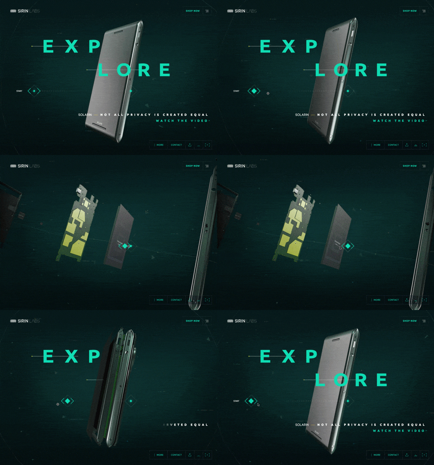
3D Motion Design for Sirin Labs

This could be as little or as much as you want. At first, you may want to only add a 3D logo or text flying around with your 2D motion design, later you could add beautiful 3D graphs, scenery, or environments. You could create a full product demo with stunning motion graphics.

2. Character Animation

Loading Character Animation for Ueno Interview

Loading Character Animation for Ueno Interview

If you fancy bringing characters to life, this does involve learning a whole new skillset within animation, acting, emotion and weight.

3. VFX

3D Rotation Vfx for The Artery

3D Rotation Vfx for The Artery

Animating for high-end features and visual effects is a different career choice, but certainly there for any designer to explore.

If you are thinking of pursuing a full-time degree course in animation I've reviewed the top UK universities and courses.

Summary

Whether you're looking for a new challenge or just want to vary your work, dabbling with or jumping full into motion design and animation can offer further professional development, a broader skill set, different projects or just to add a bit of fun and do something different.

I started as a graphic designer for print before wanting more variety in my day to day work life. I taught myself After Effects and Flash and getting my first job as an animator animating interactive websites, and animated banners, then moving into TV work.

Years later I went all out and went back to study an intensive short course at Escape Studios in London in Maya, from here I landed my first freelance role and have worked for myself ever since slowly growing a small company - Full Rotation .

You never stop learning, and never should. I've attended online courses in advanced character and creature animation and finding a passion for it, who knows where your path can lead, but I now have an extensive skill set to tackle any project.

Sunday 12.02.18
Posted by Vlad Bahatyrevich
 

How to Get Started With Motion Design

0cbe2768743225.5bfdb61344031.gif

Last week I dared to enter my mysterious yet messy studio. Because I didn’t organize my work for quite some time I decided to do so. As a result, I found lots of old ideas and stories that I made up when I was 7 years old, but one really caught my eye. It was a piece of paper with a bunch of stick figures drawn in a sequence of boxes. And this got me very excited, since it reminded me of a storyboard! More about that in my next post. For me, this is where my passion for animation and motion design started.

Motion design is a discipline that applies graphic design principles to filmmaking and video production through use of animation and visual effects.

— segd.org

If you’re reading this blog thinking; hell yes! Then this post is exactly what you need to start your motion design career! In this post I will explain to you the 5 steps on how to get started with motion design.

Step 1: Toolset

AEUIChangedeepdive-1.jpg

In order to start with motion design you first need to learn the tools required to animate and conceptualize. When I first started pushing pixels, I used Adobe Photoshop which I still use today. Nowadays, there are lots of tutorials out there carefully crafted by amazing artists e.g. Mt Mograph and Jake in Motion.
 
Those who are already familiar with the Adobe workspace can jump right in to Adobe After Effects. Adobe After Effects is the go-to-tool for 2D (and 2,5D) animation. It allows you to create simple scenes and animate them right away! The tool also offers you a variety of effects and options to lift up your animation.

Step 2: Visual library

library.jpg

While getting the hang of the tools required to create motion design, I would suggest you to get out there and look for all the beautiful well made GIFs, movies, art, music and stunning landscapes you can possibly find! Many times I find myself reusing memories to design. Even if you’re a good motion designer, without building your visual library you will not get the best out of your skillset.

Step 3: Principles of Animation

1_t22HmIcyK6kzBbfeiZoXtg.gif

After you’ve spend some time in Adobe After Effects and watched a dozen motion graphics, you now want to learn about the principles of animation by Disney’s Frank Thomas and Ollie Johnston. The principles of animation are 12 variables which help you to make your animation feel more dynamic and most of all, more pleasing to look at! The animation principles are as follows:

  • Stretch and Squash

  • Anticipation

  • Staging

  • Straight Ahead & Pose to Pose

  • Follow Through and Overlapping Action

  • Ease-in & Ease-out

  • Arcs

  • Secondary Action

  • Timing

  • Exaggeration

  • Solid Drawing

  • Appeal

More about that in this video from AlanBeckerTutorials.

toddler pokes dog butt.jpg

Step 4: Be curious

In my opinion you learn the fastest if you stay curious towards everything you see. I often ask myself, how is it made? Why did the artist create this? What is the deeper meaning behind this piece? Platforms like holdframe.com make it very easy to download project files from, in my opinion, one of the greatest motion designers out there! Break them down and go through them frame by frame. Get to know how they created the animations and use the knowledge you’ve gathered to make your own. I recommend you check it out and get your hands dirty.

Step 5 :  Fulfillment

This is the most important step on how to become a motion designer. To become successful in the field you really have to love what you do. It’s not just a job, it is a passion, a way of life. Sometimes you’re asked to do shitty projects or work with horrible clients. Just remember, it is part of the job. At the end of the day, I love what I do and if I had do it all over again I would definitely choose the same path. 

Quick tip: many believe that your best work is created while working on personal projects. Should you find yourself feeling unhappy about the projects you are being commissioned to do, start creating what you love and the projects that suite you more will come.

It’s not necessarily the client work that makes you cool. It’s the personal work that makes you cool that clients hire you for.

— Gmunk

Bonus Step: Tell, Listen and Collaborate

I recently found this out myself. After a while you might achieve the above, but the true value lies not in knowing the tools or practice. It lies within the people. Your friends, your family, the love of your life, and the many great artists out there. Talk to and collaborate with them, love what you do and share the experiences! Listen to their advice and stories. Because someday, that one story might turnout to be your next life changing short film.

This article was originally published by Roy Slagter


Saturday 12.01.18
Posted by Vlad Bahatyrevich
 

4 Huge Design Trends We'll Be Seeing in 2019

These shifts in brand behavior will have a lasting impact on design.

branding-trends-for-2019.jpg

Whether or not you choose to follow the latest design trends, some movements are just too big to ignore – and affect the industry at large. It's not necessarily about following the herd and developing a similar style – often the visual aesthetic is secondary to the social context that's driving it.

As a result, the most significant trends aren't just flash-in-the-pan occurrences that pass in a few months – they evolve, grow and expand as different designers interpret that underlying movement in their own way. In some cases, the bandwagon gets overladen with people who misinterpret and distort the original roots: we can all name our fair share of design trends we're tired of hearing about, after all.

Major social, political or environmental events may encourage designers, and the brands they work for, to think differently. In some cases, a forward-thinking brand sets an example through its behavior, and blazes a trail for others to follow.

Amongst the 2018 design trends we identified at the start of the year are new approaches to color, art direction, typography and even how ideas are expressed – but 2018 has also seen bigger-picture developments in methodology and ideology that could have lasting repercussions far beyond aesthetics.

Read on for four major shifts in brand behavior that we've seen develop during 2018, and which we predict will play an even bigger role in 2019...

01. Brands acting sustainably

V6LNPKJscSTSAAqcg2NShB-650-80.jpg

Carlsberg worked with its production partners to develop Snap Pack, a way to join multipack cans with minimal plastic.

Unless you're the current US President perhaps, sustainability is climbing up the international agenda fast. Brands are starting to put their money where their mouth is, too. If a product uses recycled materials, responsibly sourced ingredients, is ethically produced and strives to be carbon-neutral, it's not just an altruistic venture for the company in question – it's a major selling point for environmentally conscious consumers too.

Reduction in plastic is a particular concern for many brands. In April 2018, no less than 10 D&AD Pencils were awarded to AMVBBDO's Trash Isles campaign for LADBible and Plastic Oceans, encouraging the UN to recognize the huge floating island of plastic in the Pacific as a country, so the world has a shared responsibility to intervene.

Two household-name Danish brands have also been blazing a trail in this space in recent months. LEGO has announced its first sustainable bricks, made from plant-based plastic, while Carlsberg unveiled various market-leading innovations alongside its global rebrand by Taxi Studio. Most notably, Snap Pack is a new method of gluing multipack cans together, reducing the plastic required by up to 76%.

Sustainability was also a key part of Taxi's brief, and the Bristol-based agency crafted a timeless, distinctively Danish branding system that's designed for longevity, rather than fading into obsolescence in a few years. We predict many more brands will put sustainability front and centre in 2019.

02. Brands expressing their personality in new ways

yTfsN9yBR5TtGgkkFzcEE7-650-80.jpg

BBC Two's new branding expresses its risk-taking personality

A distinctive personality is crucial for brands to cut through the noise in a crowded market – and tone of voice can play a big part. For a decade, Innocent was celebrated as the leading example of this. Countless imitators followed, desperate to achieve the same quirky, playful, chatty tone that raised a smile when you drank a smoothie. More recently, a generic 'artisanal' tone has gained traction, packed with earnest adjectives like 'hand-crafted' and 'authentic'.

Following trends won't get you anywhere when it comes to market stand-out, and brands are finding new ways to express their personality visually as well as verbally. A distinctive style of illustration can give a brand personality just as effectively as its tone of voice, and brands launched this year such as Anna by NB Studio are combining the two to great effect.

Another stand-out example is Superunion's recent brand refresh for BBC Two(see video above), which rethinks the role of channel idents to express a progressive, risk-taking personality. Putting stimulating, original programming at the core of BBC Two's identity, the agency turned the entire junction between programs into an extended ident, using a range of stunning animations to express the mood a piece of content evokes, rather than just its genre.

Instead of overtly branding the idents, the content does the talking, with only a subtle curve motif – hinting at the outline of a '2' – to indicate the channel name. It's a bold way to express a brand's personality that bucks sector trends, and we predict even more forward-thinking brands will do so in 2019.

03. Brands taking a stand

7xRJiAoY3DeL2CTszccWEM-650-80.jpg

Nike's campaign was divisive but brave

Ever since 2016 – one of the most globally divisive years in Western politics for quite some time, with the shock election of Donald Trump following hot on the heels of the UK's dramatic Brexit referendum – it's become increasingly common for brands take a side. The result is a fast-growing trend for divisive campaigns that attract love and hate in equal measure.

In 2018, a prominent example was Nike's defiant stance in support of Colin Kaepernick – the outcast American football player fronted the campaign to celebrate  the 30th anniversary of its world-famous tagline. While many applauded its bravery and integrity, others destroyed their Nike goods and threatened to boycott the brand in future. With the world more divided than ever on deep-rooted, ideological issues, we predict more brands will take a stand in 2019.

04. Brands focusing on experience

As consumer demand shifts and brands such as Amazon, Uber, Netflix and Airbnb cause widespread disruption in their respective sectors, forward-thinking companies are increasingly putting digital products and services at the core of their business model, rather than just seeing digital as a glorified marketing channel.

Logo design is becoming a less important way for brands to express themselves distinctively, compared to the value of a coherent, intuitive multi-platform user experience that communicates brand values through every touchpoint.

Studio Output's multi-channel rebrand of BBC Sport, which picked up a coveted Brand Impact Award in September 2018, is a case in point. Pre-rebrand, BBC Sport's identity system was tailored for broadcast – and as it expanded across every other digital platform, it lost any sense of coherent user experience.

The solution was to communicate brand values through color, type, and motion principles, translating it seamlessly across all devices and platforms – the logo became secondary. As digital products and services become ever more integral to brands' DNA across all sectors, we will only see this trend increasing in 2019.

Thursday 11.29.18
Posted by Vlad Bahatyrevich
 

8 Of The Best Blogs & Sites To Follow About Video Marketing

blogs_and_sites_to-follow2-1-800x307.png

As a marketer, it’s not easy to stay on top of every new trend or social media channel that emerges, piling ever higher on your platter of options to pursue for your business. Just when you thought you got the hang of Instagram, Snapchat comes in and changes everything!

When it comes to video, by now most marketers know how effective video content is in comparison to other forms of content. But since video is probably just one portion of your marketing spend, it’s understandable that you may not know everything there is to know about video marketing, production, analytics, etc.

We’ve rounded up a list of helpful websites, blogs and resources to get you up to speed on the latest developments in the video world (other than the Veed.me blog, of course!) Explore these sites as you prepare to make your next video and you’ll be in good shape:

1. REELSEO

ReelSEO has become a go-to resource in the world of video marketing, with a ton of original content, tips, tutorials and opinion pieces from leading digital marketers and video professionals. They also maintain a monthly leaderboard of the top video creators across a multitude of social media channels, so you can easily get inspiration or see what competitors are doing. The data from this comes from the site’s owner, Tubular Labs, which acquired them.

2. Video Marketing 2.0

An excellent set of podcasts that covers trends, best practices, tips and more in digestible bites. Recent episodes include “Editing a Live Action Video- Tips & Techniques” and “The Thumbnail: The Cover Art of your Marketing Video.” We love how in-depth and into the nitty gritty details they get.

3. Wistia Blog

Wistia is a leader in the video hosting and analytics space. Their blog is chockfull of useful content on both sides of the equation–both how to make a video (production) and what to do after it. In particular, there are lots of great posts about how to do video production in-house, as well as lots of technical know-how and tips for promoting, sharing, and measuring your videos afterward. They also have great downloadable guides and strategy booklets.

4. Vidyard Blog

Vidyard is another robust video hosting platform with a strong backlog of content on video marketing, albeit with a slightly stronger focus on the technical aspects of video, and how it can be used for lead generation.

5. Think With Google

Google maintains a pretty robust blog with a section focused on video, which gleans lots of insights from the treasure trove of data that is YouTube. There are a lot of interesting case studies here from Fortune 500 clients.

6. HubSpot Video

Hubspot is undoubtedly one of the big juggernauts in the content marketing space, and while they obviously don’t exclusively focus on video, they have a pretty robust selection of blog posts, guides, tidbits and more on the topic of video that helps you to see the role of video in the context of the bigger content marketing picture.

7. Marketing Profs

Another biggie in the marketing blog world, usually with a more B2B focus than B2C. While you can find articles on any topic, there is a robust selection of video marketing and strategy related ones. They also put on great podcasts and webinars.

8. Vimeo Blog

The Vimeo blog has a ton of great content, both for filmmakers as well as marketers and business people. The “Video School” section is great for videographers (and aspiring amateur ones) while the “Business Tips” section is focused on video marketing, promotion and case studies.

techdesk.jpg

Summing Up
Video production and video marketing can seem daunting and mysterious if you’ve never done it before, but these  blogs and websites are a surefire way to get up to speed on best practices, trends and best examples in the industry.

Wednesday 11.21.18
Posted by Vlad Bahatyrevich
 

5 Ways To Integrate Motion Into Web Design

2222.gif

The first animated movie created in 1906 was a revolutionary step forward in storytelling. Every year, the technology behind motion in storytelling grows more impressive, and the same will remain true in 2018. Web designers are leaving older technologies behind, opting instead for more advanced 2D and 3D motion graphics.

Animation for 2018

Business owners and web developers have begun abandoning Flash for HTML, CSS and JS to create their websites. Installing Flash on sites has been phased out for technological reasons. First, Flash is not supported by iPhone, iPad, or iPod Touch and does not load well on any mobile device. This transition alone can severely cut down on traffic to a website. The second important reason that Flash has been phased out is that Google’s indexing system had omitted it. Search results featuring Flash are negatively affected. The last reason is economics; Flash is proprietary software and designers must pay for updates.

The combination of 2D and 3D motion graphics has also become popular in the last few years of technological advancement. Theses graphic types have been found to be more engaging for users’ short attention spans, but also add visual interest to an otherwise flat screen.

Ease of Access

dribbble_3.gif

Animation has become more straightforward for web designers to implement. From simple gifs to longer videos, there is an abundance of innovative open-source software to use in creating animations. Many business owners are capable of producing these designs without the help of a professional. Animations are trendy, engaging, and modern. To remain competitive in a market, websites are well served to include animations, however small, on their sites.

For the new year, there are five innovative and immersive ways to include animation that will drive traffic to a website, all requiring the use of HMTL and CSS.

#1 Logo Manipulation

A simple way to add animation to a site is with logo manipulation. Think about Google and its near-daily change of logo creations. The movement and differing logos draw user attention where it would otherwise not be. The moving logo has become the newest design trend, and it is not a good idea to be left behind. Lottie is a great app designed by Airbnb that can move or alter images already on a screen. Rotating, transforming, expanding, and reappearing logos are simple to create and will make a world of difference on a website.

#2 Kinetic Typography

Kinetic typography is defined as “moving text.” The design and movement of the text are created to invoke certain feelings or attitudes. This common animation is encountered daily on commercials, digital billboards, or website landing pages. The trick with this type of animation is finding a way to integrate it into an overall design effectively. Font, size, movement, and color are all aspects to take into consideration. For example, a beach resort’s web design could include movement in arcs or waves, to invoke emotions associated with the ocean. A small amount of creativity can be extremely useful in the design process.

#3 Hover Effects

Another simple way to add motion to your web design is to add the hover effect. Hover animation occurs when the pointer of a mouse transforms something on the page. Online stores showcase this technology often; scrolling over an item for sale will reveal the price, without the need to click a link. It is also possible to use the hover effect to change graphics into something else. If a bird is perched on a page, a seamless scroll could send him flying away. Simple ideas can sometimes be the most personable and charming to your internet traffic audience.

#4 Animated Map Marker

Most companies feature a map link to their business on their website. Dropping a marker on the map is another effective way to liven a page. Map markers can be created using Google maps and simple JavaScript. If a designer is looking for something more elaborate, there are tutorials online to code CSS map markers. Designers who are familiar with the program can then manipulate the marker by having it swoop, creating hover animation, or changing its color.

#5 Animated Documentaries

Although more time-consuming and challenging to create, animated documentaries are an engaging and creative way to bring life to web design. This format can be created to bring social and political issues to life. In late 2017, an animated documentary was released to high acclaim. Tower tells the story of the country’s first mass school shooting in 1966 Austin, Texas. The appeals of this format include the draw of creative crowds and the ability to relay issues effectively.

Creating Motion Is a Necessity

giphy.gif

The importance of integrating motion into web design cannot be overstated. Billions of websites exist in today’s modern world, with a large number of them already using motion to their advantage. Outdated sites without motion or using Flash fall by the wayside and do not receive traffic as they should be. When users come across motionless, lifeless websites, chances that they will not stay long on the site.

Today’s consumers, and millennials, in particular, have dwindling attention spans, especially as technology creates more avenues for stimulation and personalisation. Users are constantly bombarded with information, and stagnant screens fail to help them become engaged; movement on the screens is key to keeping their attention. Hiring a web designer is an option if a business or website owner is not technologically savvy enough to create motion on their site. An investment in this area can do wonders for your UX and enhance your digital brand.

Monday 11.19.18
Posted by Vlad Bahatyrevich
 

Motion Graphics Efficiency and VR Features at the Core of What’s New in After Effects CC

Creative Cloud gives you the power to do more, collaborate easily, and deliver faster with a complete integrated toolset. To see what’s new in the video apps, check out this video. I’m pleased to announce the Fall 2017 update to After Effects CC is now available. This release of After Effects improves the efficiency of motion graphics creation by streamlining your ability to create data-driven graphics and deliver high-quality VR and 3D results. And it does it all faster with GPU performance enhancements.

New ways to animate content

Build show promos, communicate schedule changes, present motion capture data, or generate the same graphic but deliver it in multiple languages with new Data Driven Animations. Animate with path points using powerful new expression access to path points on masks, shape layers, and paint brush strokes. Work with 3D elements faster with Cinema 4D Lite R19.

Motion Graphics templates, introduced in the Spring of 2017, allow After Effects users to streamline the post-production workflow by enabling Premiere Pro users to import a motion graphic into their timeline and edit parameters, such as text fields, without having to re-open After Effects to make changes. Recent benchmark studies conducted by Pheiffer Report suggested that productivity increased for users of Motion Graphics templates by almost 350 percent. Check out further findings and read the report yourself. Motion graphic artists who create titles, lower thirds, bumpers, and closing credits in After Effects can now sell Motion Graphic templates for Premiere Pro through Adobe Stock. To see the Motion Graphics template workflow in a real-world business, check out Annika König’s, video editor at Nachtblau, IBC presentation.

Immersive: a new space for new kinds of storytelling in After Effects

We’re excited to feature new tools that help you put viewers into the center of the action— from 180 storytelling to full 360 VR. A new VR Comp Editor in After Effects transforms equirectangular 360 footage into familiar, flat rectilinear images. A new Extract Cubemap in After Effects simplifies motion tracking and object removal in 360 video while the new VR Converter lets you switch on-the-fly between different immersive formats so you can ensure your final content will play well on any platform. Design immersive motion graphics experiences using the new Create VR Environment feature, including camera positions — with or without live-action footage.

New effects include VR Blur, VR Glow, VR Sharpen, VR De-noise, VR Chromatic Aberration, VR Color Gradients, VR Digital Glitch, and VR Fractal Noise. Using these features allows you to add artistry and refinement to immersive footage. Designed to work with spherical 360 imagery, the new effects deliver clean results across stitched content, including stereoscopic media, without artifacts or seamlines. Both After Effects and Premiere Pro have a variety of new features for VR, check out our IBC to see them in action.

Performance and navigation enhancements

Over the past three years, the After Effects team has made improvements to making After Effects faster and more intuitive. Building on this trajectory of innovation, the team has focused on user feedback and are deploying the following improvements for After Effects.

Performance & navigation enhancements include the ability to render layer transforms, motion blur and more effects on the GPU. Keyboard Shortcut Mapping allows you to quickly find, adjust, and customize keyboard shortcuts using a visual map like the one used in Premiere Pro and Audition. Get to work more quickly with an enhanced Start screen plus New Composition and New Composition from Footage buttons, while a new font menu allows you to set fonts as favorites or filter to see which are available via TypeKit.

To learn more about all the new features in our Fall 2017 release of After Effects, check back for deep-dive blogs that are planned in the coming weeks or view our IBC presentation. You can download the latest updates of the Creative Cloud applications from our website. Update your current version of After Effects or download a trial if you are not currently a Creative Cloud member. To see new tutorials and to get started quickly, visit our AE tutorial home page. Also, don’t forget to watch the MAX keynote.

Wednesday 11.14.18
Posted by Vlad Bahatyrevich
 

Get Started With Motion Design in 9 Steps

Start breathing life into your creations

0_byPszPS49w3uwHz4.gif


Animated means full of life and excitement. Animation adds life to static things. When it comes to software, it’s not just for delight but for solving problems.

As human beings we are used to see the world moving around us, and if any piece of software has coherent animations, it feels alive and natural.

Tech leaders in the industry are pushing their products towards being more natural. Sophisticated words like Motion Design, Motion UX, UX Choreography are gaining popularity.

Remember – Motion subconsciously builds the personality of your application. Much like layout, spacing, typography and colors.

Have you ever observed that elastic bounce on an iPhone when you finish scrolling things? Seemingly tiny details like these play a big part in forming the personality of Apple’s products.

Cool, Let’s get started on using motion

2.gif

1. Start Observing

Develop an eye for motion. If you can’t observe things moving, you won’t be able to work with them. Start observing how things move on your screen while you use your favourite apps. Look again, and find why you like it and try to look for the details. Observe what all is changing — shape, size, position, color. Doesn’t matter if it is tiny or huge, try to find what part motion is playing in the whole composition.

2. Animation is not just a layer of paint

Animation reveals a deeper meaning. Being a creator, you must consciously think of animations from the start. If you’re in the design stage, animate your prototypes to add that dimension of time. If you’re in the development stage, divide your code into modular components to easily move things around in the UI. See more on modularity.

Tip – Mindfully thinking about the animated personality of your creation will give it a character and help you get a deeper perspective on what you are trying to build.

3.gif

3. Where to introduce motion in your product?

4.gif

Some easy places where motion can be introduced into your product could be when screens are changing, when the user interacts with an element, or when the user has to wait for something.

4. Types of Motion UX

You can categorize motion in products as Transitions(content changes/user moves to another screen), Micro-interactions (Twitter’s Like button for example), Graphical animations (like the scooter jump on the splash screen of Zomato’s Order app).

5.gif

5. Provide spatial information with Motion

Motion communicates space.

6.gif

If a UI element enters from the right of the screen, users will mentally organise that element’s position to be on the right. For example, if a hamburger menu button is placed on the top-left of the screen, the menu must animate-in from the left. To check if your animations communicate right, show it to people and listen to what they have to say. It is the easiest way to avoid any possible confusion.

6. Start understanding things like Duration, Timing Curve, Animation path, Initial & Final values

These parameters technically form your animation piece. Play around with them and get a hang of these controls. Once you feel in control of these, you can make motion masterpieces. For UI, Google has some nice guidelines.

7.gif

Learn about animation parameters — These 2 boxes have all the parameters same except the Timing Curve. Explore and read about it.

7. Never MAKE people wait in the middle of a flow

8.gif

Never slow down people in the middle of a flow to MAKE them wait for an animation to finish. If they really HAVE to wait, then delight them with meaningful animation. At all times, remember to use your animation to solve a problem. There is the reason why animated loaders exist. Additionally, do not overload your software with movement. It’s not a film.

Pro tip – Keep animations subtle and in-line with your product’s storyline to create delightful experiences.

8. Tools to use

Lottie, Adobe Animate CC, After Effects, Sketch2AE, Framer, Origami, Animatic App, UIDynamics (iOS) are some tools for Motion Design . Look them up.

9.gif

I recommend using pen and paper first to get started with your idea. Move on to any digital software after doing this. For animations in this article, I did hand drawn frames on the Animatic App. An animatic helps keep things simple and focused.

Start with Pen and Paper


9. Capture and Save things you find interesting

10.gif

Save things you find interesting. Watch them over and over again, slow them down and understand how elements are moving. Learn by copying. My mac is full with animated GIFs I find interesting. You can also save GIFs on dribbble. Additionally, to capture and record things on your Mac screen, Giphy Capture works great.


Bonus Point —Say Goodbye to the Fear Monster

Still scared to start? Sit down. Relax. Eat that dessert you love. Play that song you desire. Turn off your phone. Keep a pen and paper next to you. Maybe get a small nap. Feel good. Feel comfortable. Keep that blank piece of paper in front of you. Hold that pen in your hand. Scribble randomly. Pick up another piece of paper. Scribble something random again. Next piece of paper. Make a shape. Next piece of paper. Draw more. Make a storyboard. Make the storyboard again. Feel the freedom and get your hands moving. Start. Just Start. See where it takes you.

It’s more scary to touch a pen on paper than to draw. You are creative the moment you turn that blank piece of paper into anything else.

This article was originally published by Arpit Agarwal

Monday 11.12.18
Posted by Vlad Bahatyrevich
 

Why is Motion Design So Important to User Experience?

1_-1VR4YsuFXCUNoxfQwRLcQ.jpg

Last November, my team and I attended Craig Dehner’s talk at the Shiftseven event in Buenos Aires, which got me thinking about the implications that motion can have on the user experience of our digital products.

He spoke about how animation can help on transitions, affordance, loading time and give character to the user interface:

“It’s very trendy right now to create some really cool button animations and transitions, and that’s considered motion design, but motion design can run much deeper than that”.

How can motion design improve the experience we are offering to the users of our products?

Great UX is all about creating a cohesive experience and telling a good story. That’s why we shouldn’t work on UI animation without keeping the UX in mind, especially after a design is final. Usually, we design separate screens and are not used to think about the transitions between all the states of the experience. Also, how the elements are going to move, usually thinking “it’s just a cool thing to add if we have time”, which makes our experience often feel dissociated.

Incorporating motion to improve the user experience and thinking how the elements are going to move and react to the user interaction is a mustfrom the beginning: movement provides personality, content and can improve usability.

Reflect your brand personality

At the same time, our motion design needs to work in tune with our brand personality. If our brand is playful, the animation should be the same, but if our brand is serious it can’t “jump” as a playful kid. As an example, when you see someone walking who looks sad, you probably see a person with their shoulders down and taking heavy steps, yet when you see someone who looks proud while walking, their movement will be completely different and more secure, his or her chest will be inflated, and their chin will be looking up.

0_PfoV555fPvX_htEF.gif

Thinking in motion offers an amazing dimension to explore and work to show how the brand and product are. A great example on reflecting brand personality through motion is Skype, that reflects a playful and flexible movement within the whole app.

http://www.appanimations.com/app/skype

Learn from animation’s masters

Speaking of motion design, a nice way to start learning is studying the “12 Animation Principles” set by Disney animators Ollie Johnston and Frank Thomas in their 1981 book “The Illusion of Life: Disney Animation”. Here is a quick look for all of them:

SQUASH & STRETCH

0_vBzbBsOHwwrlSbbL.gif

ANTICIPATION

0_1K82NPY5AQdIoltd.gif

STAGING

0_9XLfZrz7ebbPKM1P.gif

STRAIGHT AHEAD & POSE TO POSE

0_M-BphotNzQbjGeiq.gif

FOLLOW THROUGH & OVERLAPPING

0_pqVm3o4koZuxEEyl.gif

SLOW IN & SLOW OUT

0_irgA2i0bhu8XBDGL.gif

ARCHS

0_5DSrPAneCSo13UQE.gif

SECONDARY ACTION

0_B-Pr_mFO3Fee9Q8I.gif

TIMING

0_UzQT6J4uLYKNxwnM.gif

EXAGGERATION

0_GfLFvrXY1_GfdX7l.gif

SOLID DRAWINGS

0_fZY-B_6lltJlW4qY.gif

APPEAL

0_Oss-lxhO7R3Kteh9.gif

Use motion to improve user experience

Yet animation can not only give personality to our digital product it can also improve usability. It provides affordance and connects all the states in the app (even extreme states) while providing context.

1_0amwqdVqCqbc2o1CUqgRwA.gif

It can provide feedback and visibility of the system status. As an example, it can’t only inform the user of the waiting time but also how long something is going to take or even provide information about what’s happening. All loading animations are great but we have to think which communicate the best in our project, maybe the user will need more feedback than just seeing a wheel rotating in a funny way. When uploading, an animation that informs the user of the percentage is always a great way to engage. Another way motion can help the user understand that the app is loading is to animate how the elements appear while they load. How? By providing help not using obvious wheels that sometimes confuse users with bad functioning of the app or the phone. Facebook uses this kind of animation when loading the news feed.

0_zWJ6hZYW092sQkeV.gif

With motion you can also improve the recognition of the actions applied to the object, and the options available rather than recall. A specific CTA button can move to engage the user to tap on it, or an arrow can move letting the user know there’s more info on the left, for example.

When animating error messages, if a password is wrong, moving the blank space to the the left and right like saying “no” can work as a great metaphor. But something we have to take notice is when using metaphors, cultural differences appear. In India for example, moving your head to the right and left is paying attention to the speaker. Craig Dehner showed us how Apple solved this issue by making letters fall from the text field when the password is wrong. So it’s very important to do a profound research of the cultural dimension of the users of our apps when using metaphorical motion resources.

0_hkpLKQrxYXQ02s_b.gif

http://thekineticui.com/your-app-login-is-boring/

It’s also important to never forget the user control and freedom. An animation should never impede the user to interact with the UI. Motion design is never an ornamental thing: it’s there to improve the user’s understanding of the interface, and it should be a very smart decision that integrates the whole experience. Also, as we have standard fonts colors or icons when we design an app, we should follow the same standards for how the objects are going to move in the app or on the web; consistency is really important. If a loading screens moves up after loading, all loading screens should do the same. Also we have to take notice how motion patterns are working on each OS, and test with users if we are proposing a different animation that is not standard within the system.

Animation is one of the two pillars along with the gestures of mobile design, they complete the “illusion” and provide meaning. However, like user experience, it’s all about teamwork and every member should be engaged in this process from day one in a project. Finally, the designer needs to be in constant communication with the development team to understand and help with the execution of animations.

This article is originally published by Elisa Goyeneche

UX and Research Leader @lateralview

Sunday 11.11.18
Posted by Vlad Bahatyrevich
 

Saving Noisy Footage: The Easy Way and the Hard Way

grain-cover.jpg

Noisy shot? No problem. Here are two ways you can clean it up in post-production.

We’ve covered noisy footage in-depth before, but what can we do to save our footage when we’re out of options, and we’re dealing with severe noise?

In this article, we will briefly go through the main ways popular programs and plugins reduce distracting noise before taking a look at two powerful ways to reduce noise in your footage.

Noise Reduction

Here’s a shot that I underexposed pretty severely on a documentary shoot a few years back.

original-image1.jpg

To get this closer to a deliverable image, we’re going to need to boost the levels on the image a little bit.

0-levels.gif

After bringing the image up by about four or five stops, it’s looking much better, but we’ve introduced a lot of noise. We’ll need to clean that up before we deliver it to the client. Let’s look at a few workflows for reducing this noise.

11.5.18-noisy-levels-brought-up.jpg

So, the easy way to rid your footage of unwanted noise is by using the dynamic link between Adobe Premiere Pro and Adobe After Effects.

Shutterstock contributor Robbie Janney made a killer two-minute video breakdown on using dynamic link between AE and Premiere for noise reduction. Check it out, and give it a try; it could save you some time compared to the more involved method below.

Neat Video

If dynamic link doesn’t work for you, let me introduce you to one of the most commonly used noise reduction plugins on the market today: Neat Video. It offers some pretty outstanding results without much hassle.

You can break down the workflow in the Neat Video User Guide to a few basic steps:

  • Add effect.

  • Prepare noise profile.

  • Adjust filter settings.

1. Add Effect

To apply Neat Video to your clip, navigate to the effects panel in your editing program, search for “reduce noise,” and then drop the Neat Video effect onto the clip you want to adjust. After that, simply click the “setup” button next to the effect, and the Neat Video plugin will launch in a new window.

Let’s set our viewer windows to YCrCb. This will help us to preview each of the component “image channels” in the recorded footage.

For readers new to image channels, every video or still is actually a composite of three distinct image channel feeds blended together to form recognizable shapes and colors.

The Luminance Channel

The luminance channel often gets shortened to “Luma” or “Y,” and it contains all of the illumination and contrast data of the image. Viewing the luma channel on its own just looks like a black-and-white version of your clip.

The Chrominance Channels

CbCr.jpg

All of the color information in your shot is stored in one of two “Chrominance” channels. The chrominance channels often get shortened to “Chroma” or “C.” The chroma channels are subdivided into Red color information and Blue color information. These channels are most often labelled “Cr” and “Cb.”

The chroma channels are a bit harder to get to and interact with. We will need to know how to view and interpret them, however, as the majority of distracting noise in any type of footage usually lives in one of these two chroma channels, as illustrated in the gif above. This is especially important as we begin noise reduction.

You will see these three image channels grouped together under the shorthand “YCbCr.”

Once we have applied the “Reduce Noise” filter to our clip and have our viewers set to YCbCr, it’s time to begin working on our footage.

2. Preparing a Noise Profile

Neat Video reduces noise by building a noise profile for the specific camera or shot. While pre-made camera profiles are available online, you will always get better results by manually reducing noise.

Building a Noise Profile with the Calibration Target

The most common way to build a noise profile in Neat Video is using the built-in “calibration target.” During this process, Neat Video is sampling regions of the frame that contain little to no important detail in an effort to determine the structure and type of noise in the shot.

To begin profiling your shot, simply click the auto-profile button. You will see a square appear over your footage. This square will be blue, yellow, or green. The colors represent small, medium, and ideal sample regions to profile the noise in the shot. You always want to aim for a green square over an appropriate region of consistent noise.

Sometimes Neat Video doesn’t select the best area.

In this case, you will need to select a new area in your frame. When selecting regions, look for featureless areas of the frame that also contain noise. When profiling, try to keep the quality of your sampled region above 60 percent. I wasn’t able to hit 60 percent for this shot, but got it close enough.

Once you’re happy with your targeted region, click “Auto Fine-Tune” and then “Noise Filter Settings.”

3. Adjust Filter Settings

Now that we’re in the filter settings, let’s take a quick look at each of the panels and what they’re controlling.

Manual noise reduction in Neat Video is done in three panels: “Noise Levels,” “Noise Reduction,” and “Sharpening.”

Both the Noise Levels and Reduction panels contain two types of controls: noise frequency and noise color.

The noise frequency controls are divided into high, medium, and low frequencies. High-frequency noise usually looks sharper and more grain-like than the blocky and blotchy medium and low frequencies.

The YCrCb controls allow users to specify the image channels suffering from noise and apply necessary reduction without affecting the fidelity of the others.

Noise Levels

Screen Shot 2018-11-09 at 5.11.42 AM.png

Think of the noise levels panel as Neat Video asking you what type of noise is in your shot. Take a moment to analyze your footage — is the noise in high, medium, or low frequencies? Is it luma or chroma noise?

Once you’ve established the noise structure in the shot you want to save, tweak the sliders representatively.

Noise Reduction

The workflow for the Noise Reduction panel is very similar to the Noise Level’s workflow. Adjust the controls to be roughly in line with your Noise Levels settings, and then tweak and preview until you’re pleased with the results.

Sharpening

Screen Shot 2018-11-09 at 5.10.37 AM.png

The sharpening panel changes the control scheme up a little bit. To enable sharpening controls, select a channel to sharpen. From here, simply tweak the sharpening frequency controls until you’ve brought a little life back to your footage after noise reduction.

Screen Shot 2018-11-09 at 5.09.44 AM.png

All that’s left now is to apply the effect and return to your editing program to double-check the results in context.

And rendering. Lots of rendering.

Friday 11.09.18
Posted by Vlad Bahatyrevich
 

7 Hot Web Tends For 2019

Importance-Of-A-Responsive-Web-Design-In-The-Era-Of-The-Smartphones.jpg

The web industry is constantly changing. Here are the trends to watch out for in 2019.

Predicting coming web design trends is always tricky. Get it right and you are praised for being ahead of the curve; get it wrong and you are met with a flood of I-told-you-sos. That said, I'm going to push my luck to see if I can provide some insight into the trends that will define web design in 2019 and beyond.

We have seen some vast changes in the past decade: the HTML5 revolution, mobile-first app development and now native features in web apps, plus more new web design tools than you could imagine. With the increasing use of machine learning, cross-platform frameworks and a more diverse developer base building everything, there's going to be some exciting changes in our industry. These are my predictions for the biggest web design trends in 2019.

#1. AI gets personal

Artificial intelligence is too hot to not bring up. While it might not be as flashy as a self-driving car, the web can certainly connect to AI. Machine learning is going to take analytics to the next level. In the past, analytics offered more of a reactive approach: log the data and then use it for your next release. 2019 and onwards is going to be about capturing data about how your app is used and improving the user experience by driving the website to change and adapt to this by itself. 

This means that, depending on the data available on a user, the application will be able to act like a chameleon and change itself to provide the ideal UX for them. This will create truly personalized sites that behave differently and show different features depending on the individual using it.

pHenpfkq8vDKc3Rdmw5Xec-650-80.jpg

#2. Voice interfaces take over

Soon, voice will start to take over from traditional inputs

With the explosion of voice assistants such as Alexa and Siri, conversational interfaces are bound to become a natural part of an application's fabric. As more users become accustomed to interacting with the web using their voice, developers will need to ensure they can offer a seamless experience, even in web applications. Imagine having users sit on their couch and view their social media feed or tell their favorite voice assistant to pull up and read a news article for them – all without traditional inputs.

#3. Accessibility becomes a requirement

Accessibility is no longer a luxury; it should be an absolute requirement. We're seeing this pop up more and more, and this trend will just continue next year. Something that we have pushed hard with Progress Kendo UI is to follow common accessibility guidelines like WCAG 2.1 and WAI-ARIA, to ensure our web components follow accessibility requirements out of the box. 

This positive trend in accessibility focus will continue in the web. Whether this comes from development practices naturally emphasizing accessibility, or governments and legislature stepping in to enforce adherence, we will have more accessible applications.

#4. Web apps get an AR makeover

h6y32CSApq5G7hPhy34BYf-650-80.png

AI will no longer just be for games

Augmented reality will take the web by storm in 2019. AR is already commonplace in scenarios like Snapchat filters or Pokémon Go, but its use of AR will only expand to cover not only social media and games, but also everyday applications. 

The beauty of AR is that it does not require full immersion via a clunky headset, as with VR. Instead, it can be used with the phones that we walk around with in our pockets today. Why should AR be limited to just the native mobile applications on a device? Why not use it on the web? Offering AR services through your web application without needing it to be installed as a native app can have huge benefits from a UX perspective. 

Imagine being in a grocery store and doing a quick web search for a recipe. AR integration could provide users with turn-by-turn navigation through their mobile device to find all the ingredients within that store – all within a web app.

#5. Developers flock to the web

In the past, everyone stuck to their favored programming language. Then along came HTML5 and JavaScript went from being the language only for web to almost a universal programming language. 

Of course, JavaScript has its own set of choices. While I cannot predict the rise and fall of JavaScript frameworks, I believe that once the dust settles, developers will realize that the basic concepts of these frameworks are completely transferable. This shifts the focus to better programming habits and architecture of web applications, rather than being akin to picking your favorite flavor of ice cream.

Frameworks such as NativeScript and React Native will also play a big part in bringing more developers to web technologies, since they provide a single codebase for web and native mobile applications. 

Additionally, concepts like progressive web applications (PWAs) will continue to blur the line between native mobile apps and web. Developers will then be able to purely focus on the user experience without worrying about specific platform choices.

Web Assembly is another technology that is bringing more developers to the web. Thanks to Web Assembly, C++, C#, Rust and other programming languages can now target the web. Projects like Blazor, which leverages .NET in the web, take advantage of the promise of Web Assembly and will help open the web to even more languages. This means that in the future, all developers can be web developers, regardless of programming language.

#6. Size matters again

We're going to start seeing developers trying attempting to make applications as small as possible. Previously the size of an application would be the biggest focus for web developers. However, recently this has taken a back seat as developers increasingly focus on their new favorite framework. 

The average application has grown significantly in size, and although bandwidth has increased tremendously, it's important to remember that only certain people and areas will benefit from this. The size of our applications will hit a tipping point and we will see the trend go the other way, with devs once again taking pride in making their applications as small as possible. This not only means app that will feel faster, but it's also important for markets with slow and expensive internet connections, where every byte is precious.

#7. The workforce gets more diverse

3BK4HyXptUYZjvEJRPpJh-650-80.jpg

Online courses make training more accessible for more people

Beyond the technology, I believe what we see as the average developer and their background will also change. We already see this happening today but code camps will continue to provide us with more diversity in the developer workforce. Although not all coding camps are created equal, the overall concept is a great way of providing programming skills to an audience that would not normally have a chance to learn about development. 

The emphasis on learning the basic tools and concepts of development and then continuing this education on the job is already proving to be a very good way of creating great developers. This trend will most likely continue and is a big step on the way to create a richer and more diverse community of developers, which is ultimately better for everyone.

This article was originally published in net, the world's best-selling magazine for web designers and developers. Buy issue 311 or subscribe.

Thursday 11.08.18
Posted by Vlad Bahatyrevich
 

Become a Master of Constructive Confrontation

bulls.jpg

How to have uncomfortable conversations with colleagues and customers.

As designers, innovators and entrepreneurs, our mission is always to make people’s lives better. Our design thinking is typically pitched the same way: 'Hey, what you’re currently doing is painful; here’s an easier way'. So when Steve Selzer, a designer manager at Airbnb, suggested at SXSW that 'making things easier' isn’t always a good idea, I thought I'd misheard.

To make his point – that there are unintended consequences to removing all effort from every user experience – Selzer brought up WALL-E, a movie where all the humans are strapped to a motorised chair and eventually unable to see past a screen in front of them. In our world, our desire for everything to be instantaneously easy has caused us to shy away from facing anything tough. But challenges are how we grow. Selzer's solution is to design for confrontation; not only with our customers but our colleagues and even ourselves.

MzyNW775zCRJToCC34t2C3-650-80.jpg

Is this what happens when you remove all conflict? 

It was a powerful message, made even more powerful by what followed. Next up was a talk by the billionaire hedge fund manager Ray Dalio. He too focused on the importance of confrontation and the power of thoughtful disagreement. 

After hearing both of these talks, I was fired up! I was ready to confront anyone! But as my adrenaline lowered, I remembered a challenging (and confrontational) audience question from Selzer’s talk: 'It’s easy for you to confront others. You’re the boss. You don’t have to worry about getting fired. What about the rest of us?'

“ A person’s success in life can usually be measured by the number of uncomfortable conversations he or she is willing to have. ”

- Tim Ferris

And it’s true; both Selzer and Dalio are in positions of power. My doubts began to grow. Can only leaders design for confrontation? Then I started thinking about my own experiences. I realised that I’ve done this in small, less risky ways and that I could do it far more. I decided to list out what I’ve done to encourage confrontation, and what I’m still too afraid to try. 

Here's my advice for tackling confrontation in a constructive way. If you’re skittish, start with the low-risk ideas. If you’re feeling bullish, swing for the fences and demand your organisation define its principles and challenge your customers.

While confrontation might seem like a scary stance for you to adopt, doing nothing may actually be riskier in the end. Not confronting the problems you see today can make those issues much worse in the future. And while this all might sound really difficult – that’s kind of the point. Just remember, as Tim Ferris says: “A person’s success in life can usually be measured by the number of uncomfortable conversations he or she is willing to have.” 

Confront... yourself

Low risk: Confront your known weaknesses. Maybe – like me – you spend too much time on social media. Or maybe – like me – you’re not good at writing the copy for your interfaces. Fortunately, we can design systems to confront these weaknesses. For my social media addiction, I compartmentalise my devices. I use my iPad solely for reading articles and sketching and, when I’m working, I put my phone in my backpack. 

To improve my copywriting skills, I force myself to use actual words in my sketches. You’d be surprised just how much the design improves when your words are more than just random squiggly lines.

Medium risk: Uncover unknown weaknesses. Here, we can take a page out of Dalio’s book, Principles, and write down every mistake we make. When I started working, I created a Google Doc titled 'Never Make These Mistakes Again' and I add to it every time I mess up. This process has revealed weaknesses I didn't know I had. I've also found a trusted co-worker to point out mistakes and help me avoid them in the future.

High risk: Confront your personal purpose. Research shows that the more passionate you are, the better your designs will be. The scary thing is that for most of us, our creative purpose doesn’t always match our organisation. Discerning your creative purpose is like opening Pandora's box. You might be happy where you are but if you find your organisation doesn't align with your purpose, you might want to start looking for something new.

Confront... your colleagues

Low risk: Create a confrontation plan. Good design processes encourage differing opinions but sometimes this leads to lingering tension. A clear process solves this. At my company, we 'pull the cord' in a methodology derived from Toyota's production process. Anyone can pull the cord to stop the project if they see a problem. Once the cord is pulled, everyone involved has to work out the issue together.

Medium risk: Hold regular retrospectives. Retrospectives are team meetings to talk about what’s going well and what could be better. Involving everyone is an easy way to confront an issue without confronting an individual.

High risk: Conduct what Airbnb calls 'real talk'. Every week, find time to talk to someone you've disagreed with. Doing this weekly means the event is fresh enough to remember the details but not so fresh that it's emotional. These conversations prevent conflicts from lingering and escalating.

Confront... your customers

Low risk: Tout best practices and good habits. Content marketing is a low-stakes way to confront your customers. My organisation does a great job of advising our customers not to use our products in ways that aren't in their best interest. This enables us to confront the issue while still giving our customers options.

Medium risk: Suggest they stop. It's one thing to write an article but it’s another to change your product or service for true confrontation. The only real experience I have here is pushing back on feature requests and requirements that I think are bad for our customers. However, Selzer suggests going further. Take for example, how Nintendo confronts gamers in Wii Sports. After a few hours of play, the game pauses with an image of an open window, asking 'Why not take a break?' There is no denying that confronting your customers is scary, but if you've got their best interests at heart, they'll respect you for it.

High risk: Define your purpose. The final and riskiest way to confront our customers is by clearly defining our organisation's purpose and principles. Today's world is more connected and politicised than ever before. As a result, many organisations are having to make tough choices. Dick’s Sporting Goods’ decision to stop selling assault rifles, Patagonia's decision to sue the White House and Delta’s $40 million decision to end its hardly-ever-used NRA discountare a few examples. While not all of us have to make such high-profile decisions, it's still crucial to define our organisation's principles so everyone's on the same page when these issues arise.

This article was originally published in net, the world's best-selling magazine for web designers and developers. Buy issue 310 or subscribe.

Sunday 10.28.18
Posted by Vlad Bahatyrevich
 

Video Marketing Ideas: 9 Ways to Promote Video Content

best-video-marketing-and-promotion-ideas1.png

Creating a beautiful business video takes talent, time, and resources. Whether you’re producing your video in-house or with an outside team, the process can be expensive and time-consuming. The biggest problem is that after all the blood, sweat, and tears to produce a phenomenal final product, a big piece of the puzzle is often overlooked...the promotion strategy.

Perhaps, you’ve gotten really great at promoting your blog content – but marketing video content is a whole new beast. But we know video content resonates incredibly well with audiences. Just including a video on your landing page can increase conversions by 80%! So, the time is worth it, but you need to take the time to drive people to find, play and watch your video.

Below I’ve outlined 9 video marketing tips to get your video views way up so you know the effort of producing a beautiful product was not wasted.

#1: Optimize Your Video Thumbnail with a Smile

video-marketing-thumbnail-optimization.png

The video thumbnail is by far the most important component to drive a visitor to play or not play your video. The reality is, we do judge books by their cover, which is why you need to dress your video for the occasion by giving it a compelling, play-worthy thumbnail image.

The greatest way to ensure people play your video is by using an image of a smiling human making direct eye-contact. Why? People relate to other people. Would you rather open a book with a bunch of boring text on the cover or one with an image of Prince William smiling at the camera? The latter is more compelling, and the same theory applies to video thumbnails.

"Smiling is the outward manifestation of happiness and serves to begin to connect us to others," says Dr. Adrian Furnham, and organizational and applied psychologist.

So smack a smile on your video’s thumbnail, and you’ll likely see a much higher number of plays.


#2: Run a Video Campaign on Facebook or Twitter

What better way to drive people to your video than offering something for free? The best place to do this is on social networks where people are more likely to share and spread the word about your giveaway, in turn leading more people to your landing page, and ultimately driving more people to play your video. Check out this example below from the company Dockwa.

video-marketing-social-media-campaign.png

After clicking on this giveaway offer, I’m then directed to a nice landing page with a video explaining the boating service they offer.

how-to-promote-marketing-videos-facebook.png

#3: Add Share Buttons to Your Video Player

We’re all keenly aware of how powerful social media is. In fact, you likely start and end your day on SnapChat, Instagram, Facebook, or Twitter. It’s might be sad, but it’s true, which is why you need to ensure your video can be easily shared on these platforms.

WordStream uses the Wistia video player to host most of its marketing videos. One cool thing about the new Wistia player is that you can add share buttons directly within the video itself so that interested parties can share out a link to the video (which directs back to your website) without having to leave the player.

video-marketing-share-buttons.png

#4: Shamelessly Ask People to Share Your Video

I realize that just asking people to share your video might seem obvious, but I can (almost) guarantee that if you put yourself out there, your friends will share your content and help you spread the word. So ask your friends, colleagues, former colleagues, industry connections, brothers-in-law, nephews and nieces. Of course asking the contacts who are likely closely connected to your target market is the strategic place to start, but you never know who is connected to who, and a share can go a long way so don’t limit the people you ask.

Back in May I spoke at an event with an agency partners in Minneapolis. After enjoying some seafood and cocktails one of the employees who hosted the event began gushing about this video they’ve been working on, mentioned that the landing page would be live tomorrow, and asked if I would share it. And guess what, I shared it! She even followed up on Twitter when it was published. This person whom I had known for less than a week was able to get me to share something just by asking – so you can see how easy this is to do.


video-promotion-ideas-twitter.png
video-marketing-promotion-ideas-tweet.png

#5: Marry Video to Your Email Marketing Efforts

Video and email are a match made in marketing heaven. Just adding the word “video” in an email subject line boosts open rates by 19%, click-through rates by 65% and reduces unsubscribers by 26%, according to Animoto.

Adding a video thumbnail into your email also boosts the engagement of that email. At Wistia we found a 300% lift in CTR when using a video thumbnail over a plain image.

personalized-video-email.png

Not only is it easy and free to incorporate videos into your on-going email nurture campaigns, but it also can lead to better attribution. For instance, if you’re using Wistia with HubSpot, Marketo, Pardot, or SalesForce, you can actually pipe video viewing data directly into your lead scoring and workflows.

Let’s say one of your leads views 75% of a product demo video on your website, you could then set-up a workflow to email that person or alert a sales rep to call that individual.

#6: Put Some Money Behind Promoting Your Video on Social

A lot of the tips so far have been wallet-friendly, but now it’s time to scrape out the quarters from the bottom of your backpack and put some cash behind your video marketing strategy.

It actually won’t cost you an arm and a leg to promote your video on platforms like Facebook and Twitter, and if you pay attention to the audience and campaign settings you could run a very successful promotional campaign and drive the right people to your content, yielding a delightful ROI. Check out this guide to launch your first Facebook video ad campaign.

complete-guide-facebook-video-ads.png

#7: Play Your Video at an Event

We’ve all sat through dull speeches at industry events where we spend the entire time either staring into space, scrolling through our Instagram feeds, or hopelessly trying to keep our eyes open. But there’s nothing worse than being on the other end. If you’re presenting and notice your audience nodding off your nerves will likely go to a whole new high. A great way to combat this is by playing a video!

Not only does a video give you a break from presenting, but it gives the audience a break from listening to you present. Even the best presenters on the TED stage use videos to break up their speeches because it helps refuel the audience.

Listening to the same person for an extended period of time can become unengaging (regardless of how engaging the speaker is), which is why industry events are a great opportunity to promote your video content to a large and relevant audience.

video-marketing-and-promotion-strategies.jpg

#8: Pin Your Video to the Top of Your Twitter Feed

By pinning a tweet to the top of your personal or company Twitter feed, you ensure that tweet doesn’t get lost in the new tweets you’re consistently posting. It also will drive even more engagement to valuable video tweets.

pinned-vs-unpinned-tweets.png

Buffer found that pinning a Twitter card led to a 10X increase in conversions! This is a free and easy way to drive more video views, so pin it, and watch the plays flood in.

#9: Share Your Video in Online Communities

Whether it be a Twitter chat, LinkedIn group, Reddit, or a popular online community created in your industry, you should be actively engaging in these realms and spreading your video content when relevant. Let’s say you work for an inbound marketing agency and are participating in a conversation where several people seem to be struggling with their inbound efforts. Share your explainer video to answer their questions and show how you can help them in a truly engaging manner.

Friday 10.26.18
Posted by Vlad Bahatyrevich
 

How to Make Motion Graphics in 4 Simple Steps

how-to-create-motion-graphics-in-four-steps.png

Now that video is on the rise, there are more opportunities to play within the medium than ever. One of our favorite ways? Motion graphics. These unique animated videos are a fantastic storytelling tool. Hence, we’re seeing them everywhere from commercials to social media.

For creators, they’re particularly attractive because you can tell a creative story unconstrained by the limits of live-action video. But, while motion graphics are an entertaining medium to experiment with, not all are created equal.

There are many elements that go into motion graphics, from scripting and audio to design and animation. If any of these are poorly executed, your final product won’t be as effective. And even if you know what you’re doing, simple oversights or mistakes can cause a major headache, especially if you’re collaborating with others.

We know this firsthand, as we’ve been making motion graphics for almost a decade. Luckily, we’ve learned a lot along the way (and probably made every rookie mistake ourselves), so we know what you need to get through the process smoothly.

If you’re ready to make your first motion graphic (or trying to figure out how to make your next one less stressful), we can help. Here, you’ll find our step-by-step guide to get through motion graphic production, plus our best tips to save your time and energy.

How to Create Motion Graphics 

Before we dive into the process, it’s important to understand exactly what a motion graphic is. (This is especially true if you’re collaborating with people unfamiliar with the different types of video.)

Simply put, motion graphics are animated graphics that tell a story. Motion graphic stories can be told through kinetic text, animated images, or both. They can be 2D or 3D. There are so many options, which is why we love them. An example:

The Value of Data Visualization from Column Five on Vimeo.

Note: While animated motion graphics can be added into a live-action video, if you’re talking about a strictly animated video, you’re talking about a motion graphic.

A Few Notes Before You Start

Motion graphics can be tricky, as there are a lot of moving parts. To set yourself up for success and keep you and your team on the same page:

  • Write a strong creative brief. This should include any and all relevant information to help everyone from your writer to your animator do their job. You can adapt this template as you like.

  • Have a distribution plan set up ahead of time. If your promotion team isn’t prepped from the beginning, they will be scrambling to get the views you want. To avoid that, make sure the plan is documented. You can also try these 8 distribution tactics to get more eyes on your motion graphic.

  • Get approval. We can’t say it enough (and we’ll remind you throughout this). Make sure to get sign-off at every stage to save everyone’s sanity. We designed this process intentionally so that each step builds on the next. You shouldn’t move on to the next stage until everyone gives the OK.

  • Ask for help if you need it. If at any point you get stuck or your team is having trouble getting things over the finish line, you might consider bringing in some outside reinforcements. If so, see our tips for how to choose a video agency and how to work better with the video agency you choose.

Good to go? Let’s get into it.

Step 1: Write a Script That Tells a Story

A motion graphic does not start with a storyboard. It starts with a story, distilled into a script. Even though motion graphics are short, usually ranging from 30 seconds to 3 minutes, you still need a script to detail either dialogue or story direction. (BTW, if you’re not sure how long your motion graphic should be, use this helpful guide to figure it out.)

To find your story, ask yourself these questions:

  • Who am I trying to re­ach?

  • What do I want them to learn? Remember? Do?

  • How do I want to make them feel?

As you dive into your script, be aware of word count. It’s tempting to cram as much as possible into your script, but simplicity and clarity are key. Remember, too, that one of the advantages of motion is that it gives you multiple ways to tell your story. Unlike static infographics where you rely on visuals and copy to tell your story, motion graphics give you movement, sound, and other tools that can do some of the heavy lifting.

As you craft your script, consider which parts of your story may be best communicated through the following:

1) Kinetic (or onscreen) text: Text-only storytelling can be great for situations like trade shows where sound isn’t an option. It’s also a smart way to engage people, as they have to pay more attention when they read.

2) Voiceover: In marketing, we talk a lot about finding your brand’s voice. Voiceover is an opportunity to literally do that. VO accompanies on-screen animation, so the two work in tandem. But be wary of over-scripting. Having your voiceover artist read off your sales numbers from last year is a waste when that same information can be quickly and efficiently shown on screen with some animated data visualization.

3) Kinetic and Voiceover: As mentioned before, voiceover and visualization combined work well for data visualizations, explainer videos, or any time you need to clarify or label something onscreen.

4) Visuals-only: While not as commonly used, you can still create a compelling graphic with no text. (Again, think tradeshows.)

For more writing tips, follow our guide to write a motion graphic script. And make sure to get script approval from any relevant stakeholders before you head into design. (Trust us: There’s nothing more irritating than having to go back to square one once you’re already in the storyboard phase.)

Step 2: Storyboard While You Brainstorm the Visual Treatment

Once you have your script, you can start to visualize it during the storyboard phase. This is when you bring together the script and visuals and start to see the final product take shape.

Start your storyboarding sessions with a brainstorm with members from your design and production team. For us, that includes the scriptwriter, producer, and storyboard sketch artist (aka designer) together. (You may also include your creative director.)

During this stage, you’ll want to draw out frames on a whiteboard and review the final script together before you get started. Then you can start sketching ideas to bring the script to life.

Screen-Shot-2015-06-15-at-3.08.13-PM.png

If you need a little visual inspiration, here are 100 awesome motion graphic examples to geek out on.

Step 3: Take Your Storyboards into Design

As with any visual project you create, style and color communicate just as much as the story itself. Even when you’re working with your own brand guidelines, simple design choices can greatly impact the experience.

Once you have an idea of the storyboard with sketches, you can begin translating your storyboards into actual designs. Note: Everything at this stage is used in the final animation stages, so take time to get the details right. It also helps if the person who sketched the storyboards also handles the design.

During this stage, write out your visual notes and have your production team (and any other stakeholders) review them before passing them along to the animation team for use in the final cut.

Screen-Shot-2015-06-15-at-4.02.11-PM.png
styleframe1_texture-copy.png

Step 4: Animate the Final Designs

The animation phase is when everything comes together. If you’ve done your job and gotten sign-off on each stage, by the time you start animating, everyone should have a really good idea of what’s to come.

Some things to think about:

  • Animation style: This isn’t just about fading in and out of scenes; how you transition from one point to the next influences how cohesive the story is. Wiping away a scene communicates finality, whereas moving from point A to point B keeps the story moving. Remember: You don’t want to confuse or jar your audience.

  • Timing: Pacing can make or break your motion graphic. Too rushed and people won’t “get” what you want to tell them. Too slow and you’ll lose people’s attention. Pace keeps people interested. Consider strategic variations to add excitement.

  • Music: Like with all the other elements, music is another layer to drive your narrative. It can set the mood, fill gaps, and affect the tone of the story.

  • Sound effects: This can be hit or miss depending on who you’re working with. Some animators believe that you should let the other elements speak for itself. Others think they’re a necessity. The key is to only use what adds value to your project and doesn’t distract from the story you’re trying to tell. (That goes for everything we’ve discussed here.)

If you’ve done your job well, you should have a final result you’re proud of—and have learned a few things along the way. We also hope you’ll have the confidence to try creating more advanced motion graphics, such as 360-degree storytelling. If you do, feel free to share it with us.

Until then, keep learning and practicing. (You can also take a look at this roundup of tips for making motion graphics. We promise you’ll find something helpful, whether you’re a beginner or a pro.) And if you have any more questions, we’re always happy to have a chat.

Monday 10.22.18
Posted by Vlad Bahatyrevich
 

Top 10 After Effects Mistakes To Avoid

Thumbnail1.jpg

In this video tutorial, take a look at ten Adobe After Effects mistakes that can really throw off your project if you’re not careful.

Adobe After Effects is powerful motion graphics and compositing software. Understanding each and every aspect of its features can take years. However, there are some fundamentals that even beginners should know. In this video, I go over ten mistakes that After Effects users should avoid.

1. Not Using Motion Blur

MB.jpg

Motion blur allows you to easily make animations appear natural. Plus, motion blur is a great way to enhance your animated graphics when aesthetically appropriate.

2. Thinking You Need Plugins to Do Great Work

Plugins.jpg

After Effects is a powerful tool that allows you to do practically anything in the worlds of motion graphics and non-3D VFX. It’s important for you to visualize what you are looking to create and be able to solve problems each step of the way.

3. Using Linear Keyframes Instead of Easy Ease

Easy-Ease.jpg

Sometimes it makes sense to use the regular linear keyframes. However, using “easy ease” keyframes allows you to quickly create natural movement within your animation.

4. Forgetting to Feather Your Mask

Mask.jpg

When compositing, feathering your mask is critical. You need your images to blend together and appear as one. Forgetting to feather your mask will not yield a convincing composite.

5. Using Solid Layers for Shapes

Shapes.jpg

When you need to create shapes for motion graphics, and you use a solid layer with a mask, you are totally missing out on shape layers. Shape layers allow you to neatly organize shapes, and they open up many ways of animating shapes.

6. Not Using Video Scopes for Color Correction

Scopes.jpg

Color correction is its own art with its own rules and creative techniques. While you may not need to be a color correction expert, it is vital that you understand video scopes if you do need to color. Without video scopes, you are practically judging the images based off of your display. What looks good on your monitor may not look good on someone else’s.

7. Bad Organization

Organization.jpg

You’ve worked on a project that has hundreds of layers, and then your client asks you to change some titles. You then have to dig through your project, changing multiple titles that have been duplicating many times. With proper organization using “pre-compositions,” you can change the title once, and the entire project updates in a second.

8. Not Using The Transform Menu to Animate Text

Transform.jpg

While this isn’t a bad thing to do when it makes sense, if you are not using the animate menu with text layers, you are missing out on control. The animate menu allows you to use advanced parameters to animate your titles, individual characters, and much more.


9. Not Centering Objects By Hand

Align.jpg

If you use your mouse to center titles (or any other object in After Effects), you are bypassing the align tab. The align tab allows you to center or align layers to the left or right with a click of a bottom. Start being accurate with the align tab.

10. Forgetting to Use The Stroke Effect

Stroke.jpg

The stroke effect is great at creating outlines if you have the mask. If you have the text layer or vector object, you can convert them into shape layers and apply “trim paths.” Trim paths allow you to cleanly animate strokes.

Wednesday 10.17.18
Posted by Vlad Bahatyrevich
 

Video Tutorial: Compositing Tips for Adobe After Effects

compositing-tips-1000x576.jpg

In this After Effects video tutorial, you can learn the basic elements of compositing for more realistic results in your next project.

In this tutorial, we’re going to examine some compositing basics that are essential for working in After Effects. These tips will help you achieve more realistic results when you’re adding things into a scene, such as a 3D model, a background matte painting, or even elements like explosions and debris.

All right, let’s get started!

You may have heard the adage that “the best visual effects are the ones you don’t know are there.” And that is what we’re striving for with these compositing tips. No matter what you’re adding into your scene, we want the integration to look seamless. The four basic elements of compositing we’re going to look at are: color saturation, sharpness, grain, and color tint.

Color Saturation

Town-Square-GIF-Animation.gif

When you add an asset into a scene in post (whether it’s a CG model, keyed live-action footage, or even just a photo), typically these assets will have a high color saturation. This isn’t necessarily a bad thing. However, when you look at colors in the real world, things are not nearly as saturated as say a 3D model might be. This is because colors have a tendency to become washed out in natural lighting conditions. So the first step is to dial down the color saturation. I recommend using the Lumetri Color effect and dialing down the saturation under the “Basic Corrections” controls.

Sharpness

Saturation-GIF-Animation.gif

Sharpness is the next thing to take a close look at. You’ll want to match the sharpness or, in many cases, the softness of your original footage. Use the Lumetri Color effect to adjust the sharpness as well. Under the Creative controls, you can dial the Sharpness setting up or down. I typically will set this around -10 for CG elements like the billboard added to the town-square scene. Dialing down the sharpness can also help reduce any aliasing issues that might occur on CG elements.

Grain

grain-gif.gif

Add grain on top of your composite elements to match your original footage grain. This helps prevent the element from looking frozen because the grain movement will add some subtle variance. I recommend using the Noise effect located under “Noise & Grain” in the effects list. Try and match the real-world grain of your footage by looking at how much grain shows up in the darker areas of your image. Adding grain can also help break up any unwanted color banding that might occur.

Color Tint

color-tint-gif.gif

Adjusting the color tint on your composite element is my favorite part of the compositing process. This is where everything comes together nicely. Matching the color tint of the scene is really easy to do.  Create an adjustment layer, and then add a “Fast Box Blur” to that layer, directly above your original footage. Set the blur level to around 15 to 30. (This helps blend all of the colors together smoothly.) Next, apply the Tint effect to your composite element and bring the “Amount to Tint” level down to 0%. On the Tint effect, for “Map Black to,” select a darker color of your scene. Do the same for “Map White to”, but select a lighter color in your scene. Now you can turn off the adjustment layer and set the “Amount to Tint” level around 30-40%.

Extra Tips

Barrels.jpg

Don’t be afraid to take advantage of different blending modes if you’re compositing in elements like fire, smoke, or explosions. (I use a fire asset in the tutorial from RocketStock’s free Action Pack Lite!) If the element you’re applying a blending mode to looks too faint, just duplicate it — that should help fill back in some transparency and color vibrance. You can also create another top duplicate copy and apply a blur to it to create a secondary glow.

Camera-Lens-Blur.jpg

Finally, use the “Camera Lens Blur” effect to composite elements close to the camera and out of focus. You can duplicate those layers as well to fill back in any transparency issues. It is also a good idea to apply some grain on top of the Camera Lens Blur effect to help simulate image noise.

Sunday 10.14.18
Posted by Vlad Bahatyrevich
 

Create and Animate the YouTube UI in Adobe After Effects

YouTube_UI_Cover_Noel.jpg

Learn how to break down the UI of the world’s second largest search engine, and create your own animated YouTube channel.


Recreating the UI of any platform can seem like a lot at first, but once you inspect each individual element, it becomes easier to understand the layout. YouTube has been around for over ten years, which means the platform has been in the design works for a long time. Though, YouTube has undergone updates and will continue to change, after watching this tutorial, you’ll be able to take years of work and recreate it within minutes.

This After Effects tutorial focuses on the the UI of YouTube’s channel page. However, if you want to recreate the home page or the video page, this tutorial will provide the guidance you will need.

Why Recreate the YouTube UI in After Effects?

Screen-Shot-2017-09-20-at-2.13.33-PM-1024x570.png

There are many reasons why you might want to redesign the UI of social media platforms. You may have a project that requires a screenshot of a video page or channel. If so, now you can bring boring screenshots to animated life!

You can direct attention to important elements, like subscriber and view counts. Instead of showing a simple YouTube icon at the end of your video, you can physically show people specific elements of your channel. The ability to recreate the YouTube UI will give you the power to draw amazing attention to detail.

Whether you are new to After Effects or have been using it for some time, there are several great takeaways from this tutorial:

  • Design a expansive YouTube user interface

  • Quickly recreate elements

  • Duplicate your workflow to design and animate the layout

  • Draw attention to specific elements

Follow along with a free After Effects project file, which you can download here.

Enjoy the tutorial and good luck!

Saturday 10.13.18
Posted by Vlad Bahatyrevich
 

The Best Computer For Graphic Design in 2018

JGXKfrmETQFjQkg5XSHUDU-970-80.jpg

Looking for a new computer for graphic design? You're in the right place. If you require better ergonomics, a bigger display and more power for less cash, you're better off going for a desktop than a graphic design laptop. 

Creating great work is all about having the right skills – but a machine with sufficient specs is also important for creating work that will please your clients and take pride of place in your portfolio. There's a lot of choice out there, however, which is why we've put together this guide. 

  • The best 4K monitors for designers

  • The best mouse for designers

Here, we've selected six of the best computers for graphic design. Whether you're a Mac user or a Windows wizard, you'll find something in this list that suits your needs. 

Generally speaking, the more you pay the better the machine. But don't worry if you're on a tighter budget – we've picked the best cheap computers for graphic design, too. Read on for our selection of the best desktops out there...

#1. Apple iMac with 4K Retina display (2017)

teyxHy7Knqew3EpnPfQ88N-650-80.jpg

An affordable desktop powerhouse with a stunning screen.

CPU: 3.0 GHz Intel Core i5-3.6 GHz Core i7 | Screen: 21.5-inch Retina 4K (4,096x2,304) | Graphics: Radeon Pro 555-560 | RAM: 8GB-16GB | Storage: 1TB HDD-1TB Fusion Drive; 256GB-1TB SSD | Ports: 4x USB 3, 2x USB-C (Thunderbolt), Ethernet, SDXC | Size: 52.8cm (w)  x 17.5cm (d) x 45.0cm (h) | Weight: 5.66kg

It's easy to see why the 2017 refresh of Apple’s classic. 

21.5-inch iMac

all-in-one gets our vote for the overall best computer for graphic design. It packs impressive processing power, speedier storage and dedicated graphics into a brilliantly engineered body that takes up very little space on your desk – and it's dramatically cheaper than the iMac Pro (at number four in this list). 

Sure, it might not be 5K – like the astronomically expensive iMac Pro – but this iMac’s stunning 4K Retina display is 43 per cent brighter than before and boasts a wider range of colours (one billion, says Apple) than some competitors' monitors thanks to its DCI P3 colour space. All this means you get extremely accurate colours, deeper blacks and a greater vibrancy, which is perfect for anyone working in design. 

Connectivity-wise, there are four USB 3 ports, two high-speed Thunderbolt 3 ports that can handle data at up to 40Gbps, an SDXC card slot, Gigabit Ethernet and headphone jack, and the machine ships with a wireless Magic Keyboard and Magic Mouse 2. You don't need to buy the 

27-inch model

to get a decent Mac: the 21-inch is a compact desktop powerhouse that’s ideal for graphic designers.

#2. Scan 3XS WI4000 Design

RcLoszJV99nbaseuecH5mi-650-80.jpg

A brilliant desktop PC that offers a great combination of performance and value for money.

CPU: Intel Core i5-Core i9  6-18 cores | Display: None | Graphics: Nvidia Quadro P1000-GV100 | RAM: 16GB-64GB | Storage: 250GB; 500GB SSD, 2TB HDD | Ports: 2x USB 2; 5x USB 3; 2x USB 3.1; 1x USB-C | Size: 21.0cm (w) x 48.4cm (d) x 49.5cm (h) | OS: Windows 10 Pro

Intel’s latest eight-generation desktop processors have had a significant performance bump, thanks to their default six CPU cores. This means even the most affordable desktop workstations in Scan’s 3XS Design range pack a real punch when running content creation applications. The Scan 3XS WI4000 Designis our favourite, offering a very generous specification that delivers significantly more graphic design performance than a laptops or all-in-one system. This includes using Nvidia Quadro professional grade graphics cards, certified to work flawlessly with design software and capable of driving multiple displays.

Opting for a desktop tower does mean you’ll need to buy a display to work alongside it (you'll find the best 4k monitors here). But it also gives you greater freedom to upgrade components, with a range of even more powerful CPUs and graphics cards, extra memory and storage available from Scan, either as one-off modifications or in the rest of the 3XS range.

#3. Microsoft Surface Studio

MrJvsyGap6hi5cwKGX7PCb-650-80.jpg

A top Windows PC for graphic design.

CPU: Intel Core i5-i7 | Graphics: Nvidia GeForce GTX 965M-980M | RAM: 8GB-32GB | Storage: 64GB SSD; 1TB HDD-128GB SSD; 2TB HDD

It might sound clichéd to say that the Microsoft Surface Studio is the Windows-based answer to the best iMacs on the market, but clichés are generally rooted in truth. This is no inferior substitute, however – it's the go-to workstation for Windows users. Check out the paper thin 28-inch PixelSense Display that puts the vast majority of other 4K screens out there to shame. 

But that's not the best bit – it's touchscreen as well, meaning you can actually draw straight onto the monitor with the superb Surface Pen. If you've not used it before, you'll be surprised just how accurately the 4,096 levels of pressure-sensitivity allow you to sketch and draw. Saying it's just like a pencil and paper isn't really too much of an exaggeration.

#4. Apple iMac Pro

bor6ECUjcwLbv5jqfmt5M8-650-80.jpg

The best computer for heavy lifting graphic design professionals – with a price tag to match. CPU: Intel Xeon W (8,10,14, 18 cores, 2.3 GHz-3.2GHz) | Screen: Retina 5K (5,120x2,880) | Graphics: AMD Radeon Pro Vega 56 or Vega 64 | RAM: 32-128GB **Storage:** 1TB-4TB SSD | Ports: 4xUSB 3, 4xUSB-C (Thunderbolt), 10Gb Ethernet, SDXC | Size: 65.0cm (w) x 20.3cm (d) x 51.6cm (h) | Weight: 9.7kg | OS: MacOS

Let's be clear: this computer isn't necessary for most of us. The majority of graphic designers simply don't need this amount of power in a machine – and the cost is astronomical. But there's a reason why Apple's newest powerhouse workstation, the iMac Pro, is so darn expensive – in fact, there are several. And if you're one of the minority of professional users that need this level of power, and can afford the price tag, this is currently the best machine on the market.

First, there's the display – that incredible 27-inch 5,120 x 2,880 resolution display. Apple says it can produce in excess of one billion colours. If you've ever wondered whether you're really seeing your designs at their best, then this iMac's screen is about as true as you're going to get. Combined with your choice of either 8GB or 16GB HMB2 AMD Vega graphics, the full beauty – and, of course, any errors or flaws – of your work will be seen in dazzling 5K quality. This is the fastest and most powerful product Apple has ever made. And as you'd expect from Apple, keen attention has been paid to the ergonomics of the peripherals. The wireless Magic Mouse, Magic Trackpad and Magic Keyboard mean you have all the control and nuance you can handle. 

The iMac Pro is overkill for all but the most professional of users. If your workflow doesn't involve intense creative tasks, huge file sizes, major editing or 3D rendering at very fast speeds, you won't need this amount of power. (And if it does, but the price tag rules you out, try looking at a high-spec 5K iMac). However, if you need its power and can justify the cost, the iMac Pro is an incredible computer for graphic designers.

#5. HP Envy 34 Curved All-in-One

cPj3R3wasjkenPngaK9MvB-650-80.jpg

The best alternative Windows PC for designers.

CPU: 2.4GHz Intel Core i7-8700T (six cores) | Display: 34-inch WHQD (3,440x1,440) curved IPS screen | Graphics: Nvidia GeForce GTX 1050 | Memory: 16GB | Storage: 512GB SSD; 2TB HDD | Ports: | Size: 81.5 cm (w) x 20.1 cm (d) x 45.7 cm (h) | Weight: 11.5kg | OS: Windows 10 Home


It's hard not to be wowed when you first lay eyes on the monumental 34-inch curved screen of the HP Envy all-in-one. The ultra-wide QHD (3,440 x 1,440 pixel) LED backlit Micro Edge display is unlike pretty much anything else you'll currently see on the shelves. It's an astonishing amount of room to let your creations breathe, and displays plenty of screen furniture to let you make edits and changes with the utmost convenience. It's like having a dual display, but without the clunky hardware. Pretty nice for catching films and TV box-sets on your downtime, too. Inside there's 8GB of RAM, a quad-core seventh generation Intel Core i7 processor and a 256GB SSD + 1TB HDD combination hard drive. A top spec for your cash.


#6. Acer Aspire S24-880 All In One

JrA2debzJGsv6ZWmTPqmse-650-80.jpg

Enough guts for graphic design without the expense of alternatives.

CPU: Intel Core i5-8250U (four cores) | Display: 23.8-inch Full HD (1920x1080) | Graphics: Intel UHD 620 | Memory: 8GB-32GB | Storage: 256GB SSD; 1TB HDD | Ports: 1x USB 2, 3x USB 3; 2x HDMI | Size: 54.0cm x 0.6cm x 41.0cm | Weight: 3.94kg | OS: Windows 10 Home

The Aspire S24 is a gorgeous looking all-in-one that can handle the rigour of graphic design work, but carries a slightly smaller price tag than the competition. They key is the inclusion of an eighth-generation Intel quad-core processor across the range, which will certainly cope well with design software tasks, from editing video and animations to processing complex high resolution images with multiple layers and filters.

It has a 1080p, full HD IPS display that carries tiny bezels and is just 6mm thick, with the computer housed in the base, using a very attractive gold and black design that will really stand out on your desk. And as an all-in-one, it has everything a graphic designer will need right out of the box. 

Friday 10.12.18
Posted by Vlad Bahatyrevich
 
Newer / Older

Copyright © Vdeesign. All rights reserved.