• Templates
  • Freebies
  • Blog
  • Contact
  • About
  • FAQ
  • Create Video
VDEESIGN
  • Templates
  • Freebies
  • Blog
  • Contact
  • About
  • FAQ
  • Create Video

Efficient Ways to Promote Your Mobile App

epom_8_app_promo_ways_7_cover.png

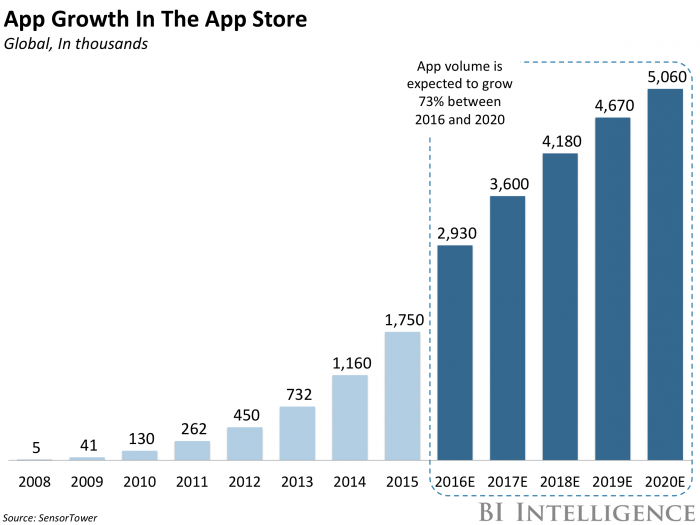
If you are caught up with the headline, you’re probably thinking on your first app promotion in fiercely competitive landscape. In 2017 the total amount of apps in App Store and Google Play went over 5M. This fact means that now app developers should not only build an outstanding product or simplify people’s lives, but also stand out from the bunch of hundreds of similar apps.
Even the world-famous apps with millions of daily users haven’t become popular after a magic finger snap. Developing an app and adding it to the distribution platforms is just a promising start point for your storyline in the world of apps. The reality is that after the app release, there is still much work to do.
Having faced countless app promotion challenges, Epom Ad Agency team defined a common pattern of the app success. It has nothing to do with the miraculous overnight successes, but will be a handy long-term strategy framework for your app promotion. Ready?

Before you start…

After getting all app development and related things done, ask yourself:  How people know about my product?
Let’s imagine you’ve decided to open a health food store. You spent months sorting everything out and finally opened the door to the visitors. The first working day is almost over and there are only ten customers who entered the shop after noticing you handing out 30% OFF flyers near balloon-decorated showcase. There is not something you’ve expected, right?
Launching an online product is very similar to offline entrepreneurship. The fact that your app is available in App Store, Google Play or any other distribution platform doesn’t guarantee people will easily find it. The very next thing you need to do is ask yourself: how to get the audience?

epom_8_app_promo_ways_1.png

To start driving your first users, define a long-term marketing strategy. Where will your business be in 3, 6 or 12 months? The clearer your product vision is the better chances of your app success are.
Do you know your users? Which apps do they spend most of their virtual lives in? Which of their problems your app is solving? What value brings your app to user’s life?
You’ve answered these questions before building your app. But you can never be too thorough when it comes to your app promotion. Double-checking could prove to be very useful in getting your app in front of the right audience.The average amount of apps used daily floats between 9 and 12. It’s a great challenge to become one of these apps, so be ready to fight for your app’s life.

App store promotion: get the benefits and jump over pitfalls

Choose the right app store

When your promotional strategy is ready, make the next step and add your app to the different app stores. Usually app developers start with Google Play and Apple stores. Distribution through App Store will cost you $ 90 per month. Google Play charges developers with only $ 25 registration fee and takes 30% of the list price for all sales. Notice that along with unlocking access to millions of Android and Apple devices you will have to stand out from 3.3M apps in Google Play and more than 2.2 M apps in App Store.
Check out this list of worthy alternatives to Google Play and App Store: here are over 300 app store environments which distribute apps in different countries and niches.Trying out Amazon Appstore,GetJar, Appolicious, or any other related platform might bring very good results for your marketing campaign.
Before picking up an app store, consider the regions you’d like to cover. If you are going to come into the Chinese market, your key channels of promotion should include TencentMyApp, 360 Mobile Assistant, Xiaomi App Store, or Wandoujia.

epom_8_app_promo_ways_2.png

Follow this detailed step-by-step guide and fulfill your app store submit form correctly.
Seeking for more good tips on app promotion? Join Ad Summit 2018, meet top-notch advertising experts in person, immerse into vibrant networking and learn how to grow your app.

Keywords optimization

Keywords play a crucial role if you want to make your app easy to find after the most relevant search requests. Devote enough time to adding best-targeted and related keywords to your app profile. Wrap your mind around the words you’d type in a search box while looking for the apps like yours.Tagging dozens of slightly related words is a superfluous work.
Useful services: SearchMan for gathering and search of the best applicable keywords.

Eye-catching profile

App description is really important in terms of app store optimization and user experience. Tell the app store visitors what your app is about and highlight its main capabilities. The same approach should be applied to the icon design. Try to make it simple, memorable and stylish. Think about Twitter, Facebook or Pinterest icons, simple and attractive at the same time. Dashing screenshots will also be a strong point for your profile. Users are more likely to install an app when they already know what to expect from the interface and design.

epom_8_app_promo_ways_3.png

Rates and reviews

High rates and reviews from your users will help your app to whip up to the first positions of the charts. Kindly ask your audience to rate your app or to spend a few minutes writing a short review for your product. Providing them with additional value like unlocking new content or virtual lives will increase your chances to get quality feedback. Getting a good ranking in the app store will also pull your ranking up in mobile search.

epom_8_app_promo_ways_4.png

Mobile Advertising Agencies

Yet another efficient-proven channel for user acquisition and driving app downloads are mobile advertising agencies. The latest strengthen your brand awareness and do product promotion through mobile devices. The best thing about partnership with such companies is they assume all the promotion hassle and give you time for doing bona fide work on your app.
Before contacting any mobile ad agencies, consider on your ads. Creatives are the crucial part of your advertising campaign and a face of your brand. In case you are not willing to dwell on this stuff, ask your mobile ad agency to advice or create unique ads with high performance for your ad campaign specifically. The vast majority of ad agencies charge an additional fee for creating high-performing ads, but sometimes you can find a truly dedicated companies, who do it for free. For instance, Epom Ad Agency have web designers team who builds banners, landing pages, native or other ad units for all types of products and brands.
! Make sure you’ve discussed your ad campaign goals, budget, rates, KPIs, expected retention rate and ROI with your personal agency manager before the ad campaign launch.
Some performance-based ad agencies like Epom Ad Agency are integrated with top ranked apps through a single SDK. So getting a personal advertising account at Epom automatically opens access to hundreds of active apps.
Yes, partnership with mobile ad agencies costs money. On the other hand, you are paying for the real results: installs, users or in-app purchases whereas ad serving and tracking remain free of charge. 

App Reviews

App review platforms are also good lead generators. They publish deep and entertaining reviews, feature key options and benefits of new apps.
There are two most common ways of cooperation with such media. First, you send them an overview of your product with links to app stores and ask to write a review. In another case, they might include you to specific lists or ratings of similar apps (if they have it). Probably, media representatives will ask you to pay for the reviews (and that is OK). If it happens, double check platform’s amount of monthly visits, geography, audience interests with Google and Similar Web. Applying to tech blogs like Appadvice, Hongkiat or Thenextwebwould definitely make a splash and bring on new users. Buildfire made a great list of 113 sources to apply for a quality app review.

Social Media

Featuring an app release in social media will also help with bringing the first interested users. Entertain subscribers with useful content, hot topics and thematic infographics and don’t spoil everything with mindless copy pasting. Social Media is great for catching up with your users, getting their feedback and rolling out important updates.
Do you already have business profile of your app in social media?

Appealing Website

epom_8_app_promo_ways_6.png

If you are going to promote your app before the release you will definitely need a website (or at least a landing page) for highlighting the main news, app key features and capabilities. Attract people to your website while running ad campaign with an advertising agency. Offer users additional value like free levels or personal discount in return for the subscription to the app news. An email base could become additional (and FREE) channel for interaction with customers. Just don’t spam.

The power of sharing button

epom_8_app_promo_ways_7.png

People want to spread the content that makes them smile, laugh out loud, muse, disagree, protest, cry, hope, slobber over etc. Your app for certain has something more behind. Cover the best of your app in the story worth spreading. Adopt a win-win strategy and offer users immediate valuable reward for sharing content from your app in their social media profiles or blogs.


What about influencers?

Brand owners and marketing experts have already revealed the real power of influencers – trendsetters, who gathered thousands of followers around their social profiles.
Partnership with influencers seems easy at a glance. But asking a person with 5M followers to post a message like ‘I am using [App Name]. Have you already tried it?’ would be a wrong strategy. The quantity doesn’t mean quality. Build honest and mutually beneficial relations with influencers at your niche. They might be followed by less, but relevant users.
Useful services: BuzzSumo or NinjaOutreach for identifying the best influencers in your field and location.
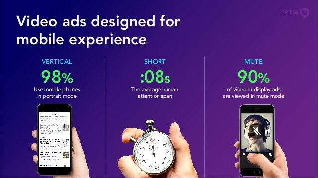
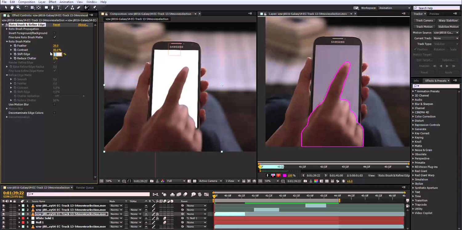

Promo video

Let people take a stroll around your app with a short 30 to 90 sec video. Show the main features, design and users’ value of your product in a dynamic video or motion graphics and the world will be eagerly waiting for the release. Place your video on the website, share through social media or send it to mobile ad agencies for promotion. A good promo video will increase your awareness and heat up the interest to your product. The below example template does a great job at featuring the highlighted app features in a visually compelling and elegant style.

And finally…

Creating an exceptional app is just a part of the work that have to be done on the way to its greatness. Despite there are dozens of app promotion channels, not all of them work appropriately for each specific product. Try to build your own tailored ecosystem with a specific range of app promotion tools, services and platforms. Don’t afraid of sticking out. Being different is a priori a good start for building a strong marketing strategy.
Contact Epom Ad Agency team and start driving installs and purchases right away.
Seeking for more good tips on app promotion? Join Ad Summit 2018, meet top-notch advertising experts in person, immerse into vibrant networking and learn how to grow your app.

Thursday 10.11.18
Posted by Vlad Bahatyrevich
 

10 Inexpensive Ways to Market Your Small Business

coins.jpg

Marketing your small business is a must if you want to produce a steady stream of paying clients and customers. There are a lot of resources out there to help optimize your paid marketing efforts, and those efforts range from very important to essential, depending on the kind of business you have. However, the good news is that any small business can make a big marketing splash with little or no cash outlay, particularly if you can put a little time and skull sweat into your efforts.


Inexpensive Methods of Small Business Marketing

1. Google My Business Listing

There are three “foundation stones” for an inexpensive marketing effort. The first is your Google My Business listing, which literally puts your business on the map. My Business listings are easy to claim, give you a wealth of promotional options, and let you interact with your customers online, all for free. Visit www.google.com/business to get started.

2. Get a Website

The second foundation stone for inexpensive marketing is your website. Every business needs a website, no matter how old-fashioned or offline your clients and customers are. Creating a website starts with claiming a domain name for your business. Domain registration is easy and inexpensive.

If you want more control over your site’s look and feel, or want to add highly advanced features, there are more expensive options out there as well. You may also want to sign up for G Suite, the Google suite of online tools, for as little as $5/month, to help integrate all your online promotional efforts.

3. Social Media Presence

The third must-have for inexpensive marketing is a social media presence. Whether it’s Facebook, Instagram, Twitter, or LinkedIn, social media is another free-to-cheap way to get the word out about your small business. We recommend you do not use your own personal accounts, as this can limit your reach to only your friends and detract from your professional image. Plus, it can take a lot of the fun out of having a personal account. If everything is work, then when and where can you play? It’s a social media best practice to create separate accounts for your business organization, and then promote those accounts to those of your friends who are also interested in your business offerings.

Related: Social Media Pocket Guide (free download)

4. Write Content

Now that you’ve got an online presence, you need a stream of content to give people something to look at! A business blog is an inexpensive way to get started on attracting readers and viewers to your site(s). Google+ has a built-in blogging platform and there are lots of other free or cheap options as well. Many business owners love WordPress, both as a blogging platform and as a website solution, because it is inexpensive and extremely powerful.

Related: Business Blogging 101 (free eBook)

5. Write Relevant Content

What kind of content should you put in your blog? There are a number of different schools of thought, but the best kind of content is material that increases your credibility with your target customers. What exactly that is will depend on the type of business you operate.

If you own a restaurant, then sharing off-menu recipes that you’ve personally developed would be a great way to impress your clientele. If you have a resume consulting service, some before-and-after posts will show your customers what you can do for them. If you are a video editor, put up some clips of funny or heartwarming material that you’ve curated. If you have writing skills or access to someone who does, write articles about your industry.

6. Share Your Content

Publish your content on more than just your blog. There are some paying markets where you can actually be paid to demonstrate your credibility, but even putting your articles on publications or sites that can’t pay you will create a permanent advertisement for your business.

Nearly all publishers will allow you to include a blurb about your own business services in your about-the-author section. If you can’t find a specific market to place your articles in, you can always publish them on LinkedIn where they will get exposure to everyone in your extended network.

7. Join Relevant Communities

One of the best ways to get a hand up is to offer a hand up to others. Join communities and groups relevant to your business or industry on LinkedIn, Reddit, and Facebook, and offer people good advice and suggestions when they have problems or questions. (Make sure your own profile information points back to your business, of course!)

This is a way to build great karma and great connections with people relevant to your work. What goes around generally comes around. And remember that while you’re helping one person with their query, you’re being observed by a thousand silent others who will see your name and what you’re doing.

8. PPC Advertising Promotions

Sites like Facebook, Google, LinkedIn and others regularly offer free advertising credits to lure in new business. You can get your feet wet in pay-per-click advertising without spending any money by waiting for these promotions to come around. (Just remember to turn off your ad campaigns if they don’t start paying for themselves.) This is a great way to promote risky or experimental product lines. If the ad campaign bombs, you haven’t spent any money or damaged your brand.

Related: Online Advertising eBook (free download)

9. Run a Class

Not all inexpensive marketing efforts need be online-only! If your business has a local presence, then consider teaching a class to attract attention and to impress potential customers with your skills. Your local library often has free classroom space available and will even let you promote the class with in-library advertising! Leverage the time you put into creating and teaching the class by having a friend take video of you teaching, then put that video on your website and on YouTube.

10. Attend Local Events

Attending local networking events can be a great way to increase your presence in your community. This works better for some types of businesses than others. If you provide services directly to other small businesses, then local networking is going to be far more rewarding than if you sell products online, for example. However, every kind of networking help, even if it’s just to share ideas and inspirations with other business owners.

Whether online or offline, inexpensive marketing techniques like these can get your business humming with the energy from new customers and clients.

Wednesday 10.10.18
Posted by Vlad Bahatyrevich
 

5 Ways to Use Your Design Skills to Earn Extra Income

how-to-make-an-extra-income.jpg

There are many ways to use your design and illustration skills to generate extra income, over and above picking up freelance work. For many creatives, profit isn’t top of the agenda when planning a side project. It’s a bonus, rather than the main goal. However, even if side projects don’t bring in extra income immediately, the boost to your graphic design portfolio can lead to work indirectly – or make money in unexpected ways further down the line. Here, we explore four ways designers have branched out and turned a sideline project into a big earner.

#1. Sell digital assets

qP44A4PYhM3kdoAKPgaumP-650-80.jpg

Diana Hlevnjak sells patterns and textures via Shutterstock and iStock, as well as her own site.

Diana Hlevnjak was working for a small web design firm when personal circumstances led her to relocate to another city. She managed to work remotely for a while, but times were tough and her contract was terminated shortly before the company shut down.

Hlevnjak had been selling digital assets through stock libraries for some additional income, but there wasn’t enough to cover her costs. She focused all her efforts on the task to see how lucrative it could be. “I liked the fact I didn’t have to deal with sales, clients, meetings and similar tasks that introverts don’t like,” she confesses. “It also meant I could work from anywhere.”

When she first started out, the returns were low, but gained momentum as she kept putting up more and more products on more and more platforms. Hlevnjak’s focus was on graphic resources such as patterns and textures, an area she’s passionate about. This is crucial, she argues, to stay motivated when building up a large portfolio of assets.

“I liked the fact I didn’t have to deal with sales, clients, meetings and similar tasks that introverts don’t like”

Diana Hlevnjak

She watches trends across illustration and design, as well as fashion, interiors and architecture. “Last summer was big on monstera and cacti plants, which came from Scandinavian interior design,” she says. Although her work is still sold on Shutterstock and iStock, Hlevnjak points out that the volume of assets on the large libraries means things that are on-trend one month are soon buried beneath new trends.

She has instead been focusing her efforts on more niche marketplaces such as Creative Market, where watercolor illustrations and textures tend to fare well, as well as her own website: Polar Vectors. The strategy has paid off: Hlevnjak has successfully managed to turn an occasional sideline into her primary earner. “As a freelancer, I am accepting less and less client work, and it’s become a minority of my revenue,” she reveals.

#2. Teach a Skillshare course

dvtpBtdkFAc8qV63BPDYmP-650-80.jpg

Online courses are a practical option if you have a busy schedule.

Following her success on the conference circuit and growing love of public speaking, Jessica Hische decided to turn her hand to teaching – and her hectic schedule meant an online course was the best option.

“I haven’t been in a position to commit to teaching at a university – I’m hardly ever in one place for 15 weeks straight,” she explains. “Skillshare was a good in-between of an on-stage talk and a more intimate classroom. You can pour more into an online course than you can a one-hour talk, but it does scale, unlike in-person teaching.”

“You can pour more into an online course than you can a one-hour talk, but it does scale, unlike in-person teaching”

Hische’s first course was based on her Penguin Drop Caps book project, which was itself inspired by one of her best-known side projects: Daily Drop Cap. Although Hische was responsible for putting together the course content, Skillshare took care of all the “production heavy lifting”, including filming and editing. Her second course took a more general angle, focusing on the logo development, feedback and the revision process.

“It’s been a very good source of income over the years, especially when it first launched and they had a different model for paying teachers,” she reveals. “Initially they sold tickets to each course and teachers made 75–85 per cent of the ticket cost, but a couple of years in they switched to a membership model that does revenue sharing based on class popularity,” Hische continues. 

“But not every teacher earns a lot from online teaching platforms,” she warns. “You do really need an audience that’s already interested in your work to take that leap to starting a class.” Take a look at Hische’s Skillshare courses here.

#3. Speak at events

x8w2yt98HCu9brS69PN4nP-650-80.jpg

Even if they don't pay, speaking opportunities can open plenty of doors.

A common thread evident with many of the creatives featured here is public speaking – not just as an income stream in and of itself, but also as a springboard to other opportunities. Jessica Hische, Jon Burgerman and Gavin Strange have all clocked up their fair share of design talks around the world.

“I was first asked to speak about my work because of Daily Drop Cap,” recalls Hische, revealing yet another major opportunity spun off from that one killer side project. “After gaining a bit of experience, the demand snowballed. I was very nervous at first, but with a little practice it has come more naturally to me. I became a good speaker, and conferences are always on the hunt for strong female voices in their lineup,” she points out.

“I try not to do speaking jobs unless I’m paid, or it’s for a good cause,” reveals Burgerman. “It’s work, so I need to be paid! Otherwise there are books and movies I’d rather be catching up on.”

“Conferences are always on the hunt for strong female voices in their lineup”

Jessica Hische

While talks at schools, colleges and non-profits are rarely paid, full-blown conferences tend to offer a fee, plus travel and accommodation. “Fees range between $1,500–10,000, with almost all events that I enjoy talking at falling on the lower end of that range,” explains Hische. “The more you’re paid, the more likely it’ll be a very business-like conference, rather than a looser creative event.” 

She has several ways of figuring out the right speaking fee, including taking into account how much prep time is involved and how long she’ll need to be out of the office.

Like Hische, Strange insists on transport and accommodation to be paid as a minimum, and always asks for a speaker’s fee for more commercial-focused talks for businesses.  “Depending on the size of the festival, some pay and some don’t,” adds Strange. “Over the years I’ve become comfortable having that conversation. They’re nice bonuses to have, but I didn’t get into speaking for money,” he concludes. “It’s the joy and excitement of having the privilege to do so.” 

#4. Write a book

gaDzKJd3hfNqDFkPT6XvkP-650-80.jpg

Gavin Strange turned reams of talk notes into a book.

After almost eight years of writing talks – a totally new one each year – Gavin Strange  ended up with a vast bank of written notes. After speaking at The Do Lectures he was handed a book by David Hyatt, co-founder of Do. “I loved it because it was so inspiring, but it was also formatted a lot like how I structure my talks,” he recalls. “For the first time ever I thought, maybe I can write a book?”

He got in touch, and the rest was history. Working closely with Miranda West, editor and founder of the Do Book Company, his book – Do Fly – took shape. Although profit is never high on the agenda for Strange’s side projects, Do Fly provides him with some royalties every quarter, and has recently been licensed to indie publisher Chronicle Books to distribute in the United States. Appetite duly whetted, Strange is already thinking about his next book – and how it could be timed to coincide with turning 40 in a few years’ time.


#5. Design products

ZQcvx33xdAYipC6huHxnmP-650-80.jpg

Jon Burgerman has transferred his designs onto a range of items.

Over the years, Nottingham-born, NYC-based doodle master Jon Burgerman has dabbled in a dizzying array of self-branded merchandise, from toys, prints, books and T-shirts to mugs, laptop sleeves and wallpaper.

Of course, he had to start somewhere and learnt a few lessons the hard way: “Always make things in small batches first, and see how your market reacts,” speaks the wisdom of experience. “Don’t make a thousand T-shirts. Make 10. I think there’s a basement in Nottingham that still has a few boxes of my unsold T-shirts in it,” he winces.

“Hand-make stuff to keep the manufacturing costs down for low runs,” he continues. “There are lots of print on-demand sites, so make some test pieces, show them to people, and see if anyone will buy them. Go from there. Dead stock can be costly!”

“Don’t make a thousand T-shirts. Make 10... Dead stock can be costly!”

Jon Burgerman

Burgerman also advises thinking about distribution from the outset, however small-scale your operation. “It’s super-easy to make stuff, but how are you going to sell it? Where will people buy it? And how are you going to ship the stuff out?” he reels off.

“It’s not fun spending all day and night packing up little toys into custom-made boxes, then waiting in a huge Post Office queue to send them out,” he adds. “Then there’s things like dealing with missing packages, and grumpy customers who want everything delivered the minute they place their order.”

Ultimately, it all paid off for Burgerman – but his experiences are a cautionary tale for anyone keen to sell their own products online. Thinking of creating your own products? Take a look at our guides to how to succeed as a designer-maker and our business tips for selling design goods for more advice.

Tuesday 10.09.18
Posted by Vlad Bahatyrevich
 

7 Ways to Grow Your Startup With Video

20-Insightful-And-Actionable-Video-Marketing-Tips-For-2016.jpg

Video is one of the best tools to leverage right now to accelerate your business growth.

Cisco expects video content to account for around 80 percent of the internet traffic by 2020. Clearly, video is not a fad. If you haven’t started to get serious about it yet, the time to take action is right now. Here are seven practical ways to integrate video into your business growth plan:

#1. Video testimonials

daryl-ubiety-testimonial.jpg

Testimonials are widely used as a tool to drive trust, via sharing positive experiences of happy customers. When you combine testimonials with the engagement driving power of video, the results are even more impressive. This is because video enables a stronger connection with the viewer.

The key is to make sure you have effective ways to capture testimonials in place. The most straightforward method is to ask customers to shoot a short video with their phone and share their experience with your product or service. Don’t worry about professional editing—rough videos come across as more genuine and work just fine.

If you want to take this up a notch, you can check out how Wistia recommends using the principles of storytelling to create powerful video testimonials.

#2. Explainer videos

UPSIDE-PIC-3-1050x700.png

Explainer videos are 60 to 90 seconds videos designed to introduce your product or service to potential customers. This is a great tool to hook your prospects and persuade them to dig deeper into you have to offer. To develop an effective explainer video, you need to keep it simple and focused on benefits, not features. The folks at Kissmetrics recommend the following structure:

  • Problem: agitate the pain point of your prospect;

  • Solution: introduce your product as a solution to the pain point;

  • How it works: describe concisely how it works;

  • Call to action: end with a strong and clear call to action on what to do next.

Here are 20 examples of good explainer videos to help inspire you.


#3. Webinars

WebinarPlayingv2-1024x664.png

Webinars are free or paid scheduled video workshops held over the internet. They can be live, recorded, or a hybrid of the two. In most markets, there is an opportunity to teach your prospects something that relates to your product or service. As the top marketer Frank Kern says, the best way to convince people that you can help them is by actually helping them. This is exactly what you do via webinars.

Moreover, live webinars allow you to interact with your audience, which drives the engagement and depth of connection through the roof. Then, at the end of the webinar, you can promote your product in a nonsales-y way, integrating it naturally into the conversation. Another way startups use webinars is to teach people how to use their product or service and potentially upgrade them to superior tiers if this serves their needs.

Here are 15 lessons on how to create compelling webinars, from some of the world’s top webinar experts.

#4. YouTube

Screen Shot 2018-10-08 at 3.27.02 PM.png

YouTube is the second largest search engine after Google. Although there are a ton of new videos uploaded to YouTube daily, it’s still much lower competition than Google. This means that for a startup that is hungry for exposure, YouTube is a golden opportunity. YouTube can give you exposure to huge internal traffic, and as a bonus, YouTube videos also rank well in Google, so you get the double benefit if you’ve done your keyword research right.

For a glimpse of what’s possible, you can check out how hair extension brand Luxy Hair built a seven-figure ecommerce business with YouTube marketing.

So, how can you take advantage of this opportunity? Two options: grow your own YouTube channel or use paid YouTube ads. You can do a quick check to see what competing brands are doing on YouTube. Are there big channels? How many views do their videos get? Is there a high level of interaction?

If you decide to start building your channel, focus on informational videos, how-to style content, video series, or vlog content.

#5. Social video

Facebook-Ads.jpg

Social video can be a great source of leads and clients.

Most social platforms are fine-tuning their systems to give a boost to native videos. This means that you get the best visibility if you upload the video directly into their platform, instead of just sharing a YouTube link.

Facebook is certainly a platform that found an effective formula to leverage video content. Both organic and paid video ads can work extremely well for small business owners. But don’t just think Facebook: there’s Pinterest, Twitter, Instagram, and so on. Pick one or two social media channels where your target market is represented the most and build a strong presence there.

In all cases, one element to keep in mind is that you need to make sure your video content is optimized for mobile.

#6. Live streaming video

Dunkin-Donuts.png

The trend toward live streaming video started to pick up steam with Periscope, and Facebook took it to a new level.

By its nature, live streaming video allows you to instantly build trust. It’s great for driving engagement and for showcasing expertise. This is one of the tools that enables small businesses to differentiate themselves from the big guys. When you have a smaller prospect and customer base than big companies, you have the ability to leverage more personalized attention and engagement.

Build a community, stay in touch, cater to their needs, and always add value. Business growth will follow.

#7. Content marketing

Screen Shot 2018-10-08 at 3.37.08 PM.png

Content marketing is an amazing tool to build your brand and grow your business. You can either do it on a budget or scale it massively if you have resources to invest.

Fire up tools such as BuzzSumo to find out what type of content works best in your market. Then, start creating video content on those topics. If you want to take it up a notch, develop a content strategy and plan that is differentiated by each funnel stage in your buyer’s journey: top, middle, and bottom of the funnel. Video is suitable for all of these stages.

You can also check out my content marketing strategy guide if you’d like to learn more.

See Also: 20 Marketing Tools Every Small Business Owner Should Try

Video is a powerful tool that you can leverage to drive growth in your business. Assess your overall marketing strategy, and see where using video can bring the highest value. For example, if you aim to generate more leads, you could fine-tune your content marketing approach and start using more social video. You could also jump on YouTube and start building an authoritative channel in your market.

Do you need to turn more leads into customers? Then you can use video to drive up your conversion rate; if you’re not using webinars yet, consider adding them into your marketing mix. Then, can you develop a more clear explainer video, gather more video testimonials, and engage your audience via live streaming.

Video is on the rise, and the trend will only continue in this direction. The sooner you start taking advantage of it, the better.

Monday 10.08.18
Posted by Vlad Bahatyrevich
 

Everything You Need to Know About Layer Styles in After Effects

layers-cover.jpg

In this video tutorial, learn how you can use the Layer Styles menu in Adobe After Effects for your next film or video project.

If you are familiar with Adobe Photoshop, then you may be well acquainted with Layer Styles. However, in After Effects the Layer Styles menu often goes unused because there are so many effects and parameters available. Each Layer Style offers a unique solution for your titles and layers. In this After Effects video tutorial, learn the purpose of each Layer Style and how to use them.

Gradient Overlay

Gradient-Overlay.jpg

The Gradient Overlay style enables you to use multiple colors to create a smooth transition from one color to another across your title. Be sure to click on “Edit Gradient” to adjust the colors.

Color Overlay

Color-Overlay.jpg

This is a very simple Layer Style — the Color Overlay option transforms the color of the title from one color to another.

Stroke

Stroke.jpg

Very straight forward: the stroke Layer Style creates an outline around titles and objects.

Bevel and Emboss

Bevel.jpg

The best method for quickly creating 3D titles is using the Bevel and Emboss style. This Layer Style gives you the option to increase and control the depth of your title.

Drop Shadow

Drop-Shadow.jpg

There’s a Drop Shadow effect under the “Effects” tab. However, you can easily group your Layer Styles together by using the Drop Shadow as a style rather than an effect. The Drop Shadow applies a nice shadow behind your title.

Inner Shadow

Inner-Shadow.jpg

Similar to the Drop Shadow style, the Inner Shadow produces a thin shadow within your title. Using the Inner Shadow creates depth and contrast in your title elements.

Inner Glow & Outer Glow

Glow.jpg

The main difference between the shadow and the glow Layer Styles is the blending mode option. The Inner Glow and Outer Glow styles allow you to create a glow around your title using using blend modes.

Satin.jpg

Satin

Lastly, the Satin effect darkens the interior portion of titles and objects and helps create undefined contrast.

Overall, Layer Styles allow After Effects users to create detailed titles and objects that stand apart from regular design. Each Layer Style is uniquely organized to stack among the other styles. So, there’s no need to worry about organization, like you would need to with effects.

Sunday 10.07.18
Posted by Vlad Bahatyrevich
 

5 Golden Rules For Social Media Strategy

Apply these tips to all your accounts for social media success.

Use social media platforms right and you can boost your profile within the industry and get your work in front of entirely new audiences. These quick-fire tips will show you how to network effectively in the digital realm.

01. Create a strong profile


ijdCm26VDBHMT4H2BSNm2T-650-80.jpg

Make it easy for your audience to find your social channels

Make sure your profile is complete by providing as much professional information as possible. Make sure you include your name, expertise, website, online shop or Patreon page, and links to all social media and creative communities, such as DeviantArt.

02. Share engaging content

kqLYeGzFnjkEGSfamdkLHV-650-80.png

Share good quality images, including quality works in progress

Always post crisp, high-quality images of your work – a low-resolution, grainy image can make even the best creations look rubbish. Engaged followers are best, so share relevant, valuable content that will hook your audience in. Establish trust by keeping an eye on your messages and replying quickly to enquiries. Remember, the more comments a post has, the more it’ll be shared.

03. Post frequently

mBLw6hXJmAhV5CkdFPPeVC-650-80.jpg

Keep active on your social media accounts

How often you'll want to post depends on your audience and what you have to say. The ideal frequency of posts also varies between different platforms, so experiment – engagement rates on Facebook are 18 per cent higher on Thursdays and Fridays, for instance. Never post for the sake of it, though. Keep it meaningful, or your audience will lose interest.

04. Cross-promote

Cr4SohWdToSRXhHCSRvGtg-650-80.png

Ross Tran uses his Facebook page to funnel people towards his popular youTube channel

Different platforms have different strengths, so use them in tandem for the biggest impact. Want to increase your YouTube subscribers? Do what Ross Tran did and create a teaser video to upload natively to Facebook. Looking for more Patreons? Share a tutorial on Instagram and link to Patreon. It's a little more work, but it's worth it.

05. Ditch the hard sell

fifzbiycmQLoiKvsdHs6iA-650-80.png

... but do make it easy for those who want to buy to do so

The best way to increase sales is not to actively sell. Don’t turn people off. Grow your audience organically and, as long as there’s a clear link somewhere to your work, sales will follow. Help your followers spread awareness for you by giving them what they want: visual eye candy and engaging conversation. Do make sure those people who want to buy your work can see clearly how to do so though.

Friday 10.05.18
Posted by Vlad Bahatyrevich
 

7 Ways Illustration Can Help Brands Stand Out

Illustration can help give a brand personality. It can make a brand more playful, more charming, more accessible or more beautiful – perhaps even all of the above. But unfortunately, brands don't always get it right.

Embracing the latest illustration trends is rarely enough to achieve standout – if anything, it'll achieve the opposite. And while more timeless illustration styles can be effective for some, it's all about picking what's appropriate for the brand. 

Read on for seven examples of brands that absolutely nailed it for different reasons, and how they used illustration to emphasize their own unique brand values... 

01. Google shows its playful side

rUaiggiB4iJ8Vg23wobvxE-650-80.gif

Bee Grandinetti's charming animation demonstrates Google's Trusted Contacts app in a playful way.

When it comes to product design and UI, Google is the master of simplicity. Form follows function: it's primarily the effectiveness and ease of use of its now ubiquitous search engine that people love, after all, rather than its visual design per se. 

However, illustration has long played a role in giving Google a playful personality that goes beyond that trademark functionality. Google Doodles, for instance, have marked major holidays, events and achievements in a broad range of colorful, creative ways for years now.

It's only within the last five years, however, that the brand has clarified its various illustrative expressions with a more coherent 'Google style' of art direction – demonstrating products and services in a colorful, playful way, while still keeping things beautifully simple and accessible.

The charming example above, created by Bee Grandinetti in 2016, relates to Google's Trusted Contacts app – which helps you stay connected with your loved ones in case of an emergency. 

02. Anna makes finance more fun

iyWxo8StxsZ4dELPFNRoom-650-80.jpg

Alice Bowsher created the quirky characters that give Anna its unique personality.

Currently in beta, Anna – which stands for Absolutely No Nonsense Admin – is a fin-tech service unlike any other. A hybrid digital assistant geared specifically at taking the headache out of admin and financial management for creative people, it combines an app, a bank card and a business account. In the pipeline are useful tools to send invoices, chase payments, analyze expenses and predict cashflow.

NB Studio and Michael Wolff created an illustration-led brand for Anna that's perfectly balanced: playful yet practical, entertaining yet restrained. Charming, decidedly un-finance-like illustrations of various animals by Alice Bowsher lend a unique personality to the service, while the warm, terracotta brand color challenges the conventions of the sector.

03. Battersea warms the heart

3e9fq7puVPENhs32VTgC7C-650-80.jpg

Pentagram's identity for Battersea creates emotive characters with simple mark-making.

Many charities already occupy a place in people's hearts by virtue of their activities, and the social good they do – but their branding often struggles to match that sentiment. Pentagram's rebrand of Battersea Dogs & Cats Home has a unique and very special charm to it, however.

The 'family' of delightfully messy, hand-drawn watercolor illustrations at the heart of the identity feel warm, humane and, like the animals that the shelter rescues, packed with different personalities. That their expressiveness is achieved with just a few simple flicks of a pen makes them all the more appealing.

04. Fanta goes handmade

urcgvCNECyyAX54DqaXSUQ-650-80.jpg

Fanta's paper-cut-style branding scheme by Koto translates across 35 different fruit combinations.

Koto's global rebrand of Fanta was one of the studio's major breakthrough projects, and illustration was at the core of the new identity – in this case, a distinctive hand-constructed paper-cut style, which was then digitally recreated.

Where the illustration really came into its own was when the two orange segments that accompanied the classic Fanta logo were expanded to cater to no less than 34 more fruity combinations, as shown above. Maintaining such a stylized approach across so many applications is no mean feat, but Koto nailed it, giving the brand a coherent, distinctive look and feel across all markets worldwide.


05. Dropbox raises a smile

5e25SgWZftAhPt5yckjP9G-650-80.gif

Dropbox has always made use of loose, hand-drawn illustration – its 2017 rebrand evolved the style further.

Dropbox has maintained savvy use of illustration since it was founded in 2007, using a loose, hand-drawn approach to add wit and warmth to its file-sharing and storage service.  Over the years, these have included a range of different styles, often using simple characters to demonstrate particular features or benefits of the service in a charming, relatable way.

Dropbox's 2017 rebrand – completed by its in-house team in conjunction with design studio Collins – gave the service a much bolder, more vibrant look, with photography juxtaposed with illustration in strikingly unusual color palettes. 

However, the hand-drawn style remained – albeit in a slightly different guise. In examples such as the one above, rough graphite sketches meet colorful, abstract shapes to symbolize bringing the creative process to life. It's a brave evolution of a much-loved style that has helped define the brand over the past decade.

06. Piccolo has the artisan spirit

hkioQ62R7RjKWgrzaDfbyV-650-80.jpg

Here Design's illustrations for artisan seed company Piccolo are based on a system of seed-like dots.

Specializing in "select seeds for the space-limited",  Piccolo's range includes the Slim Jim Aubergine and Spacemaster Cucumber, both ideal for city balconies. The Italian company brought Here Design on board to appeal to a new generation of urban gardeners.

Good things come in small packages, and Here's illustration-led branding scheme for Piccolo treats the seed packets like a collection of beautiful miniature books. In a fresh, contemporary way that's unique in the gardening sector, they're all tied together by a system of seed-like dots. The project was recently Highly Commended in the Artisan category at the Brand Impact Awards.

07. Ugly rebels against the system

7J2rJJajqDs5CMHqsePyRL-650-80.jpg

Ugly's provocative, rebellious spirit is communicated through H.Y.T. Studio's bright, bold character illustration.

Last but not least is jkr's D&AD Pencil-winning branding scheme for Ugly Drinks, the first 100 per cent natural, fruit-infused sparkling water. Flicking the finger at its artificially sweet mass-market competitors, the playful and provocative brand relies heavily on cheeky character illustration by H.Y.T. Studio to carry its message.

Working with type designer and letterer Rob Clarke, jkr crafted a logo in which the 'U' of 'ugly' doubles as a stuck-out tongue, a motif that translates seamlessly across a whole family of characters that are fruity in both name and nature. 

In a campaign dubbed The Ugly Truth, the brand's rebellious spirit is expressed through slogans such as 'contains no ridiculous promises' and 'contains no unattainable lifestyles', all accompanied by those cheeky characters. This is a great example of illustration and copy going hand-in-hand to get a brand's values across.

Thursday 10.04.18
Posted by Vlad Bahatyrevich
 

The Expert Guide to Working From Home

nvx4tgHj7WrSCYAXFQxGj6-970-80.jpg

With the right approach you can make home-working a success for you and your clients.

Working from home seems like heaven – the commute is non-existent, there are no arguments about whose turn it is to make the tea round, and you can even work in your pajamas.

Designers and artists especially can gain the most from working from home as it allows the creation of a personal work environment and schedule suited to you and you alone. Personally, having the ability to work from home has enabled me to see much more of my family and also work with a wider range of clients than I potentially would as a studio freelance artist.

However, there can be problems. It can be hard to manage client expectations, and there are all those little home chores to distract you. There are also issues that might not have even crossed your mind: can you send large files from home? Is your graphic design software up to the task? Will you still know how to network after being stuck at home all day?

After freelancing for several years for clients both at their studios and from my home base, I'm going to share some of my tips for working from home effectively.

01. Make your own space

22D8oW2CjKsNRBYQGiaAJW-650-80.jpg

The most important element for any creative work is to find a dedicated work space. If you're sharing with a partner or housemates (and especially if kids are at home too), putting a laptop on the kitchen table and thinking that is an office is not going to work – for you, or the people you live with. It's their home as well.

In my case I am lucky to have an old shed with power (but no heating) that I work in during the day, and when I need to work at nights I have a desk set up away from the main living space. This enables me to work and not get in the way of my wife when she wants to relax. So try to find a space in the house – which is not a bedroom – that can be dedicated to work.

02. Give your clients access

cSF7wjjYmxghEbiBw8CocB-650-80.png

The most important bills I pay as a home-based freelancer are not for software upgrades or for new computers, they are for unlimited fibre internet, Dropbox Pro and my smartphone. These give me the ability to be available to my clients, through Skype and screen sharing.

I keep my work files on Dropbox grouped by client. I then share them with my clients so that they can have immediate access to my work files if they need to.

This system has worked with clients from Soho to San Diego, and helps dispel any worry a client may have in not having direct involvement in the work that they are paying for. Dropbox also keeps my computers in sync, which means if I am traveling to meetings or am away from the house I know I have access to all of my work files in the cloud on any device.

03. Be disciplined

46CzRbveedSFJULciCGfzL-650-80.png

Working from home successfully is dependant on treating it as seriously as working in an office. It may sound counter-intuitive but I still find it is useful to get ready for work if I am working from home. I get dressed in clothes that I would be happy to wear if I was working at a client's studio, and make sure I am available to clients from 8.30am to 6pm.

If you don't have any billable work due on that specific work day, try not to make that a reason to switch on daytime TV. Instead, make yourself the client: update your design portfolio, website or your showreel, check in with existing clients or potential new ones, spend some time doing training, and if you spend that day on personal projects, make sure it is in a format that can be used for self-promotion.

04. Work when it's best for you

PErqfRHGN9VuHCiVigSLfY-650-80.jpg

The payoff for this personal discipline is that you can organise your day around when you're naturally at your most creative or productive, as well as scheduling things like rendering or application compiling at a time and location that suits you.

The caveat is to make sure you're not suddenly working a schedule that impacts on your downtime. Try to maintain the number of hours you would want to work if you were working in a studio. The key reason for this is to avoid burnout, but it also ensures you're not losing money if you're working to an agreed day rate with your client.

05. Stay active

dryYRS7iLdsiyDdswrqrtE-650-80.jpg

Once you've managed to get yourself into a routine where you are successfully working from home, it can be easy to forget that there are some benefits to working in a studio. As much as we all hate the commute, at least the walk to the car or train is exercise. So try to get out of the house at least once a day – even if it is just to buy some lunch.

I took up running. My least productive part of the day is between 10am and 11.30am, so using this time for a run and making it an early lunch hour means at least I feel I am doing something useful with my time, as well as being reminded of why I work at home in the first place (I live in England's South Downs).

06. Don't become a hermit

86vYoYyQPJGq6a9ZHLaRwE-650-80.jpg

The other thing that working in a studio offers is human contact. While Twitter and other forms of social media are brilliant for news and banter and can keep the hermit tendencies at bay, do try to make a couple of days every few weeks to meet with clients, have lunch with friends and generally get out of the house and see things other than the wall behind your computer screen.

Wednesday 10.03.18
Posted by Vlad Bahatyrevich
 

Instagram Developing eCommerce App

LpVAzxaBfGzmV8v6w8c5xU-970-80.jpg

IG Shopping aims to make it easy to buy the products in your favorite posts.

If you've ever felt that there simply aren't enough ways to spend your money on the internet, we have some great news for you: Instagram is reported to be developing its own shopping app.

  • Instagram takes on YouTube with new video channel

According to The Verge, this new app, possibly called IG Shopping, will enable you to check out collections of goods from merchants you follow on Instagram and then buy them within the app.

Instagram has been flirting with e-commerce for a while now; it started trialling shopping services in 2016 and rolled them out more widely in 2017; companies can tag up to five products per image and add product details and pricing, so that customers can get information and then make a purchase through the companies' own mobile sites. 

And then this year Instagram announced that it was testing shopping within Instagram Stories, using product stickers enabling people to quickly get information about featured products and then go on to buy them.

dpLJmvmjLvELnhV2At4QJH-650-80.jpg

Instagram has been rolling out e-commerce functionality for the last couple of years

It's far from certain that IG Shopping will even come to fruition; according to The Verge, Instagram has refused to comment. However it makes perfect sense for Instagram to come up with an e-commerce solution that keeps everything and everyone within its own app, rather than sending users off to various e-commerce websites, and this could be great news for creatives who want to sell their wares through the platform.

Of course, this thinking might not carry through to the users themselves; expecting them to install a whole new app specifically for shopping might be a bit of an ask; we'll have to see what sort of incentives Instagram can dangle in front of users – and also merchants – to encourage them to buy into IG Shopping.

Instagram is certainly in a good position to move further into the e-commerce business; we'll be keeping an eye on this story to see how it develops. Watch this space.

Tuesday 10.02.18
Posted by Vlad Bahatyrevich
 

Want Better Creative Content? Build a Better Brand Style Guide.

Brand-guideline-for-creative-content.png

Content marketing can be a delicate balance. You’re pulled in many directions, often taking orders from many masters, so it’s easy to fall into the trap of “checklist” content marketing.

  • Are we producing content? Check.

  • Is it loosely related to our brand? Check.

  • Do we publish it regularly? Check.

And on it goes. A lot of people think that creating content is “doing” content marketing well. But great content isn’t about being a slave to your editorial calendar; it’s about telling engaging stories that introduce your brand to people. 

But the way you tell those stories has a huge effect on how they’re perceived. The medium, the message, the colors—all of these elements influence the experience. And when you’re trying to build a consistent presence, ensuring they accurately reflect your brand story is priority. That’s why your brand style guide is the key to better creative content marketing.

How Creative Content Benefits from a Brand Style Guide

Every time you communicate with someone, you’re showing them who you are. Whether it’s the customer service pop-up on your site or an e-book download, every interaction creates a mosaic that shapes your brand.

When it comes to creative content marketing, this is especially true. For many people, it’s the first time they encounter you—and often they don’t initially assume that they’re even engaging with a brand (especially when it’s editorial content).

Usually, when they are seeking content, they are seeking something specific: the answer to a question, the solution to a problem, a bit of entertainment or distraction. They aren’t looking for a brand; they are looking for a reliable source. Your job is to prove that you are that source, to craft high-quality content that cultivates trust and, eventually, a relationship.

A brand style guide is essential to create that type of high-caliber content; it gives you the tools to effectively communicate your brand story visually and verbally. When you do this consistently, you improve your content experience in ways that are beneficial to your viewer and your brand.

Consistency: Quality control is a big issue when making creative content. Not everyone has an Art Director available to look over every project, and oftentimes you’re up against deadline. These, and many other variables, can result in content that is disjointed and inconsistent. Your reputation depends on the quality of your creative content, so having a well-documented style guide that everyone can reference helps preserve your brand.

Comprehension: Clear communication and good design make life easier for your reader or viewer. As previously mentioned, they are looking for a content experience that delivers what they want quickly and efficiently. Guidelines for things like data visualization, color use, or typography help create design that is more effective, bringing clarity and better comprehension. This simple act is a tremendous service to others. It proves that you value their time and are invested in helping them get the info they need and want.

Trust: When you provide consistent, high-quality content, people come to rely on you and—even better—seek out your content. They trust you will deliver what they want every time. That trust is the basis of every strong relationship; it’s also delicate and precious. Delivering an enjoyable content experience will help you cultivate it in spades.

Brand recognition: Obviously, this is the content marketing holy grail. A brand style guide, naturally, delivers a cohesive brand experience, one so strong it is recognizable in an instant. But the only way to do this is to build and, most importantly, apply brand guidelines accurately.

Example: Whether an e-book or infographic, LinkedIn adheres to a strict visual language, including consistent use of their signature blue color, data visualization style, and other details. As a brand determined to help people find the right career, presenting their creative content with a cohesive style helps readers trust their guidance. 

Untitled-collage.jpg

Side note: If you think good design isn’t that important, the Design Management Institute and Motiv conducted a study that found that design-driven companies over the last 10 years have outperformed the S&P 500 by 228%.

What should a brand style guide include?

Its core purpose is to be the “brand bible” for you or anyone to reference, whether it’s an in-house copywriter or a freelance video team. As such, it should include everything related to your brand, both in terms of your verbal and visual identity.

Verbal:

  • Brand promise

  • Value proposition

  • Elevator pitch

  • Messaging pillars

  • Voice and tone

  • Brand persona

  • Etc.

Visual:

  • Colors

  • Logo use

  • Fonts and typography

  • Hierarchy

  • Photography

  • Illustration

  • Iconography

  • Data visualization

  • Interactive elements 

  • Video and motion

  • Etc.

Example: We developed the visual style guide for The Cove, a workspace venture of UCI Applied Innovation. To capture the brand’s mission and essence (a California-based center of innovation), we developed an ocean-themed visual language, including logo, colors, font, iconography, photography, etc. to be used in all creative content.  

UCI_SocialPromo_R2_jf_Portfolio-Image2-1.png

5 Ways to Build a Brand Style Guide That Tells Your Brand Story

Brands can go to a lot of work to build a brand style, but half the time they create it and then let it collect virtual dust. If you want your brand style guide to propel you toward your content goals, here’s how to keep it working for you.

1) Make it comprehensive. While it might seem overwhelming, it should encompass every type of communication; really, there’s no such thing as too much info. Everything from your messaging hierarchy to your chart label style should be included—and easy to navigate.

2) Show examples. Since a brand style guide is all about helping you communicate more efficiently, walk your walk and clearly spell out various applications and how they should be used. Remember: This may be going to a freelancer who’s never seen your brand before; if a noob can’t interpret it, you’ll be in trouble.

3) Make sure it’s accessible. Everyone should know where it lives so that it can be used, updated, and shared.

4) Do post mortems. The stakeholders in charge of steering and shaping the brand should have regular reviews to ensure that the guidelines are being applied correctly to content. They should also consider what needs to be updated, expanded, clarified, removed, or edited.

5) Make a checklist. It’s probably not realistic for every single piece of creative content to be approved by an Art Director, but someone should be tasked with the final review so that they can give content a final edit/once-over to ensure on-brand design.

Tip: A printed checklist can help catch any of those little errors like incorrect logo placement or fonts. (We have had clients question the hex code on a shade of blue before we went live. While it may seem nit picky, that’s the level of brand investment we wish we saw more.)

Monday 10.01.18
Posted by Vlad Bahatyrevich
 

5 Reasons Why You Should Use a Motion Graphics Video

motion-graphics-animated-explainer-video.jpg

If you’re looking to pass out any complex or abstract concept and you’re not sure which explainer video style you should pick out, this blog post might become an ace up the sleeve. Today we´re going to share with you 5 key reasons why you should use a motion graphics video to enhance your video marketing strategy, while you also learn the amazing features and benefits of this popular style. You’ll see that it’s not only fantastic from a visual point of view but it’s also highly effective from a marketing perspective! Read on and learn why this is one of the best techniques to synthesize ideas and transmit any kind of concept in a catchy and engaging way.

Understanding The Basics

I’m sure you know that video content can definitely boost your marketing strategy results. Animated marketing videos in particular are a very useful tool to deliver your business idea in just a couple of seconds, while you engage your audience and guide them to take the next step in the sales funnel.

As you may know, you can find different explainer videos styles in the marketing world. And, among the different alternatives, motion graphics stand out as one of the most popular techniques. Watch this video to get a quick review on the most popular marketing video styles and then we’ll move forward specifically with the motion graphics technique.

ShareTweet

If you’re looking to pass out any complex or abstract concept and you’re not sure which explainer video style you should pick out, this blog post might become an ace up the sleeve. Today we´re going to share with you 5 key reasons why you should use a motion graphics video to enhance your video marketing strategy, while you also learn the amazing features and benefits of this popular style. You’ll see that it’s not only fantastic from a visual point of view but it’s also highly effective from a marketing perspective! Read on and learn why this is one of the best techniques to synthesize ideas and transmit any kind of concept in a catchy and engaging way.  

Understanding The Basics

I’m sure you know that video content can definitely boost your marketing strategy results. Animated marketing videos in particular are a very useful tool to deliver your business idea in just a couple of seconds, while you engage your audience and guide them to take the next step in the sales funnel.

As you may know, you can find different explainer videos styles in the marketing world. And, among the different alternatives, motion graphics stand out as one of the most popular techniques. Watch this video to get a quick review on the most popular marketing video styles and then we’ll move forward specifically with the motion graphics technique.

Since many years ago, the technique of graphic design has been a key resource to explain things visually, no matter if it was a simple or a complex idea / concept. This technique has been used over years and years, but in today’s world it has been optimized with some other modern techniques, like video animation, to enhance its results. That’s the moment where motion graphics come in!

To put it simply, motion graphics is about graphic design in movement. This type of marketing video is perfect to explain a complex or abstract idea in a very simple, fast and compelling way. Check out this example:

5 Reasons To Choose a Motion Graphics Video

So you know that motion graphics helps you transmit any kind of concept, specially if it’s hard to communicate or to remember. But we also have some other strong arguments on why you should pick out this marketing video style and consider it as part of your video content strategy. Here we go!

  1. Motion graphics is known for being one of the most sophisticated and elegant styles among marketing videos.

  2. It’s also one of the most formal styles among the different explainer video styles.

  3. It gets the most out of visual designs and animations and can be used with an educational purpose, without losing its appeal.

  4. It’s one of the best styles to pass out numbers, stats and specific facts that could be harder to assimilate if you used any other style. This is due to its astonishing synthesis power.

  5. It can turn the most boring and tedious information into the most appealing and enticing content.

Is that all? Of course not! In the next few paragraphs we’re going to share with you some additional arguments on why this style is widely used by marketers…


The Amazing Benefits Behind Motion Graphics

Now you have a clear idea on the main features of this particular style. But now let’s review some of its main benefits.

#1. High visual power

Marketers generally resort to visuals to communicate their messages and ideas. Remember that we are all visual learners, this means that we understand concepts, assimilate and remember ideas with the help of drawings, diagrams, charts and different designs (visual content is highly enticing, attractive and also memorable). With this in mind, just imagine how effective video content  can be, and even more so if we mixed it with graphics in motion! Motion graphics fits perfectly in this context and, as we’re all visual learners, it helps you approach your target audience with persuasive, interesting and impressive content.

#2. Stunning designs and animations

Motion graphics is not only about designs, but also about designs in motion. This means that motion graphics make use of animation techniques to make designs really come alive! With this type of video you can pass out any kind of idea by making use of graphic elements in movement. This will be of great help to deliver your message in just a couple of seconds, while you also make it understandable and memorable.

#3. Getting to the perfect mix

This is a huge advantage that the motion graphics style offers: it can be merged with other explainer video styles so that you can maximize the benefits of both styles. What do we mean? Well, keep in mind that motion graphics can lack that human / emotional touch that other styles have. But if you need to give your video that special touch, you can consider adding some cute characters that trigger strong emotions in your audience, or even include a story behind all those figures and stats to make your story even more catchy. You have different possibilities when it comes to mixing styles, but we’ll go over this later.

Different Uses Of The Motion Graphics Technique

So you still have doubts on whether this is the right animated marketing video style to communicate your business idea? We have compiled some useful information to help you understand if this is the style you’re looking for.

  1. Pass out a serious or professional image: if you sell a product or service that has a more “professional” profile, motion graphics is one of the best alternatives you can resort to in the video marketing arena.

  2. Provide your video with an elegant style: remember that motion graphics is one of the most formal explainer video styles, so if you need to pass out an elegant and sophisticated image, pick this style.

  3. Convey abstract concepts or ideas without losing “charm”: motion graphics is perfect to pass out hard data, such as numbers, statistics, facts and any other information that could be harder to assimilate without making use of designs in motion.

  4. Synthesize concepts and do it in an educational and cool way: just like an image is worth a thousand words, pictures in motion can have an astonishing power. By making use of motion graphics you can synthesize any idea, educate your audience, and do it in an attractive, interesting and catchy way.

  5. Deliver your business idea effectively, specially if you have a B2B company, or a B2C company that is related to “hard data”: if you have a software company, a financial company, or work with IT solutions, for instance, motion graphics is a great tool to deliver your business idea in a very straightforward and compelling way, without losing views.

Merging Motion Graphics With Other Explainer Video Styles

It’s not mandatory that your marketing video is “100% motion graphics”! Remember that one of the best advantages of this technique is its versatility, so you can mix it with other styles to maximize the benefits of both worlds. In this sense, motion graphics can be merged with live action, character animation, or whiteboard animation. Let’s review this in detail.

Motion Graphics and Live Action

You may have heard that live action can have some limitations. But if you mix this technique with motion graphics, the limitations are only set by your imagination! With this combination you can transmit ideas or concepts that could be impossible to deliver by using Live Action only. Check out this video we developed for Stocks In Value and see how the merge has been made:

Motion graphics with character animation

Remember that we said that motion graphics can lack that special human or personal touch that is typical of other explainer videos styles. If you need that warmer approach, then consider adding some charming and funny characters to your video. This way you will make it more “emotional” than a plain / standard motion graphics video. Check out this example:

Motion graphics with whiteboard animation

The motion graphics technique is part of every high quality whiteboard video, as it’s used for the camera movements, the graphics, the hand animations and other elements. Most whiteboard videos are made digitally and motion graphics helps the elements look just great. So remember that in any high quality whiteboard video, there will be a motion graphics technique applied to it. Just like in this example:

Want to really stand out?

Check out this creative blackboard explainer by Indulge Naturally that used a simple After Effects template. This blackboard explainer toolkit lets you assemble your own artistic animations in a chalkboard vibe using typography, iconography and graphics! A template like this can be used anything from animated lectures, blog presentations, explainer videos, commercials or product promo features. This project can also be used for startups, e-commerce, or even schools to present work or pitch an idea. This template is exclusive and only available here.

Recap

In today’s blog post we have learned the basics of motion graphics and how you can use it to enhance your video marketing strategy. We’ve reviewed the main features and benefits of this particular style and now you’re aware that, no matter if you have a B2B or a B2C company, this style can make a huge difference in your content strategy. We’ve also shared some strong reasons on why this is one of the most popular and used styles among marketers and how it can be combined with other techniques to maximize its effectiveness. Hope you’ve found this information useful and we encourage you to work on your next marketing video!

Sunday 09.30.18
Posted by Vlad Bahatyrevich
 

Colors and the Emotions They Evoke

file-20170918-8245-fvelv2 (1).jpg

Poetry can make people swoon, and a shocking image can enrage people to action. But one of the lesser-known, but no less powerful, ways to invoke emotion is through color. There is much written about color theory, and you only need to look at the world around you to see – and feel – its impact.

Every color elicits a different and unique emotional response in the viewer, and a clever web designer (or any visual professional, in fact) will know the effect of each color, plus how and when to use each.

While the discipline of color theory is broad, this article will teach you the fundamentals in a single, quick-reference source. But before we delve into the emotional nuances of 12 separate colors, we need to first make a quick note about vibrancy.

Simply put, a color's vibrancy is how dark or light it is. The tricky part about vibrancy is that, just like each individual color has its own properties, so does each shade of the same color. 

While light green and dark green have more in common than green and purple, they will still have smaller, more subtly different effects on the user.

Below, we'll explain all the noteworthy differences between a color's shades, and consider their impact on web design. As a general rule, though, brighter shades tend to be more energetic, while darker shades feel more relaxing. The brighter shades of calls-to-action attract the eye, while the darker shades in backgrounds help create an immersive effect.

Now on to the impact of different colors on viewers...

1. Red

ca3ee0f7ae3e6e8133d49a241d053ced-650-80.jpg

Passionate, aggressive, important

As a dominating color, red adds gravity and heightened awareness – quite literally, as the color increases blood circulation, breathing rates, and metabolism. 

Red can take on a variety of meanings, associated with both love and war, but the unifying factor in all meanings is a sense of importance. Think of the red carpet.

Red is a color best used cautiously. Its knack for attracting attention makes it a priceless tool for designers, but used excessively it will inhibit relaxation. Lighter shades emphasize the energetic aspects of red – including youthfulness – while darker shades emphasize power, and even durability, such as a brick wall.

The landing page for the game design company Playtika has an aggressive but potent flair. Playful and stimulating, the red suits the cheetah logo – a powerful icon itself, softened by its cartoonish qualities and anthropomorphic smile.

2. Orange

TnbG2KwHYD7RTajNmyvxfX-650-80-1.png

Playful, energetic, cheap.

Sharing red's energizing aspects, but to a safer degree, orange is a good way to add excitement to a site without severity. It is generally playful, and some claim it creates haste and plays on impulse. It can even signify health, suggesting vitality and vibrance.

Creative agency Epic uses orange as the highlight color on its website. The choice emphasizes the team's playfulness and youthfulness.

3. Yellow

T2AGUp6NCBRqH58gX6As5G-650-80.png

Happy, friendly, warning

Yellow is a strange color: it is often associated with happiness, but also activates the anxiety centre of the brain. Like red and orange, it's able to stimulate and revitalize – it's the color of warning signs and taxis – but use bright yellow sparingly because of the potential negative connotations.

Lighter shades play on the happiness aspects, reminding users of summer and the sun. Darker shades, including gold, add more weight and give a sense of antiquity.

The bright yellow-dominated color palette on the Post-it website is synonymous with the product itself. It creates an energetic vibe, and is instantly recognizable as that particular brand.

4. Green

SbXPJy95utZdpgoD54n8CB-650-80.jpg

Natural, stable, prosperous

Green mostly represents the environment and outdoors, for obvious reasons, making it the clear choice to suggest nature and an organic quality.

As the bridge between stimulating, warm colors (red, orange, yellow) and calming, cool colors (blue, purple), green is the most balanced of colors, lending it an air of stability. It's also a popular choice as an accent or for calls-to-action because it stands out, but more softly than the warmer colors. In Western culture, it also represents money and financial safety.

The site for game Sanhok uses green to emphasize being outdoors and in the wild, with different subtle hues used throughout.

5. Blue

uRsGHYWUPEfYDUKyF9SSwV-650-80.png

Serene, trustworthy, inviting

Blue is one of the most popular colors in web design – and for good reason. You see blue on a lot of websites because, to put it simply, it is the color of trust. Blue is the color of calm and serenity, and as such inspires security and a feeling of safety.

For this reason, blue is a color often used by banks: CitiBank, Chase, Capital One and Barclays, for example, all use blue. However the calming effects also make blue a friendly and inviting color, which explains its adoption by Facebook and Twitter.

As if that weren't reason enough to use it, blue is also incredibly versatile; its vibrancy has more drastic effects than other colors. Light blue is the color of water and the sky, so it generally has a refreshing and free feeling – and can be even energizing if bright enough, while still retaining that reliable calm.

Darker blues tend to be more sombre, heightening the security aspects, which makes them an excellent choice for professionalism. Trust is essential for financial advisors such as Evolve Wealth, so most of its site is designed in varying hues of blue.

All this comes at a small price, though: blue shouldn't be used for food-related sites. Because blue foods aren't common in the wild, studies show that the color actually acts as an appetite suppressant.

6. Purple

85b0e5c0223fe039253e77b11e333d25-650-80.jpg

Luxurious, mysterious, romantic

Long associated with royalty, purple creates an air of luxury, even decadence. Using a purple dominantly is a quick way to create a sense of elegance or high-end appeal, even if your product is budget-minded (an 'expensive' effect that's quite the opposite of orange).

Lighter shades of purple – especially lavender – bring to mind spring and romance. Darker shades add more mystery, and can even symbolize creativity. Darkening the shade will also turn the romantic elements more sensual.

With its ties to personal wealth, WooCommerce chose purple as the color to represent its WooView app, playing on themes like royalty and panache that fit the function of checking how much money you're making in real time.

7. Pink

a8JZRwpX2s8nxSQZpNRouZ-650-80.png

Feminine, young, innocent

Pink is a specialist color that won't work for a lot of websites, but will work perfectly with the right audience. Because most people interpret pink as feminine, the color is popular for targeting female users. However, don't overdo the pink-femininity connection, or else you're walking a fine line between appealing to users and pandering to gender stereotypes.

Its links with childhood and with sugary treats give pink a sweet, sometimes innocent appeal (not surprisingly a self-perpetuating cycle). It is also traditionally used with love and romantic themes, alongside red and light purple.

Rental service Rentberry's website uses pink as its key color. In this case, it creates a soft, safe vibe, and intentionally distances itself from more corporate, traditional rental services.

8. Brown

fgiFdLcAc8NmiKsC7bZJc-650-80.png

Earthy, sturdy, rustic

While not a popular choice in web design, brown can, under the right circumstances, be effective nonetheless. As the color associated with the earth and trees, brown can add an outdoorsy feel, maximized by a pairing with green. The tree connotations also give a sturdy and reliable feeling.

In web design, brown is often used in conjunction with wood texturing, giving the same old-fashioned and rustic atmosphere of a wooden cabin.

While tech websites are typically dominated by stronger, bolder shades, the microsite for B&O Play uses brown to great effect. The muted tones suggest a classier, more human side to the technology on offer. Natural connotations also remain: wood and leather feature prominently in the hero video, while a marble effect is used in the background.

9. Black

BAkW59iUbyKkuK35QZupwJ-650-80.png

Powerful, sophisticated, edgy

As the strongest of all colors, black is often used only sparingly – such as for text – but it works quite well as a primary color element (like for backgrounds). Much like purple, black adds an air of sophistication and elegance, and also mystery, though with much bolder confidence.

The heavy use of black for the Cartelle creative agency creates unquestionable impact on its homepage and subsequent animations.

10. White

1a00a08a9704a1c781e9b37c6c01b6c2-650-80.jpg

Clean, virtuous, healthy

Literally the opposite of black, white pairs well with just about anything, making it ideal as a secondary color. In a supporting role, white draws out the elements of more stimulating colors, and can even guide your user's attention if you know how to use it (check out UXPin's Zen of White Space in Web UI Design guide to learn more).

As a primary color, though, white gives off an impression that is both clean and chaste. White has that 'spotless' feeling that, for the right site, feels completely effortless. Its association with purity can make it seem virtuous, but also sterile and cold.

To soften this feeling of sterility, some web designers will tend towards an ivory or cream instead. These offshoots of white are softer and even less noticeable, but with the same minimalist and complementary aspects. They are the more comforting and less stark alternatives to white.

The shoe company ETQ uses a dominant off-white background to keep the users' attention where it belongs: on the shoes.

11. Grey

fef8bbdea1038ebfc6acbd04a151c6a0-650-80.jpg

Neutral, formal, gloomy

As the intermediary between black and white, grey exudes neutrality, or a lack of any particular sensation. However, in the hands of an expert, this intermediary position can be a powerful tool.

By varying the vibrancy, grey can take on the properties of either black or white – attention grabbing or repelling – to specific degrees. That means if black is too powerful for your design, try dark grey. If white is too bland, try light grey.

On its own, though, grey is rich with individual characteristics. It is the color of formality, so sites aiming to look traditional or professional tend to favor it. It can also give a depressing vibe, as it's the color of gloomy, rainy days. When used dominantly, it can be somewhat subduing, for better or worse.

You can tell the Italian furniture company Galvan Mobili uses grey well because you don't even notice it. The grey background gives a professional air, and keeps attention on the pictures and bright red logo.

12. Beige

e1a28f68c517a1df8c67a7de40b5b1b8-650-80.jpg

Accentuates surrounding colors

Beige may not be a primary color, but it's worth mentioning because of its accentuating effects: it takes on the characteristics of the colors around it. While dull on its own, its enhancing effects make it a powerful choice as a background or secondary color.

The use of beige for the aptly named Tokyo restaurant Beige Alain Ducasse creates a calming, comfortable backdrop to the more relevant elements such as clickable text and photos.

Saturday 09.29.18
Posted by Vlad Bahatyrevich
 

5 Video Advertising Trends to Watch in 2018

Having produced successful video ads for some of the largest names in mobile advertising, including Nike and MZ (Machine Zone), a video producer Dillon Becker is confident in making predictions for 2018’s possible video advertising trends and how to prepare for them. Without further ado, here are the 5 video advertising trends to watch in 2018:

1. Shorter video ads

outstream-video-advertising-with-celtra-for-brands-agencies-10-638.jpg


For a while now, video marketing has been all about 15- and 30-second mobile video ads. But toward the end of 2017, there was an initial rise in popularity among short-form video ads. I credit a lot of this to the growth of Snapchat’s video advertising options, which limit marketers to 10-second-long videos (if using Snap Ads). User acquisition pros also realized that it was more effective to run shorter mobile video ads on platforms like Fyber, Facebook, and Instagram to accommodate user attention spans.

Where 30-second video ads used to be the default recommendation, even Facebook now suggests that “mobile video works best when it’s 15 seconds or less.” Shorter video ads also means more time to create A/B test variants. It’s easier to test 4 different concepts in 4 separate 6-second video ads. Shorter ads also help keep your creatives more focused since you have less time for fluff. Short-form videos can even pay off on YouTube and certain ad networks where users are often allowed to skip advertisements after 5 seconds. I expect to see a lot more experimentation with short-form mobile video ads throughout 2018.

2. Deeper personalization

071817_PersonalizationIsNow-webinar.jpg

2018 could also be the year of personalization, especially with short-form video ads allowing for more quantity without sacrificing quality. With the improvement in machine learning and AI, user targeting is only getting better with time, and it’s already pretty damn good. It’s becoming a lot more feasible to produce video ads customized for different audiences. Most user acquisition teams are doing this to an extent already with device targeting (e.g. creating Android and iOS versions of the same ad) and ad localization for geo/language targeting.

While there are ways to keep users glued to your video ads, this new level of personalization could drive big wins in both click-through rate (CTR) and conversion rate (CVR). I won’t be surprised to see granular personalization become more popular in 2018 with mobile marketing teams producing unique ads for their varying user demographics.


3. User-generated content

User-Generated-Content-Where-Does-It-Fit-in-Your-Content-Marketing-Strategy_Main-Photo.jpg


User-generated content (UGC) is nothing new to the mobile industry. For evidence of this, look no further than Pocket Gems’s smash hit Episode. Last year, even more mobile studios breathed new life into UGC. I expect we’ll also see mobile advertising adapt to complement this growing trend. Community-created content comes with a certain level of authenticity, which tends to perform better with users who want to see gameplay anyway.

Smart UA teams will leverage their UGC to create unique ads that don’t feel like…well, ads. One of the best analogies I can offer is the growth of Minecraft, where arguably the majority of users came from watching what other users were creating. There’s no reason this concept can’t be applied to your mobile video ads, especially if your app or game embraces UGC.


4. Better influencer campaigns


Screen-Shot-2015-11-30-at-8.24.28-PM.png

If you’ve ever worked on influencer marketing campaigns, I imagine you’re rolling your eyes right now. But with 2017’s YouTube “Adpocalypse” and the recent changes in Patreon’s payment structure (which were later retracted after receiving a lot of negative feedback), I anticipate 2018 may see a renaissance in influencer marketing as marketers find new and interesting ways to collaborate with more influencers.

In fact, I know of a few studios who are already hiring in-house influencers, allowing them to be closer to the products, thus creating more genuine content. I’ve also spoken with several influencer campaign managers who are experimenting with new ways to drive engagement in more meaningful ways, including live video and unique incentives. Other experts agree with this prediction, pointing out the importance of improving influencer campaigns with real-time data, long-term campaigns, and brand ambassadors.


5. VR is far from dead

Xiaomi-VR.jpg

While it’s easy to call VR a passing fad, that couldn’t be further from the truth. While still in its infancy, VR headset sales broke 1 million in Q3 2017 alone, with 14% of those sales contributed to mobile headsets like Samsung’s Gear VR and Google’s Daydream. In June 2017, Google started experimenting with VR advertising, so it’s reasonable to speculate more activity in VR advertising over 2018, especially if the user adoption rates keep climbing.

Considering the growing number of compatible mobile devices with Samsung’s and Google’s VR headsets, as well as the non-mobile VR space, it’s safe to predict those numbers will only go higher. With VR’s inherently video-friendly medium, I expect most (if not all) VR advertising will be video based, which will undoubtedly usher in an exciting new era for video advertisers.

Friday 09.28.18
Posted by Vlad Bahatyrevich
 

The Beginner's Guide to After Effects

55f49930341405.5734dc2394d6a.gif

After Effects, which is available with Adobe's Creative Cloud, is at the core at the majority of motion graphics, VFX and 3D artists and animators' workflows, because it offers a range of tools which can be adapted for a huge range of tasks from simple lower-thirds text and titles to full 3D stereo compositing for feature films.

  • Get Adobe Creative Cloud

In many ways, After Effects is Photoshop but for moving footage, and, just like Photoshop, it can seem intimidating to new users and feel like your only ever using 10 per cent of the full power of the application. 

But it's worth persevering. Because of the effective reduction in cost of After Effects (thanks to its inclusion in the Creative Cloud suite), it can offer a range of tools that can augment Photoshop and Illustrator. And as because it can import both PSD and AI files natively, your workflow should stay the same.

Once I'd got over the initial 'hump' of learning where all the tools were, After Effects was one of the most creative applications I have ever used. Here are some of my top tips to help get the most out of this 'Jack of all Digital Trades'…

Projects and Compositions

rQa5p.png

Keeping the ‘Project' palette organized is one of the most important things to learn.

One of the initial challenges with After Effects is understanding the difference between Projects and Compositions. In After Effects there is only ever one project open, which acts as a container for all of the compositions and other files needed which are all situated and accessed in the Project Panel. When saving an After Effects file, this is the Project file, which saves all the information regarding all the compositions contained within the project.

Get started

6.jpg

To make a new composition, use the Composition >New Composition menu item, which gives a panel for entering the settings required. If there's a file (or other composition) that could be used as a template for a new composition drag the chosen project element in the project window onto the small filmstrip icon at the bottom of the project panel.

This will make a new composition with the original elements settings and place the chosen element in the top layer of the new composition.
If external files, for example still images, animated or video footage have been imported, After Effects only references those files locations and does not save them with the project.

This can be problematic if sharing work with other designers or clients. Thankfully After Effects has an excellent File Manager in 'File>Dependencies Menu' which has a wide range of options to allow the moving and organization of the source files with the master After Effects project file.

Layers

After-Effects.jpg

Using an image as a Luma matte with the ‘TrackMat' dropdown in the layers palette is one of the many ‘hidden' features of After Effects layers.

Getting to grips with layers and the timeline in After Effects is the key to unlocking the true power of After Effects. This is due to the fact that the majority of the animation controls are situated here such as keyframes, but also that there is a huge amount of 'hidden' functionality which is not immediately apparent.

Layers can be parented to one another via the small 'pickwick' or dropdown, which can be great for animating. Layers can be hidden from the timeline when not required via the 'shy' button. Animation curves are also available here for when fine control of animation falloffs are required.

One of the most useful functions of layers is using footage or an object in one layer to act as a matte (or mask) for the layer beneath it. Place the layer to be used as a matte immediately above the content layer. On the content layer use the 'TrkMat' dropdown to choose how the mask layers should interact with the footage layer, either via transparency (Alpha) or image brightness (Luma).

Expressions

Scales_Expressions.png

Expressions can be used to animate without keyframes as well as create text on the fly.

Another great feature which lives within a layer is expressions. Expressions are a simple scripting language which allows much more granular control of parenting a layers attributes to another in the same or different composition.

That is just scratching the surface of what is possible with expressions. Expressions can be used to control practically everything within After Effects from inputting text through to creating animation cycles which require no keyframes.

Expression attributes can be easily added once they have been enabled to a layer from a dropdown, and there is a wealth of resources and existing expressions online which can help both when deadlines are tight and as the syntax of After Effects expressions is reasonably clear, help in learning how to create your own expressions.

7.jpg

Animated typography

After Effects can allow you to animate text in seconds in 2D and 3D

Creating kinetic typography with After Effects is great fun, with a powerful selection of bespoke animation tools when using the dedicated text object layer, it is easy to create a wide range of animations both in 2D and 3D because text in After Effects is able to follow 3D paths.

Do not worry if the effects controls seem counterintuitive, After Effects already comes with a wide range of text animations which can be applied by dragging them from the handy 'Effects and Presets' palette. To access the text animation effects go to the *Animation Presets>Text Menu and there is a huge range of animations to get going, which again be easily deconstructed to make your own.

animated-vectors-v1.jpg

Shape layers

Shape Layers offer a huge array of vector animation possibilities, from replicating shapes to animating path growth

Shape Layers in After Effects allow the creation of vector shapes, and with After Effects bezier tool selectors is 'almost' a mini Illustrator. To add a shape layer, either use the 'Layer>New Shape Layer' menu item, or press the rectangle shape in the tool bar to choose from a range of starter shapes. Make sure that there are no existing layers selected in the composition, as that will create a mask shape on the chosen layer rather than a shape layer.

Once a shape layer is created, it can be animated as if it was any other layer, but the real fun comes when you start adding the shape layer specific animation tools which are available when the shape layer are expanded in the timeline.

Among the options available are duplicating the path, jittering the stroke, puckering the line just as in Adobe Illustrator, and most importantly 'Trim the path' which allows the animation of the end and beginning of any shape or path. Multiple animations can be applied to a shape to create a unique look and animation really quickly.

Working in 3D

AE_C4D_Render_01.png

Using different layouts for specific tasks, such as sculpting in Cinema 4D studio quickly sppeds up your workflow. You can also create your own custom layouts easily

For a long time After Effects was a 2.5D application, which meant that it could manipulate flat layers in 3D space, but in the last couple of versions, it is possible to create true 3D objects based on splines or Shape Layers in After Effects and light it interactively using the After Effects lighting system.

3D in After Effects was given a major boost in the latest After Effects CC release with the inclusion of the Cineware plugin which creates true 3D files via the bundled Cinema 4D Lite application which comes bundled with After Effects, which creates 3D objects which can then be interacted with in the After Effects timeline.

There are a range of tracking tools such as the inbuilt 3D tracker and the bundled planar tracker mocha AE which can be used to pull 3D data from video files to enable the placing of 3D embossed text and 3D objects into video footage with ease. Finally After Effects also has a full stereo workflow to make your 3D, er… 3D!

Rotoscoping

roto.jpg

With a little bit of practise the Roto and Refine brushes can revolutionise rotoscoping tasks such as extracting element from video footage

As well as motion graphics tools, such as the typography and shape layers. After Effects is also a visual effects powerhouse. One of the most important new tools to arrive in After Effects when creating VFX is the RotoBrush. Rotoscoping is the process of extracting elements from video footage or the cleaning footage of unwanted elements.

After Effects' Rotobrush speeds up what was time intensive process of masking, by allow the user to paint the area to be removed on one frame and then After Effects can extrapolate that through the rest of the footage. The 'Refine Edge' tool was added to the Rotobrush toolset in After Effects CC which has greatly improved the performance and accuracy of the RotoBrush, many times handling shots which will make you believe in magic, it chomps through tasks such as the extraction of wispy hair from a video plate in minutes rather than hours.


Plugins

Tsuite_pullout_Asquare_v16_01-16x9.jpg

After Effects plugins like Magic Bullet Looks can change the way you work for the better

One of the great things about Adobe switching to a subscription model is that when new features are ready they are added to applications rather than waiting for the next big point release. However there are still times when After Effects won't be able to do what is required for the job.

Instead of looking for another application, check out the huge range of After Effects plugins to see if you can find one that does what's needed. While it can be irritating paying for plugins, the functionality that they can offer can pay for itself. After Effects has a fantastic array of plugins for creating beautiful 3D particle systems such as the Form, Particular and Plexus.

A plugin like Element 3D from VideoCoPilot can import and create photoreal 3D models allowing you to animate them directly in After Effects without needing to roundtrip with Cineware or other 3D Application. Then there are the colour tools such as Magic Bullet Looks which can change the way footage looks using a wonderfully intuitive interface. The list of plugins and what they can add to After Effects is practically endless.

One of the best places to start looking for plugins for After Effects is aescripts.com. This site collates a wide range of scripts from around the world, and the creators also write their own. Gems like BGrenderer which for $35 allows the render of After Effects composition more quickly than using the normal render dialogue while allowing you to still work in After Effects are more than worthy of the asking price!

Conclusion

giphy.gif

Hopefully this quick guide has shown the capabilities of After Effects that can add to your design and video production workflow. The great thing about using After Effects is that once you dive in, it is one of the most 'fun' applications to work with. Very rarely is there an animation or VFX challenge which After Effects with its huge array of core tools and plugins can not handle.

Thursday 09.27.18
Posted by Vlad Bahatyrevich
 

Where to Find Royalty Free Images to Use in Your Template

Creative_Commons_logo.gif

Using strong, high-quality imagery can help you create a professional video that delivers a strong message. Finding the right image, however, can be challenging. You can’t just do a Google image search and use whatever comes up, that’s a quick way to get sued!

You need to make sure that all the images you use are royalty free. Royalty free doesn’t necessarily mean there’s no cost to you. For paid images, it usually means you pay a licensing fee as a one-off cost, and can use it as many times as you want without giving attribution to the photographer or stock photo site.

Free images are typically licensed with Creative Commons copyright licenses, but not all of these allow you to use them for commercial purposes, and most require that you give attribution to the creator. You’ll want to ensure that the image you intend to use has the right license and that you follow the conditions of the license. Public domain images, however, are free for commercial use without attribution.

There are lots of places online to find copyright free images, but they can vary widely in price, quality, and ease of finding what you’re looking for. Below, we’ll break down the best places to find premium, cheap, and free stock photos.

Best places to find completely free images for commercial use.

The stock photo databases below offer images licensed with a Creative Commons Zero (CC0) license, which means they are completely free to use for any legal purpose without attribution to the creator.

Pixabay

1.jpg

With over 1.1 million free stock photos, illustrations, and vector images, Pixabay is the largest database of free images for commercial use. Though the database of images is quite large, the quality can be a bit hit or miss, with some images more snapshot-quality than professional photography.

Pexels

2.jpg

Pexels offer more than 30,000 royalty free stock photos, with thousands more added every month. The Pexels database is curated from a community of photographers and other stock photo sites, including Pixabay.

Unsplash

3.jpg

Unsplash has a huge library of 200,000 free, high-resolution photos available to use for whatever you want. Unsplash’s collection veers toward artsy portraits and beautiful scenery, where Pexels and Pixabay’s images tend to be more like traditional stock photos. It’s a popular choice for high-quality images for blogs, when a more artistic image is desired.

Burst

4.jpg

Burst is a new free stock photo site powered by Shopify. The collection isn’t huge, but it’s nicely categorized into themed collections, and the images are specifically geared toward business and marketing purposes.

Gratisography

5.jpg

If you’re looking for an image that’s a little more whimsical or surreal, Gratisography is the place to go. The high-resolution images are free to use for any purpose, and are definitely more unique than anything you’ll find on other stock photo sites.

Other Free Stock Photo Sites

Here are a few more places to look for free stock photos. Since these collections are smaller, they may not have exactly what you’re looking for, but you may also find an image that hasn’t been overused by other creators.

StockSnap.io — With hundreds of new images added each week, this growing collection of stock photos is curated from user-submitted photos.

Picjumbo — A smaller collection of around 1500 free images with a variety of themes. These are created by a single artist, rather than a community of users, but there’s is still a good deal of variation.

FoodiesFeed — If you need food images, this collection of 800+ free culinary-themed images may have just what you need.

Death to Stock Photos — Sign up for this “anti-stock photo” newsletter to receive unique photo packs that aren’t your typical stock photo. There’s no searchable database though, unless you sign up for premium.

Flickr — Lastly, you can search on Flickr for images posted under Creative Commons CC0 (note that not all images on Flickr have this license.) However, because it’s entirely user-submitted, these copyright free images are not always professional quality so it can be difficult to find exactly what you’re looking for.

Wednesday 09.26.18
Posted by Vlad Bahatyrevich
 

How to Create Report Design That Reflects Your Brand Identity

How-to-Create-On-Brand-Report-Design.png

Any piece of communication you create and share is a part of your brand story. Whether it’s an infographic or your employee orientation handbook, meant for internal reference or external viewing, it’s still a representation of your brand. Which is why it’s important to create consistency in all your content—even in things like your report design.

Plenty of marketers focus on making on-brand content marketing, but reports deserve the same treatment. The look, the feel, the voice—it all affects how your content is consumed and how your brand is perceived. So, before you send your next annual report to the printer or send a monthly report to a client, give it a pass to make sure it’s truly on brand. And to make it even easier, use our handy checklist.

The Checklist for On-Brand Report Design

Your brand is communicated through both copy and design. Here’s how to make sure both are on point.

In Your Report Copy…

Remember: A good report follows a structured narrative that leads the reader through the content intuitively. Consider:

  • Brand voice: Your brand’s personality is communicated through the language and words. Give content a quick pass to see if any words or messaging seems off, and keep an eye out for specific words you should and should not use. (For example, we don’t like to use the word “audience” in our content because it sounds like impersonal marketing speak.)

  • Tone: Your report should always reflect your brand’s tone—with sensitivity to the subject at hand. Is your brand tone authoritative? Enthusiastic? Friendly? Helpful? If you can’t easily identify it, amp it up.

  • The takeaway: After reading the report, is the reader meant to draw their own conclusions or come away with a specific takeaway? If your report is meant to garner support for your brand in some way, make sure that underlying story is clear and reinforced.

  • The reader: Reports can sometimes contain data or other dense information for readers to synthesize. While visualization can help with this, it’s important to talk to your reader at their level, use terms they’re familiar with, and speak at their knowledge level.

Example: For the 2014 National Realtors Association annual report, the trade association crafted their report around the theme “You are NAR.” Imagery and language supported the theme, speaking directly to their members in a friendly and celebratory tone.

Project-Images_7.png

In Your Report Design…

Good report design follows your brand’s visual language (a set of guidelines that detail how to apply design elements in the best way). Still, sometimes off-brand elements can make it in, especially if you’re working with an outside designer or content agency. To avoid this, make sure your visual language is up-to-date and easy for your designers to access.

For your report design, make sure those guidelines are interpreted and applied correctly—and that they follow design best practices.

  • Colors: Are all color codes correct? Are they used effectively? (Tip: Use 1 or 2 dominant colors, plus 2-3 accent colors.)

  • Logo use: Is the logo rendering correctly and used sparingly? Remember: You don’t want to overbrand your content.

  • Fonts and typography: Are headers, subheads, and callouts easy to identify? Are there any spacing issues to address? Tip: Don’t use more than 2 typefaces.

  • Hierarchy: Is there an intuitive, logical flow overall—and is there an easy-to-follow hierarchy on the page?

  • Photography and illustration: Are visuals on theme and high res?

  • Iconography: Are icons easy to understand and used effectively? You don’t want the reader to have to work to understand them—and you don’t want to unnecessarily clutter your design with them.

  • Data visualization: Are visualizations designed according to your guidelines, as well as best practices? Try these 25 tips to improve your data visualizations.

  • Interactive elements: If you are working with an interactive report, does everything work? Animations? Visualizations? You don’t want anything lagging or distracting the viewer.   

Example: The 2015 Pacific Life Annual Report used an oceanic theme that beautifully incorporated the brand’s visual language elements, from headers and data visualization to photography and typography.  

How-to-Create-On-Brand-Report-Design.jpg

How to Ensure Your Report Design Is Always On Brand

One of the reasons people struggle to create a cohesive brand is because they don’t have enough time to approve everything that goes out the door. That’s understandable, but you can make your life easier with a simple trick.

Ask your designers to create report design templates (if you don’t have them already). This will reduce production time and help you ensure that your visuals are on point. You can follow these same steps to create templates that are easy to mix and match.

For more tips and inspiration on creating stronger reports:

  • Follow these 7 report design and storytelling tips.

  • Learn how to use data visualization to make your report design memorable.

  • Try our top 10 tips to create a beautiful, attention-grabbing report design.

  • Get inspired by these 40 examples of beautiful annual report design.

  • Find out how these 7 brands are turning their reports into unique content marketing.

Sunday 09.23.18
Posted by Vlad Bahatyrevich
 

The Future of Apps: What to Expect in 2018

40_best_apps_lead.png

In 2018, both the Apple App Store and the Android app market will be celebrating their 10-year anniversaries. Since they launched, apps have taken over the world in a huge way, transforming industries and evolving from smartphone-only experiences to platforms controlling homes, TVs and even cars. The momentum for apps has been steadily growing, and this is only the beginning.

By the end of this year more than 40 countries will generate over $100 million consumer spend across both iOS and Google Play app stores. Growth is massive already, but the decade ahead will be even bigger as technology advances, markets mature and infrastructure is built for the next generation of networks and devices.

In 2018, the app economy will enter a new era, predicted to surpass $110 billion in app store spend and characterized by emerging markets and innovation. As we look forward, here are some of the trends we expect to see at the forefront of the app industry.

augmented-reality-ar-apps-iphone-x-hero.jpg

The New Reality Will Be Augmented

Pokemon GO and Snapchat introduced augmented reality (AR) to the mainstream, but so far we’ve only seen a glimpse of AR’s full potential. As we look to the year ahead, anticipation is building for Niantic’s launch of Harry Potter: Wizards Unite, which will take AR in gaming to new heights. And major companies are identifying business use cases to take AR a step beyond the existing consumer applications. For instance, retailers like Ikea, Nordstrom and Pottery Barn have AR-driven app features to help shoppers visualize how a product will fit in their home. Additionally, Strava and BMW have also enhanced their mobile apps with AR features to create more immersive, visual experiences for their users — whether for tracking a run or buying a car.

The tech titans Apple and Google announced AR initiatives at their 2017 developer conferences, and we expect to see the fruits of these efforts become more defined in 2018. Glance-centric use cases in particular will rise from app publishers looking to enter this market as early AR adopters. Consumer interest in these apps is already spiking, and we expect the excitement, and downloads, to climb as further AR applications continue to emerge.


Nov29-1_720x360.jpg

Apps for the Internet of Everything

The past decade has seen tremendous growth in mobile- and touch-centric apps and their varied use cases. Looking ahead, a hallmark of the coming decade will be the extension of apps into everything — leveraging new UIs, especially voice, for interaction. Amazon drove the charge towards a voice-controlled future with its Echo device, first launched in 2014 and this past holiday season we saw the Alexa app drive more than 2 million downloads on Christmas Day alone. Today there are several voice assistants on the market, and thousands of apps have been developed to help consumers take advantage of their many use cases.

Existing voice agents are being reinvented, and new entrants are building their own tools, to capitalize on the interest and opportunities these devices present, especially for entertainment and the home. Cable providers have integrated voice recognition into TV remotes to help consumers more easily find the shows and channels they seek. Philips has developed smart light bulbs that respond, via a mobile app integration, to voice commands that dim, brighten and turn on and off. The coming years will see not only higher adoption rates, but also deeper integration of voice command features into touch-based apps for a world where the internet and apps control just about everything.

us-iphone-revenue-per-device-2020.png

Global Consumer Spend to Soar

As we pass the ten-year app store anniversaries, don’t expect a slowdown in their revenue-driving capacity. The iOS and Google Play stores reach record levels for consumer spend — nearly $17 billion in Q3 2017 alone. Continued growth in mobile users, time spent in apps approaching 3 hours per day, subscription revenue and in-app purchases will keep apps accelerating and boosting bottom lines. In fact, app monetization will reach new heights globally as China outpaces the world in consumer spend growth in 2018 — building on its already established ranking as the top market for iOS App Store consumer spend.

On Android devices, emerging markets Brazil and India saw significant growth in time spent in mobile apps this past year, and they’re nowhere near done yet. Both of these countries, as well as major markets across southeast Asia still have large populations without smartphones today. As this shifts and mobile devices penetrate these markets more deeply, we expect to see further increase in time and money spent in mobile apps. And apps’ monetization potential isn’t limited to consumer spend; in-app advertising and expanding mobile commerce mean the growth opportunities are limitless. Only time will tell what heights the next decade will bring.

The years ahead may hold much uncertainty for the world, but for the app industry there’s a clear indication of growth. We’re looking forward to more innovation, new use cases and global expansion in key markets as the app industry continues its domination path.

58aeee9d549057dc008b6520-750.png
Thursday 09.20.18
Posted by Vlad Bahatyrevich
 

5 Reasons Motion Graphics Help You Connect With People

We’re big fans of motion graphics. It’s not because they’re pretty or feature cool animations. It’s because they’re a unique way to communicate. They blend the best of visual communication with motion storytelling and audio to create an engaging piece of content that helps brands share their story, reach people in different ways, and present their message in a compelling package. That’s why we think they belong in every content marketers’ mix.

Motion-Graphics-S.jpg

OK, But What Are Motion Graphics?

There can be some confusion about this format. Are they videos? Are they cartoons? Basically, a motion graphic is our industry’s term for animated video. They may be 2D animations, 3D renderings, or GIFS. They may include audio, voiceover, or sound effects. They may also incorporate technology like 360-degree video, Virtual Reality, or Augmented Reality. But you’re probably most familiar with them as animated videos.

Here’s an example of motion graphics animation explain how Intuit use their Google Calendar for Quickbooks app:

How Do Motion Graphics Help Brands?

A healthy content strategy includes a mix of content, including articles, infographics, e-books, and more. But there’s no denying people are more and more interested in video. More media platforms support video, and people are coming to prefer—if not expect—information to be delivered in that package. (According to a 2014 Levels Beyond survey, 40% of consumers said they would rather watch a brand video than read the same information.)

”Consumers consider brand video the preferred way for marketers to share information as it creates true engagement and builds brand loyalty.” - Levels Beyond Survey, 2014

For marketers, this is an exciting opportunity to explore motion graphics. No matter your communication needs, there are plenty of applications for motion graphics at all touchpoints.

  • Traditional ads: Online or television commercials (national or regional).

  • Promo videos: Viral videos, case studies, testimonials, product reviews—anything that publicizes your work or brand. May be editorial or advertorial.

  • Explainer videos: Introductions, overviews, processes, tutorials for products, services, or ideas.

  • Culture marketing videos: Content to showcase your brand, people, or causes.

  • Social videos: Content to engage followers on social—Facebook, Instagram, Snapchat, YouTube, etc. May be educational or pure entertainment. (According to Tubular Insights, 46% of consumers said they’ve made a purchase as a result of watching a brand video on social media.)

  • Sales collateral: Company info, product info, or anything that a sales team regularly communicates. (Turning that info into a motion graphic can save time and energy.)

The 5 Biggest Benefits of Motion Graphics

What makes motion graphics so special? It’s a mix of both what they do for the viewer and how they help you tell your brand story.

#1 They’re Emotionally Captivating

Beyond being attention-grabbing, motion graphics affect our emotions; it’s actually a biological response. Thanks to the phenomenon of emotional contagion, we immediately empathize with and mirror the emotions of the experiences we see depicted on a screen. (That’s why you experience physical fear in a horror movie or joy in a rom-com.)

When you are telling emotional stories, motion graphics give you many tools to help you communicate. Moody music, powerful voiceover, and stunning visuals can all work together to build an impactful story. (On that note, motion graphics can give you more control over how you tell a story than other video formats; live-action productions rely on things like actors, sets, weather, etc., which make it harder to control outcome. With motion, if it’s on the storyboard, you can do it.)

Here’s a great example depicting an emotionally captivating motion graphics piece:

#2 They Distill Information for Easy Comprehension

Visual communication is so effective because it targets the way your brain processes information. In fact, visual processing is nearly instant. (A 2014 MIT study found that you can process visual information in as little as 13 milliseconds.) That’s why many things are easier to understand if you can “see” them. Through visual storytelling, motion graphics help break down complex information, delivering the message simply and clearly. This is especially useful for:

  • Tutorials: Motion graphics are great any time you need to show, not just tell—especially great for explainer videos.

  • Processes: How does something work? What’s the process? Motion graphics are a great way to break it down.

  • Data visualization: Data that seems dense and impenetrable can be easily brought to life through visualization.

  • Abstract concepts: Motion graphics are a great tool to clarify, give context, or explain information.

Here’s another example with effective visual communication:

#3 They’re a passive experience

Tubular Insights reports that consumers spend around 6 hours per week watching video content on social media networks. It’s no surprise. We all remember why we were so happy when a substitute teacher put on a video in class; it meant we didn’t have to do anything. Motion graphics are the same. Viewers don’t have to read, explore data, or exert much mental energy. They just have to press play and sit back. (Remember that the majority of consumers would rather watch than read.) When you need to deliver a contained message, doing so with motion graphics will make it easier for viewers to consume it. Check this motion graphics piece on privatizing space by Vice News:

#4 They Can Be Repurposed

Now that social and media platforms support video, you can disseminate your motion graphics in many places and in many ways, helping extend the lifecycle of a campaign. You might break up a video to create content tailored for specific groups. You might add your motion graphic to a presentation or e-book. With evergreen topics or explainer videos, you have a piece of well-designed piece of communication that can serve you well for years.  

devices.jpg


#5 They’re Great When You’re Short on Time

Most motion graphics are 30 seconds to 3 minutes long, which is incredibly helpful when you need to make an impact ASAP. (This is especially useful on social. According to a 2015 Facebook study, even watching under 10 seconds of a video can help increase brand awareness and build purchase intent.) By combining audio and visuals, motion graphics make the most of humans’ information-processing abilities, letting you say more with less content. What might be explained in a 1,500-word article can be shown in a minute. A complicated process can be visually explained in 15 seconds. Their inherently visual nature also makes motion graphics useful if you are in an environment where you can’t rely on audio (e.g., a busy trade show floor).

Here’s another example by Google explaining the potential of its Chrome for Businesses in just :37 seconds:

Monday 09.17.18
Posted by Vlad Bahatyrevich
 

How to Use Templates in After Effects

Adobe After Effects is the industry standard for motion graphics and is responsible for the coolest animations you see online. Mastering this powerful tool, however, can be… time-consuming. Luckily, you don’t need to be an AE pro to create professional-level motion graphics for your biz, brand, or personal projects. All you need is a is beautiful, professionally-designed template. In this post, we’ll use a corporate presentation template to create a promo video for a music school. Here’s the final product:

Before You Begin

Before diving into AE, create a folder on your computer to house the assets that you plan to use, like images, video, and music. Here’s why: When you import files to AE, AE will continue to look for the files in the location from which you imported them. So, let’s say you’ve got your assets spread out all over your desktop and then mid-project you decide to pop them into a folder. AE will not know where you’ve moved the files. It will prompt you to relink them—not the end of the world, but you can avoid the extra work if you start on the right (organized!) foot.

Missing-File.png

Opening the File

Upon opening the document, you may get an alert that the program needs to convert the file to your version of After Effects. Go ahead and convert the file; this typically means that the creator made the template on a PC and you’re using a Mac, or vice-versa. The second alert that you may get is that the template uses fonts that are not installed on your computer. If you want to use those exact fonts, just note the names and you can download and install them separately. Alternatively, you may choose to use similar fonts or others that fit your brand guidelines.

Meet the Project Panel

Once the document is open, take a look around. On the left side of your Project panel, you’ll see three types of items: Folders, Compositions, and Assets. Compositions—or “comps”—are containers that hold layers of video, audio, images, text, shapes, and more. Comps each have their own timeline and can be nested within one another. In the Project panel, you will see comps represented as icons with multi-colored shapes. Assets are represented as icons like you would see on your desktop; they vary depending on the file type. Folders, represented by a folder icon (easy!), are there to organize the whole thing as the Project panel can get a little crowded.

Project-Panel-2.png

Replacing Files

You’ll need to open up some folders and look around the Project panel to locate the parts that you want to edit. Typically, there are placeholders that you will need to replace with photos or videos. To replace an asset, simply right-click on it and choose “replace footage.” In the example below, notice there are two items listed in the Project panel with the same name, “Place1.2.” The file we want to replace is simply a solid, represented by the color of the solid. The other item with the same name is a comp. A comp cannot be replaced with a file. In this example, the comp under the “Image Holders” folder is used for resizing and adjusting the image itself.

Project-Panel.png

The Main Comp

There will be one comp—called something like “Main”—that will hold the other comps, as well as master settings (such as colors) for the whole piece. Keep this comp open to watch your progress and edit the universal settings. To edit the colors of other design elements, use the Main Comp to locate the settings layer.

Delete What You Don’t Need

Once you’ve scoped out your document, delete any sections that you don’t plan to use. Keep in mind that you might only want one scene in a multi-scene file! Deleting excess elements will make it easier to see what you’re working with. In this example, we cut out about half of the project.

Main-Settings.png

Editing Text

You may need to change the text fonts and colors to fit your brand, or even to make the text readable against the background. You can find the text comps in the Project panel and use the text tool to type. Use the text controls to adjust the color, size, and font.

Make it Your Own with Music

When we updated the imagery in the template, the included music didn’t really fit anymore. To make the project more cohesive, we grabbed a rock song from our audio library. The rock song fit the video much better than the original song, so don’t be afraid to experiment with audio!

Optimize Performances

If you don’t regularly use graphics-intensive applications, you may not have a computer with the recommended computing power for AE.  One easy trick to improve performance is to lower the playback resolution. While you work, you’ll watch the project playback in a lower quality, but it will still export at full quality. Find more tips for optimizing performance here.

Playback-Resolution.png

Export It

When you’re ready to export, navigate to File > Export > Add to Render Queue. This will open a tab in the timeline area where you can adjust your settings. If you need a smaller file, go to “Render Settings” to adjust the file quality. Under “Output Module” you can choose your format (Quicktime works well) and codec (H.264 will provide high-quality video at a lower file size). Where it says, “Output to,” click the default filename to rename your project and choose where you want to save the file.

There you have it! After Effects takes some getting used to, but working with a template is a great way to get to know the interface and tools while achieving great results. Just remember that not all templates are created with the same structure. Each template will take a little bit of exploring, but as you become more familiar with After Effects, you’ll feel more and more comfortable diving in.

Sunday 09.16.18
Posted by Vlad Bahatyrevich
 

5 Ways to Pick the Perfect App Font

87a6df5b2fd05ef401f648ec9d756d43.png

Text makes up 95 per cent of all digital communication. So no matter how carefully refined the user interface, icon design or choice of imagery within an app, your choice of font is absolutely crucial.

Typography has a direct impact on an app's user experience. If content is difficult to read, menu options are unclear, or the purpose of buttons and other calls to action are undecipherable, usability suffers enormously. And all these decisions must be made with a small screen in mind.

Read on for five top tips for picking the perfect font for your next app design...

01. Consider a native app font

AAmqEWRatGTEvnZRnKeXxK-650-80.jpg

Apple clearly saw the value in typography when it released its own sans-serif typeface, San Francisco, in 2015. Having used a mixture of Helvetica Neue, Lucida Grande, Myriad Pro and VAG Rounded for its various software, hardware and marketing needs until that point, SF ticks all the boxes for the tech giant.

As the default iOS font, San Francisco can be licensed to registered third-party developers to design apps for Apple's platforms. It's designed with utility and legibility in mind, and iOS automatically switches between Text and Display variants when the size drops below 10pt or above 20pt.

Three years earlier, Google had also released its own in-house designed app font for the Android platform: Roboto, which replaced previous system font Droid. Like San Francisco, it's a clean, modern sans-serif, but it has a few more personality quirks.

If a 'native' look is what you're going for, San Francisco or Roboto are a good bet – and the designers at Apple and Google have done the hard work in terms of ensuring they work on mobile.

02. Choose a font to suit the content

Ns5EvhqiNQsiqSH2Sekb6a-650-80.jpg

Both San Francisco and Roboto are clean sans-serif designs, which tends to be the default choice for most app designers: sans-serifs are neutral and safe, and great for legibility on buttons, menus and headlines.

If your app contains large amounts of long-form content, however, a serif may well be a better choice. Medium, iBooks, and newspaper apps such as Bloomberg or The New York Times all use serif fonts, for instance.

Apps such as these must cater to a wide variety of ages and preferences within their readership. If your app features large bodies of text, it may be worth building in some level of customization of both font and size to cater to particular user needs.


03. Use size and weight to create hierarchy 

SNaeNzkgMBAdVXtyS6E3xg-650-80.jpg

Apple advises a minimum of 11pt text to maintain legibility on the iPhone, iPad and Apple Watch, although try to avoid pushing the limits. The ideal value is more like 15-19pt, so allow plenty of space and avoid over-cluttering the interface.

San Francisco, Roboto and popular app design alternatives such as Open Sans, Proxima Nova and Museo Sans come in a range of useful weights, so make full use of them for emphasis and hierarchy. You don't have much space to work with, and bringing a key element up a weight or two can work wonders to draw attention.

As a rule of thumb, Regular weights are best for the minimum 11-19pt range, Medium weights work well from 20-34pt, and anything above that – usually main headlines – works well in Bold. Light and Ultralight weights are best saved for very large type, as legibility will suffer otherwise.

Consider line-length as well. On average, a website will have 60–75 characters per line, whereas apps are much narrower: you're looking at more like 35–50. 

If lines are too long, they become unwieldy and users can lose track of the information; too short, and reading becomes unnatural. In practice, if you meet the font size guidelines you should avoid these problems.

04. Add a twist of personality

atRh9PcU4dafjZfRonkxUA-650-80.jpg

When it comes to very pared-back, minimalist, functional interfaces there aren't so many tools at your disposal to add character to your app design. Flat design is all about colour, simple shapes – and typography.

Accordingly, if type is one of the most prominent aspects of an otherwise brutally simple user interface, a display font that has some subtle, but unique quirks is worth considering. Commonly used, neutral typefaces are effective but you could run the risk of your app losing its identity.

Typefaces that have flourishes or particular design features on certain characters are worth a look. Browse Google Fonts for free options such as Raleway or Quicksand, or license a more complex and versatile typeface such as Klinic Slab.


05. Leave plenty of white space

DSQjmRqYA5R767LRtVQKLj-650-80.jpg

One of the most important rules in app design is to avoid clutter at all costs, and this inevitably has a knock-on effect on your font choices, as well as how you apply them in the design process.

Mobile screens don't give you much space to work with, but you need to leave as much of it free as possible and respect the breathing space between elements. Too much text, and too many options to choose from, adds nothing but confusion and is not a satisfying user experience.

Likewise, leading between lines and paragraphs needs to be sufficient. Crushing this down to fit too much content into a single screen is an all-too-common mistake that will frustrate users who are used to apps that make their lives simpler and easier.

When the 'white space' rule is combined with the minimum size guidelines for text, the outcome is clear: you need to cut it back, not squeeze it in.


Friday 09.14.18
Posted by Vlad Bahatyrevich
 
Newer / Older

Copyright © Vdeesign. All rights reserved.