• Templates
  • Freebies
  • Blog
  • Contact
  • About
  • FAQ
  • Create Video
VDEESIGN
  • Templates
  • Freebies
  • Blog
  • Contact
  • About
  • FAQ
  • Create Video

Apple Announces iPhone XS, iPhone XR, and MAX.

x.jpg

The wait for Apple's next-generation smartphone is finally over – here's everything you need to know about the new iPhone XS and iPhone XR.

The wait for the new iPhone XS is finally over. Under the watchful eyes of the world, Apple CEO Tim Cook has just unveiled the company's next-generation smartphone – named the iPhone XS; not the iPhone 11 as many predicted – calling it "the most advanced iPhone we've ever created".

As expected, Apple pulled not one, but three models out the bag: the iPhone XS, iPhone XS Max and the iPhone XR.

So when can we expect the new iPhones to ship? What new features do they have? Will they become one of the best smartphones for creatives in 2018 ? And how much do they cost? 

Here's everything we know so far about the new iPhone XS, iPhone XS Max and iPhone XR...

xr.jpg

iPhone XS, XS Max and XR release date

The iPhone XS and iPhone XS Max will be available for pre-order from Friday 14 September 14, and in stores from Friday 21 September. Meanwhile, the iPhone XR will be available to pre-order from Friday 19 October – and in stores from Friday 26 October.

iPhone XS, XS Max and XR price

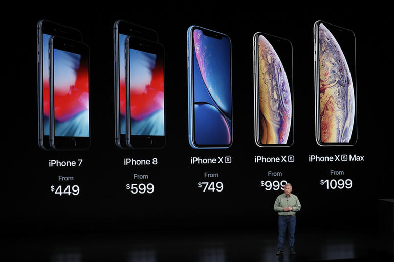
Ok, so what's the damage? The iPhone XR starts at $749, the iPhone XS at $999 and the iPhone XS Max at $1,099.

This is Apple, so these new iPhones were never going to be cheap. First impressions suggests the prices are a fair reflection of what's on offer here, but only time will tell if the new iPhone XS, XS Max and iPhone XR are worth their price tags. 

grid.jpg

iPhone XS and iPhone XR designs

The iPhone XS boasts a 5.8-inch OLED display, with Dolby Vision and HDR 10. It's made of stainless steel, has a new gold finish (on the front and glass) and Phil Schiller is calling it the most 'beautiful iPhone we've ever made'. It's also kitted out with more, new glass, which Schiller comments is 'the most durable ever in a smartphone'. 

Apple's iPhone XS is available in gold, silver and space grey, it's also IP68, so it's up there with the most water- and dust-resistant phones out there. The iPhone XS also introduces Face ID, meaning you can unlock your phone simply by picking it up and looking at it. It has "the most secure facial authentication ever in a smartphone," Schiller adds.

Exciting developments have happened with the camera too, with Apple introducing bokeh adjustments, thanks to the new image processing capabilities of the A12 chip.

The iPhone XR is the one model out of the three with an LCD display, unlike the OLED on the iPhone Xs and XS Max. 

It's made from 7000 series aluminum, more durable glass, and comes in a variety of new colors - white, black and blue, coral, yellow and red. The IP is not quite up to it's siblings, coming in 67, rather than IP68. And there's no home button, in keeping with the iPhone XS models, you unlock this model using Face ID.  

iphone-xs-pricing.jpg

For more information on all the new iPhone XS and iPhone XR features, head over to the Apple website. 


Thursday 09.13.18
Posted by Vlad Bahatyrevich
 

How to Create a Scribble Animation in After Effects

scribble-animation.jpg

So you think frame-by-frame animation is just too tedious for your film or video project? In this tutorial, we invite you to think again.

Many people think animating frame by frame is tedious and time-consuming, but it doesn’t have to be. The animated scribble technique is a perfect example of an easy way to create dynamic, handmade graphic elements. You’ve seen this effect in a lot of popular music videos over the last few years, including videos by Justin Bieber and Bruno Mars. Let’s take a closer look at how, in just a few simple steps, you can add eye-catching graphics to your videos.

Step 1: Prepare the Workspace

First, I need to set up my workspace. For this tutorial, I’m going to add some cartoonish flames that will come off the back of a race car. I’ll add the flames using the Brush tool, which you can find in the Tools panel or by using the Cmd (Mac) or Ctrl (PC) + B keyboard shortcut. The brush tool only works on the Layer panel — you can’t paint directly on the Composition panel. To open up my clip in the Layer panel, I’ll simply double-click the layer. Next, I’ll set up my brush.

Step 2: Prepare Your Brush

setup.jpg

As soon as you select the Brush tool, both the Paint and Brushes panels will become visible. Both panels offer a variety of options. The Paint panel allows you to change the opacity, flow, color, diameter, blend mode, channels, and duration. Clicking on the diameter button will bring you directly to the Brushes panel, where you can specify the diameter, angle, roundness, hardness, and spacing of your brush. You can even save your brush settings for future use.

The duration section of your Paint panel is one of the most important properties. Since this is a fast-moving clip, I want my flames to animate as quickly and frenetically as possible. For this reason, I’ll change the duration to “Single Frame.” If I want something a bit more subdued or clunky, I can change the Duration to “Custom” and then manually type in whatever frame rate I want. With both my workspace and brush ready, it’s time to scribble.

Step 3: Scribble

To start my scribble animation, I’ll bring my playhead to the first frame of my clip in the timeline. Using the Brush tool directly on the Layer panel, I’ll draw my flames on the first frame. Now it’s as simple as drawing the same flames for each frame. This particular clip is two seconds in length, shot at 25fps, so if I want flames throughout the entire clip, I will need to draw these same flames 50 times. If you want to create an animation that changes over time, it’s imperative to know the length of your clip so you can make subtle changes.

Knowing a few shortcuts will save you a lot of time and possible headaches when creating a frame-by-frame animation. To quickly navigate by individual frames inside After Effects, use the Page Up/Down keys. To resize the diameter of your brush, hold the Command (Mac) or Control (PC) key while you click and drag up or down.

Et voilà! The final animation.

final-animation-camtasia.gif


Tuesday 09.11.18
Posted by Vlad Bahatyrevich
 

5 Classic Fonts That Are Still On Trend (and Why)

LetterPress.jpg

There are thousands of typefaces out there, with more being released all the time. And with free fonts increasing in quality as well as quantity over recent years, the choice can be overwhelming for a designer.

If you can afford one, bespoke branded typefaces are also becoming increasingly popular. They help give brands a unique and distinctive personality that cuts through the noise, and conveys just the right tone of voice. If not, with the right amount of research and due diligence, you'll be able to find a typeface that suits your needs.

Despite the proliferation of typefaces on the market, however, a noble few have stood the test of time for decades, even centuries, to remain in-demand and relevant amid a sea of young pretenders.

So read on for our guide to five classic fonts that are still not showing their age, and why they could be right for your next project... 

#1. Futura

GzbhYvkXwJn5sy4tiYA7xU-650-80.jpg

Designed by Paul Renner and released in 1927, Futura can be seen as the grandfather of geometric sans-serifs – a flavour that is very much of the moment, following a wave of minimalist rebrands for the likes of Google, Mastercard and Spotify over the last decade. Futura itself has been used by a dizzying array of brands, including Alfa Romeo, Cisco, Domino's Pizza, Gillette and more.

Futura may have passed the grand old age of 90, but the iconic typeface's popularity has shown little sign of waning. With the spirit of the Bauhaus at heart, its design is based on simple geometric shapes – circles in particular – and exudes efficiency, purity and modernity to this day.

Its strokes are smooth, even and low-contrast, and the typeface as a whole – despite being progressive at the time, flying in the face of its grotesque counterparts – is timeless enough to be as relevant and usable in 2018 as it was in 1927.

#2. Caslon

aT3gSLU5ctqA42XSsbEEKX-650-80.jpg

Caslon makes the 91-year-old Futura look like a scrappy upstart. The name references William Caslon, an engraver of 'punches' – or master templates used to create the moulds for metal type – who lived from 1692–1766.

Although it comes in several different varieties and modern revivals, the typeface known as Caslon retains the organic, Old Style look and feel that he established in the 18th century. Like Futura, Caslon was ahead of its time – in London, at least – drawing on imported Dutch Baroque typefaces for inspiration.

Known for timeless elegance and effortless readability across large passages of text, the Caslon typeface family briefly fell out of popularity during the early 19th century, but recovered and now lends 300 years of gravitas to books, journal articles, encyclopedias and more.

#3. Garamond

gjgECgFPmHWsMxWEB6LDoZ-650-80.jpg

Another popular typeface for setting large passages of text in books, Garamond's heritage makes even the three-century-old Caslon look like a young whippersnapper. Like William Caslon, Parisian engraver Claude Garamond created punches for metal type, and first crafted the typeface that bears his name in the 16th century.

Its history can be traced back even further to 1495: the design follows the Old Style serif model originally established by Venetian printer Aldus Manutius, and designed by punchcutter Francesco Griffo. Both Garamond and Caslon maintain a natural, almost handwritten look and feel, but with a strong and timeless structure.

Many modern revivals of the typeface are inspired by the work of Garamond and his contemporaries in the early-modern French typography scene, such as Jean Jannon – and the family remains a viable choice for setting long-form text.

#4. Clarendon

qSnk7YTswLNaw5Y2AVaQNc-650-80.jpg

Slab serifs became particularly popular in British lettering, printing and signage during the early 19th century, so Clarendon was riding the wave of this trend on its release in 1845. Its original design was engraved by punch-cutter Benjamin Fox and credited to Robert Besley, a partner in the type foundry Thorowgood and Co.

Clarendon's popularity was such that its look and feel was widely imitated by other foundries – both at the time, and in the latter half of the 20th century – effectively spawning a sub-genre of type design in its own right.

Although the many different varieties of Clarendon have their own idiosyncrasies, the common factors are bold, solid letterforms with a relatively uniform stroke weight and bracketed, slightly tapered slab serifs. The typeface is popular to this day for display use, particularly for letterpress and woodblock printing work.

#5. Akzidenz Grotesk

2v4VxmV8ZY8z7fiUUB53dg-650-80.jpg

Love it or hate it, Helvetica has become the typeface that defined an entire generation of graphic designers that embraced mid-20th century Swiss design principles, otherwise known as the International Typographic Style. But Helvetica follows in the footsteps of Akzidenz Grotesk, the sans-serif family originally released by the Berlin-based Berthold Type Foundry.

Released in 1898, almost 50 years before Helvetica, Akzidenz Grotesk was part of a wave of overtly 'commercial' typefaces, intended for use in advertising and promotional materials to communicate, persuade and ultimately sell, rather than to decorate, or make reading easier.

Following the grotesque sans-serif tradition that Futura bucked against with its geometric approach, Akzidenz Grotesk became one of the leading exponents of late-19th century German typography. Simple, bold and neutral, and yet clearly distinct from its more widespread descendent Helvetica in characters such as 'Q', 'R' and 'J', it remains a classic sans-serif option 120 years on.

Monday 09.10.18
Posted by Vlad Bahatyrevich
 

Why Color Grading Should Be The Most Important Part of Your Post Processing Workflow

moodboard.jpg

Photographers and cinematographers often treat color grading as a trivialized aspect of their workflow. Something that they only worry about once the image is complete and with no greater attention than flipping through a series of filter presets in whichever their flavor of the month plugin happens to be at any given time. Instead, obsessive time and attention is paid to aspects such as cloning, dodging, burning, sharpening, liquefying, etc. Colorists in the film industry have known for years powerful color grading is critical to great filmmaking. Directors know this as well, which is why colorists often enjoy a massive, expensive, personal theater filled with an impressive array of tools to grade the latest mega blockbuster. 

Color Grading Defines a First Visual Impression

color.jpg

The majority of images are first seen as they are hurtling by in one of the endless scrolls that fill the social networks or in small thumbnails in galleries. In these situations perfect skin retouching or flawless exposure mean very little. The user simply is not perceiving the image in sufficient detail to even be aware of these sorts of things. Color grading however, stands out within the context of these formats. A beautifully color graded image that appeals to the viewer will compel them to stop and take a closer look. As a photographer you need to invest in learning how to grade your images in a way that they will grab attention in the span of a fleeting second among the chaotic noise of the digital age.

Color Grading Communicates The Mood of a Scene

deep_water_004_920.jpg

The communication of emotion and story through the lens is one of the most powerful tools a photographer has at their disposal. The grading of a well graded image can often augment the sense of story within a scene or even completely transform it. Without the grading an image may look flat, boring, or even disjointed. As a photographer becomes more proficient at grading he or she can leverage the power of color tone to influence emotional tone within a scene. Grading at this level can transform an unexciting frame into a moment of cinematic magic. 

Color Grading Builds a Style and Brand That Can be a Reflection of You

style.jpg

One of the most daunting challenges a photographer faces lies in building a unique style that can function as a brand for their work. Being able to create a visual style that viewers can recognize at a glance can be tremendously impactful in the growth of a photographer's career. Color grading plays a key role in that process. Clients will often come to you with a vast range of different photography projects. By defining a consistent color grading brand you are able to tie it all into a cohesive brand that not only reflects strongly on you but also builds a unique value that gives you something to sell that only you can offer.

How To Learn Color Grading

fast_rgb_three_way-780x380.jpg

This is a topic far beyond the scope of a simple article but the first step begins with casting aside those preset filters which are only serve to eliminate your creative vision in the color grading process by supplanting with the pre-determined creative vision of someone else. Before you consider investing in expensive plugins or applications to aid in color grading, spend time both learning color theory from a fine art point of view but also mastering simple color grading tools within common editors. Master colorists can make magic with only a simple curves tool (though that magic expands with the addition of more advanced tools). Begin thinking of color grading as a pre-visualized destination that you are aiming to reach before even beginning instead of a set of effects that you cycle through until you find one that looks ok. Great color grading is an explicit decision made by the photographer in order to meet the creative needs of the image they create. Be the sort of photographer who has the command of your color workflow rather than depending on stumbling upon the right filter to fit your image.

Conclusion

Color grading shouldn't be the last, barely cared about step in a complex workflow. Rather, it should be what drives the entire process. Regardless of which color grading tool you use, learn to master it in a way that maximizes the benefit of all of the above so that you can not only create the best possible images but also so that those images can connect to the world. 


Saturday 09.08.18
Posted by Vlad Bahatyrevich
 

10 Best Places to Find Free Fonts

Typography plays a big role in all types of designs, from product packaging to mobile apps and more. Today we’re taking a look at the best places to find free fonts, and take your design work to a new level.

But why is typography so important? Remember what happened at the Oscars 2017, when they gave the Best Picture award to the wrong film? Typography is to blame for that huge mess. As the creative strategist Benjamin Bannister points out, a simple change in the font and the designcould have helped avoid such an embarrassing incident.

oscars-mistake.jpg

This is why it’s important to have more options when designing a new project. Don’t settle for those overused default fonts. Be brave enough to try something new.

There are many places you can download a great looking font free of charge. We narrowed down the list to the top 10 websites for finding free fonts. Have a look.

Things To Consider Before Using Free Fonts

Before downloading and using these fonts, you need to be aware of the rules. Just because it’s free doesn’t mean you get to do whatever you want with these fonts. Most of the free fonts available on the web come with limited licenses, which means you can only use them with personal projects. However, there are sites that offer free fonts with commercial licenses. Just be sure to check the license for each font you download before using them with your projects.

Now, let’s get to the fun part: Free fonts!

1. Google Fonts

google-fonts-1.jpg

Google Fonts is one of the first sites that come up on top when searching for free fonts. This massive library features over 800 font families of various types, from sans serif to handwriting fonts, monospaced fonts, and more.

Google Fonts is widely used by web designers for faster and reliable font hosting. However, what most designers don’t know is that the fonts in Google Fonts are downloadable.

And the best part is all the fonts on Google Fonts are open-source. You can use them however you like.

2. Font Squirrel

font-squirrel.jpg

Font Squirrel is another reliable source for downloading free fonts of high quality. Most of the fonts featured in Font Squirrel also comes with commercial licenses. To avoid complications, the site makes it quite easier for users to check the licenses for each font before downloading them.

Font Squirrel also features a set of useful tools, including a Webfont Generator for creating your own web fonts and a cool Font Identifier, which helps you detect and find fonts based on images.

3. FontSpace

fontspace.jpg

This site features a massive collection of over 32,000 free fonts from over 2,100 designers. It’s also the home for more than 746,000 members who enjoy downloading free fonts.

You can use FontSpace to find plenty of free fonts to use for your personal projects. Simply hovering over a font while browsing is enough to find out the license for the font before downloading.

As a registered member, you can even create a personal favorites collection to easily access the best fonts and you can also contact the designers and even donate a few dollars if you like.

4. DaFont

dafont.jpg

DaFont is another popular platform for downloading free fonts. Most of the fonts in the site only support personal use, but there are plenty of fonts that come with commercial licenses as well.

One feature that makes DaFont stand out is its category system. Which lets you browse its fonts collection based on different themes like horror-themed fonts, video game fonts, valentine themed fonts, and much more. This offers designers an easy way to quickly find fonts for different types of projects.

5. Abstract Fonts

abstract-fonts.jpg

Abstract Fonts is a site that includes a curated collection of high-quality fonts. Most of the fonts available in the collection are free to use with both your personal and commercial projects. Just remember to check the license before downloading.

The website also features a fun category system for easier browsing. You can find fonts of different themes quite easily using these visualized categories.

6. Behance

behance-1-1.jpg

Behance is not exactly a platform for fonts. It’s like a social network where designers create portfolios of their best work and share designs with each other.

Designers share lots of free content on Behance, this includes free fonts as well. A quick search on the platform will bring up an endless list of fonts that are available to download at free of charge.

The best part of finding fonts on Behance is that the fonts you find on this platform usually feature unique designs and are less used than the fonts you find on other sites.

7. FontStruct

fontstruct.jpg

FontStruct is actually a font building tool that allows you to create your own fonts with geometrical shapes. The tool generates TrueType fonts using your designs that can be used with any app and for any kind of work you want.

The site also contains a gallery full of more than 43,000 fonts. Most of which are created by people just like you. All free to download. You can even clone the fonts created by other users to design your own unique fonts.

8. 1001 Fonts

1001.jpg

Don’t let that name fool you. 1001 Fonts includes more than 9,000 fonts. The site features an often updated collection of high-quality fonts. Many of the fonts are available for commercial use.

You can also browse the fonts in 1001 Fonts according to font style, size, and even font weight to quickly find fonts that match your design projects.

9. Urban Fonts

urban-fonts.jpg

Urban Fonts is another great place to find free fonts. The site features a more detailed page for each font that shows you all the characters of the font along with a tool to test drive the fonts before downloading.

You can also browse fonts according to different themes and create an account to save fonts for later as well.

10. FontSpring

fontspring-1.jpg

FontSpring is a premium fonts marketplace full of premium font families. But, the site also allows you to download a couple of free fonts from these font families to use them with your various projects. You can find detailed information about the font licenses in each font page.

More Ways To Get Free Fonts

You can also download premium fonts for free. Popular marketplaces, such as Creative Market and Envato Market give out free goodies every month to its registered users. It’s a great way to grab premium fonts without spending any money.

Friday 09.07.18
Posted by Vlad Bahatyrevich
 

How to Make 3D Text in After Effects Without Plugins

AE_3D_text_01.png

In this video tutorial, learn how you can quickly and easily create 3D titles in After Effects without any external plugins.

Understanding the built-in 3D engine in After Effects can be tricky if you’ve never worked with programs like Cinema4D, but this tutorial from the team over at Greyscalegorilla will guide you through the process of building your first 3D animation. They even include the project files, so open up After Effects, and follow along.

Where to Begin

3d-text-1.jpg

Create a text layer, and use whichever text, font, or number you want for your own title. Then, you’ll use Cinema4D Lite, which comes with After Effects CC, to create the 3D text. Go to Composition > Composition Settings, then hit 3D renderer, then click on “Cinema4D.” Next, click on the 3D layer icon within your text layer. To add depth to your layer, open up the text composition layer settings and open “Geometry Options” — then adjust the “Extrusion Depth.”

Playing with the Look

3d-text-2.jpg

Now for this next part, you’ll want to add lighting and reflection. Once you’ve done this, you need to add a camera to the project. Go to Layer > New > Camera > Two Node Camera, and then set the focal length to 30mm. Next, we’ll add bevels to the text, so select the 3D Text Layer and hit the “A” key twice. This will open up your 3D options. Play with the bevel depth as you see fit until you get the text to your liking.

Play with Your Text

3d-text-3.jpg

Once you’ve established the camera, the shape of the text, and the size, you can start playing with the specifics of the color and the lighting. Then you can animate the text. To do this, go to the camera layer and hit “P” for position and set it for however long you want it to move or bobble. In the example, they set it to two seconds, so add a position keyframe where you want it to stop. Bring up the Rotate tool by hitting “C” on your keyboard. Then move the text around until you find a good spot to start the animation.

Thursday 09.06.18
Posted by Vlad Bahatyrevich
 

Creating Screen Replacements in After Effects and Premiere

screen.jpg

Learn how you can create believable screen replacements in Adobe Premiere and Adobe After Effects with these simple techniques.

Say you’re recording a video for a client, and one of the shots includes a person holding a phone and browsing an app. You set it up, record it, and edit it. But wait — the company just redid the layout of the app, and they need the new design in their spot. What do you do now? Record the bit all over again?

Well, not when you’re using screen replacements. With tools like Adobe After Effects at your disposal, the fix is as simple as swapping out a single layer. Here’s how you do it.

Record Footage Correctly

When recording your footage for your screen replacement, here are a few things to keep in mind:

  • Record your screen with a “green screen” — download a green .jpg from the internet, and open it in your photo app. Make it full screen, and use that when recording the device. This will come in handy when keying out the screen in post, and it will allow you to move objects over the screen without disrupting the screen replacement.
  • Keep all 4 corners visible — When you get to the motion tracking portion of this tutorial, the screen replacement will be much easier if you have four corners to track in After Effects.

Working in After Effects

tracker.jpg

Create a new composition, and import all of your footage. The first thing that you want to do is track the motion of your device’s screen. Open up the tracker window, and click the Track Motion button. Make the motion source your video, and change the track type to Perspective Corner Pin. This will prompt a four-corner box to open up in your preview window. Match those pins to the corners of your device’s screen, and then click Analyze to enable AE’s motion tracking software.

solid2.jpg

Before analyzing the track, you’ll need something to place the tracking onto in lieu of your vertical video (for later placement). Create a solid object by right-clicking the timeline and selecting New > Solid. No need to resize this object — just make it a visible color such as bright red, and from the tracker tab, select that solid in the Edit Target options. Once targeted, the new solid layer will take the shape of the tracked screen.

keylight2.jpg

Now, it’s time to key out the green screen to allow movement over your device. Start by going to Effects > Keying > Keylight. Once you’ve applied this to your video clip, take the dropper in the effects tab and click the green screen. To make the keying process a bit clearer, change your view settings to Alpha Channel so the color difference is more apparent. Toy with the settings until you get a clear distinction between your key and the rest of the video. The Clip Black and Clip White settings will give you the clearest lines.

The keying process is going to alter the color of your video, so to bring it back to normal, duplicate your clip, and delete the keylight effect on the bottom layer. Afterward, go to your Track Matte settings on your timeline and Alpha Matte your bottom clip to the one above it. This will keep the color keyed, while maintaining the original color of your video.

completedscope.jpg

Since you’re almost done, it’s time to add your vertical video to your phone. Pre-compose your red solid by right-clicking it and selecting Pre-Compose. This will open a new composition with just your red solid. In that window, drag in your vertical video and stretch it to the corners of the red solid. It may look warped, but it will go back to its original size in the main composition.

Now go back to your original composition, and see if the color matches up. If it seems like the video is too bold or the colors don’t wash with the original composition, give it a few touch-ups with the Lumetri Color effect. You can de-saturate the video a bit, turn down the exposure, or even adjust the curves to match the phone footage to your composition.

Remember, you can create this effect with any type of screen. A television in the background, a billboard in Times Square: you name it — with the screen replacement method, any screen can display your footage.

Screen Replacements in Premiere

premiere.jpg

While I recommend that you create your screen replacements in After Effects (due to the customization options and motion tracking capability), you can also create them in Premiere. Just remember: the screen cannot be moving if you choose to do this effect in Premiere. Without the assistance of motion tracking, you’d have hours and hours of keying ahead of you.

So take a clip of a screen shot on a tripod and import it into Premiere. Take the clip you would like to insert into the original screen and add it over the other in your timeline. Shrink it down in the settings to just about the size of your device’s screen. Then go to the Effects tab and drop Corner Pin onto your top video. This will allow you to manipulate the corners of your new video, so now all you have to do is pin those to the corners of the device’s screen.

Once you’ve done that, you have another successful screen replacement!


Tuesday 09.04.18
Posted by Vlad Bahatyrevich
 

Color Grading vs. Color Correction: What's the Difference?

Screen Shot 2018-08-31 at 12.06.33 PM.png

In the history of the Indianapolis 500, Al Unser is in the top three of career Starts, Front Row Starts, Pole Position, Laps Led, and Wins. But do we refer to him as a driver—or a racer?

As a professional colorist and colorist coach, the question of which term to use—color correction or color grading—feels to me like the Al Unser question.

Over the past few years, the answer to the color-grading-vs.color-correction question has changed among professional colorists. I’ll show you what each term means—and how to color grade like a colorist.

Understanding ‘color grading’

Wikipedia describes color grading as “the process of altering and enhancing the color of a film, video . . . photochemically or digitally.” It uses color grading to describe the overall process, referring to digital color grading as “color correcting”and photochemical color grading as “color timing.”

img.png

We used to agree with Wikipedia—but not anymore. Photochemical color timing is nearly dead. Except for the rare film auteur who chooses to shoot on film and color time old-school, modern film-outs always start with a digital color grade. The job of the few remaining photochemical color timers is usually to compensate for variability in chemical baths.

Shot-by-shot and scene-by-scene, color decisions happen digitally before the timer sees the film. Professional colorists know this and our language has changed over the past decade.

Today, the term “color correction” doesn’t differentiate the digital and photochemical pipelines. More often, professional colorists use “color correction” to define the task they are performing. They use the term to literally mean, “Correcting problems of the underlying image.” Some examples:

  • Fixing exposure problems
  • Fixing white balance problems
  • Repairing excessive noise from aggressive ISO settings
  • Expanding contrast from LOG- or Flat- recorded images
  • “Developing” the image from RAW recordings
  • Setting the initial black-, white- and gamma points

Almost every shot needs one of these corrective actions applied to it.

When I teach, I call color correction the “first pass” in a color grading workflow. These are the first things a colorist needs to look at before doing anything else while color grading. Another term often used for this stage of a color grade is “Primary color correction.”

Screen Shot 2018-08-31 at 12.10.33 PM.png

What else is color grading?

After correcting the initial image problems, colorists move into the realm of the color grade. Some examples include:

  • Shot matching: Ensuring the editor”s “invisible edit” isn’t revealed by shots that look different as the timeline plays down
  • Removing distractions: Isolating and manipulating annoying elements that prevent shots from matching each other
  • Controlling the viewer’s eye: Using shape masks (or other techniques), attracting the eye to the focal point of interest
  • Creating looks: Stylizing an image to indicate a flashback, dream sequence, or re-creation—or simply to give the entire project a unique feel

Not all jobs require full color grade

Usually, quick turnarounds or extremely tight budgets prevent us from doing a full color grade. Or what if it’s a live shoot with a professional shader on-site matching the cameras together? Then there’s little for the colorist to do than some basic color correction tweaks.

But every color grade requires the colorist to begin with the intent of doing a color correction pass on each shot.

Screen Shot 2018-08-31 at 12.18.57 PM.png

Basically? Terms are interchangeable

In everyday usage, the term color correction is interchangeable with color grading.

Color correction is the term our clients and peers use when talking about the larger craft of color grading. Just as racing is much more than steering, accelerating, and braking, color grading is much more than correcting problems.

No matter which words you use, as long as you know the proper order of things (correct problems first, then shot match, then stylize and control the eye), you’ll make it to the finish line.

Friday 08.31.18
Posted by Vlad Bahatyrevich
 

How to Remove Color Banding in After Effects

Color-Banding-1000x576.jpg

Removing color banding is a simple yet effective way to make your images look more professional and appealing.

Color banding can look tacky and unprofessional even to the untrained eye. To put it simply, banding happens when two colors are so similar, the image appears posterized. The resulting look is unappealing and unprofessional.

Removing color banding in After Effects is easier than you might think, as you’ll see in this minute-long tutorial from Standard Film Team.

The short, goofy video covers everything you need to know about removing banding, from changing the bit rate to adding adjustment layers and noise. For an even more in-depth tutorial on removing banding, check out this helpful tutorial from Justin Hemsley.

Simple Breakdown

When removing color banding in After Effects remember to:

  1. Change Bit Rate of your Composition to a higher number like 16 or 32

  2. Add an Adjustment Layer

  3. Add Noise

  4. Switch Off Color Noise

  5. Add 1% Noise

Don’t forget that choosing a different color entirely could also help prevent banding for future projects.

Wednesday 08.29.18
Posted by Vlad Bahatyrevich
 

A Surprise Presidential Win Inspires “Our Cartoon President” on Showtime

When Tim Luecke first created Cartoon Trump for The Late Show with Stephen Colbert’s election coverage in 2016, he assumed it would be temporary. Today, he’s using the experience gained producing short Late Show segments to drive the quick turn production of a full animated series using Adobe Character Animator and Adobe After Effects CC.

Our Cartoon President is a 10-episode, satirical series that parodies what’s going on behind-the-scenes with the current administration in Washington, DC. The show, which premiered on Showtime on February 11, 2018, relies on Adobe Character Animator to achieve its tight production deadlines.

Tim initially used the Cartoon Trump character—along with one of opponent Hillary Clinton—to learn his way around the newly released software. “Cartoon Trump was a practice project to play around with Character Animator,” says Tim, the lead animator on The Late Show with Stephen Colbert and co-executive producer of Our Cartoon President. “The live interactions between Stephen and the Trump and Clinton cartoon characters were well received, so we continued to feature them leading up to the election.”

Just before the election, the Late Show team partnered with Showtime to do live election-night special. From script to air, two people wrote and animated a three-and-a-half minute segment on candidate Trump in just 18 days. “The segment aired 20 minutes before the results became clear, and immediately took on a more prescient tone than what we intended,” says Tim.

As a result, Tim and his team ended up doing a lot more Cartoon Trump than they originally expected. Within the first few days of the new administration taking office, The Late Show addressed early news coming out of the White House in short cartoon segments created primarily using Character Animator, along with some Adobe After Effects compositing.

From there, the concept of a full-length animated narrative—Our Cartoon President—was born. The new series required a significant shift. Instead of producing one- or two-minute segments, they faced producing 250 minutes over the course of 10 episodes. But that challenge was offset by the fact that they were no longer confined by the daily deadlines of The Late Show, and had five months to get the work done.

“Character Animator is a key component for driving quick animation,” says Brian Maffitt, technical director of Our Cartoon President. “You can achieve a look that is borderline cinematic, without cinema budgets and turnaround times.”

Using a hybrid approach, the team looked at each shot individually and assessed which tool, including hand-drawn animation, would be best suited to get the job done. For example, Character Animator lends itself well to conversational scenes, while Photoshop and After Effects are used for frame-by-frame animation and full-body shots. Use of the face tracking and automatic lip sync tools in Character Animator let the team animate characters quickly, and meet their aggressive production deadlines.

“We combine a lot more traditional, drawn animation than we originally thought we would,” explains Tim. “But we’ve found that Character Animator allows us to trigger drawn animation in a way that creates a real hybrid between motion capture body-movement animation and traditional, cel-by-cel hand-drawn animation.”

The team is counting on both the style and substance of the series to draw viewers. “Our goal is to create a world that is beautiful and rich,” says Brian. “We’ve created characters that people will want to spend time with. It really is very compelling to watch.”

You can learn more about Character Animator here.

Tuesday 08.28.18
Posted by Vlad Bahatyrevich
 

Video Tutorial: 5 Crucial Tips for After Effects Beginners

todd-cover-1000x576.jpg

New to After Effects? No idea what you’re doing? Check out these 5 tips about the program to get started on the right track.

When you first start using After Effects, it can feel like learning a completely foreign language. Every button and all the layouts are so vastly different than any other editing program you’ve used, and it can be daunting to figure out how everything works. Thankfully, Todd Blankenship over at Shutterstock Tutorials has laid out the 5 things you need to know when getting started in After Effects, and once you learn those, it’s all downhill.

1. Motion Blur

motion-Blur.gif

When you add motion to your animation, does it look blocky and unrealistic? That might be because you don’t have motion blur turned on. Motion blur adds a faint tail-image to your animation that smoothes out the motion and mimics how cameras capture motion in the real world.

To turn on motion blur for your layer, click the three-circle button on the top of your timeline. This will enable a clickable box on your layers with the same logo. Click that box to enable motion blur for that layer. If you want to customize the amount of motion blur in your project, go to Composition > Composition Settings. From there, click the Advanced tab, and you will be able to adjust the shutter angle either up or down for more or less motion blur.

2. Keyframes

keyframes.gif

Keyframes are the building blocks of After Effects. They are the language you use to tell the program when and where to do what. When you put two keyframes onto anything in your composition, After Effects will automatically connect those two positions by creating the information between them.

There are easy ways to manipulate keyframes. For example, if you want to move your keyframes in your timeline without having to move each one individually, you can highlight all of them with your cursor and drag them through the composition. To compress or expand your keyframes, you can hold the alt key with the keyframes selected and manipulate the timing of the sequence while keeping the relative timing the same.

3. Easing Keyframes

easyease.gif

When you establish your first keyframes in a timeline, you may think it looks super blocky and unnatural. This is because After Effects is completing the information in the strictest way possible: from point A to point B. To make it look more natural, you have to slow down the movement at the beginning and end.

This is where easing keyframes comes into play. To do this, right-click your keyframe and select Keyframe Assistant > Easy Ease. This is going to ramp down the last few frames to make it gently glide into its final position.

To adjust how “easy” your keyframes are, you can adjust those settings in the Graph Editor. To select this, click the graph button next to the motion blur button on your timeline. This will pull up a graph on your layer. To edit the speed, click the drop-down menu on the bottom and select “Edit Speed Graph.” Here, you can grab the yellow handle on the side of the keyframe to ramp up or slow down your “easyness.” This will make your animation super smooth.

4. Masks and Track Mattes

Masks.gif


At this point, you may already know what solid layers are. They are the visible, tangible layers that you use to build your animation. Now think of masks as the exact opposite: they hide layers behind an invisible “mask.” You can create masks within your layers to hide certain properties of your layer. For example, if you need to cut a circle out of a square layer, a mask would be a good option.

Now track mattes are a bit different. This is the process of taking a shape and turning it into a mask for another layer. You can do this for a multitude of reasons, but one of the simplest is for a logo reveal. To do this, create a shape layer the size of your logo. Go to the layer settings, and click the Track Matte drop-down menu for your logo layer. Click Alpha Matte – Shape Layer 1. This will turn the alpha channel for that layer into the alpha channel of your logo’s layer. From here, you can keyframe your logo’s location to go from behind the shape layer onto the visible plane.

5. Null Objects

NullObject.gif

Null objects, simply put, are empty objects that you can use to control other objects. Think of it as a grouping mechanism — you can use it to control a lot of layers by only adjusting one. How you go about doing this is a thing called “parenting.” In After Effects, you can “parent” a layer to another, and whatever the parent does, the “child” does as well. To do this, just select the squiggly circle icon called a “pickwhip” on the layer you want to become the child and drag it to the layer you want to become the parent. Now you can adjust the settings of the null object to change things like size, placement, or orientation without messing up any keyframes you have already established.

Sunday 08.26.18
Posted by Vlad Bahatyrevich
 

Why Video is Exploding on Social Media in 2018?

5-apps-to-make-social-media-videos1.png

There’s been an explosion of growth in video on social media in recent years. Views of branded video content have increased 99% on YouTube and 258% on Facebook between 2016 and 2017. On Twitter, a video Tweet is 6x more likely to be retweeted than a photo Tweet. If you haven’t taken a closer look at the power of social media and video together, you’re in for a surprise. The numbers are big. Really big.

“I see video as a megatrend,” Facebook CEO Mark Zuckerberg, February 2017

We could go on and on with more numbers like that, but it’s better to show you. Let’s see how brands are driving dramatic growth with video on Facebook, YouTube, Instagram, Snapchat and Twitter.

Facebook has the largest audience of any social network, with more than 2.07 billion monthly active users. That’s more than one-third of the world’s population, and a whole lot of those people are watching video. Around 100 million hours of video are watched every day on Facebook. Like YouTube, Facebook has a massive and diverse audience, which makes it harder to characterise than the emoji-filled landscape of SnapChat. The overall point to remember about Facebook is that people come to be entertained. In other words, cat videos. Last year, for instance, a video titled “How to wrap your cat for Christmas 101” got more than 80 million views and 405,000 shares.

Moving Pictures Boost Engagement

1.jpg

Video can also lead directly to sales. Studies show that 74% of users who watched an explainer-video about a product subsequently bought it. So better start crafting your exciting product videos now! If you think about it, the effectiveness of video is not even that surprising. After all, vision is our most dominant sense. Most information transmitted to our brain is visual. So if already pictures can boost engagement massively, imagine what moving pictures can do to your business.

Google Loves Videos

Videos allow you to increase the time spent by visitors on your site. Thus, longer exposure builds trust and signals search engines that your site has good content. Moovly gives us whopping statistics: You’re 53 times more likely show up first on Google if you have a video embedded on your website. Since Google now owns YouTube, there has been a significant increase in how much videos affect your search engine rank.

Video Appeals to Mobile Users

2.jpg

Video and mobile go hand in hand. 90% of consumers watch videos on their mobile. From Q3 of 2013, mobile video views have grown more than 233 percent. YouTube reports mobile video consumption rises 100% every year. Since people like to watch videos on the go, and the number of smartphone users is growing, your video audience keeps getting bigger and bigger.

Video Marketing Can Explain Everything

Are you launching a new product or a service? Create a video to show how it works. 98% of users say they’ve watched an explainer video to learn more about a product or service. That is why 45% of businesses who use video marketing said that they have an explainer video on their home page. Of those businesses, 83% said that their homepage explainer video was effective.

Trying to explain a difficult concept? Create animated videos. Animation can bring concepts to life that no text or live video can. Besides, boring talking heads are not enough anymore to break through the clutter. Animated videos are a perfect combination of entertainment, nostalgia, and simplicity. And they work.

Video Builds Trust

3.jpg

Trust is the foundation of conversions and sales. But building trust should be a goal on its own. The whole concept of content marketing is based on trust and creating long-term relationships. Stop selling and let the people come to you by providing them interesting and useful information. I couldn’t have said it better than Mark Schaefer, the Executive Director of Schaefer Marketing Solutions:

“The new era demands a focus on ignition, not just content, on trust, not just traffic, and on the elite people in your audience who are spreading and advocating your content.”

Video does it all. Video content is likely to engage us and ignite emotions. And when we talk about elite people in the audience, YouTubers have become the most powerful social media figure to promote your brand. So, if you are serious about content marketing, you must be serious about video, too.

Promotional videos can foster trust as well. Some consumers are still skeptical about buying products and services on the internet because they fear fraud and cheating. But effective marketing videos present your products in a conversational form. That creates a sense of individual approach which is why 57% of consumers say that videos gave them more confidence to purchase online.

Final Thoughts

Undoubtedly, video marketing is one of the newest additions to your promotion toolbox. You might still have your doubts. Is it really worth to consider using videos for promoting your business? Do you have enough resources to create and use video content in your marketing? The answer is simple: Yes, it’s worth it. Not only because everyone’s doing it but because video is one of the most versatile and profitable digital marketing tools out there.


Saturday 08.25.18
Posted by Vlad Bahatyrevich
 

Production Tip: How to Optimize Your Audio Levels

audio.jpg

Audio can sound different depending on how you play it back. Use this technique to make sure your levels work with any medium. What ruins a film quicker than bad visuals? Bad audio. Sound is one of the most immersive elements in film, and when it’s off, it can take your viewer completely out of the experience.

If you’re like me, then you’ve been in the awkward situation of showing off your film to your friends on your living room TV, and the audio plays back completely differently than it did on your computer after the export, and you can hear everyone silently judging you. So, how do you make sure that your project sounds the same on every device? Don’t worry: the folks over at The Film Look are here to help out.

When you’re in an edit, your perception can become warped after a while, especially if you’re working with only one playback medium, like headphones. After a while, you may get the perfect mix for your headphones, but once you listen to the track on speakers, the mix doesn’t translate. Headphones are perfect for creating your soundspace because of all the detail you can hear, but speakers are better for the final edit. Switch it up every now and then once you’ve got a solid mix. If you have access to monitor speakers, even better.  

If you’re uploading your video to a platform like YouTube, you want to make sure that the sound quality is top-notch on every device. From phone speakers to headphones, your audio quality should be consistent. To ensure this, export your video and test it on various devices. Are there sounds that aren’t translating well to a certain device? Then go back to your mastering software and boost the levels of that sound. But make sure you don’t boost anything too much at once — try to find a happy medium that works on all platforms.

If you’re looking for an easy way to determine if your volume is at the correct levels, try volume referencing. To do this, pull up a show or movie from a platform like Netflix and watch it for a few minutes. After you’ve determined the levels, quickly switch to your film without changing the volume level on your TV. Is it too loud? Too soft?

Once that you have a reference, you can adjust your volume levels on your master mix to match the volume of a professionally mastered film. Now, you can be confident that your film will sound great on any platform.

Thursday 08.23.18
Posted by Vlad Bahatyrevich
 

Ever Wonder How Obsessive Artists Colorize Old Photos?

In this Vox short about the colorization of photos, they interview Jordan J. Lloyd of Dynamichrome about his process of coloring photos. He claims that a good colorizer has a good network to call upon when trying to stay true to what colors the subject of the photo might be donning. This takes loads of research into old advertisements, diaries, clothing descriptions from tailors, etc. After researching, the color artist can grasp what shades and color types they’re going to use in their restoration.

Take his colorization of King Tut’s tomb for example. He dug through old archives of the archeologist’s journals and cross-referenced those with pictures of the preserved artifacts on display currently in Cairo. This research allowed him to create a true color image of what we would see on that day if the photographer had used a color camera.

Dynamichrome also makes sure to keep lighting in mind when recreating old photos. Since light alters our perception of color, the colors would need to darken or lighten depending on where the source is coming from. The intensity of light also plays a role.

Jordan’s team at Dynamichrome primarily focuses on photos, though. The real juggernaut of the craft is restoring footage.

Wednesday 08.22.18
Posted by Vlad Bahatyrevich
 

The Media in My After Effects Template is Missing!

missing.jpg

By default, you shouldn’t have to do anything besides simply open up the project file to begin editing your template. However, if for some reason your asset files are put in the wrong spot, you will get an error message when you open up your project. Don’t fret.

Missing footage can be found by simply moving the asset back into the appropriate file structure, right clicking on the file in the Project Panel, and selecting reload footage.

Monday 08.20.18
Posted by Vlad Bahatyrevich
 

How Are After Effects Templates Different From Scripts, Expressions, Assets, Plugins and Presets?

realcam-ae-drag-drop.jpg

There are a lot of After Effects related files sold on the internet. The most common are After Effects templates which we’ve already covered in this post, but you’re likely to run across a few other After Effects items online. Here’s a quick breakdown of what each of them are:

  • After Effects Script: Lines of code that tell After Effects to do something. Typically scripts are used to save motion graphic designers time from doing mundane or repetitive tasks like duplicating layers.
  • After Effects Expression: An expression is a quick snippet of code that will tell After Effects to change the value of a certain parameter. For example, the “wiggle” expression will tell After Effects to wiggle a number value. Expressions are normally used by intermediate to expert After Effects artists. You can get by in After Effects without learning a single expression.
  • After Effects Asset: An asset is simply a  file that can be dragged and dropped into your After Effects project. An asset can be video, audio, or image files. Typically video editors will use assets to stylize their footage in After Effects.
  • After Effects Plugin: An After Effects plugin is a third-party plugin that gives After Effects extra functionality beyond what it’s already capable of doing. One popular plugin is Element 3D, which allows users to create and customize 3D objects directly in After Effects.
  • After Effects Preset: A preset is simply a predefined group of effects and keyframes that can be easily applied to layers. The most common type of presets are text animation presets and color grading presets.
Friday 08.17.18
Posted by Vlad Bahatyrevich
 

How Do I Use an After Effects Template?

spider.jpg

To use an After Effects template, you will need to have the template project file along with all of the video editing assets. If you don’t already have After Effects open, you can either start the program and open the template file by navigating to File>Open, or you can simply double click the project file on your computer.

When you open an After Effects template, you will typically see all of the files on the left side of the screen in a box called the project panel. In the middle you will see a large video screen called the composition panel. You will also see a timeline at the bottom of the program. The timeline is where all of the different video, audio, and graphic elements are placed when they are used to create the final video.

For a simple graphics project, you might just have a video and text layer in your compositions timeline. In a template, there will be many more elements, sometimes hundreds. Luckily for you, a good template won’t require you to navigate all of those layers. Instead, a good template will only ask you to access a few simple layers at most.

At the heart of every good After Effects template is a well-organized composition structure. For most templates, all you will need to do is access the composition that corresponds with the scene you are trying to change. For example, if you want to change the end logo, you can look for a composition called “End Logo” and manipulate the text or elements as you need them.

Every After Effects template is different, so it’s important to read any documentation that comes with your template to make the whole editing process easier to understand. All of our templates are standardized, meaning they are all customizable in a similar file structure.

Thursday 08.16.18
Posted by Vlad Bahatyrevich
 

What Hardware and Software Do I Need to Use an After Effects Template?

hardware.jpg

In order to use an After Effects template you will need a copy of Adobe After Effects on a Mac or PC computer. If you’re not already familiar, After Effects it is an incredibly deep, yet approachable computer program used for motion graphics and VFX work. Some designers spend their entire careers mastering After Effects, but the majority of After Effects users simply use it to create simple graphics or visual effects for videos.

After Effects is one of the programs included in the Creative Cloud by Adobe. Unlike other software manufacturers, Adobe sells their software in a subscription pack called the Creative Cloud. Instead of you purchasing the software outright, you actually license their entire library of softwares for a fee each month. While this may seem strange, it actually saves artists a lot of money in the long run.

If you don’t already have After Effects on your computer, you can download a free 30 day trial from Adobe.  You can fully customize and export videos during your trial, so if you simply purchased an After Effects template with no intentions of using the software again in the future, you might be able to get by without actually subscribing to the Creative Cloud.

In order to use an After Effects template, you will need an After Effects project file along with any assets (video, pictures, music, etc.) that your project file may use. It’s best to think about your After Effects template as a video project. Just because you have the project file doesn’t mean you have all of the video assets on your computer. Some templates may include video, photos or illustration graphics along with the template at no additional cost. Be sure to check what each templates includes in the description before downloading.

Wednesday 08.15.18
Posted by Vlad Bahatyrevich
 

What are After Effects templates? Here’s a quick rundown.

imac.jpg

After Effects templates are a fantastic resource for anybody looking to make their project look professional and customized. Let’s take a look at the wide world of After Effects templates.

An After Effects template is a customizable After Effects project file. Typically when a motion designer is working on a project in After Effects, they will use a file structure that is not formatted for other people to customize it. In a typical project file it’s not uncommon to see unnamed elements, poor organization, and confusing file structures. Templates, on the other hand, are labeled, well organized, and easy to understand.

A good After Effects template is designed in such a way that users can easily change text, colors, and design elements without needing to understand the complex file structures created by the Motion Graphic Designer. Typically a motion graphic designer will create compositions (timelines) that allow you to simply drag and drop your images or footage inside, and text fields that can be easily customized in a similar fashion to a text editor.

Some After Effects templates are used to create entire finished videos, while others are used to add in graphics to a video that’s already been created. There are also some After Effects templates that have been designed to create a certain effect. 

Tuesday 08.14.18
Posted by Vlad Bahatyrevich
 

5 Tips for Beginners Working with After Effects Templates

Consulting.jpg

So, you think you want to venture in to the world of After Effects templates, huh? Not to fret! It’s really a lot easier than you think, especially if you’re working with a professionally made pre-designed template. However, there are some terms that you should be familiar with if you’re new to the game.

It’s an AFTER EFFECTS template…

…that means you must use it in After Effects. After Effects in an Adobe program that is used to create motion graphics. It can be kind of a beast to learn, but starting with pre-made templates is a good way to learn the basics. If you do not have After Effects, you will not be able to use After Effects templates in any other program.

It says it is pre-rendered? Does that mean I can’t change it?

If an After Effects template says it is pre-rendered, that simply means that someone has gone ahead and put in some extra time to ensure that you don’t need any third party plugins to make the template work the way it should. Pre-rendered is a great thing for a beginner!

What is a third party plugin?

A third party plugin is some piece of additional software (usually downloaded from the Internet) that works with After Effects to create new visual effects. These typically cost money and sometimes require vast experience with After Effects to use properly. Third party plugins can be great for creating new looks, but if you’re new to the game you’ll probably want to avoid them for a while.

How do I make it work?

There is no quick answer for this question. Each After Effects template is a work of art that is comprised of many layers. If you recently purchased or downloaded an After Effects template, chances are it came with instructions on how to use it. Check your disc or look in your .zip file to find the how to. If you still can’t find instructions, consider getting in touch with the creator of the template.

This is taking forever…

Remember, After Effects is a beast of a program. Depending on your computer, it can take hours to render a file. Heck, it might even take hours just to download the template from the Internet. But remember, it took the person who created this template twice as long to make it from scratch as it did for you to simply drag and drop your text. Take your rendering time as a chance to stretch your legs and enjoy some fresh air!

Monday 08.13.18
Posted by Vlad Bahatyrevich
 
Newer / Older

Copyright © Vdeesign. All rights reserved.