• Templates
  • Freebies
  • Blog
  • Contact
  • About
  • FAQ
  • Create Video
VDEESIGN
  • Templates
  • Freebies
  • Blog
  • Contact
  • About
  • FAQ
  • Create Video

How Vogue Used Instagram Stories to Sell Out its September Issue

59569360_652342865226952_1179736995480469504_n.jpg

Instagram Stories enables people to gain new perspectives on life, learn new tasks and interact with their favorite celebrities. At the same time, entertainment brands want to grab people’s attention and build intrigue around their films, TV shows or events while driving business results. To accomplish this goal, marketers are increasingly taking a playful and unfiltered approach with Instagram Stories to create unique, compelling content.

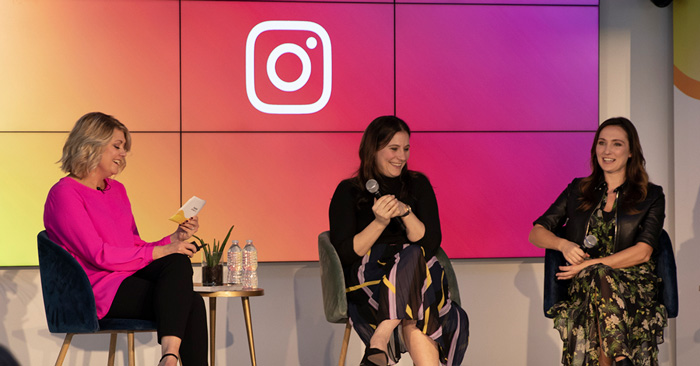
During SXSW 2019, we talked with Abby Sjoberg, Vogue’s Director of Audience Development Analytics, and Eden Gorcey, Senior Vice president of Enterprise Strategy at Condé Nast, on how the publication has increased magazine sales and advertising revenue through its wildly successful Instagram campaigns, which have resulted in more than 22 million followers.1

“We convinced stakeholders that Instagram is a platform they should be investing in by showing [them] results,” said Sjoberg. “When we were able to show the amount of impressions we get through swipe-ups or the amount of click-throughs that we can bring to an advertiser, the numbers speak for themselves.”

In fact, Vogue’s Instagram channel is getting many more impressions than the publication’s website, Vogue.com.2 And the results on the advertising front are equally impressive: Vogue has achieved a 40% higher conversion rate with ads on Instagram Stories versus campaign averages.3 In addition, Vogue has a 20% lower cost per acquisition with ads on Instagram Stories versus ads in other placements.4

Start with creative: Selling out September and gaining new subscribers

Vogue uses Instagram throughout the year and is especially proud of its success with their Instagram Stories campaign for the September 2018 issue featuring Beyoncé on its cover.

The campaign helped the issue sell out on newsstands and was directly responsible for 20% of new subscribers.5 By focusing on the lifetime value of the follower, the team used the opportunity to bring this new audience into the broader Vogue World with offers to listen to a podcast or download the Vogue World app.

What can marketers learn from Vogue’s Instagram strategy?

You can increase your ability to succeed like Vogue did—without its ample budget or unfiltered access to a megastar like Beyoncé—simply by adopting its approach. Translation: Add Instagram Stories to your social media strategy. Thanks to Facebook and Instagram Stories, Vogue achieved enormous success with its September issue.

Adopt these key strategies from the Vogue Instagram team to increase your ability to gain and convert new customers with Instagram Stories:

  • Use video
    Vogue found its videos got higher click-through rates than still photos. By creating videos quickly in their office, they saw impactful results. Many of the campaign’s videos were filmed on staff members’ phones to create a raw, behind-the-scenes feel.

  • Test new ideas with Instagram Stories
    Because stories have a more fun and carefree attitude than feed, Vogue uses it to test new languages, different types of callouts or to A/B test new types of content. Explore new ways to unlock your creative potential on Instagram Stories here.

  • Use your feed and stories differently
    Vogue uses curated photos from professional photographers in its Instagram feed, while showing the brand’s more casual and playful side within stories. By engaging Instagram Stories as a distribution platform, Vogue has tripled its traffic year over year.

  • Offer content that only your brand can create.
    Vogue’s Beyoncé Instagram campaign is likely as close to the celebrity as most people will ever get. The biggest reason for the campaign—and ultimately the September issue—was that very few brands other than Vogue could offer their audience this type of exclusive access.

  • Think about the Instagram Stories format during photo shoots.
    By getting the right vertical images and video up front, the team was able to focus on the message and stay on deadline.

By adding Instagram Stories to your campaigns, you give your audience a playful and unfiltered peek into your world. Your followers will pay you the highest compliment: They’ll become customers.

Learn how to drive conversions with Instagram Stories. Be sure to watch the Vogue panel with Facebook in Austin to get more insights and behind-the-scenes details into how Instagram Stories helped sell out the Vogue September 2018 issue.

This article was originally posted by Instagram by Instagram Business Team on May 1st, 2019

Monday 06.10.19
Posted by Vlad Bahatyrevich
 

How to Get Permission to Use a Music Track

Copyright law is a complicated topic, but get it wrong and you could end up in hot water (we’re talking copyright infringement hot). You might think that if you don’t intend to monetize your video or if you’re just making a fan video, you’re in the clear to use copyrighted music on YouTube. But that’s far from the truth.

The fact is that unless your video is only for your personal use (as in, not sharing it online anywhere) you must get permission from the copyright holder to use any music on YouTube. This is the best way to not run into any copyright issues – but doing so isn’t always easy. Even just tracking down the owner can be tricky, but this guide will walk you through how to legally use copyrighted music.

What might happen if you don’t get permission?

Best case scenario, if you don’t get copyright permission to use a piece of music in your video, you might be asked to take it down. But you might also face more severe consequences. For example, if you post your video on YouTube, you could get a copyright strike against your account or have the audio on your video muted (and yes, that’s even if you’re just using it as background music in your YouTube videos) Any ad money might be given to the copyright holder, or in a worst case scenario, you could get sued.

To avoid the legal headaches (and potentially expensive fees and settlements) you’ll need to make sure you have explicit permission from the copyright holder to use any music.

How to get permission to use a song in your video?

To avoid the legal headaches (and potentially expensive fees and settlements) you’ll need to make sure you have explicit permission from the copyright holder to use any music.

How to get permission to use a song in your video?

The first step in getting permission to use recorded material is determining who owns the copyright of the intellectual property and contacting them.

Copyright law is a complicated topic, but get it wrong and you could end up in hot water (we’re talking copyright infringement hot). You might think that if you don’t intend to monetize your video or if you’re just making a fan video, you’re in the clear to use copyrighted music on YouTube. But that’s far from the truth.

The fact is that unless your video is only for your personal use (as in, not sharing it online anywhere) you must get permission from the copyright holder to use any music on YouTube. This is the best way to not run into any copyright issues – but doing so isn’t always easy. Even just tracking down the owner can be tricky, but this guide will walk you through how to legally use copyrighted music.

What might happen if you don’t get permission?

Best case scenario, if you don’t get copyright permission to use a piece of music in your video, you might be asked to take it down. But you might also face more severe consequences. For example, if you post your video on YouTube, you could get a copyright strike against your account or have the audio on your video muted (and yes, that’s even if you’re just using it as background music in your YouTube videos) Any ad money might be given to the copyright holder, or in a worst case scenario, you could get sued.

To avoid the legal headaches (and potentially expensive fees and settlements) you’ll need to make sure you have explicit permission from the copyright holder to use any music.

How to get permission to use a song in your video?

The first step in getting permission to use recorded material is determining who owns the copyright of the intellectual property and contacting them.

However, it’s not a matter of just contacting the artist or record label. In fact, there are two (or more) rights owners to a given piece of recorded music — the rights to the written song (including the composer, lyricist, and/or music publisher) and the rights to the particular recording (the record label and performer/s.)

How do you find the copyright owner of a song?

So you want to use music in your video. Often, tracking down the owner and successfully contacting them is the most challenging part of getting permission, but a good place to start is with the music publisher or the record company.

You can often find the contact information for music publishers through performing rights societies, since all professional songwriters and music publishers belong to one of these organizations. ASCAP, BMI, or SESAC are the main organizations, and members can only belong to one of them. Try searching their databases for a given title, but if you don’t find it at one society, the copyright owner likely belongs to one of the other two. If you find the title here, you should also find the contact information for the owner.

If you can’t find the copyright holder through these organizations, you can try contacting music licensing companies (PRS) for Music (which represents composers, writers and publishers) or PPL (which represents performers and record companies) for information about recordings they license.

How to ask for copyright per mission to use a song?

Once you’ve tracked down the copyright holder, you can contact them, usually by writing a letter or email. Refer to this sample letter or follow this guide. The main thing is to identify yourself, the song/original music you want to use, and explain how/where it will be used. Is it not-for-profit? Commercial use? Finally, you can ask them to sign and return the letter by way of agreement, or contact you to negotiate for the music rights.

If you expect your usage/views to be very limited, you may get permission to use the piece for free, but if you expect to profit from or monetize your video, you will likely need to pay the owner a fee.

How much does it cost to license a song?

Music_Licensing_640.jpg

The cost to license a copyrighted song can vary widely. The cost for a song from a small independent artist might be less than $100, while a track by a major artist or label can run thousands of dollars. Some licenses might also charge you a percentage of revenue instead. The key is to carefully read the terms of the license to know what you’re getting into. Licensing services like Getty and others have clear, easy to understand terms, which makes them an appealing option for creators.

Alternatives to getting permission

If you’re not up to the task of tracking down the copyright owner of the musical work(s), you can purchase a royalty-free license. Note that royalty-free doesn’t necessarily mean the license itself is free, just that you won’t pay royalties for using it. There are free royalty-free options, however. YouTube’s own Audio Library is a good place to start. You can also search for pieces that are in the public domain and therefore free to use. We’ve also written a comprehensive guide to finding royalty-free music to use in your videos.

Saturday 06.08.19
Posted by Vlad Bahatyrevich
 

[New Research] Video Skyrockets to 25% of Digital Ad Spending

What a year it’s been for online video. Consumers are watching more and more content online, as the average user spends 67 minutes a day streaming.

This is a large bump over last year’s 56 minutes, and marketers are taking notice.

New research from eMarketer estimates that marketers are breaking spending records on video as Q4 2018 starts, and this growth is not expected to slow down any time soon.

Growth in Online Video Ad Spending

In 2018 alone, digital video advertising will grow by nearly 30% to a healthy $27.82 billion. That equates to just over one quarter of all digital ad spending this year, and Zenith forecasts that number to climb to $43 billion by 2020.

The need to divert spending toward video should come as no surprise as people grow accustomed to consuming video on their own time and on the platforms and devices of their choice.

Online video streaming is especially popular among younger consumers like Gen Zers, who average 4.2 hours per week streaming content, according to MNI Targeted Media.

Gen Zers, more so than other generations, also don't mind seeing pre- or post-roll ads to learn about new products as long as the ads are relevant.

As the members of Generation Z grow up, they and the generations that come after them are expected to further increase the volume of time that consumers spend watching videos.

So where should you be moving your ad spend? Let’s dig into the eMarketer report to find out who is on which platform, and how much competition you’ll have to fight through to get your ad in front of your target audiences.

emarketer_chart.png

Facebook

Facebook is currently king when it comes to video, and with new features such as Facebook and Instagram Live increasing in popularity, it makes sense that almost 25% of all video ad spending (approximately $7 billion) in the United States will go to Facebook in 2018.

eMarketer forecasts that Facebook will continue to dominate spending on online video advertising through 2020.

How do you get your piece of the Facebook video ads pie given the large amount of competition on the platform?

One of the best ways is “in-feed” video. These ads build brand awareness and capture users’ attention, and segmenting your audience with granular demographics can help ensure that your ads are shown to the right people.

There is a new format for video ads on Facebook too with Facebook Watch. In-stream Facebook Watch ads will function similarly to the ads you find on YouTube, and are projected to work well as users can compare it to commercials in standard television.

Snapchat

Snapchat is the new kid on the block when it comes to video ads, and is projected to hit almost $400 million in video ad revenue in 2018. While spending on Snapchat video ads is not nearly as high as it is on Facebook, it is significant given the platform’s popularity with younger millennials and Gen Zers.

That $400 million represents around 60% of Snapchat’s total ad revenue, showing the company’s heavy reliance on video ads as a driving force behind its profitability.

It makes sense that SnapChat’s share of the market is projected to skyrocket in the next few years. Right now it accounts for 5.1% of all social video ad spend, and 1.4% of overall video ad spend in the U.S. While Snapchat holds the smallest share of video advertising spend in percentage terms, it has one of the highest rates of growth, with spending increasing by 20% year over year.

The point here is to get on board with SnapChat now while you can, as long as you are looking to appeal to a younger demographic. Whether or not your target audience is on the platform right now, odds are they will be pretty soon.

Twitter

More than half (55%) of Twitter’s ad revenue will come from video in 2018, and this is projected to grow by 12% this year to hit around $630 million.

Twitter accounts for 8.1% of overall social video ad spending and 2.3% of overall total video ads, but the company’s share of video ad spend is expected to decline through 2020.

While Twitter’s growth has declined in recent years, the platform is still popular amongst certain demographics. Because there is not heavy competition for video ads on the platform, it could be a good option if Twitter is popular with the audience you are targeting.

YouTube

No other platform has a bigger stake in the video ad space than YouTube.

While Facebook has surpassed YouTube in terms of total video ad revenue, YouTube is still a force to be reckoned with, generating $3.36 billion in video ad revenue in 2018 alone. This is up 17.1% over last year, and video ads now accounts for a whopping 73% of YouTube’s total ad revenue.

One of the main challenges YouTube faces compared with Facebook is how much they spend to get content. While Facebook doesn’t have to do much of anything to get users sharing content, YouTube spends over half of its gross revenue on content and user acquisition. With that being said, YouTube still represents a steady 11% of Google’s net US ad revenues.

YouTube is a different beast for marketers. It is the go-to source for EVERYTHING video, so taking a stake in the game is a must if you are serious about reaching your audience with video.

YouTube reaches more 18 to 49 year olds than any other broadcasting network, so your target audience is definitely here – along with all of your competitors.  

The Bottom Line

rawpixel-777267-unsplash-1-1440x961.jpg

You’ve probably been hearing for years that your company needs to get started with video, but what’s more important is the content you create and how you get it in front of your audience.

Understanding the differences between how social platforms deliver video to their users, as well as the audience demographics of each platform, can help you make the most of your video budget and ad spend.

With some insight into how these platforms are performing with video and where they will be in the next few years, you can meet your audiences where they are to serve the best content.

Friday 06.07.19
Posted by Vlad Bahatyrevich
 

Are You Planning On Giving Up On That You Set Out To Achieve? Then, Is For YOU!!!

How to stay inspired and motivated in today’s world.

10.jpg

Having you ever heard people say things like, “Do not give up” or “keep the fire burning” and you wonder how that is possible?

Have you ever had times when you had a long list of tasks but lacked the zeal to get to work? Well, it happens to the best of us and it often takes a committed effort to snap out of it. Motivation is important because it gives you the momentum to take action. For a lot of people, the question of finding motivation is pertinent. We all need motivation in order to harness your potential and become the best version of yourself. Whenever you are trying to set new goals for your life, you need to stay committed to the process.

In this article, I will give you practical insights that can help you stay motivated. We will take a look at simple and effective ways to keep the fire burning in all areas of your life.

Tips on How to Stay Inspired:

#1. Improve your attitude and mindset

The mind is the most powerful tool that any human has. It is the seat of reasoning and it affects the way you see things. This is why you need to gain mastery of your mind. When you are able to understand your mind then you are only one step away from gaining total control of your mind. Also, your attitude is very important because it determines how far your talents will take you. The first step to ensure that you never run out of motivation is by ensuring that you pay attention to your mind. You also need to cultivate a positive attitude.

#2. Set Goals

Goals are important in life whether it is in the short term or long term. When you set goals and achieve them, it motivates you to do more. A lot of times, people fail to achieve their goals as a result of the failure to set goals. Your daily activities and routines may become boring if there isn’t a long term goal. Without short term goals, distractions are bound to arise.

Make_Happen.jpg

#3. Visualize

The ability to envision what you want to become is a powerful tool for maintaining momentum. When you are able to visualize the result of the process then you will gain motivation. A lot of times, we tend to visualize negative outcomes and this may be highly detrimental. However, by visualizing positive outcomes, you can find the strength to achieve your set goals. For example, if you seek motivation to lose weight then you can gain motivation by imagining what you’d look like after the process of consistently working out is done. Visualization works for those who understand how to leverage it for motivation.

#4. Find support

The best way to consistently stay inspired is by being around like minds. When you are able to find allies who will support your goals then you will consistently stay motivated to carry out the things that you need to do. Friends are great motivators because they understand your struggles and your goals. With the right kind of support system, you can gain insights to succeed or you can be motivated to rise when you fail.

#5. Take care of yourself

You are the vehicle with which your goals will be achieved and you need to take care of your physical and mental health. When your body and mind are not well taken care of then you may likely lose motivation. You are more likely to find motivation when you make it a habit to consistently meet up with your body’s physical and mental needs. It is also very important to reward yourself from time to time; this helps you to maintain momentum. A lot of times, we tend to focus too much on achieving goals and ignore self-care.

#6. Believe in Yourself

As humans, there is a tendency to gain inspiration from the applause of people who believe in you. However, it is much more important for you to believe in yourself. Self-belief is a great motivating factor, when you believe in your ability to succeed then you will find it easier to push yourself to achieve success. Self-belief is crucial during times when you are trying to achieve something new. You need to be convinced that you are capable of achieving that which you set out to achieve. Another reason why it is important to believe in yourself is that along the way to success, you will find people that will doubt you. The opinions of the doubters would not affect you when you believe in yourself. When you believe in yourself, that belief will cause you to stay inspired and take the required steps towards your goals.

#7. Focus

This is one of the most powerful tips that you need to stay inspired on your way to achieving your goals. Focus is very helpful when it comes to eliminating distractions and purposefully going in the direction of success. Focus is important for anyone that wants to stay motivated; it helps you to organize yourself in a bid to see results. With consistent focus comes mastery and this is very crucial when it comes to finding and sustaining inspiration. Also, focus brings growth and the evidence of growth motivates humans to do more.

#8. Do the Work

Although this seems like an obvious thing, many people fail to do it. A lot of times, people get inspired and eventually fail to use their inspiration rightly by not doing the necessary work. The best way to gain motivation is by consistently doing the work. It is not enough for you to make plans about the amazing things that you plan to do, you need to ensure that you DO THE WORK. When you commit to the process of doing the actual work then it becomes easier to find inspiration to succeed at it.

Rounding Up…

14.jpg

“Life is not necessarily a competition. Businesses compete, schools may compete, athletes may compete but that is where it all ends. Life itself is not a competition, each individual is supposed to focus on attaining growth till death takes us.” - Ayotunde Olojede

The process of finding success starts when you make the decision to commit to the process. However, distractions are bound to rise every now and then. This is why you need to ensure that your motivation never wears off. The decision to succeed is then followed by the ability to think of the long term.

I have come to realize that in order to achieve long-term goals you need to break it down into simple goals. It is not enough to understand these 8 tips; you need to apply them to your life in order to see results. I hope this article has been helpful?

Thursday 06.06.19
Posted by Vlad Bahatyrevich
 

Why Everyone's Wrong About Apple's $999 Monitor Stand.

Yes, it's ludicrously expensive. No, Apple hasn't lost the plot.

https___specials-images.forbesimg.com_dam_imageserve_bcff6f91119f43fbb9c6d1042774fd88_960x0.jpg

[Image: Apple]

You can't beat an Apple keynote for getting people riled. If there's not something in there that makes someone utterly furious then Apple's probably not doing its job properly. So it's no surprise that this week's WWDC 2019 reveal of the new Mac Pro has provoked a torrent of online scorn; not for the Mac Pro itself, but for the Pro Stand for its swish new Pro Display XDR monitor, which comes separately for $999.

What? $999 for a monitor stand? Is Apple stupid? LOLZ!!!

Clearly we're into uncharted territory here. You buy a monitor, you kind of expect the stand to come with, right? And you absolutely, definitely don't expect to be stung for a grand.

And so the big takeaway from WWDC seems to be that Apple's completely lost the plot with its $999 monitor stand. Because seriously, what sort of idiot's going to pay that sort of money for something you should get thrown in for free?

kF6WDSyVQmYEXQVUUB9JpC-650-80.jpg

The Pro Stand does all this, but is it really worth a grand? [Image: Apple]

Well, hold your horses for just one second. For starters, Apple clearly isn't stupid. It does very nicely indeed out of high-end kit where you pay a premium for the Apple badge and the slick design. Everyone knows that for the price of the average iMac or MacBook you can buy one of the best computers for graphic design that are a whole lot more powerful but some of which look like they've been hit with a sack of ugly spanners, and for many people that distinction makes it well worth paying the additional Apple tax.

So we have no doubt whatsoever that a healthy chunk of that $999 Pro Stand price tag is pure profit aimed straight at the top of Apple's ever-growing cash mountain. But we also have no doubt that Apple has done its sums and its research and decided that this is the right price for the Pro Stand.

Built to perform

When you look at what the Pro Stand actually does, it becomes apparent that this is a serious piece of kit that's built to perform. It's described as making the seven-and-a-half kilo Pro Display XDR feel weightless, it enables you to adjust the height and tilt it effortlessly, and it leaves the screen absolutely stable once it's in place. We're not engineers, but that sounds like quite an achievement to us, especially when you factor in that as well as doing all that, the Pro Stand has to be utterly reliable and built to last – after all, it's the one thing stopping your $5000 monitor smashing onto the desk.

BigElegantAngwantibo-size_restricted.gif

So, we suspect that, as with so much other Apple kit in the past, once the Pro Stand's out there and people get to play with it, they're going to love it. And they're probably going to go on and on about it. The bastards.

Still, though, selling a $5,000 monitor that doesn't have a stand at all feels like a bit of a misfire. If you're not sold on the Pro Stand then there is of course another option: the $199 VESA mount that you can use to attach your Pro Display XDR to the wall mount or desk stand of your choice. We've had a bit of a look around, though, and there doesn't seem to be any sort of VESA stand that looks as good or works anything like as nicely as the Pro Stand does.

Of course, what Apple could have done is ship the XDR with a basic stand like the one on an iMac, with the Pro Stand as an optional extra. But hey, that's Apple; we suspect that this would be an inelegant solution in its view.

Selling a monitor without a stand seems like madness, but if Apple included the Pro Stand and bumped the XDR's price by $1,000, anyone who instead wanted to wall-mount their monitor – which, given that a lot of Mac Pros are going to end up in editing suites and the like, could be quite a proportion of the market – would be rightly annoyed at being charged for an unwanted high-end stand.

YwXNeShZrqEH5FKGVJPeVM-650-80.jpg

If your workspace doesn't look like this then $12,000 of new Apple hardware probably isn't for you [Image: Apple]

And ultimately, it seems that most of the people complaining about the Pro Stand and its price aren't actually the people who are going to be buying it. The new Mac Pro isn't for the average creative, it's for serious video and film production companies and the like, and while it's clearly expensive for what it is, it's also clearly going to find a market, with all the expensive extras and complete with the Pro Display XDR and its $999 stand, because it's Apple and because it does exactly what these high-end studios need while looking fantastic.

Wednesday 06.05.19
Posted by Vlad Bahatyrevich
 

Do You Know How Valuable a Good Video Content is to Effective Communication?

video-marketing-for-business-content-creation-blog-1.jpg

Here are some Tips…

Facts About the Relevance of Video Content.

Effective communication is often the difference between great brands and those that aren’t. The brands, businesses and people that we often remember are those that can leave a lasting impression on us. Often times, this is done by ensuring top-notch communication with their prospective clients. There are several ways of communicating thoughts, ideas, and other necessary things that brands need to get out there.

Are you wondering whether it is worth investing in video marketing? This article will give you a brief overview of facts that show us why video marketing is the most preferred mode of reaching out to potential clients. At the end of this article, you will have a handful of facts and other important details that you need to know.

Why Video Marketing?

video-marketing.jpg

Videos are great because they offer versatility as well as, engagements. A single video can be used for marketing across various platforms (with little changes based on the selected platforms. When it comes to forms of marketing, video content has provided the most Returns on Investment for brands. The rate at which videos can be used to successfully make conversions and subsequently raise revenue is one major reason why it is preferred.

Another important reason why videos are important is that it helps people to understand products and services. With videos, brands can give users a close-up look at the value that is being offered. It is the best way for brands to express their value proposition and relate to their audiences.

When it comes to online marketing, success or failure is majorly determined by the level of engagement. With video content, you can gain the interest of people to the extent that they respond by clicking, sharing, or showing other forms of engagement which may eventually lead to sales. Facebook is said to generate about 8 billion views every day. This does not include numbers from platforms such as YouTube and other similar websites.

On the business side, brands are beginning to realize the importance of video content as a crucial marketing tool. Between 2017 and now, there has been a 38% increase in the number of businesses that use video as a marketing tool. More marketers are beginning to adopt video as a marketing tool, thereby acknowledging the increased significance of video content.

The Effectiveness Of Videos

49-1.jpg

There are various types of video content that you can use. These types include; Video advertisements, product reviews, videos of; interviews, presentations, product reviews, live streams, and many more.

The major difference between video and other kinds of marketing is its effectiveness. 90% of online visitors attest to this by confirming that product videos are helpful in their decision-making process. Videos can influence people and cause them to take certain lines of action after viewing a video ad. When compared to image content, videos are much more effective than photos, here are 5 fast facts that prove this;

1.      By simply including the word “video” in the subject of an email, you can increase the rate at which that email is opened by at least 10%.

2.     70% of professionals in marketing confirm that videos are much more effective than photos. As a matter of fact, they report that no other form of content is better than videos.

3.     Also, with video contents, businesses have been able to reduce support calls by as much as 40%.

4.     When compared to non-video users, marketers that use videos record significant numbers in terms of revenue growth.

5.     Lastly, video marketing is said to be responsible for up to 50% increase in brand awareness.

Video Marketing Across Various Social Media Sites

Social_media.jpg

Across various online platforms, video marketing can be leveraged by using different strategies. This part of the article will help you to understand the effect of videos on marketing across various platforms. Various platforms use videos differently and it is best to find the platform that works best for your brand.

Twitter: On Twitter, video content is a great way to advertise your brand. It is said that twitter videos leave a more memorable impression on users. If you are looking to use videos to influence the way your brand is seen then twitter is a great tool for that.

Facebook: This is a great platform for brands that want to reach out to a wide range of people. With Facebook, you can also leverage tools such as Facebook Ads and use insights to find potential clients.

YouTube: 87% of marketers have once used YouTube and up to 80% attest to the success of this platform. With more than 500 million videos being watched every day, the ease of doing marketing with motion is in full swing.

Others: with more than 4 billion video adverts going up annually, businesses now

Rounding Up

american-blond-hair-casual-1409694.jpg

“Seeing is believing”

With more than a third of online activity dedicated to watching videos, it has become much more popular than ever before. Another amazing thing about video content is the fact that its significance is projected to rise as times goes. By 2021, CISCO has been projected that 17,000 hours of video content will cross IP networks globally.

The goal of any form of marketing is to ensure that the message is grasped effectively. Various kinds of marketing techniques and strategies can be used to effectively reach out to the audience. With videos, the process of gaining the trust of the client is made easier.

You can use the various templates, styles, concepts, and other ideas to successfully pass across the message or to achieve the goal that you set to achieve with your video. One thing that people tend to miss when it comes to video marketing is the fact that CONTENT IS KING. No matter how fancy the images may appear, it is hard to without quality content.

Although YouTube consistently leads the way as the most widely used means of video marketing, there are numerous platforms that make use of video content. The recent surge in the relevance of video content is as a result of the relevance that I pointed out earlier.

Wednesday 05.29.19
Posted by Vlad Bahatyrevich
 

The Truth About In-House Digital Video Advertising

experiment-lessons-digital-video-advertising-.width-1200.jpg

Digital video advertising is mainstream. From the smallest brands, to huge multinationals, digital video has cemented its place in the marketing mix. The reason? It’s never been easier to produce and publish in-house.

Whether this is a good thing or not is a matter of artistic debate. However, With US advertisers expecting video advertising to increase from $17.87 billion in 2018 to $29.61 billion in 2022, it’s growing in prominence.

The viewership of digital video is evolving too. Millennials and Generation Z are more at home watching short-form videos on social platforms than traditional live tv. Snapchat and Instagram being two favorite hangouts.  

Yet, across the board consumers are engaging more with video – B2B marketing via LinkedIn video a prime example. It is now critical that advertisers reach consumers through a range of video formats, working across multiple channels and devices.

The way we consume digital video is changing

What’s more, how viewers interact with video ads is constantly changing. With the length and placement of video ads now varying greatly. From skippable pre-roll ads on Youtube, to out-stream video located in a publisher’s content, there are many options. Not to mention the humble in-banner video format – which still plays an important role in digital video consumption.

Viewers can even experience different types of video ads when consuming the same content too. For example, one 17-minute Youtube video can deliver as many as six video ads: two pre-roll ads (both skippable), two ads one-third of the way through, and two more ads two-thirds of the way through.

All of this can be rather bewildering, and not just for the viewer! For example, marketers need to take into consideration the location and format of their video ads too. Senior writer at Econsultancy, Ben Davis, notes: “Placing an ad is, as ever, all about context. You want to make sure your ads are seen in places where viewers are happy with the perceived transaction.” Indeed, it is a delicate balance between digital video ads, and creating optimal viewing experiences for audiences.

Moreover, being able to adapt and scale your video ads are is key. Longer digital video ads, 30 seconds or more, are not appropriate for the way content is consumed via certain channels. According to Bogdana Butnar, head of strategy at Poke, “video completion is less relevant for fragmented video environments like Instagram Stories or Snapchat, and overall for mobile. This is why Google is switching to simpler six-second ads instead of the traditional skippables”. The lesson for advertisers? You need to be adaptable when producing effective digital video campaigns.  

Building your digital video advertisements in-house

Professional-Video-Editor.jpg

One way of producing all the digital video ads for your campaign is by doing it in-house. In fact, in-house teams (and in-house agencies) are now at the forefront of current digital marketing thinking. A recent survey found 30% of marketers were “unsatisfied” with their current agency! While brand’s employing more staff with the right skills, means creating digital video ads in-house is likely how most video ads in the future will be produced.

However, talking in the Drum, Kate Tancred, co-founder of The Smalls, a video commissioning platform, sees positives and negatives in the shift in-house. “Creating in-house videos will help with consistent storytelling and optimisation.” However, she also notes that the key is to success is ensuring an in-house team knows how, and when, to connect with outside talent. “A good combination of working with agencies, publishers, when creating [your] own content”, she adds.  For example, knowing when to commission an agency to create key video, which can then be edited, and reused, by an in-house team across marketing materials.  

The solution to producing digital video in-house?

Yet, the question is: how can digital advertisers adapt and produce the sheer amount of video ads required? The old answer is expensively, and slowly via an agency, or using a fully equipped in-house agency. But what if I told you there was another way? And you could produce your digital video ads easily in-house? After all, not all marketing teams are so blessed with talent.

Producing digital video is set to become as easy as producing digital display ads. In fact, the same tool that makes banners so easy to produce is at the heart of the solution. Thanks to enterprise-level creative management platforms, or CMPs, producing and exporting, video content quickly, for all your campaigns, is now a reality.

That’s the beauty of it. The same as before! The same powerful versioning, scaling, translating, and collaborating tools for display advertising campaigns, are now applicable when creating digital video ads.

The catch? There isn’t one. The only limitation is the power of your designer’s imagination. The ability to create the 6 second ads, or longer pre-roll ads, which work seamlessly within the context of your digital campaign is now possible. This means that you can create the huge numbers of digital video ads required for the many different platforms you might be serving. You can cover everything.

Just make sure you invest in the right CMP as some basic platforms will not offer this feature!

Why is this feature useful?

digital-video-advertising-760x400.png

The reality, as previously mentioned, is that brands need to be adaptable; producing a large quantity of digital video ads per campaign. This is where being able to export your video from a creative management platform becomes extremely useful.  

But where can use the digital video ads created in your CMP?  

Social channels

The most obvious place for videos to be served is via social platforms. From the traditional big three of Twitter, Facebook, and LinkedIn, to the youthful and fragmented narratives of Snapchat, and intimidator/competitor Instagram.     

Digital out of home (DOOH)

With out-of-home becoming ever more digital and programmatically driven, the opportunities for marketers are exploding. For example, a brand’s in-house digital video can go global like never before. From digital transit ads on Stockholm trains, to the huge screens of London’s Piccadilly Circus.

What’s more with in-store screens now part of the mix for many commerce brands, creating messages for consumers is even easier. Update and churn out as many messages as you want across your entire store network!     

Internal marketing

But why stop there with your use of digital video? Use the same functionality to create content that can be used to display video on internal web pages and portals. Even add it to the emails you send, or use it within company presentations.  

Other hosting networks

The list of options for digital video ads is endless. However, before we forget, why not upload your exported digital video to Google Ads and serve it on YouTube too?

Then there is all the other options from Vimeo, to countless other third-party hosts. Your video creatives can be displayed wherever you wish. Not to mention new options such as programmatic TV.

The future of digital video and programmatic TV

s3-news-tmp-140656-s3-news-tmp-136225-child_watching_tv-2x1-940--2x1--940.png

Staying ahead of the game in terms of digital video ads looks a good bet for the future too. The merging of traditional television and programmatic is predicted to be the next big thing in ad-tech. There are already strong indications that TV is going programmatic and Netflix will lead the charge.

Indeed, Netflix is unlikely to be a slouch when it comes to adopting programmatic. Advertisers will need to be ready for the floodgates opening as more players take notice of Netflix and enter the programmatic market. As usual those Advertisers that can embrace the change look set to prosper.

Conclusion

Here at Vdeesign we believe making your digital videos should be as easy as making digital display ads. That’s why our pre-animated video templates give users the ability to create and export digital video ads, effortless. Being able to remain in total control of all aspects your digital campaigns is key for our partners working in-house.

Tuesday 05.28.19
Posted by Vlad Bahatyrevich
 

Guide to Maximizing Video ROI With Complementary Content

student-849825_960_720.jpg

Want to run a profitable business? Yeah, we thought so. One key to that is getting the highest possible return on every investment. From the people you hire to the software you buy to the marketing strategies you use, you always want to choose the ones that promise the best ROI.

That’s why you introduced video in the first place, right? Because it works. But what if it could work even better? What if you could get higher ROI out of every video you make?

With a little creative thinking, you can. Turn that 60-second video into a package of complementary content, and you’ll warm up cold leads, gain a tool to guide clients through your sales funnel, and boost your ROI.

What’s Complementary Content?

content-marketing-question-ss-1920.jpg

Simply put, complementary content is anything that enhances or emphasizes your original content.

For example, you start with a video. Then you use the data in that video to create a shareable infographic. Or you repurpose the background research and publish it as a case study. Maybe you do both.

It doesn’t cost you much time or money. The research is already done, and the message is already defined.  For minimal work, you get more points of engagement between you and your target audience.

Complementary Content Warms-Up Cold Leads

lead-min.jpg

Email marketers have been using this strategy for years. They call it bonus content. It’s often used as a way to capture email addresses for a mailing list. Here’s how it works.

First, you post an in-depth blog explaining something related to what you do. Like we did with How to Optimize your B2B Marketing Strategy with Video. Somewhere within that blog, you offer a downloadable PDF strategy sheet that helps readers think through their marketing strategy.

When your readers click download, they’re presented with a prompt to enter their email address so you can send them their free strategy sheet.

The reader gets the content they want. You get what you want: a cold lead that’s just become at least a lukewarm one.

Even if you don’t use your complementary content as an opportunity to capture emails, you still have plenty of opportunities to boost ROI.

Linked Content Controls Viewer Experience

Netfilx on screen.jpg

When someone watches your video, they’re signaling that they’re interested in what you have to say. If you can present them with more information on similar topics, odds are good that they’ll stay interested.

The more they view, read, and engage with your content, the more they trust you. You become an advisor, not just a company trying to sell them something.

It’s the same principle behind the videos Netflix shows you. Netflix’s algorithms and curators look at what you’ve already watched and use that knowledge to suggest similar titles.

When you create complementary content, visitors engage more because you’re showing them the information they’re interested in.

That’s important because engaged visitors are more likely to become buyers. According to Demand Gen Report 2016, 47% of buyers view between three and five pieces of content before engaging with a sales rep.

In other words, presenting related content helps move them from interest to conversion.

How Do You Create Complementary Content?

create-content.png

Content is the currency of the marketing world. Creating complementary content is like collecting interest on that original content investment.

“I’ve realized that no marketing is possible without content,” said Rebecca Lieb in an episode of theMarketing Cloudcast podcast from Salesforce. “Without content, not a thing moves forward in the entire marketing landscape.”

They used their podcast to make several pieces of complementary content. They took key points from the podcast and turned them into a blog. From that blog, they created shareable graphics.

You can do the same thing with your content. First, pick a marketing video. Maybe the video that’s had the most views. Maybe the one your sales team has found most useful for engaging potential clients.  

Next, identify key points. What is the vital message? Can you highlight key takeaways for viewers? Do any main visuals lend themselves to becoming an infographic? Could you expand on something that’s only touched on in the video? Or add statistics to strengthen your point?

Ask yourself what questions or objections might arise in viewers’ minds as they watch. Those are what you want your complimentary content to speak to.

What Format Should You Choose?

visual-content-types.jpg

We’ve already talked about a few options for complementary content formats, but let’s dig deeper into some of the more popular ones and when to use them.

Blogs. Blogging has long been the go-to strategy for content marketers. And with good reason. Marketers who prioritize blogging are 13x more likely to achieve a positive ROI on their efforts.

You probably don’t need a deep-dive 1500-word blog post here. In this case, less is more. Think of a complementary blog as a way to quickly highlight key talking points and add some shiny statistics.

Infographics. People like images. In fact, infographics are liked and shared 3x more frequently than any other type of content on social media, according to the Nielsen Norman Group. Infographics are great for communicating a high volume of data or for helping people visualize timelines or the anatomy of a product.

Checklist. If you want to help people think through a decision or prepare for a task, checklists are perfect. They remove uncertainty and provide a guide. If I check all the boxes, I know I have everything I need.

Transcript. Probably the easiest one of them all, and super useful for people who want to revisit a key point in your video or review a quote. All you have to do is take the original script, add some time signatures, and put it on the internet. Done and done.

Of course, these aren’t your only options. You can get really creative here. Turn a key point into a one-panel comic. Transform a couple of frames of your video into a GIF. Or use one of the content types from this exhaustive list by Hubspot.

As long as what you’re making is relevant and useful, nothing is off limits.

But make sure that your content checks both of those boxes. Making content just because a trustworthy blog post recommended you should isn’t going to earn you any marketing brownie points.

In fact, if your content doesn’t meet those two criteria, you might lose leads rather than gaining them. Useful content builds trust. Useless content is just more noise in the internet echo chamber. Potential clients will see it as advertising and start tuning you out.

Promote Your Video With Complementary Content

20160823031539-shutterstock-316715393.jpg

Once you’ve created a couple of pieces of complementary content, it’s time to share them with your viewers.

This is where hyperlinks are your friend. Add a clickable link under your video that invites viewers to click for a transcript or to get the downloadable guide. If you plan ahead, you can even include a plug for your complimentary content at the end of the video in the form of a narrator comment or a cue card.

You can create a whole chain of connected content with hyperlinks. Once you get viewers to the blog or transcript, they can download an infographic, checklist, or guide. You might use this as an opportunity to capture their email address in exchange for the very useful content you’ve offered.

And, ta-da! With a few pieces of content, you’ve moved your viewer from awareness to conversion.

Or, Promote Complementary Content With Your Video

If you’re new to video but already have other content in place, you can flip this script. Take your highest performing blog and turn it into a video. Animate that much-shared infographic. Distill your case study into something watchable. Plus, when the new video rolls out, your existing content will get even more attention.

We’ll stop talking about boosting ROI so you can start doing it. Get to it with a video worthy of building a content package around by using state of the art video templates today.

Saturday 05.25.19
Posted by Vlad Bahatyrevich
 

The Top 6 Sales Enablement Strategies

0-42807.png

Sales enablement is revolutionizing businesses. It elevates the entire sales team, giving every representative the tools not just to make sales, but also to nurture customer relationships. Implementing a sales enablement strategy might require a complete overhaul of your sales and marketing process, or you might just need to tweak some things. Either way, choosing the right strategy is the first step toward sales enablement success. 

Before diving into the pros and cons of different strategies, it’s a good idea to get clear on what exactly sales enablement is. In short: it’s a system that gives your sales team the information, training, tools, and content they need to sell effectively. 

Understanding what this means in practice requires a slightly longer definition. Sales enablement is a customer-focused approach that measures success based on customer experience rather than raw sales numbers. Sales teams work closely with marketing to create content that answers customer questions and provides essential information at exactly the right moment in the sales cycle. To be most successful, sales enablement requires a lot of data and some strong content. 

Sales enablement can take many forms. The size, budget, and industry of your business dictates which strategies you’ll need to, um, enable, sales enablement. 

#1. Build a Resource Library

Resource-Library-image.jpg

The key to successful sales enablement is empowering each sales representative to answer customer questions and overcome customer objections. You can’t do this if you don’t know what questions and objections customers have. Often, sales reps hear the same questions or concerns over and over. They might even have already created some informal content to address those concerns.

With sales enablement, you take all of that informal content, spruce it up so it matches your brand voice and style, then make it available to the entire sales staff. In some cases, you might have to create content from scratch. 

Start by talking to sales teams and finding out what questions or concerns they hear most often. Ask about points when a lead went cold or when a customer chose not to buy. Using that information, create content targeted to the most common questions and objections. 

You might create videos for every stage of the buyer journey including explainer videos and how-to videos. Videos are effective because they deliver information visually and audibly at the same time. You can supplement those videos with a library of case studies that show how other clients have used your product or service to solve a problem or improve results. Nothing is more compelling than seeing someone else succeed. Through case studies, businesses can showcase the success of their existing customers, making prospects more likely to buy. You might even take time to create high-quality video case studies. Infographics, emails, blog posts, and even product images can all help build your resource library, too. 

You’ll need to make your content easy to search so sales reps can quickly find whatever they need. This might require customized software or a simple Google Drive with folders for different topic areas. 

#2. Align Sales and Marketing

Clint-Podcast_Marketing-Strategy-V2_700x335-01.png

The success of a sales enablement approach hinges on the alignment between your sales team and your marketing team. Both departments need to work together with the customer in mind. Achieving alignment is easier said than done, especially if the two teams have a history of detachment or even animosity.

You can work toward sales-marketing alignment by: 

  • Bring everyone closer together. Physical proximity goes a long way toward getting everyone on the same page. If your marketing and sales teams are currently on separate floors or on opposite sides of the office, try integrating them. 

  • Train everyone together. Build understanding between the two departments by letting each team sit in on the other’s training. With sales enablement in place, there’s going to be more overlap between the two departments anyway, and this will help them understand what their coworkers are doing. 

  • Assign contacts. Sales representatives should know who to talk to in the marketing department if they need new content made or if they can’t find the information they’re seeking. By assigning each sales person a marketing buddy, you foster collaboration between the two teams.

#3. Use the Right Software

dev-tools_2-1400x1050.png

Sales enablement works best when you can see at a glance where each customer is in the buyer journey. Additional information about the customer can help sales teams meet that customer’s needs and preferences. You might want to know if the customer is an individual or buying on behalf of their company, what position they hold within that company, whether or not they’ve bought before… the list goes on. The more you know about the customer, the more closely you can tailor your communications with them. 

Keeping all of this information organized requires robust customer relationship management software. You probably already have some sort of CRM in place. Reevaluate it based on your sales enablement needs and decide whether it’s still the best choice for your business.

You might also investigate software designed specifically for sales enablement. These software solutions help you organize and customize content, analyze customer interactions, and plan and execute outreach. Consider what features would be most valuable to you and then shop around for a solution that fits your needs and budget. 

#4. Consider a Chatbot

1*e8v1xC0NTgoduh_ei9F7Pw.png

When you implement sales enablement strategies, you may be asking your sales team to do a lot more work—at least upfront. To make the effort easier for them and more valuable for your clients, you might want to consider using a chatbot. 

A chatbot is a computer program that communicates with your customers on your behalf. There is no human element, but it gives the illusion of one. Chatbots can be extremely useful in answering common questions or giving customers key pieces of information. Of course, they can also cause problems if the user feels like they’re being forced to play the world’s most boring text-based computer game. Remember the last time you called your utility company and got an automated voice instead of a real person? Talking to a poorly designed chatbot feels a lot like that. 

To make chatbot helpful and not a source of frustration for customers, make sure you thoroughly test the software before implementing it. Let the sales and marketing teams throw questions at it until they’re satisfied that it can answer all of the common customer queries. Just like your sales team can’t answer customer questions if they don’t have the right information, your chatbot is only as good as the content you give it. 

You can use a readymade bot or design one (or have one designed) from scratch. The route you choose will depend on the complexity of the tasks you want it to perform and the value it can provide to your organization. Keep in mind that every question your chatbot answers is one less question your sales team needs to deal with. Those saved minutes add up to increased productivity and happier customers. 

#5. Train Continuously

CoverPage_Effectiveness-of-Corporate-training.jpg

Effective sales teams are well-trained sales teams. Every team has its weak points. With continuous training, you address weak points before they become habits. Training also brings teams closer together because it helps them align their knowledge and values. Use training to get buy-in on the value of sales enablement and to teach sales teams how to effectively use the tools you’ve provided. All sales representatives should know how to find content, how to customize it, and how to send it to customers. 

Every member of the sales team should also understand the customer journey. Like many trips, it’s often much longer than it first appears. Often customers have done a lot of research before they make first contact with a salesperson. The more expensive your product, the more research a customer is likely to have done before they ever talk to a sales representative. Your sales team needs to understand that customers will come to them with different levels of knowledge about the product or service you provide. They should be ready to assess where the customer is on their journey and provide appropriate guidance. 

#6. Formalize Mentoring Relationships

howtomentor*750xx4000-2259-0-0.jpg

Along with more traditional training methods, every member of your sales team should also have a coach. One-on-one coaching helps every salesperson fill gaps in their knowledge, improve their skills, and discover new sales strategies. At the same time, senior members of the team benefit from the opportunity to go back to basics, think about marketing in new ways, and keep looking for up-and-coming sales strategies. 

Giving each member of your sales staff a mentor also strengthens the team as a whole by bringing everyone closer together. In businesses with a more traditional marketing model, this might be a huge departure from the norm. Sales representatives will need to stop seeing each other as competition and instead view the whole group as a team that succeeds or fails together.

Thursday 05.23.19
Posted by Vlad Bahatyrevich
 

Growing Your Business Using Motion Graphics

Abstract and Concrete

Many companies have to market products that don’t physically exist. If your company primarily works with data, networking, security, or SaaS, it might not be possible to depict what you do in a realistic way. Not effectively, at least. A video of people typing at computers or tapping on phones won’t grab your audience. That’s when you use motion graphics.

A motion graphics video uses text, icons, shapes, charts, and graphs to communicate ideas in an abstract or symbolic way. The broadest definition would say that any video that doesn’t feature characters fits the bill, but the best examples of motion graphics videos distill complex and abstract ideas into simple images. Rather than with characters, they tell stories by demonstrating the relationships between ideas with shapes and motion. They can be 2D, rely on on-screen text, or incorporate 3D motion graphics to give the video a sense of space.

A motion graphics video might be right for you if your product or service exists solely in the digital space or is so complex that it can’t be depicted directly.

Think Big

You can tell a simple story with just two people in a room with a few props. But that might not accurately explain the scope of your offering. Motion graphics videos are commonly used to explain cutting-edge concepts like big data, cloud analytics, or blockchain.

You can’t show those with two people in a room. You can barely show that with a map of the world. Instead, you need to create a functional video metaphor out of shape and motion that demonstrates exactly how impressive your product is.

A motion graphics video might be right for you if your product or service operates at an extreme scale, from the microscopic all the way up to the global—and beyond.

The Color and the Shape

Motion graphics videos are fashionable because they’re a great fit for companies that want to communicate sophistication. When made with your brand guidelines in mind, your video looks right at home no matter where you deploy it.

Motion graphics videos are flexible. Because you’re working primarily with text, shape, color, and motion, the world can be tailored to accomplish exactly what you need it to accomplish, no matter how specific or out-there your brand requirements are. The end result emphasizes the two things that are most important to brand-conscious companies: your identity and your ideas.

A motion graphics video might be right for you if your brand favors sophisticated visual design.

Sound Ideas

An essential element of motion graphic video design is often ignored, but it makes a huge difference. It’s sound design. Motion graphics videos create huge opportunities to tell your story through sound and music, which makes them a perfect fit for keynote presentations or brand identity pieces.

Conversely, many motion graphics videos are built to work without any sound at all. This means you can deploy them at trade show booths or as muted autoplay videos on social media without losing any impact because the visuals carry the ideas.

A motion graphics video might be right for you if your message or brand could benefit from rich sound design—or no sound at all.

Wednesday 05.22.19
Posted by Vlad Bahatyrevich
 

Ever Wondered The Number of Amazing Things You Could Do With Motion Graphics? Check This Out!

Why Motion Graphics is Important.

One.gif

Experts in the field of brand marketing can attest to the power of video content when it comes to communicating with prospective clients. With video content, you can share ideas in a fast, simple and persuasive manner. There are various styles when it comes to video content creation and one of the most significant is motion graphics. In this article, we will take a look at the features of motion graphics. This will be done in a bid to properly understand motion graphics and its importance when it comes to passing information across.

unnamed (1).gif

What is Motion Graphics?

A lot of people get confused when it comes to understanding the exact type of contents that are referred to as motion graphics. Motion graphics simply refers to the process of animating video content. It may be done in 2D, 3D, as well as, GIFs and it may also include sound effects. There are other effects that can be incorporated to ensure that a beautiful animation is made.

Motion graphics is a great option when it comes to passing out ideas. No matter how complex or abstract an idea may seem, it is possible to represent them using motion graphics. Motion graphics are popular these days; it is probably the commonest explainer video styles. It is a video style that is used for both informal and formal instruction videos. With this tool, users can combine various colors and styles to ensure that ideas are properly synthesized.


Motion Graphics and Your Brand

image.jpg

Motion graphics can be creatively deployed to align with your brand's image. As a matter of fact, it is a great way to influence the way other people see your brand.

Brands that leverage the potential of efficient marketing are able to do this by using a mix of all kinds of content. The various kinds of content can be used for various reasons depending on what the goal is. However, in more recent times, customers would rather watch videos than read the same content as a single written note.

This means that motion graphics is a crucial tool that can help brands to explore a lot of opportunities. No matter what your communication need is, there are several ways through which motion graphics can be useful to you. Some of these ways include;

-        Motion graphics is a great tool when it comes to publicizing your brand. It can be used for viral videos, testimonials, product reviews and many more.

-        It can also be used to create top-notch traditional videos that can be used to gain traction both online and offline.

-        Motion graphics can also be used to explain concepts, ideas, process, tutorials and many others. Explainer videos can be used to give a proper overview of certain parts of your brand in a stylish and creative manner.

-        These days, almost every brand is hoping to make a viral video. Motion graphics can be used to create videos for your favorite social media network. These kinds of videos are important because they may lead to sales.

-        Lastly, motion graphics may be used by brands to regularly communicate any kind of information and it saves time and energy.

-       

Benefits of Using Motion Graphics

There are a number of ways through which a brand can creatively utilize motion graphics. The best brands understand these benefits and they consistently utilize it for brand growth. Some benefits of motion graphics include;

Easy Comprehension

Motion graphics can be beneficial because visual communication relies on the way the brain processes information. Things are easier to understand when you are able to see them in a clear light. Complex concepts can be broken down to the bare minimum in order to ensure that folks can effectively comprehend.

Emotional Attachment

Branding and marketing efforts are often successful as a result of trust. Branding efforts can be used to appeal to the emotions of your audiences with the creative use of experiences and stories. There are several other components of motion graphics that can be used to influence emotions. Components such as music, graphics, voiceovers, visuals, and many more can be used to foster an emotional attachment.

Saves Time

When it comes to sharing information to folks in real time then motion graphics is just the right choice. The average time for motion videos is mostly 1 minute or less. This means that with motion graphics, brands can pass on the information and make an impact in real time. Motion graphics make the most of the information processing part of the human brain. It combines both audio and visual content, thereby, helping users to communicate more with less effort.

A Passive Experience

 It has been discovered that most people would rather watch graphic videos than read the content. The reason for this is simple; watching a video is a passive experience. Online visitors would rather press play and watch all the information being displayed on the screen. According to TUBULAR DATA INSIGHTS, folks spend up to 6 hours watching videos on social media every week. This is enough evidence that folks just want to sit back and watch these videos. This is why brands need top-notch motion graphics.

Can Be Used Across Platforms For Different Purposes

Motion graphics can be used by the brand in various ways both online and offline. There are certain topics that are always relevant and graphics made for this topic can be referred to from time to time.

Round Up…

There is no doubt that motion graphics are a crucial part of any organization’s marketing efforts. It is a great and effective way to communicate. By making use of both visual and communication, it combines the best of both worlds in the production of content.

Brands and individuals are able to reach out to people and share their stories in different ways. Motion graphics seems like the common ground between 2 extremes; Overproduced live action on one side and boring static content on the other. Motion graphics are mostly seen as the ideal way to do content marketing due to their succinct nature. It can be used to tell compelling and impactful stories that will grab people’s attention.

Monday 05.20.19
Posted by Vlad Bahatyrevich
 

15 Influential Art and Design Movements You Should Know

Brush on up your knowledge of these major periods in art and design history.

As a designer, inspiration can come from anywhere. But sometimes influences, attitudes and approaches converge to form a coherent movement that has a knock-on effect around the world.

There have been hundreds of art and design movements of different sizes and significance over the centuries – some centered on the style or approach of a particular collective of artists in a particular place, others spanning many creative disciplines, and much more organic in terms of interpretation.

Whether they happened 150 years ago or 30 years ago, the impact of many of these is still felt today – you may even have felt their influence without knowing it. These things often move in cycles, particularly with the contemporary trend for retro aesthetics. So a little knowledge of art history goes a long way.

  • Art techniques: top tutorials for painting and drawing 

There are certain art and design movements that creatives need to be familiar with. Read on for our comprehensive guide to 15 of the most influential art and design movements of the 20th century.

We've put these in chronological order, with the examples on page 2 and page 3most relevant to graphic designers, and those on this page and page 2 likely to inspire more artists and illustrators. Use the quick links menu to jump straight to the section you'd like to explore first, or scroll on to read them in order.

iiazLBHxNh5h7nFcdWDPqZ-650-80.jpg

Sunset on the River at Lavacourt, Winter Effect (1882) demonstrates Claude Monet's talent for capturing light and colour

Developing primarily in France during the late 19th century, Impressionism was a fine art movement in which a small group of painters eschewed the then-traditional emphasis on historical or mythological subject matter in favour of depicting visual reality, and particularly the transient nature of light, colour and texture.

Seven painters were at the core of this hugely influential movement: Claude Monet, Pierre Auguste Renoir, Camille Pissarro, Alfred Sisley, Berthe Morisot, Armand Guillaumin and Frédéric Bazille – and worked and exhibited together.

The Impressionists abandoned the established palette of muted greens, browns and greys for their landscapes in favour of a much brighter, expressive range of colours in an attempt to depict conditions such as dappled sunlight, and reflections on rippled water.

Instead of greys and blacks for shadows, they used a whole range of complementary colours – and objects were depicted using dabs of paint rather than defined with a hard outline.

S432BBmaptjiihSr6A4VkZ-650-80.jpg

An icon of the Post-Impressionist style: Paul Cezanne's Still Life, Pitcher and Fruit (1894) 

Post-Impressionism embraced many of the tenets of its predecessor movement, whilst also rejecting some of its limitations. Painters such as Paul Cézanne, Georges Seurat, Paul Gauguin, Vincent van Gogh and Henri de Toulouse-Lautrec used similarly pure, brilliant color palettes and expressive, short brush strokes, but also sought to elevate the work to something less transient and experimental.

Rather than ever-changing conditions of natural light and its effect on color, Cezanne and the other Post-Impressionists focussed more on solid, permanent objects, with still-life paintings – such as Cezanne's Pitcher and Fruit, and van Gogh's Sunflowers – emblematic of the movement.

02. Arts and Crafts

o9hUwStjqCC9uTEBLWycuZ-650-80.jpg

William Morris' famous Strawberry Thief wallpaper is a perfect example of the Arts and Crafts aesthetic. 

As a reaction to the rise of mass production (and corresponding decline of artisan craftsmanship) during the Industrial Revolution, there was a resurgence of interest in decorative arts across Europe in the second half of the 19th century – fittingly known as the Arts and Crafts movement.

At the vanguard of this new movement was reformer, poet and designer William Morris, who formed a collective of collaborators in the 1860s to try to reawaken the handcrafted quality of the medieval period. They produced beautiful metalwork, jewelry, wallpaper, textiles and books.

By 1875, this collective became known as Morris and Company, and by the 1880s the attitude and techniques they practiced had inspired a whole new generation of designers, and the Arts and Crafts movement was born.

While many criticized the practicality of such intricate handicrafts in the modern, industrialized world, the influence of the movement endures to this day.

03. Art Nouveau

UgnbWRGySvajLAFcFdpHkZ-650-80.jpg

Detail from House for an Art Lover in Glasgow, designed by Charles Rennie Mackintosh in 1901 but only constructed in the 1990s.

Following on from the Arts and Crafts movement, Art Nouveau was a primarily ornamental movement in both Europe and the USA. One distinctive characteristic of the style is the use of organic, asymmetrical line work instead of solid, uniform shapes – applied across architecture, interiors and jewelry, as well as posters and illustration.

Intricate ironwork, stained glass, ceramics and ornamental brickwork were used expressively, with freeform lines taking precedence over any pictorial elements in the designs, which were often inspired by delicate forms found in nature, such as flower stems, vines, creepers, tendrils and insect wings.

Scottish architect and designer Charles Rennie Mackintosh was a leading exponent of the Art Nouveau movement, as well as Czech graphic artist Alphonse Mucha, and iconic Spanish architect and sculptor Antonio Gaudí – whose magnum opus, Barcelona's La Sagrada Família, has famously been under construction for more than 130 years.

Wy6nBJYMATnD5TeKgxUTpZ-650-80.jpg

This striking Art Nouveau artwork by Alphonse Mucha was used to promote printing firm F. Champenois.

Mucha's stunning artworks, many of which were commercial commissions for advertising clients, combined the flowing organic lines and natural motifs of the Art Nouveau style with sensual portraits of women.

While the decorative style fell out of fashion after 1910, it saw a resurgence in the 1960s thanks to a series of major exhibitions in London, Paris and New York, which retrospectively helped elevate a style once seen as a passing fad to the status of an international movement that influenced fashion, music design and advertising.

04. Cubism

ku7ghPWs4guby4ewPTewnZ-650-80.jpg

Pablo Picasso's 1907 work Les Demoiselles d'Avignon is arguably the most famous example of Cubism.

Two artists were instrumental in founding the Cubist movement: Pablo Picasso and Georges Braque. Unlike the expressive attempts to capture natural conditions in Impressionism and Post-Impressionism, Cubism was about flat, two-dimensional, distorted objects – sacrificing accurate perspective in favor of surreal fragmentation.

The name came from a disparaging remark by art critic Louis Vauxcelles, who described Braque’s 1908 work Houses at L’Estaque as being "composed of cubes". But it was Picasso's Les Demoiselles d’Avignon, painted the previous year, that set the wheels in motion, depicting five female nudes as fractured, angular shapes.

As Braque and Picasso continued to explore how abstract shapes could be used to define familiar objects, the period from 1910-1912 is often referred to as Analytical Cubism. A distinctive palette of tan, brown, grey, cream, green and blue prevailed, and common subjects included musical instruments, bottles, newspapers, and the human body.

Post-1912 this evolved into Synthetic Cubism, where multiple forms are combined within the increasingly colorful artworks, which made use of collage techniques to explore texture. The visual language defined by Braque and Picasso was later embraced by many other painters, and also influenced sculptors and architects such as Le Corbusier.

05. Futurism

zEvPGQouRMM4iGxEAbMmuZ-650-80.jpg

Depicting the sensations derived from observing modern life, Umberto Boccioni's The Laugh (1911) is widely considered his first truly Futurist work.

Founded in Italy in the early 20th century, Futurism attempted to capture the pace, vitality and restlessness of modern life through highly expressive artwork that ultimately glorified war, Fascism and the machine age. The aesthetic style would later spread across Europe, and notably into Russia.

The movement was officially announced in 1909 when Parisian newspaper Le Figaro published a manifesto by Italian poet Filippo Tommaso Marinetti, who coined the term to describe how his work celebrated social progress and cultural innovation.

Cutting-edge technology such as the automobile was put on a pedestal, while traditional values – and historical institutions such as museums and libraries – were aggressively repudiated.

M9ik8LNquT8cTaNcrkxyjZ-650-80.jpg

Bombardamento Aereo, by Tullio Crali (1932) is a late Futurist work that glorifies the speed and mechanics of aerial warfare.

Two of the leading proponents of Futurism, Umberto Boccioni and Antonio Sant'Elia, were killed in combat in 1916. However, the aesthetic would go on to be expressed in modern architecture, as visions of mechanized cities defined by towering skyscrapers became a reality, while artists such as Tullio Crali kept the style going into the 1930s.

06. Constructivism

sY9WwgRJqCp94wotJPQXmZ-650-80.jpg

Alexander Rodchenko's distinctive style of graphic design graced many Russian propaganda posters.

Strongly influenced by both Cubism and Futurism, Constructivism was an artistic and architectural movement initiated by Soviet painter and architect Vladimir Tatlin, who co-authored the so-called 'Realist Manifesto' in 1920 with sculptors Antoine Pevsner and Naum Gabo.

Similar to Futurism, Constructivism glorifies technological and industrial progress, with a radical aesthetic that places function over form. As the name implies, the aesthetic is literally about 'constructing' art from a kit of component parts, like a machine. Its distinctive style was widely used for Soviet propaganda posters.

hsATZBdTYRMu5q3bHipmgZ-650-80.jpg


Beat the Whites with the Red Wedge (1919) is a propaganda poster by El Lissitzky, depicting the Red Bolsheviks defeating the White movement in the Russian Civil War.

Leading figures in Constructivism included graphic designer, photographer and sculptor Alexander Rodchenko and artist, designer and architect El Lissitzky. While Tatlin and Rodchenko remained in the Soviet Union, Gabo and Pevsner helped spread the Constructivist aesthetic to Germany, France and later England and the US.

Meanwhile, Lissitzky influenced the artists and architects of the Berlin-based de Stijl movement, as well as Hungarian painter and photographer László Moholy-Nagy, a professor at the Bauhaus.

07. Bauhaus

tDzFfzuTC6UaeHWS45S6hZ-650-80-1.jpg

The simple shapes and primary colors of the 'Bauhaus style' is neatly summed up by this Herbert Bayer poster.

Founded by the architect Walter Gropius, the hugely influential Bauhaus school of design, architecture, and applied arts ran in Germany from 1919-1933, when it was shut down by the Nazi regime. 

The school sought to bridge the gap between art and technical craft – not unlike the goal of the Arts and Crafts movement, although the Bauhaus favored modern mass-production over individual artisan methods.

Students took a six-month preliminary course, where tutors including Johannes Itten, Lyonel Feininger, Josef Albers, Herbert Bayer and László Moholy-Nagy gave them a rigorous education in both the craft and theory of everything from carpentry and metalwork to textiles, graphics and typography.

While the resulting works were hugely diverse, the prevailing style associated with the Bauhaus is that of simple, elegant geometric shapes, combined with bold primary colors – an aesthetic that spread across graphic design, products and architecture long after the school was closed down.

08. Art Deco

q6ru4ytXpZaRkmEDNGE5nZ-650-80.jpg

These striking London Underground posters by graphic artist Edward McKnight Kauffer embody many features of the Art Deco aesthetic.

A major international movement across western Europe and the US, Art Decotakes many of its cues from Art Nouveau, as well as elements of Bauhaus and Cubism. It originated in Paris, where the 1925 Exposition Internationale des Arts Décoratifs et Industriels Modernes gave it its name.

Style, elegance and sophistication are the order of the day in an Art Deco design, communicated through simple, streamlined shapes; stylized, often geometric ornamentation and elaborate use of expensive materials, both natural and synthetic.

Spanning architecture, furniture, fashion, sculpture and more, Art Deco encapsulates the decadent spirit of the 1930s – and the Rockefeller Centre, Chrysler Building and Empire State Building were all designed in the style.

Although Art Deco fell out of fashion somewhat during World War II, it saw a resurgence from the late 1960s onwards, and continues to inspire decorative arts, fashion and jewelry to this day.

09. Surrealism

WioHeLFGxhgjJsbW6ohLoZ-650-80.jpg

Salvador Dalí's seminal work The Persistence of Memory (1931) is a Surrealist masterpiece.

Like Art Deco, Surrealism flourished in the interim period between the World Wars. It grew out of the 'anti art' Dada movement in the early 20th century, but in place of Dada's often nonsensical, satirical vibe – a negative reaction to the horror and futility of war – it brought a much more positive creative expression. 

In his 1924 Surrealist Manifesto, poet and critic André Breton argued that Surrealism was about reuniting conscious and unconscious experience; bridging the gap between a fantastical dream world and rational reality.

Leading Surrealist painters included Jean Arp, Max Ernst, André Masson, René Magritte, Yves Tanguy, Salvador Dalí, Pierre Roy, Paul Delvaux and Joan Miró – all of whom had a uniquely personal twist on the movement, and how art could express the sometimes bizarre, sometimes deeply unsettling depths of the unconscious mind.

Unlike the relatively rigid visual language of contemporary Cubist art, Surrealist art was much more organic and freeform, putting the emphasis on symbolism and content rather than form.

10. Abstract Expressionism

JwvA5X4Ee4wT6Hqz96cuxZ-650-80.jpg

American artist Jackson Pollock was one of the central figures of the Abstract Expressionism movement.

Beginning in the 1940s, the Abstract Expressionism movement fueled the development of modern art as we know it during the following decade. New York was the hub, and prominent artists such as Jackson Pollock, Willem de Kooning, Franz Kline and Mark Rothko led the way.

Often filling huge canvases with dynamic, powerful applications of paint that evoke everything from violence to sensuality and everything in between, Abstract Expressionist artists drew influence from various avant-garde artists who had arrived in the US in the late 1930s and early 1940s, fleeing Nazi-occupied Europe.

VNuprH4j7EE4wsb37FzzqZ-650-80.jpg

In contrast to Pollock's chaotic, energetic style, Mark Rothko's works – such as White Cloud Over Purple (1957) – are calmer and more structured, but no less expressive

Unlike its predecessors Expressionism and Post-Expressionism, Abstract Expressionism didn't attempt to depict the observable world with any degree of realism, but rather convey an emotional response. While the free, spontaneous, totally abstract nature of the work is a common factor, however, the movement incorporated a broad range of styles and techniques.

Known as action painting, one variation – demonstrated by Jackson Pollock – is particularly loose and dynamic, defined by aggressive, sweeping brushstrokes or partly random splashes and drips of viscous paint. At the other end of the scale, painters such as Mark Rothko worked with much thinner mixtures of paint to create large, soft-edged rectangles of flat color.

11. The International Typographic Style.

qV3EhYKjjZW3rGhU5nzBjZ-650-80.jpg

These beautifully simple, graphic posters by Josef Müller-Brockmann embody the essence of Modernism

Although Modernism in its broadest sense encapsulates many of the avant-garde movements on this list that broke the boundaries of traditional artistic expression, the peak of Modernist art and literature occurred in the years between the First and Second World Wars.

Following World War II (1945), graphic designers in Switzerland and Germany developed a cohesive, unified Modernist movement that became known as Swiss Design, or the International Typographic Style. Building on the rational approach of the Bauhaus, this movement – still embraced by many graphic designers – is all about functionality and universality.

Logical, modular grid systems provided a structured framework to align different elements, something now considered essential for most forms of graphic design. The unbiased, graphic accuracy of photography was preferred over more expressive illustration, alongside neutral sans-serif typefaces such as Helvetica.

One leading figure was Josef Müller-Brockmann, whose designs for posters, publications and advertisements helped define the Swiss Design aesthetic – particularly through his long series of Zürich concert posters, which combined geometric forms, bold colors and clean, sans-serif type.

As the 20th century progressed, many multinational corporations adopted the clean uniformity of the International Typographic Style to create brand guidelines for trademarks, colors and typefaces, and help ensure consistent application across all media.

12. Pop Art

cEnUypyR24JwjiEWZGjypZ-650-80.jpg

One of the much-loved symbols of the Pop Art movement: Andy Warhol's iconic prints of Marilyn Monroe.

Primarily a British and American cultural phenomenon that gained traction in the late 1950s and 1960s, Pop Art was so named by art critic Lawrence Alloway because of the way it glorified popular culture and elevated commonplace, often unremarkable objects to iconic status – such as soup cans, road signs and hamburgers.

Sources of inspiration ranged from television to comic books to advertising, rejecting the pretensions of 'high art' as well as the expressive, subjective nature of Abstract Expressionism in favor of bold, graphic printmaking.

Although many contemporary art critics derided Pop Art as vulgar and sensationalist, its inclusive, accessible and democratic nature was praised by others – and it also drew a certain amount of influence from the 1920s Dada movement that ridiculed European high art in the wake of the First World War.

3MJjfpWXc2WfZWuxr3uYsZ-650-80.jpg


Making use of the color dots and flat tones of commercial printing, Roy Lichtenstein's stylized depictions of comic strips were another Pop Art staple.

Roy Lichtenstein's print reproductions of comic book scenes were a particularly striking example of the Pop Art aesthetic, as were Andy Warhol’s repeated silk-screen prints of everything from soap cartons to celebrities. 

These American artists' work was stark and graphic, compared to their British Pop Art counterparts such as David Hockney and Peter Blake, who took a more subjective, almost romanticized view of pop culture from across the pond.

13. Minimalism

JnFQZH87DTpbvUiB9oVUhZ-650-80.jpg

Now belonging to the Guggenheim Foundation, Frank Stella’s Harran II (1967) is a mesmerizing visual interplay of line, shape and color.

Characterized by extreme simplicity of form and a very literal, objective approach, Minimalism originated in New York in the late 1960s, driven by dissatisfaction with the spontaneous, messy subjectivity of Action Painting in Abstract Expressionism.

For the Minimalists, this style was too insubstantial and personal – they believed art should be clean and self-contained, without external references. Hard edges, simple forms and clean lines dominated in primarily two-dimensional graphic artworks.

Abstract Expressionism still had its share of influence on the movement, but primarily the calmer, more organized color-field works of painters such as Mark Rothko, Barnett Newman and Ad Reinhardt.

Q23XsFkinPakM8Ma86FdgZ-650-80.jpg

Ellsworth Kelly’s first wholly abstract relief, Méditerranée (1952) is based around a grid of nine colored squares.

Ultimately, Minimalism was about exploring the essential elements of an art form, stripping away extraneous detail and emotional expression in favor of objective, purely visual elements that were open to interpretation.

In its broadest sense, Minimalism has enjoyed a significant resurgence in fields such as branding, UI design and packaging – due in no small part to influential global companies such as Apple and Google prioritizing a clean, pared-back aesthetic above ornament and decoration.

14. Postmodernism

vDearMFocwySNPtBzRsThZ-650-80.jpg

This cover for WET magazine (1979) by April Greiman and Jayme Odgers sums up the Postmodernism aesthetic.

Modernism celebrated social progress, and the idealistic pursuit of utopia. Whether religious or scientific, it was about how universal principles could make sense of the world, and Modernist artists put more emphasis on form, technique and process than on the subjects of their work.

Postmodernism was a reaction against this attitude. In place of idealism and reason was skepticism, suspicion and a denial of the existence of universal truths that can describe the world around us. Postmodernist artists advocated complex individual experience and interpretation over the simple clarity of abstract principles, and the resulting aesthetic was multi-layered and often contradictory.

By the late 1970s, many designers working in the Modernist tradition felt it had lost its innovative spirit, and that it had become stale and academic. Questioning the rigid 'form follows function' philosophy of the International Typographic Style, they were inspired to rip up the rule book and break grids, challenge expectations and introduce decorative, subversive, and at times eccentric design elements.

April Greiman was a particularly acclaimed Postmodernist designer, often collaborating with photographer Jayme Odgers on colorful montages and innovative typographical experiments. Their WET magazine cover, for instance, collages color photocopies with textured papers and airbrushed color.

HidXnHNBvceudUJYNkUggZ-650-80.jpg

William Longhauser put a Postmodernist twist on architect Michael Graves' name in this 1983 poster

Another leading exponent of the style was William Longhauser, who worked with dynamic, geometric patterns to create stylized typographic arrangements. In one particular poster from 1983, he built the last name of Postmodernist architect Michael Graves out of geometric forms that allude to the shapes, patterns and textures found in Graves' buildings.

Since the late 1990s, Postmodernism has fallen out of fashion to some extent, although a subversive 'anti design' aesthetic does enjoy popularity in some areas, such as music and indie publishing. However, despite various attempts to define the period since – including post-postmodernism, trans-postmodernism, post-millennialism, pseudo-modernism and metamodernism – none have gained mainstream traction.

15. Memphis

QtJHhc9vqGH959qhZ2aprZ-650-80.jpg

A section of furniture and objects designed by the Memphis Group collective in the 1980s

Drawing on many of the tenets of Postmodernism, the Memphis design aesthetic challenged the neutral, understated, functional Modernism that preceded it. With its roots in furniture design, the Memphis Group collective was founded by Italian designer Ettore Sottsass in the 1980s, and existed for just six years. 

Colorful, garish furniture was at the heart of the movement, but the aesthetic went on to influence fashion, graphic design and more. Simple geometric shapes; flat colors combined in bold, contrasting palettes; stylized graphic patterns with black-and-white stripes and abstract squiggles – these are the ingredients of Memphis-inspired design, influenced by earlier movements such as Pop Art and Art Deco.

Many of the movements on this list enjoyed considerable longevity in their heyday, and influenced millions of creatives across many different disciplines. Many led to new movements, either complementary or contradictory, as new attitudes and approaches took hold. 

Memphis is one of the most niche examples of all: a handful of Italian designers who created a series of bizarre, kitsch products 30 years ago are influencing a whole new generation of designers today.


Check out a library of motion graphics and design templates that were inspired by some of these influential art and design movements.

Friday 05.17.19
Posted by Vlad Bahatyrevich
 

Having Problems Choosing The Best Colors For Your Projects?

Well, Here Is An Easy Way!

photoshop-posterise-gradient-map-800w-opt.png

According to a friend of mine who is a branding and marketing consultant, “People believe what they can see and colors influence what we see, you need to use colors wisely”. This is why the choice of color and other components that make up a template is important for any project. It is fundamental for any project to be visually appealing and for this to happen, the colors need to be accurately combined. The accurate combination of these colors is only possible when users understand how colors work.

In this article, I will take a look at the importance of the right colors when it comes to your projects. I will also give an overview that will give you valuable insight into the selection of colors.

Choosing Colors 101

choosing-right-colors.jpg

A common question that users like to ask when it comes to the selecting of colors is," Where do I begin? Whether you are designing your brand's logo or thinking of color for your offices, the choice of colors is a pretty significant choice. This is why you need to make use of colors that work together. The right choice of colors will also help you to project your thoughts or ideas in a particular direction in a bid to achieve certain goals.

There are other factors such as the harmony of colors and other details about how colors can be tweaked, twisted, and combined. In order to understand everything that there are to colors, we need to start from the basic classification of colors. When we were younger we learned about primary, secondary, and tertiary colors.

Primary colors are parent colors that cannot be gotten by combining two or more colors. When it comes to designing, primary colors serve as anchors for the general color scheme of a project. Primary colors help you to understand the relationship between other colors. They also help you to make the right choices when it comes to combining colors effectively for design projects. Primary colors are; red, yellow and blue

Secondary colors are formed by combining any 2 of the 3 primary colors. This mixes only work when you use the purest form (hue) of the primary colors. We will learn more about this later in the article.

Lastly, tertiary colors are the result of the mixture of primary and secondary colors. Design experts often understand the complexity with tertiary colors, it begins by understanding that not all primary colors can be combined with secondary colors to make up tertiary colors. Tertiary colors can only be created when primary colors mix with a secondary color that comes next to it on the color wheel.

The Color Wheel

kisspng-color-wheel.png

When it comes to the right selection of colors, the color wheel helps designers to choose rightly. The choice of colors for designers goes beyond the typical 12 colors and this tends to get confusing. However, this circular graph is vital because it helps users to visualize colors and subsequently understand how each color relates to the other.

Originally fashioned by the great Sir Isaac Newton, the color wheel shows the relationship between colors. With the color wheel, users can create brighter, lighter, softer, and darker colors. Subsequently, with these mixes, users can create magic by combining the best possible colors that go well together.

Color Scheme

Choosing-Colors-that-Work-Together-Color-Combinations.jpg

Before embarking on projects, designers often have to select a set of colors that will work together. Depending on the task at hand, users may begin with one or two base colors and creatively build other colors around it. The harmony of colors is crucial when it comes to the proper selection of a color scheme. With the color wheel, designers can pick out the most harmonious color combinations and work with them to create amazing results.

Color harmonies are created based on the geometric relationships between the colors on the wheel. This means that users can create limitless color combinations. Let’s take a look at some of these combinations;

-  When 2 opposite colors on the color wheel are used then it is known as a complementary color scheme.

-  When 3 different values of the same color are used for a project then it is known as a monochromatic color scheme.

-  When 3 adjacent colors on the color wheel are combined then it is known as an Analogous color scheme.

-  When 2 adjacent tertiary colors are combined with a complementary color then it is known as a Split complements the color scheme.

-  Triadic color schemes occur when three evenly spaced colors on a color wheel are combined.

-  Lastly, Tetradic color schemes are gotten when 2 complementary pairs on the color wheel are used.

Quick Tips On Choosing Colors

As we round up, let’s take a look at some helpful tips when it comes to color choices;

1.     It is best to use a group of colors because this will help you to adequately express emotions through colors.

2.     Simplicity is crucial when it comes to color selection. It is not always about choosing the most appealing colors but the most appropriate ones that can be best combined.

3.     Consider using highlights instead of switching between colors. When you make use of the same color palettes then you will get enough contrast to make your content legible.

Rounding Up…

10-striking-colour-palettes-of-the-world’s-most-beautiful-places.png

When it comes to your choice of colors, you need to ensure that you choose the right colors. However, to do this, you need to be creative and open to experimenting with various schemes and combinations. Typically, there are several combinations that work perfectly together and this means that there are several ways options to pick from. Your understanding of how colors work will go a long way in helping you to design excellently.

Colors are very psychological and this is why it is a crucial aspect of marketing your brand. You can generate the right kinds of effects on your prospective customers; you need to understand how colors relate to tone another.


Monday 05.13.19
Posted by Vlad Bahatyrevich
 

How to Choose The Right Typeface / Font for Your Next Project.

Imagine hauling around heavy boxes of metal type — a different set for every typeface — and having to assemble your text letter by letter in order to design a document.

That seems a world away from our point-and-click, instant world of digital design. But it really wasn’t too many years ago that a font would have been known as a specific set of movable metal type — rather than a funny name in software program’s drop-down menu.

Although our design methods have come a long way, sometimes navigating the modern process of choosing and using fonts can seem almost as difficult and complicated as the good old days of metal typesetting and printing presses. So if you’ve ever felt a little lost when it comes to fonts, then you’re in the right place.

This guide is designed to offer a comprehensive overview of fonts: their different categories, how to choose them, how to use them, and even where to find free font downloads.

1. What types of fonts are there?

Short answer: there are many, including some crazy ones that defy categorization. Typographers, typeface designers, and others interested in the history of typography might tell you that there are many classifications, each with their own historical and technical definitions, and they’d be right. Some classifications you may have heard of include Old Style, Blackletter, or Humanist. But we’re not going to concern ourselves with those in this article (though if you’re interested, there are plenty of resources you can find online, like this one). Instead, we’re going to focus on four basic font categories that will be useful to understand when you’re going about choosing a suitable font, combining fonts for your design project, or discussing your type choices with other people.

1. Serif: Serif fonts have little “feet” or lines attached the ends of their letters. They’re generally thought to look more serious or traditional.

2. Sans-Serif: “Sans-serif” literally means “without serif” — these fonts don’t have the extra lines on the ends of letters. For that reason, they’re generally thought to look more modern and streamlined.

Though this point is often debated, it’s commonly said that serifs make long passages (in print) easier to navigate visually, helping move your eyes along the lines of text. However, because serifs are usually small and thin, they often don’t display as well on pixel-based screens (looking distorted and “noisy” rather than clear and crisp), so many designers favor sans-serif fonts for web use, especially at small sizes, like in logos.

3. Script: Scripts are what we might think of as cursive- or handwriting-style fonts. They generally have connecting letters. You’ll find that script fonts come in many different styles, from elegant, to fun and casual, to hand-drawn.

4. Decorative / Display: When you hear a font categorized as decorative, display, or novelty, it all means the same thing — that font is meant to get your attention. They’re often more unusual than practical and should only be used in small doses and for a specific effect or purpose.

414849610.png

02. Is it a font or a typeface?

You may have heard the text you use in design projects referred to as both fonts and typefaces and wondered if the two terms mean the same thing. Technically and historically (in terms of typesetting) they’re different, but today, they’re often used interchangeably. If you’re interested in understanding the difference, a few snappy definitions might help:

The typeface is the design; the font is how that design is delivered. typeface + style + size = font A font is what you use; a typeface is what you see. The distinction dates back to traditional printmaking with metal type. The unique style or design of the alphabet that we identify by name — say, Times New Roman or Bodoni, would be considered the typeface. When those letters needed to be cast at a particular size or weight (10 point bold, for example), that would be considered a particular font. So 10 pt. Bodoni bold and 24 pt. Bodoni italic would be two different fonts, but the same typeface.

All that to say, that for most graphic design purposes today, the terms are more or less interchangeable; fonts are the digital representations of typefaces, and we can change either with a simple click on our computer screens… So unless you’re talking to a typography expert who you want to impress with your superior knowledge, no need to worry about the differences.

3. Why do font choices matter?

Designers (including Erik Spiekermann, Dan Mayer, and Jessica Hische) have been known to compare choosing fonts for design projects to choosing an outfit to wear. And it’s an apt analogy. Think about what your clothes might say about you: based on what you wear, people might rightly or wrongly make assumptions about your style, your personality, your socio-economic background, your age (or the age you wish you were), or the kind of impression you want to make. And different occasions and situations call for different apparel. You wouldn’t wear a bathing suit to a job interview; then again, you wouldn’t want to wear a suit and tie during your vacation on the beach either. There’s an element of appropriateness to consider.

Now, what your clothes do for you, font choices serve the same purpose in a design. Typography often provides that at-a-glance first impression that people gauge and judge the rest of the design by — so your font choices need to be purposeful and appropriate. Is your font saying “beach vacation” when it should be saying “job interview”? Do the elements of your font “outfit” clash, or do they complement each other? Are they effectively communicating the qualities you want to project? These considerations are part of what makes choosing fonts such an important part of the design process, one that should be approached thoughtfully.

Font choices often set the tone for the whole design and can influence viewers’ feelings toward and interactions with your design — just like how if you were to show up at a black-tie party in your favorite threadbare t-shirt and sweatpants, people would judge you on your appearance. Don’t be that guy with your design and give viewers an excuse to make incorrect assumptions about your brand or business; bad typographic choices always distract from your design’s message and intentions.

Not sure where to start? This next section will get down to the nitty-gritty of choosing and using fonts with easy-to-understand explanations and practical tips.

4. How to Choose a Font

The Basics

Your first concern in choosing a font for a project should be that it matches the message or purpose of your design. Before you ever start browsing through fonts on your computer or searching for a new one to buy or download, it would be a good idea to brainstorm some of the qualities or characteristics that you want your design to communicate.

That way, when you’re choosing a font, you already have a blueprint that you can match up your font with. This is important because every typeface has its own mood or personality. Maybe it’s serious, casual, playful, or elegant. You’ll need to determine what a particular font is saying to you, and whether that fits with your design.

If the characteristics the font is communicating don’t match the message of your overall design, then there will be a visual disconnect for the viewers or users of your design, and you don’t want that. When browsing fonts, it can be easy to get caught up in all the fun and interesting choices, but don’t let personal preferences get in the way; a font you think is distinctive or stylish may not be useful or appropriate for the project you’re working on.

If you find yourself getting off track, just ask yourself this question: Does this font support the qualities of my brand or complement the purpose of my design? The most effective font choices do just that.

SANSMANIA.jpg
photo_19961_1-7.jpg

Consider context and audience.

Where and how your design will be viewed should also figure into your font choices. For instance, a business card design will need a font that’s easily readable at a small size. Or social media graphics, which are likely to be viewed on mobile devices, would benefit from fonts that display well on screen.

bc.jpg

Who is viewing your design may also be important. Is your audience of a certain age or demographic? Will your font choice resonate with them?

Is your font choice suitable?

More than the mood or character of a font, and related to context, suitability is more of a functional matter. Will the font you’ve chosen actually work where you’re intending to use it? Will it be practical and easily readable in the context of your design?

One of the most common mistakes that beginners make is not realizing what various font categories are most suitable for — for instance, body typefaces versus display typefaces.

Body typefaces are used in body copy: book text, magazine or newspaper text, website content, any lengthy passages. These fonts are easy on the eyes and easy to read. It’s important that they’re not distracting, so users can easily skim or scan the text. This is the category that fonts like Times New Roman and Arial fall into. (Though these two particular fonts happen to be pretty overused; we’ve suggested some great alternative body typefaces in our article, “20 Best and Worst Fonts to Use on Your Resume.”)

fonts-3-1060x7951.jpg

Display or decorative typefaces (briefly mentioned at the beginning of the article), on the other hand, are never suitable for reading at length. These are the type of fonts that scream, “Look at me!” They come in various degrees of usefulness, from the bold, all-caps fonts that might be used for headlines, to the fonts that are very literal or obvious — such as snow-capped letters that seem to say “I’m supposed to be used at Christmas!” or letters that look like they’re made of made of logs or twigs that supposedly give your design an instantly outdoorsy look. These types of fonts can be fun and have their uses, but good design, especially design intended for business or professional contexts, often has more subtlety than that. Display fonts can make a big impact when used in the right way, but when used incorrectly, they can make a design look busy and amateurish — or completely unreadable.

typo24_1551204009191_eygf1r.png

In short, display typefaces differ from body typefaces in that they’re not easy to read at length and should be used sparingly and with purpose. If you have doubts whether a certain font is suitable for your design, it’s always a safe bet to pick a more neutral font. In the next section, we’ll get into how to choose a versatile, functional font that you’ll get a lot of good use out of.

Is your font choice versatile?

Every designer needs a few neutral fonts that adapt to their surroundings and can be a go-to choice when time is tight or nothing else seems to be working. These types of fonts, sometimes referred to as “workhorse” typefaces, are usually basic serif or sans-serif fonts that can be used pretty anywhere because they don’t draw a lot of attention to themselves. The most useful sort come in a variety of weights (such as light, regular, medium, bold, or heavy) and styles (such as narrow, condensed, extended, or small caps).

fonts-5.png

Having all those options (especially for a text-heavy design) allows you to assign different styles of the same typeface to different functions within your design, creating a very cohesive look overall. That’s why choosing a versatile font — especially if you’re planning on only using one typeface for your design project — will make laying out an attractive, easy-to-navigate design a lot easier.

fonts-6.png

Looking for some recommendations on a “workhorse” font to use yourself? Last year, more than 40 top designers weighed in on some of their favorite, go-to fonts. The results? Though answers varied widely, Avenir (and Avenir Next, a version updated for improved web use) was mentioned most often — but if you want it, you’ll have to buy it, and it isn’t cheap.

8d30aadabfb219004dadfff295077f65--font-family-free-download.jpg
fonts-8-tb-800x0.png

However, you don’t have to be independently wealthy to get your hands on some versatile fonts. Although they may not be as high quality or carefully crafted as a typeface from a top font foundry, there are plenty of fonts available that are free to download or commonly available on many operating systems that will do very nicely for everyday design projects. In the serif category, try Georgia, Andada, Crimson Text, Droid Serif, Heuristica, or Merriweather. For some sans-serif picks, check out Franklin Gothic, Clear Sans, Roboto, Lato, Source Sans Pro, or Merriweather Sans.

Is your font readable?

If you’re including text in your design, it’s likely that you have something important to communicate. Readability becomes an important quality to look for in a font to make sure your message comes across. How can you tell whether a typeface is readable, other than your own visual assessment? There are a few ways:

• Size: You’ll want to choose point size that fits your design context. A business card will need a different sized font than an event poster. If you’re designing something that might be viewed on mobile devices — social media graphics, for example — open up any word processing program and try typing a few lines using the font you’re considering and then reducing the size. If you can still easily make it out at smaller sizes, then it will probably perform well on small screens. If you Google any font name and look up some background information on it (likely on the website of its designer or foundry), you should be able to find out whether it’s optimized for the web.

fonts-9.jpg

• Spacing: Adjusting the spacing of your text so that it’s appropriate for your design is a big contributor to enhanced readability. In most cases, generous spacing improves readability. But if you’re tight on space, you’ll need to experiment with different combinations of font size and spacing to optimize readability. Most design programs will allow you to adjust letter-spacing/tracking (spacing between whole groups of letters in lines or passages of text), kerning (spacing between pairs of letters), and leading (vertical space between lines).

• X-height: This is the height of a font’s lowercase letters. A generous x-height in proportion to the typeface’s capital letters improves readability and maintains it at smaller sizes. However, you don’t want the x-height to approach so close to the capital letters that it’s hard to distinguish between the two cases.

fonts-10.png

• The I/l/1 test: For any font you’re considering for passages of text that include both letters and numbers, try this: Type out a capital I, a lowercase L, and the number one. If two or more look identical, then readers might stumble over certain words or letter/number combinations.

theIl1test.jpg

Combining Fonts

Choosing two or more fonts to use together can be tricky. You want the fonts to complement each other, but not be too similar — different, but so wildly different that they clash. Avoiding these extremes of too little or too much contrast often ends up being a process of experimentation and trial-and-error — like Goldilocks testing out the three bears’ porridge and finding one too cold, one too hot, but one “just right.”

fonts-12.jpg

Finding a font combination with a level of contrast that’s “just right” isn’t a step-by-step process, but is usually the result of a mash-up of personal taste, practice, instinct, and observation. But this process doesn’t have to be completely mysterious. While you’re developing an eye for pairing fonts, you can take a few shortcuts to get started:

• Find a shared quality: Fonts that look significantly different but share something in common are more likely to work well together. That quality might be general proportions like letter height or width, or two fonts might share an underlying structure or skeleton. Even if the similarity is subtle, it will help give your font combination a basic cohesiveness.

• Find fonts by the same designer: Typeface designers often design with a unique approach or a recognizable aesthetic. Their fonts will share a certain look or structure that makes it easy to pair them. Look for font families known as “super-families” that come with both a serif and a sans-serif typeface designed specifically to complement each other, along with a variety of weights and styles to choose from. Want to try out a super-family? Download Alegreya and Alegreya Sans (two free font families with 40 weight/style options in all) or Merriweather and Merriweather Sans, which also appeared in our recommendations for versatile typefaces.

• Give each font a job: Your chosen fonts will need to be different enough that they create a clear visual hierarchy — showing viewers where to look and what’s important. One sans-serif and one serif font are often enough to do this effectively.

Screen Shot 2019-05-12 at 8.12.20 AM.png

But how many fonts are too many? There are those in the design community who would say that one font will do for most projects, and that three is the maximum number you should include in one design to avoid an overly busy or confusing layout. While that’s a good starting point if you’re new to design, there really are no rules — at least, no rules that can’t be broken in the right situation. Some designs will call for a certain aesthetic or an extra-decorative look that would benefit from a wider range of fonts.

m_e_all_set.jpg

If you’re interested in learning more about how to combine fonts, we have a whole article on the subject: “10 Golden Rules You Should Live By When Combining Fonts: Tips From a Designer.”

Where to Find Free Fonts

Looking for a new font to try out, but don’t want to dig into your wallet? There are plenty of sites (of varying quality) that offer free font downloads. The number one thing to remember when downloading fonts is to check the license (more on that in a bit). First, here are several free font sources to get you started:

1. Font Squirrel: This is probably the best resource for fonts that are both free and licensed for commercial use (every single one on the site!). Includes a great selection of hand-picked, high-quality fonts that are searchable by classification (such as serif, san-serif, or script) or tag (such as casual, retro, or distressed).

2. Google Fonts: Created as a directory of free fonts for use on websites or other web-based projects and applications. Includes hundreds of fonts that are all Open Source (which means they can be shared, modified, customized, etc.) and optimized for the web (with instructions on how to add the appropriate code to your website or integrate the font into your CSS). They can also be downloaded to your computer for use on print projects, though it’s a little hard to find where to do that.

1_ZgcOQ7WQl7o1pitpd67N-w.png

3. DaFont: Currently has over 25,000 free, public domain, and demo fonts available, but they are of varying quality since anyone can submit a font they’ve created. Many fonts are free only for personal use.

4. 1001 Fonts: Currently has over 7,000 free fonts available, that, like DaFont, are of varying quality. Includes a special section of free commercial-use fonts and offers a handy option to search by type/style/mood, decade, and even holidays and other occasions.

5. Others: These sites aren’t dedicated exclusively to free fonts, and aren’t extensive, but they have some nice options.

Lost Type Co-Op: Trendy, unique, and vintage-style fonts that are “pay what you want” (including nothing — though if you can afford to support type designers in even a small way, that would be nice!) for personal use and priced accordingly for commercial use. Fontfabric: A small but varied selection of free, professionally designed typefaces that’s updated with new options semi-regularly. FontShop: A source for buying fonts that offers certain weights and styles of a selection of its fonts for free. Must create an account to download. Pixel Buddha: Has a freebie section with a small selection of artsy and hand-drawn typefaces. Must create an account to download.

Font Licensing

When you buy a font or even download a free one, it’s not necessarily yours to do whatever you like with. Always check the license of the font you’re downloading before using it. Usually it will be licensed for personal, commercial, or educational use.

Some fonts have limits on how many times they can appear in print or online or how/if they can be distributed to other parties. Reading your font’s license is a good idea to protect yourself and/or your client. For a more technical overview, check out this introduction to font licensing from a law firm.

Inspired? Start designing with awesome fonts today!

Figuring out how to effectively use fonts in your design projects is a learning process, one that’s helped along by plenty of practice and trial-and-error. We hope that this guide provides a motivational starting point for learning how to choose appropriate fonts (and find free ones!) and apply them to your designs.

This article was originally published by Janie Kliever.
Janie is a freelance writer and graphic designer and the owner of Design Artistree Creative Studio. After college, she built on her background in art to explore design…and loved it. Now, she enjoys finding ways to combine the craftsmanship of traditional fine arts with the digital possibilities of graphic design.

Sunday 05.12.19
Posted by Vlad Bahatyrevich
 

4 Ways to Encourage Empathic Collaboration

Have you ever been in a meeting where everyone is speaking over each other? Or how about one where no one is speaking up at all? In both of these scenarios, the right people might be in the room, but that won’t lead to breakthrough ideas if they can’t figure out how to work with each other.

Effective collaboration is fueled by empathy—an awareness of others and an ability to detect their emotions and understand their perspective. To come up with truly innovative solutions requires new ideas. And to bring new ideas to light requires seeking a diversity of perspectives and creating a welcoming space for people to share their ideas without fear of judgment.

Leaders who are skilled at empathic collaboration know that voicing an opposing opinion can be a moment of tension for a member of their team, but that those tense moments are the greatest opportunity to unearth impactful ideas. They design ways to intentionally push their people beyond their comfort zones and guide them through the process of creative problem solving by providing support—asking questions instead of calling shots—at critical steps along the way.

To build your capability for empathic collaboration, start by asking more questions, actively listening, assuming a curious mindset, and building on others’ ideas. Then, work to encourage empathy and creative collaboration across your team by taking these four steps.

1. Bring in a diversity of perspectives

Lay the groundwork for innovation by building a diverse team—one where people bring different perspectives, skill sets, backgrounds, and experiences to the table—and uniting them under a collectively held goal. Research shows that diverse teams outperform non-diverse teams by significant margins, especially on problems that require creativity, new thinking, and synthesis of knowledge.

On a project with an airport, IDEO was challenged with improving the baggage handling process. The team encouraged engagement by recognizing the expertise of front-line employees and designing fun incentives, like games to guess the weight of bags and special pins that employees could earn only by sharing an idea. By gathering a diversity of perspectives from across the organization, they surfaced a wealth of potential solutions.

2. Make time to build trust

The key to maximizing the benefits of a diverse team is making sure each person feels able to bring their fullest self to work, so focus on establishing a culture of trust and belonging to enable those vulnerable moments.

At Google, a two-year research project across 280 teams surfaced strong evidence that building trust and psychological safety leads to better collaboration and innovative outcomes. Leaders can build trust by demonstrating vulnerability and empathy and encouraging honest communication. “Gain trust by being real,” says Alan Ratliff, IDEO senior experience lead. “Speak like a human.”

3. Hold the space for tensions and positive friction

startup-team.jpg

Tensions naturally arise when opposing perspectives meet, but that’s not a bad thing when approached with the right mindset. IDEO explored the upside of tensions through a partnership with the Sundance Institute Theatre Program. The partnership resulted in Creative Tensions, a unique live event series where participatory theater met collective conversation. Opposing viewpoints were assigned to opposite ends of an empty room and participants reflected their perspective on the issue by where they stood—or moved to—within in the room. The resulting dialogue inspired open conversation around challenging topics.

With your team, keep an open mind and make it a rule to assume the positive of each other—that every person’s intention is to contribute to the shared goal. Also, raise awareness of individual biases so that you can identify if a reaction to a new idea is out of instinct or evidence.

4. Make others successful

Smiling-happy-team.jpg

“On any giving project, I’m always looking for the person who is the flower facing the light,” says Susan O’Malley, Head of Strategy and Office of the CEO at IDEO, about supporting people who are actively looking for growth opportunities. As a leader, you can inspire your team and build trust by demonstrating your desire to help each individual grow into their potential. Set the tone for collaboration instead of competition—make it clear that there isn’t a limited supply of success and one person’s growth doesn’t impede the growth of another.

Paul Bennett, IDEO’s chief creative officer, has helped hundreds of people advance their careers at IDEO by paying attention to what inspires and motivates each individual. Don’t assume you know what people want. “It’s not about being in the room having all the answers,” Paul says. “Your job is to have the great questions.” By helping each individual develop their skills and tap into their strengths, you’re increasing the chances for empathic collaboration.

To learn more about harnessing the power of diverse perspectives and creativity to develop innovative solutions, you can sign up for our 5-week online course, Cultivating Creative Collaboration.

Friday 05.10.19
Posted by Vlad Bahatyrevich
 

Have an Idea or New Service to Explain?

This blackboard chalk explainer toolkit can be a smart a solution:

Imagine an online workspace where there are several visual artists, designers, and animators that come together to create a collection of quality motion graphic templates. Each person can focus on the distinct and intricate aspects of design and ensure that the result is an amazing body of art that users can convert for personal and commercial use.

Advertisers have taken the craft of publicizing brands and businesses to another level. Today, it is pretty rare to see top brands with low standard/low-quality designs. With templates and websites that offer creative templates with which users can create personal branding campaigns, advertising has become a crucial aspect of any business. Whether it is about sharing ideas or advertising products or services, using catchy modes of advertising (with great designs) is a must. In this article, we will take a look at some unique, professional, and cost-effective templates that Vdeesign has provided.

Blackboard Chalk Explainer Toolkit 3.0

Blackboard_Chalk_Explainer_Toolkit_Preview_Template_1080p_00542.jpg

This tool is top tier when it comes to the proper explanation of service, idea, or concept. Every business or brand has unique factors that they want to project and with a tool such as this, it is very possible. With a wide range of artistic animations to choose from, users can select the one that best suits the idea that they want to represent.

The blackboard chalk explainer presents users with a wide range of unique ideas. A lot of times, the difference between a great branding effort and a sub-par one is the level of fun and creativity that goes into the process. With this tool, users can successfully express messages with ready to use templates for various uses.

With hundreds of ready-to-use pre-animated icons, this template is a great option when it comes to the proper education of the members of your audience. The toolkit also provides the option of sharing the content online through 2 ways. Firstly, it can be shared on a specially designed platform on www.videohive.net. It can also be shared across various social media platforms. This makes it possible to share the edited content directly to your business or personal page.

Blackboard_Chalk_Explainer_106_Icons_v3_0_00092.png

This toolkit can serve a lot of purposes when it comes to marketing or explaining anything. It can be used for explainer videos, animated lectures, blog presentations, and commercials, to name a few. The kit is setup stylishly with properly engaging animation setup that can be used to effectively present ideas. This means that startups, e-commerce businesses, and a wide range of users can leverage the benefit of the blackboard chalk explainer toolkit.

Another benefit of this tool is the fact that it is made entirely in after effects. This means that users can customize any part of the asset that is desired. This makes it possible to make the template ‘yours’ by adding crucial elements that will distinctly represent what you stand for. It is a distinct way to stand out from the crowd.

Blackboard_Chalk_Explainer_Toolkit_Preview_Template_1080p_01506.jpg

This tool is also very important for users because of its user-friendly interface. The tool can practically be used by anyone with little knowledge of how after effects work. The ease of use is remarkable for a tool of its calibre, it allows users to replace texts and drop icons as they wish. The tool also comes with a descriptive tutorial and this is a great way for anyone to get accustomed to the tool.

If you seek to find a tool that is smart and authentic then this is the right tool. It makes the explanation more impactful and can drive better engagement. Some other important features of this tool include;

- Hundreds of unique custom drawn chalk doodles (both drags and drops)

- There is both the option of previewing a template with an identical clean template. This can help users to view the progress of their work and ensure that they produce great results.

- There is no need to use illustrator or PhotoShop for further edits because it is a 100% after effect project tool.

- The tool has customizable assets that can be specifically set to satisfy the unique needs of every user.

- The tool provides users with premium customer services where their needs are actively attended to by ever-ready customer service agents.

- The tool is highly flexible and it encourages individual creativity with its host of amazing options for users. However, there is a sizable number of users that complain about the fact that there isn’t an always ready list from which users can search and see the range of options.

- When it comes to video quality, this tool provides full HD 1920×1080

- The tool also makes use of after effects CS6 and above.

- There are 15 placeholders included in this tool.

- Rendering with this tool is greatly optimized and this quickens the process.

- The tool does not require plugins

Blackboard_Chalk_Explainer_Toolkit_Preview_Template_1080p_00903.jpg

Rounding Up…

Although the Blackboard Explainer Toolkit was originally designed to be an alternative to traditional whiteboard explainer videos, it has become much more than that over time. Update 2.0 has 100 extra icons while version 3.0 has 105 additional icons. Below is a list of Icons;

 People Icons

 20 Transportation Icons

 16 Retail Icons

 15 Food & Drink Icons

 16 Building Icons

 15 Sport Icons

 7 Shaped Line Icons

 25 Extras Icons

 15 Infographic Icons

 6 Checkmark Icons

 4 Money Icons

 6 Speech Bubble Icons

 9 Digits Icons

 10 Devices Icons

 15 Social Media Icons

 15 Faces Icons

 15 Supplies Icons

 15 Education Icons

 18 Body Parts Icons

 15 Weapons Icons

 10 Miscellaneous Icons

 15 Fruits & Vegetables Icons

 8 Comic Speech Text Bubbles

 24 Cute & Funny Icons

With this tool, it is convenient to effectively tell your story with prebuilt and ready-to-use icons (more than 200). With this toolkit, users can take up total control of the overall direction of branding efforts. With this toolkit, users can gain access to a wide range of objects, as well as, other smileys that will ensure that any kind of data is well-represented. Curious to check this out? You can download this Blackboard Explainer Toolkit here.

Friday 05.10.19
Posted by Vlad Bahatyrevich
 

8 Attention Grabbing Studio Sites

These sites go the extra mile to engage potential clients.

Your studio website is an essential promotional tool that's often your main calling card when it comes to attracting new clients. While it can sometimes be tempting to sift through the best website templates, pick your favorite and then drop in your most recent design portfolio, the end results aren't likely to be too spectacular.

If you really want to grab clients' attention then you need to put as much thought, imagination and personality into your studio site as you do with every other project. Visitors can quickly get a handle on who you are and what you're about, making them that bit more likely to have a look through your work and decide if you're someone they want to work with.

To inspire you, here are eight sites that have surprised and delighted us recently, sometimes by using cutting-edge techniques and sometimes by doing something completely unexpected. Check them out and have a think about how you could revamp your own site to deliver an experience that's similarly engaging.

01. Dogstudio

gLfaLBYLLfvmL8CGCDY3UG-650-80.jpg

If you're going to make claims like that then you need to back them up, and Dogstudio does.

Based in Belgium and Chicago, Dogstudio has always had a killer tagline – We Make Good Shit – and its new site demonstrates this admirably. Its backdrop features a gently animated 3D model of a dog, which moves and rotates as you scroll down the page, and is recolored to match the studio's featured projects as you mouse over them. There's plenty of great technique on show, but none of it's overpowering, and it's more than enough to entice you to check out the studio's recent work.


02. P2MV

tTgqmAoH8GXcJjSJTjscNG-650-80.jpg

P2MV's subtle effects really go a long way

Just a little bit of movement can really draw a viewer's eye, and France-based studio achieves this brilliantly with its use of imagery; it overlays a subtle animated film grain on its main images, and combines that with a light warp effect as you mouse over them. It's all beautifully understated and cleverly executed, and enough to convince visitors to explore P2MV's projects further.

03. ToyFight

QdPPJ9QVFhhtbUP3UazeNG-650-80.jpg

Action figures and dinosaurs; who can resist?

Sometimes you just have to let your own personality shine through in your site, and ToyFight co-founders Jonny Lander and Leigh Whipday go the extra mile on their studio site. It recreates them both as action figures then puts them in all manner of bizarre and revealing situations, and really gives you a sense of where the studio's coming from.

04. Green Chameleon

UjBSarqMqQTVtdZiwNQeQG-650-80.jpg

We can't wait to see what their finished site is like.

We love it when a temporary website looks better than many studios' full-on sites. Bristol-based Green Chameleon promises that its full website is launching soon, but this holding page, packed with parallax and image warping effects, is a visual treat, and it's enough to make potential clients wonder what the studio's capable of when it really puts in some effort.

05. Dennis Berti

26uXoCjfZv6KMoXLs8sBUG-650-80.jpg

But where are the photographs?

You'd expect a photographer's website to put the photography front and centre, right? Not so with Dennis Berti; his site confounds expectations by leading with typography and illustration, and it's not until you've been through the opening splash and home page that you can actually click through to the photography. It all serves to emphasize his positioning as an honest visual storyteller, and it makes getting to the photos all the more rewarding.

06. Set Reset

amfhWdpwriJmX9hCAqkiLG-650-80.jpg

It takes a lot of confidence to pull this off.

Playing it mysterious can be a dangerous game; get it right and you can pique visitors' curiosity enough for them to want to find out more, but if you overdo it then you'll just confuse them and lose a potential client. Set Reset's site is an incredibly ballsy proposition; it outlines its studio principles in just 36 words, provides contact details and that's it. We like the cut of their jib; it's a wonderfully minimal site that makes a refreshing change from being bombarded with endless stuff. 

07. Phantom

zpCWNHvmMWJgSWcfmu6ERG-650-80.jpg

This amazing liquid effect makes you want to dive straight in.

Phantom's site looks pretty standard when it loads, with a stark black-on-white list of projects in a fat display font taking centre stage. Once you move the mouse pointer over the list, though, it explodes into rippling motion, and as you focus on a particular project a wobbly animated portal expands around it, giving a little glimpse of the work that you feel compelled to explore further. A brilliant way of drawing clients in to see what you can do.

08. Tavano Vincent

jaDMjLYDJGMBCXMsaL6rQG-650-80.jpg

Every item on this list of projects is guaranteed to surprise and delight.

Finally, French designer Tavano Vincent has come up with a striking way of drawing attention to his recent work; there's a different mouseover effect for every project, and once you click through, each one is presented in its own unique and unexpected way. We're particularly keen on the page showcasing his work on Nina Ricci's e-commerce portal, beautifully sampling a vintage Speak & Spell toy as you mouse over the scattered letters spelling out the company name. It's all very strange and baffling and we love it.

This article was originally posted by Jim McCauley on CreativeBloq.com

Wednesday 05.08.19
Posted by Vlad Bahatyrevich
 

How to Run a Design Business With Just an iPad

mMQzYwt6zLANu8uyp333e8-970-80.jpg

Do you really need a studio, computers and all the trimmings?


The design industry has changed a lot since computers came along to make life easier for everyone. Back in the day a studio was a necessity; you needed a physical space in which to draw, create and bounce ideas off colleagues. But nowadays the computer fulfils all of these needs, and it's entirely possible to work remotely with just a desktop or laptop machine.

  • Do you even need a traditional computer, though? Could you run a design business using just an iPad? It would definitely be possible with a Microsoft Surface Pro, as that's a full Windows 10 machine that'll run all the creative apps you need – albeit with less power than you'd get from a full fat desktop. An iPad as the hub of your creative business is a bit more of a challenging prospect, but depending on the nature of your work it's definitely doable. Here's what you'll need.

The hardware

WUjLTWMx9FnyqvEwwzKUc8-650-80.jpg

An iPad Pro with Smart Keyboard and Apple Pencil makes for an excellent go-anywhere setup

Naturally you'll need an iPad, and if you're going to be relying on it as your all-in-one work machine then you'll need to do things properly and opt for an iPad Pro with all the extra options you can afford. If you go the whole hog and plump for the 12.9-inch model you'll be getting plenty of screen real estate, and with a 4G model rather than wifi then you'll truly be able to work wherever you want. With up to 1TB of storage available you shouldn't run out of space, and multi-tasking means you can easily switch between those high-end iPad Pro apps.

You're almost certainly going to need an Apple Pencil and Smart Keyboard, too; they'll make the difference between having a desirable tablet and a proper work machine. We've rhapsodised about the Apple Pencil plenty of times in the past, and it really does live up to the hype, and as for the keyboard, it's a must-have if you need to do a lot of typing. Typing on-screen works just fine in short stretches, but if you're facing a day of admin (it happens to us all sooner or later) then an actual physical keyboard will make things a lot easier.

p7xeCgasbNT33dTnDXkkc8-650-80.jpg

The new 10.5-inch iPad Air is an ideal budget alternative

If you can't stretch to an iPad Pro, all is not quite lost; the new 10.5-inch iPad Air supports the first-gen Apple Pencil (although its 60Hz rather than 120Hz display makes the experience a little less fluid) and Smart Keyboard. It doesn't quite have the power of a full-on Pro, but it's close enough if you're on a budget.

And whatever model you opt for, don't overlook vital iPad accessories like a case or cover; if you're relying on it for your business, it's wise to invest in a little protection in case of accidents.

Creative Apps

nizQyRh6RaTERxFeQbefZ8-650-80.jpg

Affinity Designer gives Illustrator more than a run for its money

The real sticking point when it comes to the iPad ecosystem is that you can't get the full Adobe Creative Cloud apps for it; if you're absolutely wedded to Photoshop, Illustrator, InDesign and the rest then you're stuck with a PC or Mac, or perhaps you could try the Surface Pro. 

The good news is that Photoshop CC is coming to the iPad at some point, and it'll be the full Photoshop experience, not a cut-down version like Illustrator Draw; when that arrives it could change everything, and if Adobe could follow up with the rest of everyone's go-to CC apps then that would be lovely.

For now, though, you'll have to do your best with what's available, and there's a very good selection of iPad apps for designers available to fill the Adobe CC gap. Serif's Affinity Photo and Designer can comfortably stand in for Photoshop and Illustrator, and at a fraction of the price. 

rYtCkhsmedStUKgam3hvd8-650-80.jpg

Procreate's an unmissable creative app, even more so now that it has typography tools

For artists and illustrators there's only one choice: Procreate. Designed with creative professionals in mind, it gives you 64-bit colour and all the tools, effects and blends you need, and on the iPad Pro it'll let you work on canvases up to 16k by 4k in size. As of the latest version it features proper typography tools as well, and it'll even export as a PSD; do you really need to wait for Photoshop CC?

Business Apps

RpGacFNU3skBsuXXPR5zb8-650-80.jpg

iWork Numbers makes spreadsheets fun! Well, as close to fun as you get with spreadsheets

You may well have the creative side sorted, but there's more to running a creative business than that. Fact is, you're going to need to take care of the business side too; that admin won't do itself and those clients will still need chasing up for payment.

Thankfully the iPad is well catered-for when it comes to the sort of productivity apps you'll need. Apple Mail and Calendar come as standard, and Apple thoughtfully gives you its iWork suite for free with your iPad; that's Pages for word processing, Numbers for spreadsheets, and Keynote for presentations.

Alternatively, if you're already using Google's productivity apps, you can carry on using them on iPad, with the added benefit that you can make use of all the collaboration features. And as a third option there's Microsoft's Office apps; you'll need to sign up for Office 365 and install OneDrive, and then you'll be able to run Word, Excel and PowerPoint on your iPad.

Any of these setups will cover most of the business bases; however when it comes to the question of managing your finances you'll need to look a little further afield. Intuit's Quickbooks has two versions of its accounting software for iPad; there's one for the self-employed to help track receipts and expenses, send invoices and calculate your tax return, and a more heavyweight app for small businesses that also tracks sales, calculates VAT and generates financial reports to help you see how your business is performing.

r6fAt6by7q2Zy9Dj24DVZ8-650-80.jpg

For the boring financial side of things, Quickbooks will help you get those figures in order

While they're not strictly business apps, it's useful to have a selection of communications apps for those inevitable tele- and videoconferences. You can guarantee that various clients will prefer to use different systems, so if in addition to FaceTime you have Skype, Zoom and Google Hangouts installed and set up, you'll be ready to jump in on most online meetings.

One last thing: for peace of mind you'll need to get some cloud storage set up. If anything happens to your iPad, if you have a good online backup in place you can at least be sure that you haven't lost any vital work. Many cloud storage providers have their own iPad apps; read our guide to the best cloud storage for designers to find out more.

Is it for you?

YS4jrxSmaDfADYQLyGQbX8-650-80.jpg

Why not get ahead of the game?

Everyone prefers to work in their own way; some depend on the security of a studio setup and having all the right kit in place, others are more free-wheeling and enjoy the freedom to work however and wherever they want. With the right systems in place it's clearly possible to run a design business with just an iPad, even if it means having to compromise a little on the tools you get to use, and as things move forward you'll have to compromise less.

Nothing lasts forever, and the current studio setup may eventually seem as anachronistic as drawing boards and spray mount; why not get ahead of the game?

Friday 05.03.19
Posted by Vlad Bahatyrevich
 

Growing Your Business Using Motion Graphics

Abstract and Concrete

Many companies have to market products that don’t physically exist. If your company primarily works with data, networking, security, or SaaS, it might not be possible to depict what you do in a realistic way. Not effectively, at least. A video of people typing at computers or tapping on phones won’t grab your audience. That’s when you use motion graphics.

A motion graphics video uses text, icons, shapes, charts, and graphs to communicate ideas in an abstract or symbolic way. The broadest definition would say that any video that doesn’t feature characters fits the bill, but the best examples of motion graphics videos distill complex and abstract ideas into simple images. Rather than with characters, they tell stories by demonstrating the relationships between ideas with shapes and motion. They can be 2D, rely on on-screen text, or incorporate 3D motion graphics to give the video a sense of space.

A motion graphics video might be right for you if your product or service exists solely in the digital space or is so complex that it can’t be depicted directly.

Think Big

You can tell a simple story with just two people in a room with a few props. But that might not accurately explain the scope of your offering. Motion graphics videos are commonly used to explain cutting-edge concepts like big data, cloud analytics, or blockchain.

You can’t show those with two people in a room. You can barely show that with a map of the world. Instead, you need to create a functional video metaphor out of shape and motion that demonstrates exactly how impressive your product is.

A motion graphics video might be right for you if your product or service operates at an extreme scale, from the microscopic all the way up to the global—and beyond.

Color and Shape

Motion graphics videos are fashionable because they’re a great fit for companies that want to communicate sophistication. When made with your brand guidelines in mind, your video looks right at home no matter where you deploy it.

Motion graphics videos are flexible. Because you’re working primarily with text, shape, color, and motion, the world can be tailored to accomplish exactly what you need it to accomplish, no matter how specific or out-there your brand requirements are. The end result emphasizes the two things that are most important to brand-conscious companies: your identity and your ideas.

A motion graphics video might be right for you if your brand favors sophisticated visual design.

Sound Ideas

An essential element of motion graphic video design is often ignored, but it makes a huge difference. It’s sound design. Motion graphics videos create huge opportunities to tell your story through sound and music, which makes them a perfect fit for keynote presentations or brand identity pieces.

Conversely, many motion graphics videos are built to work without any sound at all. This means you can deploy them at trade show booths or as muted autoplay videos on social media without losing any impact because the visuals carry the ideas.

A motion graphics video might be right for you if your message or brand could benefit from rich sound design—or no sound at all.

Wednesday 05.01.19
Posted by Vlad Bahatyrevich
 

Where to Find High Quality Images to Use in Your Templates For Free

cover.jpg

With photography at an all-time high in terms of photo and video quality, the need for quality photos has remained significant for all kinds of interests. The real essence of pictures is to help in the creation of memories, however, there are certain pictures that people can relate to and create art with. We are all artists on various levels of the scale (one which was set by an unknown “consensus”; funny yeah?). With various amazing templates, everyone can channel the inner artistry in them.

You do not need to purchase pictures or use original pictures for templates. There is a wide range of options that provide amazing photos and videos for users. In this article, I will take you through a number of amazing options where you can get an amazing collection of all kinds of photos.

PEXELS

1.jpg

With a collection of amazing photos and the option to upload, users can explore a world of great pictures. I came across a lot of great images with important messages. This is a great option because it has it allows users to upload great pictures that other people can use.

The license for Pexel is as simple as you can imagine. The site allows all photos to be used for commercial and non-commercial use. Although acknowledgement is appreciated, it is not always required or necessary. The site also allows users to creatively edit the photos as they see fit. The site understands the need for individuals to express their stories with amazing pictures. This is why the site allows users to use their photos on websites, blogs, as well as, apps. Pictures from Pexels can also be used for brand promotion and marketing campaigns.

Pexels allows a lot of things but there are limits to the kind of things that are allowed. Some of these restrictions include;

-        That the identifiable people in pictures from the Pexel site should not be seen in the bad light.  

-        The people on the images should not be implied to endorse your product if they do not.

-        It is also wrong to redistribute or sell the photos from the Pexel site; however, you can make great templates with them.

As long as you respect the hard work that contributors go through to make quality images and act accordingly then you would be alright on the Pexel site.   

ALBUMARIUM

2.jpg

With more than 20 categories for users to select from, Albumarium is a great place to get quality stock photos for your templates. Some categories include; Nature, people, babies, Animals, Africa, Architecture, and women, to name a few. Users can like their favourite pictures and subsequently, the site sorts the pictures from most liked pictures downwards.

The site is regularly restocked with great pictures under each category and it is another available option for users to pick their templates from.

GRATISOGRAPHY

3.jpg

Looking for free, quirky and creative photos? Look no further than Gratisography for a collection of the quirkiest photos. There are numerous high-resolution pictures to choose from. Users have access to the most unusual photos that you are not likely to find anywhere else. The pictures on the site are free from copyright restrictions. Pictures are divided into various categories for easy searching and reference.

Gratisography also gives users the option of email alerts for updates about their favourite categories of pictures.   

NEW OLD STOCK

4.jpg

In a world where we are all fascinated by colourful pictures about today's places, there are some sites that defy the status quo (for good reasons). New old stock is a great example and the site provides users with a wide range of classical images from times past. Therefore, if you are interested in capturing everyday events, as well as, significant events from times past then this site is a great option.

The site is said to be free from “any known copyright restrictions”. The simple goal for "new old stock" is the recapturing of man's history. The site also offers perfect vintage photo collections in email updates for users that subscribe.

HIGHRESOLUTION.PHOTOGRAPHY

5.jpg

For free images, mockups, templates, graphics, icons, and much more high-resolution photography is the right site. The photos on the site are curated from several award-winning photographers who often generously released their photos for general use. User activities on the site are monitored with the use of the CC (creative commons) license.

The license states that users can share, copy, and redistribute the material in any format (this includes commercial use). However, attribution is necessary for users who decide to use pictures from this site. In case of any changes to the photo, it may not be redistributed for any reasons. These restrictions show the calibre of photographers that work with high-resolution photography.

PHOTO PIN

6.jpg

Photo Pin is a haven for bloggers who wish to add unique pictures to their blog posts. Pictures can serve as a powerful tool and Photopin gives an endless array of amazing pictures from which users can choose. Search and click on specific photos across an endless array of categories. It uses the Flickr API (the brand isn’t associated with Flickr in any other way).

SPLITSHARE

6.jpg

This site has a great collection of stock photos for commercial use. There are more than 1000 pictures under various interesting categories from photography, things, lifestyle, nature, and many more. The site covers pictures of the most amazing places, people, events, things, lifestyle trends, and many more fascinating things.

Ready to use graphics, photos, and themes have been made readily available for a ridiculously low price.

Round Up…

In this article, we have been able to take a lot at a number of options when it comes to selecting the best templates with which you want to express your thoughts and feelings. Many of these options are absolutely free and they offer premium quality content for users with little restrictions.

The art of expressing individual or collective thoughts and feelings just got better. With amazing templates and specific kinds of pictures, users can rest assured that their photo/video template needs will be satisfied.   

Monday 04.29.19
Posted by Vlad Bahatyrevich
 
Newer / Older

Copyright © Vdeesign. All rights reserved.