• Templates
  • Freebies
  • Blog
  • Contact
  • About
  • FAQ
  • Create Video
VDEESIGN
  • Templates
  • Freebies
  • Blog
  • Contact
  • About
  • FAQ
  • Create Video

5 Video Advertising Trends to Watch in 2018

Having produced successful video ads for some of the largest names in mobile advertising, including Nike and MZ (Machine Zone), a video producer Dillon Becker is confident in making predictions for 2018’s possible video advertising trends and how to prepare for them. Without further ado, here are the 5 video advertising trends to watch in 2018:

1. Shorter video ads

outstream-video-advertising-with-celtra-for-brands-agencies-10-638.jpg


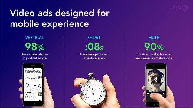
For a while now, video marketing has been all about 15- and 30-second mobile video ads. But toward the end of 2017, there was an initial rise in popularity among short-form video ads. I credit a lot of this to the growth of Snapchat’s video advertising options, which limit marketers to 10-second-long videos (if using Snap Ads). User acquisition pros also realized that it was more effective to run shorter mobile video ads on platforms like Fyber, Facebook, and Instagram to accommodate user attention spans.

Where 30-second video ads used to be the default recommendation, even Facebook now suggests that “mobile video works best when it’s 15 seconds or less.” Shorter video ads also means more time to create A/B test variants. It’s easier to test 4 different concepts in 4 separate 6-second video ads. Shorter ads also help keep your creatives more focused since you have less time for fluff. Short-form videos can even pay off on YouTube and certain ad networks where users are often allowed to skip advertisements after 5 seconds. I expect to see a lot more experimentation with short-form mobile video ads throughout 2018.

2. Deeper personalization

071817_PersonalizationIsNow-webinar.jpg

2018 could also be the year of personalization, especially with short-form video ads allowing for more quantity without sacrificing quality. With the improvement in machine learning and AI, user targeting is only getting better with time, and it’s already pretty damn good. It’s becoming a lot more feasible to produce video ads customized for different audiences. Most user acquisition teams are doing this to an extent already with device targeting (e.g. creating Android and iOS versions of the same ad) and ad localization for geo/language targeting.

While there are ways to keep users glued to your video ads, this new level of personalization could drive big wins in both click-through rate (CTR) and conversion rate (CVR). I won’t be surprised to see granular personalization become more popular in 2018 with mobile marketing teams producing unique ads for their varying user demographics.


3. User-generated content

User-Generated-Content-Where-Does-It-Fit-in-Your-Content-Marketing-Strategy_Main-Photo.jpg


User-generated content (UGC) is nothing new to the mobile industry. For evidence of this, look no further than Pocket Gems’s smash hit Episode. Last year, even more mobile studios breathed new life into UGC. I expect we’ll also see mobile advertising adapt to complement this growing trend. Community-created content comes with a certain level of authenticity, which tends to perform better with users who want to see gameplay anyway.

Smart UA teams will leverage their UGC to create unique ads that don’t feel like…well, ads. One of the best analogies I can offer is the growth of Minecraft, where arguably the majority of users came from watching what other users were creating. There’s no reason this concept can’t be applied to your mobile video ads, especially if your app or game embraces UGC.


4. Better influencer campaigns


Screen-Shot-2015-11-30-at-8.24.28-PM.png

If you’ve ever worked on influencer marketing campaigns, I imagine you’re rolling your eyes right now. But with 2017’s YouTube “Adpocalypse” and the recent changes in Patreon’s payment structure (which were later retracted after receiving a lot of negative feedback), I anticipate 2018 may see a renaissance in influencer marketing as marketers find new and interesting ways to collaborate with more influencers.

In fact, I know of a few studios who are already hiring in-house influencers, allowing them to be closer to the products, thus creating more genuine content. I’ve also spoken with several influencer campaign managers who are experimenting with new ways to drive engagement in more meaningful ways, including live video and unique incentives. Other experts agree with this prediction, pointing out the importance of improving influencer campaigns with real-time data, long-term campaigns, and brand ambassadors.


5. VR is far from dead

Xiaomi-VR.jpg

While it’s easy to call VR a passing fad, that couldn’t be further from the truth. While still in its infancy, VR headset sales broke 1 million in Q3 2017 alone, with 14% of those sales contributed to mobile headsets like Samsung’s Gear VR and Google’s Daydream. In June 2017, Google started experimenting with VR advertising, so it’s reasonable to speculate more activity in VR advertising over 2018, especially if the user adoption rates keep climbing.

Considering the growing number of compatible mobile devices with Samsung’s and Google’s VR headsets, as well as the non-mobile VR space, it’s safe to predict those numbers will only go higher. With VR’s inherently video-friendly medium, I expect most (if not all) VR advertising will be video based, which will undoubtedly usher in an exciting new era for video advertisers.

Friday 09.28.18
Posted by Vlad Bahatyrevich
 

The Beginner's Guide to After Effects

55f49930341405.5734dc2394d6a.gif

After Effects, which is available with Adobe's Creative Cloud, is at the core at the majority of motion graphics, VFX and 3D artists and animators' workflows, because it offers a range of tools which can be adapted for a huge range of tasks from simple lower-thirds text and titles to full 3D stereo compositing for feature films.

  • Get Adobe Creative Cloud

In many ways, After Effects is Photoshop but for moving footage, and, just like Photoshop, it can seem intimidating to new users and feel like your only ever using 10 per cent of the full power of the application. 

But it's worth persevering. Because of the effective reduction in cost of After Effects (thanks to its inclusion in the Creative Cloud suite), it can offer a range of tools that can augment Photoshop and Illustrator. And as because it can import both PSD and AI files natively, your workflow should stay the same.

Once I'd got over the initial 'hump' of learning where all the tools were, After Effects was one of the most creative applications I have ever used. Here are some of my top tips to help get the most out of this 'Jack of all Digital Trades'…

Projects and Compositions

rQa5p.png

Keeping the ‘Project' palette organized is one of the most important things to learn.

One of the initial challenges with After Effects is understanding the difference between Projects and Compositions. In After Effects there is only ever one project open, which acts as a container for all of the compositions and other files needed which are all situated and accessed in the Project Panel. When saving an After Effects file, this is the Project file, which saves all the information regarding all the compositions contained within the project.

Get started

6.jpg

To make a new composition, use the Composition >New Composition menu item, which gives a panel for entering the settings required. If there's a file (or other composition) that could be used as a template for a new composition drag the chosen project element in the project window onto the small filmstrip icon at the bottom of the project panel.

This will make a new composition with the original elements settings and place the chosen element in the top layer of the new composition.
If external files, for example still images, animated or video footage have been imported, After Effects only references those files locations and does not save them with the project.

This can be problematic if sharing work with other designers or clients. Thankfully After Effects has an excellent File Manager in 'File>Dependencies Menu' which has a wide range of options to allow the moving and organization of the source files with the master After Effects project file.

Layers

After-Effects.jpg

Using an image as a Luma matte with the ‘TrackMat' dropdown in the layers palette is one of the many ‘hidden' features of After Effects layers.

Getting to grips with layers and the timeline in After Effects is the key to unlocking the true power of After Effects. This is due to the fact that the majority of the animation controls are situated here such as keyframes, but also that there is a huge amount of 'hidden' functionality which is not immediately apparent.

Layers can be parented to one another via the small 'pickwick' or dropdown, which can be great for animating. Layers can be hidden from the timeline when not required via the 'shy' button. Animation curves are also available here for when fine control of animation falloffs are required.

One of the most useful functions of layers is using footage or an object in one layer to act as a matte (or mask) for the layer beneath it. Place the layer to be used as a matte immediately above the content layer. On the content layer use the 'TrkMat' dropdown to choose how the mask layers should interact with the footage layer, either via transparency (Alpha) or image brightness (Luma).

Expressions

Scales_Expressions.png

Expressions can be used to animate without keyframes as well as create text on the fly.

Another great feature which lives within a layer is expressions. Expressions are a simple scripting language which allows much more granular control of parenting a layers attributes to another in the same or different composition.

That is just scratching the surface of what is possible with expressions. Expressions can be used to control practically everything within After Effects from inputting text through to creating animation cycles which require no keyframes.

Expression attributes can be easily added once they have been enabled to a layer from a dropdown, and there is a wealth of resources and existing expressions online which can help both when deadlines are tight and as the syntax of After Effects expressions is reasonably clear, help in learning how to create your own expressions.

7.jpg

Animated typography

After Effects can allow you to animate text in seconds in 2D and 3D

Creating kinetic typography with After Effects is great fun, with a powerful selection of bespoke animation tools when using the dedicated text object layer, it is easy to create a wide range of animations both in 2D and 3D because text in After Effects is able to follow 3D paths.

Do not worry if the effects controls seem counterintuitive, After Effects already comes with a wide range of text animations which can be applied by dragging them from the handy 'Effects and Presets' palette. To access the text animation effects go to the *Animation Presets>Text Menu and there is a huge range of animations to get going, which again be easily deconstructed to make your own.

animated-vectors-v1.jpg

Shape layers

Shape Layers offer a huge array of vector animation possibilities, from replicating shapes to animating path growth

Shape Layers in After Effects allow the creation of vector shapes, and with After Effects bezier tool selectors is 'almost' a mini Illustrator. To add a shape layer, either use the 'Layer>New Shape Layer' menu item, or press the rectangle shape in the tool bar to choose from a range of starter shapes. Make sure that there are no existing layers selected in the composition, as that will create a mask shape on the chosen layer rather than a shape layer.

Once a shape layer is created, it can be animated as if it was any other layer, but the real fun comes when you start adding the shape layer specific animation tools which are available when the shape layer are expanded in the timeline.

Among the options available are duplicating the path, jittering the stroke, puckering the line just as in Adobe Illustrator, and most importantly 'Trim the path' which allows the animation of the end and beginning of any shape or path. Multiple animations can be applied to a shape to create a unique look and animation really quickly.

Working in 3D

AE_C4D_Render_01.png

Using different layouts for specific tasks, such as sculpting in Cinema 4D studio quickly sppeds up your workflow. You can also create your own custom layouts easily

For a long time After Effects was a 2.5D application, which meant that it could manipulate flat layers in 3D space, but in the last couple of versions, it is possible to create true 3D objects based on splines or Shape Layers in After Effects and light it interactively using the After Effects lighting system.

3D in After Effects was given a major boost in the latest After Effects CC release with the inclusion of the Cineware plugin which creates true 3D files via the bundled Cinema 4D Lite application which comes bundled with After Effects, which creates 3D objects which can then be interacted with in the After Effects timeline.

There are a range of tracking tools such as the inbuilt 3D tracker and the bundled planar tracker mocha AE which can be used to pull 3D data from video files to enable the placing of 3D embossed text and 3D objects into video footage with ease. Finally After Effects also has a full stereo workflow to make your 3D, er… 3D!

Rotoscoping

roto.jpg

With a little bit of practise the Roto and Refine brushes can revolutionise rotoscoping tasks such as extracting element from video footage

As well as motion graphics tools, such as the typography and shape layers. After Effects is also a visual effects powerhouse. One of the most important new tools to arrive in After Effects when creating VFX is the RotoBrush. Rotoscoping is the process of extracting elements from video footage or the cleaning footage of unwanted elements.

After Effects' Rotobrush speeds up what was time intensive process of masking, by allow the user to paint the area to be removed on one frame and then After Effects can extrapolate that through the rest of the footage. The 'Refine Edge' tool was added to the Rotobrush toolset in After Effects CC which has greatly improved the performance and accuracy of the RotoBrush, many times handling shots which will make you believe in magic, it chomps through tasks such as the extraction of wispy hair from a video plate in minutes rather than hours.


Plugins

Tsuite_pullout_Asquare_v16_01-16x9.jpg

After Effects plugins like Magic Bullet Looks can change the way you work for the better

One of the great things about Adobe switching to a subscription model is that when new features are ready they are added to applications rather than waiting for the next big point release. However there are still times when After Effects won't be able to do what is required for the job.

Instead of looking for another application, check out the huge range of After Effects plugins to see if you can find one that does what's needed. While it can be irritating paying for plugins, the functionality that they can offer can pay for itself. After Effects has a fantastic array of plugins for creating beautiful 3D particle systems such as the Form, Particular and Plexus.

A plugin like Element 3D from VideoCoPilot can import and create photoreal 3D models allowing you to animate them directly in After Effects without needing to roundtrip with Cineware or other 3D Application. Then there are the colour tools such as Magic Bullet Looks which can change the way footage looks using a wonderfully intuitive interface. The list of plugins and what they can add to After Effects is practically endless.

One of the best places to start looking for plugins for After Effects is aescripts.com. This site collates a wide range of scripts from around the world, and the creators also write their own. Gems like BGrenderer which for $35 allows the render of After Effects composition more quickly than using the normal render dialogue while allowing you to still work in After Effects are more than worthy of the asking price!

Conclusion

giphy.gif

Hopefully this quick guide has shown the capabilities of After Effects that can add to your design and video production workflow. The great thing about using After Effects is that once you dive in, it is one of the most 'fun' applications to work with. Very rarely is there an animation or VFX challenge which After Effects with its huge array of core tools and plugins can not handle.

Thursday 09.27.18
Posted by Vlad Bahatyrevich
 

Where to Find Royalty Free Images to Use in Your Template

Creative_Commons_logo.gif

Using strong, high-quality imagery can help you create a professional video that delivers a strong message. Finding the right image, however, can be challenging. You can’t just do a Google image search and use whatever comes up, that’s a quick way to get sued!

You need to make sure that all the images you use are royalty free. Royalty free doesn’t necessarily mean there’s no cost to you. For paid images, it usually means you pay a licensing fee as a one-off cost, and can use it as many times as you want without giving attribution to the photographer or stock photo site.

Free images are typically licensed with Creative Commons copyright licenses, but not all of these allow you to use them for commercial purposes, and most require that you give attribution to the creator. You’ll want to ensure that the image you intend to use has the right license and that you follow the conditions of the license. Public domain images, however, are free for commercial use without attribution.

There are lots of places online to find copyright free images, but they can vary widely in price, quality, and ease of finding what you’re looking for. Below, we’ll break down the best places to find premium, cheap, and free stock photos.

Best places to find completely free images for commercial use.

The stock photo databases below offer images licensed with a Creative Commons Zero (CC0) license, which means they are completely free to use for any legal purpose without attribution to the creator.

Pixabay

1.jpg

With over 1.1 million free stock photos, illustrations, and vector images, Pixabay is the largest database of free images for commercial use. Though the database of images is quite large, the quality can be a bit hit or miss, with some images more snapshot-quality than professional photography.

Pexels

2.jpg

Pexels offer more than 30,000 royalty free stock photos, with thousands more added every month. The Pexels database is curated from a community of photographers and other stock photo sites, including Pixabay.

Unsplash

3.jpg

Unsplash has a huge library of 200,000 free, high-resolution photos available to use for whatever you want. Unsplash’s collection veers toward artsy portraits and beautiful scenery, where Pexels and Pixabay’s images tend to be more like traditional stock photos. It’s a popular choice for high-quality images for blogs, when a more artistic image is desired.

Burst

4.jpg

Burst is a new free stock photo site powered by Shopify. The collection isn’t huge, but it’s nicely categorized into themed collections, and the images are specifically geared toward business and marketing purposes.

Gratisography

5.jpg

If you’re looking for an image that’s a little more whimsical or surreal, Gratisography is the place to go. The high-resolution images are free to use for any purpose, and are definitely more unique than anything you’ll find on other stock photo sites.

Other Free Stock Photo Sites

Here are a few more places to look for free stock photos. Since these collections are smaller, they may not have exactly what you’re looking for, but you may also find an image that hasn’t been overused by other creators.

StockSnap.io — With hundreds of new images added each week, this growing collection of stock photos is curated from user-submitted photos.

Picjumbo — A smaller collection of around 1500 free images with a variety of themes. These are created by a single artist, rather than a community of users, but there’s is still a good deal of variation.

FoodiesFeed — If you need food images, this collection of 800+ free culinary-themed images may have just what you need.

Death to Stock Photos — Sign up for this “anti-stock photo” newsletter to receive unique photo packs that aren’t your typical stock photo. There’s no searchable database though, unless you sign up for premium.

Flickr — Lastly, you can search on Flickr for images posted under Creative Commons CC0 (note that not all images on Flickr have this license.) However, because it’s entirely user-submitted, these copyright free images are not always professional quality so it can be difficult to find exactly what you’re looking for.

Wednesday 09.26.18
Posted by Vlad Bahatyrevich
 

How to Create Report Design That Reflects Your Brand Identity

How-to-Create-On-Brand-Report-Design.png

Any piece of communication you create and share is a part of your brand story. Whether it’s an infographic or your employee orientation handbook, meant for internal reference or external viewing, it’s still a representation of your brand. Which is why it’s important to create consistency in all your content—even in things like your report design.

Plenty of marketers focus on making on-brand content marketing, but reports deserve the same treatment. The look, the feel, the voice—it all affects how your content is consumed and how your brand is perceived. So, before you send your next annual report to the printer or send a monthly report to a client, give it a pass to make sure it’s truly on brand. And to make it even easier, use our handy checklist.

The Checklist for On-Brand Report Design

Your brand is communicated through both copy and design. Here’s how to make sure both are on point.

In Your Report Copy…

Remember: A good report follows a structured narrative that leads the reader through the content intuitively. Consider:

  • Brand voice: Your brand’s personality is communicated through the language and words. Give content a quick pass to see if any words or messaging seems off, and keep an eye out for specific words you should and should not use. (For example, we don’t like to use the word “audience” in our content because it sounds like impersonal marketing speak.)

  • Tone: Your report should always reflect your brand’s tone—with sensitivity to the subject at hand. Is your brand tone authoritative? Enthusiastic? Friendly? Helpful? If you can’t easily identify it, amp it up.

  • The takeaway: After reading the report, is the reader meant to draw their own conclusions or come away with a specific takeaway? If your report is meant to garner support for your brand in some way, make sure that underlying story is clear and reinforced.

  • The reader: Reports can sometimes contain data or other dense information for readers to synthesize. While visualization can help with this, it’s important to talk to your reader at their level, use terms they’re familiar with, and speak at their knowledge level.

Example: For the 2014 National Realtors Association annual report, the trade association crafted their report around the theme “You are NAR.” Imagery and language supported the theme, speaking directly to their members in a friendly and celebratory tone.

Project-Images_7.png

In Your Report Design…

Good report design follows your brand’s visual language (a set of guidelines that detail how to apply design elements in the best way). Still, sometimes off-brand elements can make it in, especially if you’re working with an outside designer or content agency. To avoid this, make sure your visual language is up-to-date and easy for your designers to access.

For your report design, make sure those guidelines are interpreted and applied correctly—and that they follow design best practices.

  • Colors: Are all color codes correct? Are they used effectively? (Tip: Use 1 or 2 dominant colors, plus 2-3 accent colors.)

  • Logo use: Is the logo rendering correctly and used sparingly? Remember: You don’t want to overbrand your content.

  • Fonts and typography: Are headers, subheads, and callouts easy to identify? Are there any spacing issues to address? Tip: Don’t use more than 2 typefaces.

  • Hierarchy: Is there an intuitive, logical flow overall—and is there an easy-to-follow hierarchy on the page?

  • Photography and illustration: Are visuals on theme and high res?

  • Iconography: Are icons easy to understand and used effectively? You don’t want the reader to have to work to understand them—and you don’t want to unnecessarily clutter your design with them.

  • Data visualization: Are visualizations designed according to your guidelines, as well as best practices? Try these 25 tips to improve your data visualizations.

  • Interactive elements: If you are working with an interactive report, does everything work? Animations? Visualizations? You don’t want anything lagging or distracting the viewer.   

Example: The 2015 Pacific Life Annual Report used an oceanic theme that beautifully incorporated the brand’s visual language elements, from headers and data visualization to photography and typography.  

How-to-Create-On-Brand-Report-Design.jpg

How to Ensure Your Report Design Is Always On Brand

One of the reasons people struggle to create a cohesive brand is because they don’t have enough time to approve everything that goes out the door. That’s understandable, but you can make your life easier with a simple trick.

Ask your designers to create report design templates (if you don’t have them already). This will reduce production time and help you ensure that your visuals are on point. You can follow these same steps to create templates that are easy to mix and match.

For more tips and inspiration on creating stronger reports:

  • Follow these 7 report design and storytelling tips.

  • Learn how to use data visualization to make your report design memorable.

  • Try our top 10 tips to create a beautiful, attention-grabbing report design.

  • Get inspired by these 40 examples of beautiful annual report design.

  • Find out how these 7 brands are turning their reports into unique content marketing.

Sunday 09.23.18
Posted by Vlad Bahatyrevich
 

The Future of Apps: What to Expect in 2018

40_best_apps_lead.png

In 2018, both the Apple App Store and the Android app market will be celebrating their 10-year anniversaries. Since they launched, apps have taken over the world in a huge way, transforming industries and evolving from smartphone-only experiences to platforms controlling homes, TVs and even cars. The momentum for apps has been steadily growing, and this is only the beginning.

By the end of this year more than 40 countries will generate over $100 million consumer spend across both iOS and Google Play app stores. Growth is massive already, but the decade ahead will be even bigger as technology advances, markets mature and infrastructure is built for the next generation of networks and devices.

In 2018, the app economy will enter a new era, predicted to surpass $110 billion in app store spend and characterized by emerging markets and innovation. As we look forward, here are some of the trends we expect to see at the forefront of the app industry.

augmented-reality-ar-apps-iphone-x-hero.jpg

The New Reality Will Be Augmented

Pokemon GO and Snapchat introduced augmented reality (AR) to the mainstream, but so far we’ve only seen a glimpse of AR’s full potential. As we look to the year ahead, anticipation is building for Niantic’s launch of Harry Potter: Wizards Unite, which will take AR in gaming to new heights. And major companies are identifying business use cases to take AR a step beyond the existing consumer applications. For instance, retailers like Ikea, Nordstrom and Pottery Barn have AR-driven app features to help shoppers visualize how a product will fit in their home. Additionally, Strava and BMW have also enhanced their mobile apps with AR features to create more immersive, visual experiences for their users — whether for tracking a run or buying a car.

The tech titans Apple and Google announced AR initiatives at their 2017 developer conferences, and we expect to see the fruits of these efforts become more defined in 2018. Glance-centric use cases in particular will rise from app publishers looking to enter this market as early AR adopters. Consumer interest in these apps is already spiking, and we expect the excitement, and downloads, to climb as further AR applications continue to emerge.


Nov29-1_720x360.jpg

Apps for the Internet of Everything

The past decade has seen tremendous growth in mobile- and touch-centric apps and their varied use cases. Looking ahead, a hallmark of the coming decade will be the extension of apps into everything — leveraging new UIs, especially voice, for interaction. Amazon drove the charge towards a voice-controlled future with its Echo device, first launched in 2014 and this past holiday season we saw the Alexa app drive more than 2 million downloads on Christmas Day alone. Today there are several voice assistants on the market, and thousands of apps have been developed to help consumers take advantage of their many use cases.

Existing voice agents are being reinvented, and new entrants are building their own tools, to capitalize on the interest and opportunities these devices present, especially for entertainment and the home. Cable providers have integrated voice recognition into TV remotes to help consumers more easily find the shows and channels they seek. Philips has developed smart light bulbs that respond, via a mobile app integration, to voice commands that dim, brighten and turn on and off. The coming years will see not only higher adoption rates, but also deeper integration of voice command features into touch-based apps for a world where the internet and apps control just about everything.

us-iphone-revenue-per-device-2020.png

Global Consumer Spend to Soar

As we pass the ten-year app store anniversaries, don’t expect a slowdown in their revenue-driving capacity. The iOS and Google Play stores reach record levels for consumer spend — nearly $17 billion in Q3 2017 alone. Continued growth in mobile users, time spent in apps approaching 3 hours per day, subscription revenue and in-app purchases will keep apps accelerating and boosting bottom lines. In fact, app monetization will reach new heights globally as China outpaces the world in consumer spend growth in 2018 — building on its already established ranking as the top market for iOS App Store consumer spend.

On Android devices, emerging markets Brazil and India saw significant growth in time spent in mobile apps this past year, and they’re nowhere near done yet. Both of these countries, as well as major markets across southeast Asia still have large populations without smartphones today. As this shifts and mobile devices penetrate these markets more deeply, we expect to see further increase in time and money spent in mobile apps. And apps’ monetization potential isn’t limited to consumer spend; in-app advertising and expanding mobile commerce mean the growth opportunities are limitless. Only time will tell what heights the next decade will bring.

The years ahead may hold much uncertainty for the world, but for the app industry there’s a clear indication of growth. We’re looking forward to more innovation, new use cases and global expansion in key markets as the app industry continues its domination path.

58aeee9d549057dc008b6520-750.png
Thursday 09.20.18
Posted by Vlad Bahatyrevich
 

5 Reasons Motion Graphics Help You Connect With People

We’re big fans of motion graphics. It’s not because they’re pretty or feature cool animations. It’s because they’re a unique way to communicate. They blend the best of visual communication with motion storytelling and audio to create an engaging piece of content that helps brands share their story, reach people in different ways, and present their message in a compelling package. That’s why we think they belong in every content marketers’ mix.

Motion-Graphics-S.jpg

OK, But What Are Motion Graphics?

There can be some confusion about this format. Are they videos? Are they cartoons? Basically, a motion graphic is our industry’s term for animated video. They may be 2D animations, 3D renderings, or GIFS. They may include audio, voiceover, or sound effects. They may also incorporate technology like 360-degree video, Virtual Reality, or Augmented Reality. But you’re probably most familiar with them as animated videos.

Here’s an example of motion graphics animation explain how Intuit use their Google Calendar for Quickbooks app:

How Do Motion Graphics Help Brands?

A healthy content strategy includes a mix of content, including articles, infographics, e-books, and more. But there’s no denying people are more and more interested in video. More media platforms support video, and people are coming to prefer—if not expect—information to be delivered in that package. (According to a 2014 Levels Beyond survey, 40% of consumers said they would rather watch a brand video than read the same information.)

”Consumers consider brand video the preferred way for marketers to share information as it creates true engagement and builds brand loyalty.” - Levels Beyond Survey, 2014

For marketers, this is an exciting opportunity to explore motion graphics. No matter your communication needs, there are plenty of applications for motion graphics at all touchpoints.

  • Traditional ads: Online or television commercials (national or regional).

  • Promo videos: Viral videos, case studies, testimonials, product reviews—anything that publicizes your work or brand. May be editorial or advertorial.

  • Explainer videos: Introductions, overviews, processes, tutorials for products, services, or ideas.

  • Culture marketing videos: Content to showcase your brand, people, or causes.

  • Social videos: Content to engage followers on social—Facebook, Instagram, Snapchat, YouTube, etc. May be educational or pure entertainment. (According to Tubular Insights, 46% of consumers said they’ve made a purchase as a result of watching a brand video on social media.)

  • Sales collateral: Company info, product info, or anything that a sales team regularly communicates. (Turning that info into a motion graphic can save time and energy.)

The 5 Biggest Benefits of Motion Graphics

What makes motion graphics so special? It’s a mix of both what they do for the viewer and how they help you tell your brand story.

#1 They’re Emotionally Captivating

Beyond being attention-grabbing, motion graphics affect our emotions; it’s actually a biological response. Thanks to the phenomenon of emotional contagion, we immediately empathize with and mirror the emotions of the experiences we see depicted on a screen. (That’s why you experience physical fear in a horror movie or joy in a rom-com.)

When you are telling emotional stories, motion graphics give you many tools to help you communicate. Moody music, powerful voiceover, and stunning visuals can all work together to build an impactful story. (On that note, motion graphics can give you more control over how you tell a story than other video formats; live-action productions rely on things like actors, sets, weather, etc., which make it harder to control outcome. With motion, if it’s on the storyboard, you can do it.)

Here’s a great example depicting an emotionally captivating motion graphics piece:

#2 They Distill Information for Easy Comprehension

Visual communication is so effective because it targets the way your brain processes information. In fact, visual processing is nearly instant. (A 2014 MIT study found that you can process visual information in as little as 13 milliseconds.) That’s why many things are easier to understand if you can “see” them. Through visual storytelling, motion graphics help break down complex information, delivering the message simply and clearly. This is especially useful for:

  • Tutorials: Motion graphics are great any time you need to show, not just tell—especially great for explainer videos.

  • Processes: How does something work? What’s the process? Motion graphics are a great way to break it down.

  • Data visualization: Data that seems dense and impenetrable can be easily brought to life through visualization.

  • Abstract concepts: Motion graphics are a great tool to clarify, give context, or explain information.

Here’s another example with effective visual communication:

#3 They’re a passive experience

Tubular Insights reports that consumers spend around 6 hours per week watching video content on social media networks. It’s no surprise. We all remember why we were so happy when a substitute teacher put on a video in class; it meant we didn’t have to do anything. Motion graphics are the same. Viewers don’t have to read, explore data, or exert much mental energy. They just have to press play and sit back. (Remember that the majority of consumers would rather watch than read.) When you need to deliver a contained message, doing so with motion graphics will make it easier for viewers to consume it. Check this motion graphics piece on privatizing space by Vice News:

#4 They Can Be Repurposed

Now that social and media platforms support video, you can disseminate your motion graphics in many places and in many ways, helping extend the lifecycle of a campaign. You might break up a video to create content tailored for specific groups. You might add your motion graphic to a presentation or e-book. With evergreen topics or explainer videos, you have a piece of well-designed piece of communication that can serve you well for years.  

devices.jpg


#5 They’re Great When You’re Short on Time

Most motion graphics are 30 seconds to 3 minutes long, which is incredibly helpful when you need to make an impact ASAP. (This is especially useful on social. According to a 2015 Facebook study, even watching under 10 seconds of a video can help increase brand awareness and build purchase intent.) By combining audio and visuals, motion graphics make the most of humans’ information-processing abilities, letting you say more with less content. What might be explained in a 1,500-word article can be shown in a minute. A complicated process can be visually explained in 15 seconds. Their inherently visual nature also makes motion graphics useful if you are in an environment where you can’t rely on audio (e.g., a busy trade show floor).

Here’s another example by Google explaining the potential of its Chrome for Businesses in just :37 seconds:

Monday 09.17.18
Posted by Vlad Bahatyrevich
 

How to Use Templates in After Effects

Adobe After Effects is the industry standard for motion graphics and is responsible for the coolest animations you see online. Mastering this powerful tool, however, can be… time-consuming. Luckily, you don’t need to be an AE pro to create professional-level motion graphics for your biz, brand, or personal projects. All you need is a is beautiful, professionally-designed template. In this post, we’ll use a corporate presentation template to create a promo video for a music school. Here’s the final product:

Before You Begin

Before diving into AE, create a folder on your computer to house the assets that you plan to use, like images, video, and music. Here’s why: When you import files to AE, AE will continue to look for the files in the location from which you imported them. So, let’s say you’ve got your assets spread out all over your desktop and then mid-project you decide to pop them into a folder. AE will not know where you’ve moved the files. It will prompt you to relink them—not the end of the world, but you can avoid the extra work if you start on the right (organized!) foot.

Missing-File.png

Opening the File

Upon opening the document, you may get an alert that the program needs to convert the file to your version of After Effects. Go ahead and convert the file; this typically means that the creator made the template on a PC and you’re using a Mac, or vice-versa. The second alert that you may get is that the template uses fonts that are not installed on your computer. If you want to use those exact fonts, just note the names and you can download and install them separately. Alternatively, you may choose to use similar fonts or others that fit your brand guidelines.

Meet the Project Panel

Once the document is open, take a look around. On the left side of your Project panel, you’ll see three types of items: Folders, Compositions, and Assets. Compositions—or “comps”—are containers that hold layers of video, audio, images, text, shapes, and more. Comps each have their own timeline and can be nested within one another. In the Project panel, you will see comps represented as icons with multi-colored shapes. Assets are represented as icons like you would see on your desktop; they vary depending on the file type. Folders, represented by a folder icon (easy!), are there to organize the whole thing as the Project panel can get a little crowded.

Project-Panel-2.png

Replacing Files

You’ll need to open up some folders and look around the Project panel to locate the parts that you want to edit. Typically, there are placeholders that you will need to replace with photos or videos. To replace an asset, simply right-click on it and choose “replace footage.” In the example below, notice there are two items listed in the Project panel with the same name, “Place1.2.” The file we want to replace is simply a solid, represented by the color of the solid. The other item with the same name is a comp. A comp cannot be replaced with a file. In this example, the comp under the “Image Holders” folder is used for resizing and adjusting the image itself.

Project-Panel.png

The Main Comp

There will be one comp—called something like “Main”—that will hold the other comps, as well as master settings (such as colors) for the whole piece. Keep this comp open to watch your progress and edit the universal settings. To edit the colors of other design elements, use the Main Comp to locate the settings layer.

Delete What You Don’t Need

Once you’ve scoped out your document, delete any sections that you don’t plan to use. Keep in mind that you might only want one scene in a multi-scene file! Deleting excess elements will make it easier to see what you’re working with. In this example, we cut out about half of the project.

Main-Settings.png

Editing Text

You may need to change the text fonts and colors to fit your brand, or even to make the text readable against the background. You can find the text comps in the Project panel and use the text tool to type. Use the text controls to adjust the color, size, and font.

Make it Your Own with Music

When we updated the imagery in the template, the included music didn’t really fit anymore. To make the project more cohesive, we grabbed a rock song from our audio library. The rock song fit the video much better than the original song, so don’t be afraid to experiment with audio!

Optimize Performances

If you don’t regularly use graphics-intensive applications, you may not have a computer with the recommended computing power for AE.  One easy trick to improve performance is to lower the playback resolution. While you work, you’ll watch the project playback in a lower quality, but it will still export at full quality. Find more tips for optimizing performance here.

Playback-Resolution.png

Export It

When you’re ready to export, navigate to File > Export > Add to Render Queue. This will open a tab in the timeline area where you can adjust your settings. If you need a smaller file, go to “Render Settings” to adjust the file quality. Under “Output Module” you can choose your format (Quicktime works well) and codec (H.264 will provide high-quality video at a lower file size). Where it says, “Output to,” click the default filename to rename your project and choose where you want to save the file.

There you have it! After Effects takes some getting used to, but working with a template is a great way to get to know the interface and tools while achieving great results. Just remember that not all templates are created with the same structure. Each template will take a little bit of exploring, but as you become more familiar with After Effects, you’ll feel more and more comfortable diving in.

Sunday 09.16.18
Posted by Vlad Bahatyrevich
 

5 Ways to Pick the Perfect App Font

87a6df5b2fd05ef401f648ec9d756d43.png

Text makes up 95 per cent of all digital communication. So no matter how carefully refined the user interface, icon design or choice of imagery within an app, your choice of font is absolutely crucial.

Typography has a direct impact on an app's user experience. If content is difficult to read, menu options are unclear, or the purpose of buttons and other calls to action are undecipherable, usability suffers enormously. And all these decisions must be made with a small screen in mind.

Read on for five top tips for picking the perfect font for your next app design...

01. Consider a native app font

AAmqEWRatGTEvnZRnKeXxK-650-80.jpg

Apple clearly saw the value in typography when it released its own sans-serif typeface, San Francisco, in 2015. Having used a mixture of Helvetica Neue, Lucida Grande, Myriad Pro and VAG Rounded for its various software, hardware and marketing needs until that point, SF ticks all the boxes for the tech giant.

As the default iOS font, San Francisco can be licensed to registered third-party developers to design apps for Apple's platforms. It's designed with utility and legibility in mind, and iOS automatically switches between Text and Display variants when the size drops below 10pt or above 20pt.

Three years earlier, Google had also released its own in-house designed app font for the Android platform: Roboto, which replaced previous system font Droid. Like San Francisco, it's a clean, modern sans-serif, but it has a few more personality quirks.

If a 'native' look is what you're going for, San Francisco or Roboto are a good bet – and the designers at Apple and Google have done the hard work in terms of ensuring they work on mobile.

02. Choose a font to suit the content

Ns5EvhqiNQsiqSH2Sekb6a-650-80.jpg

Both San Francisco and Roboto are clean sans-serif designs, which tends to be the default choice for most app designers: sans-serifs are neutral and safe, and great for legibility on buttons, menus and headlines.

If your app contains large amounts of long-form content, however, a serif may well be a better choice. Medium, iBooks, and newspaper apps such as Bloomberg or The New York Times all use serif fonts, for instance.

Apps such as these must cater to a wide variety of ages and preferences within their readership. If your app features large bodies of text, it may be worth building in some level of customization of both font and size to cater to particular user needs.


03. Use size and weight to create hierarchy 

SNaeNzkgMBAdVXtyS6E3xg-650-80.jpg

Apple advises a minimum of 11pt text to maintain legibility on the iPhone, iPad and Apple Watch, although try to avoid pushing the limits. The ideal value is more like 15-19pt, so allow plenty of space and avoid over-cluttering the interface.

San Francisco, Roboto and popular app design alternatives such as Open Sans, Proxima Nova and Museo Sans come in a range of useful weights, so make full use of them for emphasis and hierarchy. You don't have much space to work with, and bringing a key element up a weight or two can work wonders to draw attention.

As a rule of thumb, Regular weights are best for the minimum 11-19pt range, Medium weights work well from 20-34pt, and anything above that – usually main headlines – works well in Bold. Light and Ultralight weights are best saved for very large type, as legibility will suffer otherwise.

Consider line-length as well. On average, a website will have 60–75 characters per line, whereas apps are much narrower: you're looking at more like 35–50. 

If lines are too long, they become unwieldy and users can lose track of the information; too short, and reading becomes unnatural. In practice, if you meet the font size guidelines you should avoid these problems.

04. Add a twist of personality

atRh9PcU4dafjZfRonkxUA-650-80.jpg

When it comes to very pared-back, minimalist, functional interfaces there aren't so many tools at your disposal to add character to your app design. Flat design is all about colour, simple shapes – and typography.

Accordingly, if type is one of the most prominent aspects of an otherwise brutally simple user interface, a display font that has some subtle, but unique quirks is worth considering. Commonly used, neutral typefaces are effective but you could run the risk of your app losing its identity.

Typefaces that have flourishes or particular design features on certain characters are worth a look. Browse Google Fonts for free options such as Raleway or Quicksand, or license a more complex and versatile typeface such as Klinic Slab.


05. Leave plenty of white space

DSQjmRqYA5R767LRtVQKLj-650-80.jpg

One of the most important rules in app design is to avoid clutter at all costs, and this inevitably has a knock-on effect on your font choices, as well as how you apply them in the design process.

Mobile screens don't give you much space to work with, but you need to leave as much of it free as possible and respect the breathing space between elements. Too much text, and too many options to choose from, adds nothing but confusion and is not a satisfying user experience.

Likewise, leading between lines and paragraphs needs to be sufficient. Crushing this down to fit too much content into a single screen is an all-too-common mistake that will frustrate users who are used to apps that make their lives simpler and easier.

When the 'white space' rule is combined with the minimum size guidelines for text, the outcome is clear: you need to cut it back, not squeeze it in.


Friday 09.14.18
Posted by Vlad Bahatyrevich
 

Apple Announces iPhone XS, iPhone XR, and MAX.

x.jpg

The wait for Apple's next-generation smartphone is finally over – here's everything you need to know about the new iPhone XS and iPhone XR.

The wait for the new iPhone XS is finally over. Under the watchful eyes of the world, Apple CEO Tim Cook has just unveiled the company's next-generation smartphone – named the iPhone XS; not the iPhone 11 as many predicted – calling it "the most advanced iPhone we've ever created".

As expected, Apple pulled not one, but three models out the bag: the iPhone XS, iPhone XS Max and the iPhone XR.

So when can we expect the new iPhones to ship? What new features do they have? Will they become one of the best smartphones for creatives in 2018 ? And how much do they cost? 

Here's everything we know so far about the new iPhone XS, iPhone XS Max and iPhone XR...

xr.jpg

iPhone XS, XS Max and XR release date

The iPhone XS and iPhone XS Max will be available for pre-order from Friday 14 September 14, and in stores from Friday 21 September. Meanwhile, the iPhone XR will be available to pre-order from Friday 19 October – and in stores from Friday 26 October.

iPhone XS, XS Max and XR price

Ok, so what's the damage? The iPhone XR starts at $749, the iPhone XS at $999 and the iPhone XS Max at $1,099.

This is Apple, so these new iPhones were never going to be cheap. First impressions suggests the prices are a fair reflection of what's on offer here, but only time will tell if the new iPhone XS, XS Max and iPhone XR are worth their price tags. 

grid.jpg

iPhone XS and iPhone XR designs

The iPhone XS boasts a 5.8-inch OLED display, with Dolby Vision and HDR 10. It's made of stainless steel, has a new gold finish (on the front and glass) and Phil Schiller is calling it the most 'beautiful iPhone we've ever made'. It's also kitted out with more, new glass, which Schiller comments is 'the most durable ever in a smartphone'. 

Apple's iPhone XS is available in gold, silver and space grey, it's also IP68, so it's up there with the most water- and dust-resistant phones out there. The iPhone XS also introduces Face ID, meaning you can unlock your phone simply by picking it up and looking at it. It has "the most secure facial authentication ever in a smartphone," Schiller adds.

Exciting developments have happened with the camera too, with Apple introducing bokeh adjustments, thanks to the new image processing capabilities of the A12 chip.

The iPhone XR is the one model out of the three with an LCD display, unlike the OLED on the iPhone Xs and XS Max. 

It's made from 7000 series aluminum, more durable glass, and comes in a variety of new colors - white, black and blue, coral, yellow and red. The IP is not quite up to it's siblings, coming in 67, rather than IP68. And there's no home button, in keeping with the iPhone XS models, you unlock this model using Face ID.  

iphone-xs-pricing.jpg

For more information on all the new iPhone XS and iPhone XR features, head over to the Apple website. 


Thursday 09.13.18
Posted by Vlad Bahatyrevich
 

How to Create a Scribble Animation in After Effects

scribble-animation.jpg

So you think frame-by-frame animation is just too tedious for your film or video project? In this tutorial, we invite you to think again.

Many people think animating frame by frame is tedious and time-consuming, but it doesn’t have to be. The animated scribble technique is a perfect example of an easy way to create dynamic, handmade graphic elements. You’ve seen this effect in a lot of popular music videos over the last few years, including videos by Justin Bieber and Bruno Mars. Let’s take a closer look at how, in just a few simple steps, you can add eye-catching graphics to your videos.

Step 1: Prepare the Workspace

First, I need to set up my workspace. For this tutorial, I’m going to add some cartoonish flames that will come off the back of a race car. I’ll add the flames using the Brush tool, which you can find in the Tools panel or by using the Cmd (Mac) or Ctrl (PC) + B keyboard shortcut. The brush tool only works on the Layer panel — you can’t paint directly on the Composition panel. To open up my clip in the Layer panel, I’ll simply double-click the layer. Next, I’ll set up my brush.

Step 2: Prepare Your Brush

setup.jpg

As soon as you select the Brush tool, both the Paint and Brushes panels will become visible. Both panels offer a variety of options. The Paint panel allows you to change the opacity, flow, color, diameter, blend mode, channels, and duration. Clicking on the diameter button will bring you directly to the Brushes panel, where you can specify the diameter, angle, roundness, hardness, and spacing of your brush. You can even save your brush settings for future use.

The duration section of your Paint panel is one of the most important properties. Since this is a fast-moving clip, I want my flames to animate as quickly and frenetically as possible. For this reason, I’ll change the duration to “Single Frame.” If I want something a bit more subdued or clunky, I can change the Duration to “Custom” and then manually type in whatever frame rate I want. With both my workspace and brush ready, it’s time to scribble.

Step 3: Scribble

To start my scribble animation, I’ll bring my playhead to the first frame of my clip in the timeline. Using the Brush tool directly on the Layer panel, I’ll draw my flames on the first frame. Now it’s as simple as drawing the same flames for each frame. This particular clip is two seconds in length, shot at 25fps, so if I want flames throughout the entire clip, I will need to draw these same flames 50 times. If you want to create an animation that changes over time, it’s imperative to know the length of your clip so you can make subtle changes.

Knowing a few shortcuts will save you a lot of time and possible headaches when creating a frame-by-frame animation. To quickly navigate by individual frames inside After Effects, use the Page Up/Down keys. To resize the diameter of your brush, hold the Command (Mac) or Control (PC) key while you click and drag up or down.

Et voilà! The final animation.

final-animation-camtasia.gif


Tuesday 09.11.18
Posted by Vlad Bahatyrevich
 

5 Classic Fonts That Are Still On Trend (and Why)

LetterPress.jpg

There are thousands of typefaces out there, with more being released all the time. And with free fonts increasing in quality as well as quantity over recent years, the choice can be overwhelming for a designer.

If you can afford one, bespoke branded typefaces are also becoming increasingly popular. They help give brands a unique and distinctive personality that cuts through the noise, and conveys just the right tone of voice. If not, with the right amount of research and due diligence, you'll be able to find a typeface that suits your needs.

Despite the proliferation of typefaces on the market, however, a noble few have stood the test of time for decades, even centuries, to remain in-demand and relevant amid a sea of young pretenders.

So read on for our guide to five classic fonts that are still not showing their age, and why they could be right for your next project... 

#1. Futura

GzbhYvkXwJn5sy4tiYA7xU-650-80.jpg

Designed by Paul Renner and released in 1927, Futura can be seen as the grandfather of geometric sans-serifs – a flavour that is very much of the moment, following a wave of minimalist rebrands for the likes of Google, Mastercard and Spotify over the last decade. Futura itself has been used by a dizzying array of brands, including Alfa Romeo, Cisco, Domino's Pizza, Gillette and more.

Futura may have passed the grand old age of 90, but the iconic typeface's popularity has shown little sign of waning. With the spirit of the Bauhaus at heart, its design is based on simple geometric shapes – circles in particular – and exudes efficiency, purity and modernity to this day.

Its strokes are smooth, even and low-contrast, and the typeface as a whole – despite being progressive at the time, flying in the face of its grotesque counterparts – is timeless enough to be as relevant and usable in 2018 as it was in 1927.

#2. Caslon

aT3gSLU5ctqA42XSsbEEKX-650-80.jpg

Caslon makes the 91-year-old Futura look like a scrappy upstart. The name references William Caslon, an engraver of 'punches' – or master templates used to create the moulds for metal type – who lived from 1692–1766.

Although it comes in several different varieties and modern revivals, the typeface known as Caslon retains the organic, Old Style look and feel that he established in the 18th century. Like Futura, Caslon was ahead of its time – in London, at least – drawing on imported Dutch Baroque typefaces for inspiration.

Known for timeless elegance and effortless readability across large passages of text, the Caslon typeface family briefly fell out of popularity during the early 19th century, but recovered and now lends 300 years of gravitas to books, journal articles, encyclopedias and more.

#3. Garamond

gjgECgFPmHWsMxWEB6LDoZ-650-80.jpg

Another popular typeface for setting large passages of text in books, Garamond's heritage makes even the three-century-old Caslon look like a young whippersnapper. Like William Caslon, Parisian engraver Claude Garamond created punches for metal type, and first crafted the typeface that bears his name in the 16th century.

Its history can be traced back even further to 1495: the design follows the Old Style serif model originally established by Venetian printer Aldus Manutius, and designed by punchcutter Francesco Griffo. Both Garamond and Caslon maintain a natural, almost handwritten look and feel, but with a strong and timeless structure.

Many modern revivals of the typeface are inspired by the work of Garamond and his contemporaries in the early-modern French typography scene, such as Jean Jannon – and the family remains a viable choice for setting long-form text.

#4. Clarendon

qSnk7YTswLNaw5Y2AVaQNc-650-80.jpg

Slab serifs became particularly popular in British lettering, printing and signage during the early 19th century, so Clarendon was riding the wave of this trend on its release in 1845. Its original design was engraved by punch-cutter Benjamin Fox and credited to Robert Besley, a partner in the type foundry Thorowgood and Co.

Clarendon's popularity was such that its look and feel was widely imitated by other foundries – both at the time, and in the latter half of the 20th century – effectively spawning a sub-genre of type design in its own right.

Although the many different varieties of Clarendon have their own idiosyncrasies, the common factors are bold, solid letterforms with a relatively uniform stroke weight and bracketed, slightly tapered slab serifs. The typeface is popular to this day for display use, particularly for letterpress and woodblock printing work.

#5. Akzidenz Grotesk

2v4VxmV8ZY8z7fiUUB53dg-650-80.jpg

Love it or hate it, Helvetica has become the typeface that defined an entire generation of graphic designers that embraced mid-20th century Swiss design principles, otherwise known as the International Typographic Style. But Helvetica follows in the footsteps of Akzidenz Grotesk, the sans-serif family originally released by the Berlin-based Berthold Type Foundry.

Released in 1898, almost 50 years before Helvetica, Akzidenz Grotesk was part of a wave of overtly 'commercial' typefaces, intended for use in advertising and promotional materials to communicate, persuade and ultimately sell, rather than to decorate, or make reading easier.

Following the grotesque sans-serif tradition that Futura bucked against with its geometric approach, Akzidenz Grotesk became one of the leading exponents of late-19th century German typography. Simple, bold and neutral, and yet clearly distinct from its more widespread descendent Helvetica in characters such as 'Q', 'R' and 'J', it remains a classic sans-serif option 120 years on.

Monday 09.10.18
Posted by Vlad Bahatyrevich
 

Why Color Grading Should Be The Most Important Part of Your Post Processing Workflow

moodboard.jpg

Photographers and cinematographers often treat color grading as a trivialized aspect of their workflow. Something that they only worry about once the image is complete and with no greater attention than flipping through a series of filter presets in whichever their flavor of the month plugin happens to be at any given time. Instead, obsessive time and attention is paid to aspects such as cloning, dodging, burning, sharpening, liquefying, etc. Colorists in the film industry have known for years powerful color grading is critical to great filmmaking. Directors know this as well, which is why colorists often enjoy a massive, expensive, personal theater filled with an impressive array of tools to grade the latest mega blockbuster. 

Color Grading Defines a First Visual Impression

color.jpg

The majority of images are first seen as they are hurtling by in one of the endless scrolls that fill the social networks or in small thumbnails in galleries. In these situations perfect skin retouching or flawless exposure mean very little. The user simply is not perceiving the image in sufficient detail to even be aware of these sorts of things. Color grading however, stands out within the context of these formats. A beautifully color graded image that appeals to the viewer will compel them to stop and take a closer look. As a photographer you need to invest in learning how to grade your images in a way that they will grab attention in the span of a fleeting second among the chaotic noise of the digital age.

Color Grading Communicates The Mood of a Scene

deep_water_004_920.jpg

The communication of emotion and story through the lens is one of the most powerful tools a photographer has at their disposal. The grading of a well graded image can often augment the sense of story within a scene or even completely transform it. Without the grading an image may look flat, boring, or even disjointed. As a photographer becomes more proficient at grading he or she can leverage the power of color tone to influence emotional tone within a scene. Grading at this level can transform an unexciting frame into a moment of cinematic magic. 

Color Grading Builds a Style and Brand That Can be a Reflection of You

style.jpg

One of the most daunting challenges a photographer faces lies in building a unique style that can function as a brand for their work. Being able to create a visual style that viewers can recognize at a glance can be tremendously impactful in the growth of a photographer's career. Color grading plays a key role in that process. Clients will often come to you with a vast range of different photography projects. By defining a consistent color grading brand you are able to tie it all into a cohesive brand that not only reflects strongly on you but also builds a unique value that gives you something to sell that only you can offer.

How To Learn Color Grading

fast_rgb_three_way-780x380.jpg

This is a topic far beyond the scope of a simple article but the first step begins with casting aside those preset filters which are only serve to eliminate your creative vision in the color grading process by supplanting with the pre-determined creative vision of someone else. Before you consider investing in expensive plugins or applications to aid in color grading, spend time both learning color theory from a fine art point of view but also mastering simple color grading tools within common editors. Master colorists can make magic with only a simple curves tool (though that magic expands with the addition of more advanced tools). Begin thinking of color grading as a pre-visualized destination that you are aiming to reach before even beginning instead of a set of effects that you cycle through until you find one that looks ok. Great color grading is an explicit decision made by the photographer in order to meet the creative needs of the image they create. Be the sort of photographer who has the command of your color workflow rather than depending on stumbling upon the right filter to fit your image.

Conclusion

Color grading shouldn't be the last, barely cared about step in a complex workflow. Rather, it should be what drives the entire process. Regardless of which color grading tool you use, learn to master it in a way that maximizes the benefit of all of the above so that you can not only create the best possible images but also so that those images can connect to the world. 


Saturday 09.08.18
Posted by Vlad Bahatyrevich
 

10 Best Places to Find Free Fonts

Typography plays a big role in all types of designs, from product packaging to mobile apps and more. Today we’re taking a look at the best places to find free fonts, and take your design work to a new level.

But why is typography so important? Remember what happened at the Oscars 2017, when they gave the Best Picture award to the wrong film? Typography is to blame for that huge mess. As the creative strategist Benjamin Bannister points out, a simple change in the font and the designcould have helped avoid such an embarrassing incident.

oscars-mistake.jpg

This is why it’s important to have more options when designing a new project. Don’t settle for those overused default fonts. Be brave enough to try something new.

There are many places you can download a great looking font free of charge. We narrowed down the list to the top 10 websites for finding free fonts. Have a look.

Things To Consider Before Using Free Fonts

Before downloading and using these fonts, you need to be aware of the rules. Just because it’s free doesn’t mean you get to do whatever you want with these fonts. Most of the free fonts available on the web come with limited licenses, which means you can only use them with personal projects. However, there are sites that offer free fonts with commercial licenses. Just be sure to check the license for each font you download before using them with your projects.

Now, let’s get to the fun part: Free fonts!

1. Google Fonts

google-fonts-1.jpg

Google Fonts is one of the first sites that come up on top when searching for free fonts. This massive library features over 800 font families of various types, from sans serif to handwriting fonts, monospaced fonts, and more.

Google Fonts is widely used by web designers for faster and reliable font hosting. However, what most designers don’t know is that the fonts in Google Fonts are downloadable.

And the best part is all the fonts on Google Fonts are open-source. You can use them however you like.

2. Font Squirrel

font-squirrel.jpg

Font Squirrel is another reliable source for downloading free fonts of high quality. Most of the fonts featured in Font Squirrel also comes with commercial licenses. To avoid complications, the site makes it quite easier for users to check the licenses for each font before downloading them.

Font Squirrel also features a set of useful tools, including a Webfont Generator for creating your own web fonts and a cool Font Identifier, which helps you detect and find fonts based on images.

3. FontSpace

fontspace.jpg

This site features a massive collection of over 32,000 free fonts from over 2,100 designers. It’s also the home for more than 746,000 members who enjoy downloading free fonts.

You can use FontSpace to find plenty of free fonts to use for your personal projects. Simply hovering over a font while browsing is enough to find out the license for the font before downloading.

As a registered member, you can even create a personal favorites collection to easily access the best fonts and you can also contact the designers and even donate a few dollars if you like.

4. DaFont

dafont.jpg

DaFont is another popular platform for downloading free fonts. Most of the fonts in the site only support personal use, but there are plenty of fonts that come with commercial licenses as well.

One feature that makes DaFont stand out is its category system. Which lets you browse its fonts collection based on different themes like horror-themed fonts, video game fonts, valentine themed fonts, and much more. This offers designers an easy way to quickly find fonts for different types of projects.

5. Abstract Fonts

abstract-fonts.jpg

Abstract Fonts is a site that includes a curated collection of high-quality fonts. Most of the fonts available in the collection are free to use with both your personal and commercial projects. Just remember to check the license before downloading.

The website also features a fun category system for easier browsing. You can find fonts of different themes quite easily using these visualized categories.

6. Behance

behance-1-1.jpg

Behance is not exactly a platform for fonts. It’s like a social network where designers create portfolios of their best work and share designs with each other.

Designers share lots of free content on Behance, this includes free fonts as well. A quick search on the platform will bring up an endless list of fonts that are available to download at free of charge.

The best part of finding fonts on Behance is that the fonts you find on this platform usually feature unique designs and are less used than the fonts you find on other sites.

7. FontStruct

fontstruct.jpg

FontStruct is actually a font building tool that allows you to create your own fonts with geometrical shapes. The tool generates TrueType fonts using your designs that can be used with any app and for any kind of work you want.

The site also contains a gallery full of more than 43,000 fonts. Most of which are created by people just like you. All free to download. You can even clone the fonts created by other users to design your own unique fonts.

8. 1001 Fonts

1001.jpg

Don’t let that name fool you. 1001 Fonts includes more than 9,000 fonts. The site features an often updated collection of high-quality fonts. Many of the fonts are available for commercial use.

You can also browse the fonts in 1001 Fonts according to font style, size, and even font weight to quickly find fonts that match your design projects.

9. Urban Fonts

urban-fonts.jpg

Urban Fonts is another great place to find free fonts. The site features a more detailed page for each font that shows you all the characters of the font along with a tool to test drive the fonts before downloading.

You can also browse fonts according to different themes and create an account to save fonts for later as well.

10. FontSpring

fontspring-1.jpg

FontSpring is a premium fonts marketplace full of premium font families. But, the site also allows you to download a couple of free fonts from these font families to use them with your various projects. You can find detailed information about the font licenses in each font page.

More Ways To Get Free Fonts

You can also download premium fonts for free. Popular marketplaces, such as Creative Market and Envato Market give out free goodies every month to its registered users. It’s a great way to grab premium fonts without spending any money.

Friday 09.07.18
Posted by Vlad Bahatyrevich
 

How to Make 3D Text in After Effects Without Plugins

AE_3D_text_01.png

In this video tutorial, learn how you can quickly and easily create 3D titles in After Effects without any external plugins.

Understanding the built-in 3D engine in After Effects can be tricky if you’ve never worked with programs like Cinema4D, but this tutorial from the team over at Greyscalegorilla will guide you through the process of building your first 3D animation. They even include the project files, so open up After Effects, and follow along.

Where to Begin

3d-text-1.jpg

Create a text layer, and use whichever text, font, or number you want for your own title. Then, you’ll use Cinema4D Lite, which comes with After Effects CC, to create the 3D text. Go to Composition > Composition Settings, then hit 3D renderer, then click on “Cinema4D.” Next, click on the 3D layer icon within your text layer. To add depth to your layer, open up the text composition layer settings and open “Geometry Options” — then adjust the “Extrusion Depth.”

Playing with the Look

3d-text-2.jpg

Now for this next part, you’ll want to add lighting and reflection. Once you’ve done this, you need to add a camera to the project. Go to Layer > New > Camera > Two Node Camera, and then set the focal length to 30mm. Next, we’ll add bevels to the text, so select the 3D Text Layer and hit the “A” key twice. This will open up your 3D options. Play with the bevel depth as you see fit until you get the text to your liking.

Play with Your Text

3d-text-3.jpg

Once you’ve established the camera, the shape of the text, and the size, you can start playing with the specifics of the color and the lighting. Then you can animate the text. To do this, go to the camera layer and hit “P” for position and set it for however long you want it to move or bobble. In the example, they set it to two seconds, so add a position keyframe where you want it to stop. Bring up the Rotate tool by hitting “C” on your keyboard. Then move the text around until you find a good spot to start the animation.

Thursday 09.06.18
Posted by Vlad Bahatyrevich
 

Creating Screen Replacements in After Effects and Premiere

screen.jpg

Learn how you can create believable screen replacements in Adobe Premiere and Adobe After Effects with these simple techniques.

Say you’re recording a video for a client, and one of the shots includes a person holding a phone and browsing an app. You set it up, record it, and edit it. But wait — the company just redid the layout of the app, and they need the new design in their spot. What do you do now? Record the bit all over again?

Well, not when you’re using screen replacements. With tools like Adobe After Effects at your disposal, the fix is as simple as swapping out a single layer. Here’s how you do it.

Record Footage Correctly

When recording your footage for your screen replacement, here are a few things to keep in mind:

  • Record your screen with a “green screen” — download a green .jpg from the internet, and open it in your photo app. Make it full screen, and use that when recording the device. This will come in handy when keying out the screen in post, and it will allow you to move objects over the screen without disrupting the screen replacement.
  • Keep all 4 corners visible — When you get to the motion tracking portion of this tutorial, the screen replacement will be much easier if you have four corners to track in After Effects.

Working in After Effects

tracker.jpg

Create a new composition, and import all of your footage. The first thing that you want to do is track the motion of your device’s screen. Open up the tracker window, and click the Track Motion button. Make the motion source your video, and change the track type to Perspective Corner Pin. This will prompt a four-corner box to open up in your preview window. Match those pins to the corners of your device’s screen, and then click Analyze to enable AE’s motion tracking software.

solid2.jpg

Before analyzing the track, you’ll need something to place the tracking onto in lieu of your vertical video (for later placement). Create a solid object by right-clicking the timeline and selecting New > Solid. No need to resize this object — just make it a visible color such as bright red, and from the tracker tab, select that solid in the Edit Target options. Once targeted, the new solid layer will take the shape of the tracked screen.

keylight2.jpg

Now, it’s time to key out the green screen to allow movement over your device. Start by going to Effects > Keying > Keylight. Once you’ve applied this to your video clip, take the dropper in the effects tab and click the green screen. To make the keying process a bit clearer, change your view settings to Alpha Channel so the color difference is more apparent. Toy with the settings until you get a clear distinction between your key and the rest of the video. The Clip Black and Clip White settings will give you the clearest lines.

The keying process is going to alter the color of your video, so to bring it back to normal, duplicate your clip, and delete the keylight effect on the bottom layer. Afterward, go to your Track Matte settings on your timeline and Alpha Matte your bottom clip to the one above it. This will keep the color keyed, while maintaining the original color of your video.

completedscope.jpg

Since you’re almost done, it’s time to add your vertical video to your phone. Pre-compose your red solid by right-clicking it and selecting Pre-Compose. This will open a new composition with just your red solid. In that window, drag in your vertical video and stretch it to the corners of the red solid. It may look warped, but it will go back to its original size in the main composition.

Now go back to your original composition, and see if the color matches up. If it seems like the video is too bold or the colors don’t wash with the original composition, give it a few touch-ups with the Lumetri Color effect. You can de-saturate the video a bit, turn down the exposure, or even adjust the curves to match the phone footage to your composition.

Remember, you can create this effect with any type of screen. A television in the background, a billboard in Times Square: you name it — with the screen replacement method, any screen can display your footage.

Screen Replacements in Premiere

premiere.jpg

While I recommend that you create your screen replacements in After Effects (due to the customization options and motion tracking capability), you can also create them in Premiere. Just remember: the screen cannot be moving if you choose to do this effect in Premiere. Without the assistance of motion tracking, you’d have hours and hours of keying ahead of you.

So take a clip of a screen shot on a tripod and import it into Premiere. Take the clip you would like to insert into the original screen and add it over the other in your timeline. Shrink it down in the settings to just about the size of your device’s screen. Then go to the Effects tab and drop Corner Pin onto your top video. This will allow you to manipulate the corners of your new video, so now all you have to do is pin those to the corners of the device’s screen.

Once you’ve done that, you have another successful screen replacement!


Tuesday 09.04.18
Posted by Vlad Bahatyrevich
 

Color Grading vs. Color Correction: What's the Difference?

Screen Shot 2018-08-31 at 12.06.33 PM.png

In the history of the Indianapolis 500, Al Unser is in the top three of career Starts, Front Row Starts, Pole Position, Laps Led, and Wins. But do we refer to him as a driver—or a racer?

As a professional colorist and colorist coach, the question of which term to use—color correction or color grading—feels to me like the Al Unser question.

Over the past few years, the answer to the color-grading-vs.color-correction question has changed among professional colorists. I’ll show you what each term means—and how to color grade like a colorist.

Understanding ‘color grading’

Wikipedia describes color grading as “the process of altering and enhancing the color of a film, video . . . photochemically or digitally.” It uses color grading to describe the overall process, referring to digital color grading as “color correcting”and photochemical color grading as “color timing.”

img.png

We used to agree with Wikipedia—but not anymore. Photochemical color timing is nearly dead. Except for the rare film auteur who chooses to shoot on film and color time old-school, modern film-outs always start with a digital color grade. The job of the few remaining photochemical color timers is usually to compensate for variability in chemical baths.

Shot-by-shot and scene-by-scene, color decisions happen digitally before the timer sees the film. Professional colorists know this and our language has changed over the past decade.

Today, the term “color correction” doesn’t differentiate the digital and photochemical pipelines. More often, professional colorists use “color correction” to define the task they are performing. They use the term to literally mean, “Correcting problems of the underlying image.” Some examples:

  • Fixing exposure problems
  • Fixing white balance problems
  • Repairing excessive noise from aggressive ISO settings
  • Expanding contrast from LOG- or Flat- recorded images
  • “Developing” the image from RAW recordings
  • Setting the initial black-, white- and gamma points

Almost every shot needs one of these corrective actions applied to it.

When I teach, I call color correction the “first pass” in a color grading workflow. These are the first things a colorist needs to look at before doing anything else while color grading. Another term often used for this stage of a color grade is “Primary color correction.”

Screen Shot 2018-08-31 at 12.10.33 PM.png

What else is color grading?

After correcting the initial image problems, colorists move into the realm of the color grade. Some examples include:

  • Shot matching: Ensuring the editor”s “invisible edit” isn’t revealed by shots that look different as the timeline plays down
  • Removing distractions: Isolating and manipulating annoying elements that prevent shots from matching each other
  • Controlling the viewer’s eye: Using shape masks (or other techniques), attracting the eye to the focal point of interest
  • Creating looks: Stylizing an image to indicate a flashback, dream sequence, or re-creation—or simply to give the entire project a unique feel

Not all jobs require full color grade

Usually, quick turnarounds or extremely tight budgets prevent us from doing a full color grade. Or what if it’s a live shoot with a professional shader on-site matching the cameras together? Then there’s little for the colorist to do than some basic color correction tweaks.

But every color grade requires the colorist to begin with the intent of doing a color correction pass on each shot.

Screen Shot 2018-08-31 at 12.18.57 PM.png

Basically? Terms are interchangeable

In everyday usage, the term color correction is interchangeable with color grading.

Color correction is the term our clients and peers use when talking about the larger craft of color grading. Just as racing is much more than steering, accelerating, and braking, color grading is much more than correcting problems.

No matter which words you use, as long as you know the proper order of things (correct problems first, then shot match, then stylize and control the eye), you’ll make it to the finish line.

Friday 08.31.18
Posted by Vlad Bahatyrevich
 

How to Remove Color Banding in After Effects

Color-Banding-1000x576.jpg

Removing color banding is a simple yet effective way to make your images look more professional and appealing.

Color banding can look tacky and unprofessional even to the untrained eye. To put it simply, banding happens when two colors are so similar, the image appears posterized. The resulting look is unappealing and unprofessional.

Removing color banding in After Effects is easier than you might think, as you’ll see in this minute-long tutorial from Standard Film Team.

The short, goofy video covers everything you need to know about removing banding, from changing the bit rate to adding adjustment layers and noise. For an even more in-depth tutorial on removing banding, check out this helpful tutorial from Justin Hemsley.

Simple Breakdown

When removing color banding in After Effects remember to:

  1. Change Bit Rate of your Composition to a higher number like 16 or 32

  2. Add an Adjustment Layer

  3. Add Noise

  4. Switch Off Color Noise

  5. Add 1% Noise

Don’t forget that choosing a different color entirely could also help prevent banding for future projects.

Wednesday 08.29.18
Posted by Vlad Bahatyrevich
 

A Surprise Presidential Win Inspires “Our Cartoon President” on Showtime

When Tim Luecke first created Cartoon Trump for The Late Show with Stephen Colbert’s election coverage in 2016, he assumed it would be temporary. Today, he’s using the experience gained producing short Late Show segments to drive the quick turn production of a full animated series using Adobe Character Animator and Adobe After Effects CC.

Our Cartoon President is a 10-episode, satirical series that parodies what’s going on behind-the-scenes with the current administration in Washington, DC. The show, which premiered on Showtime on February 11, 2018, relies on Adobe Character Animator to achieve its tight production deadlines.

Tim initially used the Cartoon Trump character—along with one of opponent Hillary Clinton—to learn his way around the newly released software. “Cartoon Trump was a practice project to play around with Character Animator,” says Tim, the lead animator on The Late Show with Stephen Colbert and co-executive producer of Our Cartoon President. “The live interactions between Stephen and the Trump and Clinton cartoon characters were well received, so we continued to feature them leading up to the election.”

Just before the election, the Late Show team partnered with Showtime to do live election-night special. From script to air, two people wrote and animated a three-and-a-half minute segment on candidate Trump in just 18 days. “The segment aired 20 minutes before the results became clear, and immediately took on a more prescient tone than what we intended,” says Tim.

As a result, Tim and his team ended up doing a lot more Cartoon Trump than they originally expected. Within the first few days of the new administration taking office, The Late Show addressed early news coming out of the White House in short cartoon segments created primarily using Character Animator, along with some Adobe After Effects compositing.

From there, the concept of a full-length animated narrative—Our Cartoon President—was born. The new series required a significant shift. Instead of producing one- or two-minute segments, they faced producing 250 minutes over the course of 10 episodes. But that challenge was offset by the fact that they were no longer confined by the daily deadlines of The Late Show, and had five months to get the work done.

“Character Animator is a key component for driving quick animation,” says Brian Maffitt, technical director of Our Cartoon President. “You can achieve a look that is borderline cinematic, without cinema budgets and turnaround times.”

Using a hybrid approach, the team looked at each shot individually and assessed which tool, including hand-drawn animation, would be best suited to get the job done. For example, Character Animator lends itself well to conversational scenes, while Photoshop and After Effects are used for frame-by-frame animation and full-body shots. Use of the face tracking and automatic lip sync tools in Character Animator let the team animate characters quickly, and meet their aggressive production deadlines.

“We combine a lot more traditional, drawn animation than we originally thought we would,” explains Tim. “But we’ve found that Character Animator allows us to trigger drawn animation in a way that creates a real hybrid between motion capture body-movement animation and traditional, cel-by-cel hand-drawn animation.”

The team is counting on both the style and substance of the series to draw viewers. “Our goal is to create a world that is beautiful and rich,” says Brian. “We’ve created characters that people will want to spend time with. It really is very compelling to watch.”

You can learn more about Character Animator here.

Tuesday 08.28.18
Posted by Vlad Bahatyrevich
 

Video Tutorial: 5 Crucial Tips for After Effects Beginners

todd-cover-1000x576.jpg

New to After Effects? No idea what you’re doing? Check out these 5 tips about the program to get started on the right track.

When you first start using After Effects, it can feel like learning a completely foreign language. Every button and all the layouts are so vastly different than any other editing program you’ve used, and it can be daunting to figure out how everything works. Thankfully, Todd Blankenship over at Shutterstock Tutorials has laid out the 5 things you need to know when getting started in After Effects, and once you learn those, it’s all downhill.

1. Motion Blur

motion-Blur.gif

When you add motion to your animation, does it look blocky and unrealistic? That might be because you don’t have motion blur turned on. Motion blur adds a faint tail-image to your animation that smoothes out the motion and mimics how cameras capture motion in the real world.

To turn on motion blur for your layer, click the three-circle button on the top of your timeline. This will enable a clickable box on your layers with the same logo. Click that box to enable motion blur for that layer. If you want to customize the amount of motion blur in your project, go to Composition > Composition Settings. From there, click the Advanced tab, and you will be able to adjust the shutter angle either up or down for more or less motion blur.

2. Keyframes

keyframes.gif

Keyframes are the building blocks of After Effects. They are the language you use to tell the program when and where to do what. When you put two keyframes onto anything in your composition, After Effects will automatically connect those two positions by creating the information between them.

There are easy ways to manipulate keyframes. For example, if you want to move your keyframes in your timeline without having to move each one individually, you can highlight all of them with your cursor and drag them through the composition. To compress or expand your keyframes, you can hold the alt key with the keyframes selected and manipulate the timing of the sequence while keeping the relative timing the same.

3. Easing Keyframes

easyease.gif

When you establish your first keyframes in a timeline, you may think it looks super blocky and unnatural. This is because After Effects is completing the information in the strictest way possible: from point A to point B. To make it look more natural, you have to slow down the movement at the beginning and end.

This is where easing keyframes comes into play. To do this, right-click your keyframe and select Keyframe Assistant > Easy Ease. This is going to ramp down the last few frames to make it gently glide into its final position.

To adjust how “easy” your keyframes are, you can adjust those settings in the Graph Editor. To select this, click the graph button next to the motion blur button on your timeline. This will pull up a graph on your layer. To edit the speed, click the drop-down menu on the bottom and select “Edit Speed Graph.” Here, you can grab the yellow handle on the side of the keyframe to ramp up or slow down your “easyness.” This will make your animation super smooth.

4. Masks and Track Mattes

Masks.gif


At this point, you may already know what solid layers are. They are the visible, tangible layers that you use to build your animation. Now think of masks as the exact opposite: they hide layers behind an invisible “mask.” You can create masks within your layers to hide certain properties of your layer. For example, if you need to cut a circle out of a square layer, a mask would be a good option.

Now track mattes are a bit different. This is the process of taking a shape and turning it into a mask for another layer. You can do this for a multitude of reasons, but one of the simplest is for a logo reveal. To do this, create a shape layer the size of your logo. Go to the layer settings, and click the Track Matte drop-down menu for your logo layer. Click Alpha Matte – Shape Layer 1. This will turn the alpha channel for that layer into the alpha channel of your logo’s layer. From here, you can keyframe your logo’s location to go from behind the shape layer onto the visible plane.

5. Null Objects

NullObject.gif

Null objects, simply put, are empty objects that you can use to control other objects. Think of it as a grouping mechanism — you can use it to control a lot of layers by only adjusting one. How you go about doing this is a thing called “parenting.” In After Effects, you can “parent” a layer to another, and whatever the parent does, the “child” does as well. To do this, just select the squiggly circle icon called a “pickwhip” on the layer you want to become the child and drag it to the layer you want to become the parent. Now you can adjust the settings of the null object to change things like size, placement, or orientation without messing up any keyframes you have already established.

Sunday 08.26.18
Posted by Vlad Bahatyrevich
 

Why Video is Exploding on Social Media in 2018?

5-apps-to-make-social-media-videos1.png

There’s been an explosion of growth in video on social media in recent years. Views of branded video content have increased 99% on YouTube and 258% on Facebook between 2016 and 2017. On Twitter, a video Tweet is 6x more likely to be retweeted than a photo Tweet. If you haven’t taken a closer look at the power of social media and video together, you’re in for a surprise. The numbers are big. Really big.

“I see video as a megatrend,” Facebook CEO Mark Zuckerberg, February 2017

We could go on and on with more numbers like that, but it’s better to show you. Let’s see how brands are driving dramatic growth with video on Facebook, YouTube, Instagram, Snapchat and Twitter.

Facebook has the largest audience of any social network, with more than 2.07 billion monthly active users. That’s more than one-third of the world’s population, and a whole lot of those people are watching video. Around 100 million hours of video are watched every day on Facebook. Like YouTube, Facebook has a massive and diverse audience, which makes it harder to characterise than the emoji-filled landscape of SnapChat. The overall point to remember about Facebook is that people come to be entertained. In other words, cat videos. Last year, for instance, a video titled “How to wrap your cat for Christmas 101” got more than 80 million views and 405,000 shares.

Moving Pictures Boost Engagement

1.jpg

Video can also lead directly to sales. Studies show that 74% of users who watched an explainer-video about a product subsequently bought it. So better start crafting your exciting product videos now! If you think about it, the effectiveness of video is not even that surprising. After all, vision is our most dominant sense. Most information transmitted to our brain is visual. So if already pictures can boost engagement massively, imagine what moving pictures can do to your business.

Google Loves Videos

Videos allow you to increase the time spent by visitors on your site. Thus, longer exposure builds trust and signals search engines that your site has good content. Moovly gives us whopping statistics: You’re 53 times more likely show up first on Google if you have a video embedded on your website. Since Google now owns YouTube, there has been a significant increase in how much videos affect your search engine rank.

Video Appeals to Mobile Users

2.jpg

Video and mobile go hand in hand. 90% of consumers watch videos on their mobile. From Q3 of 2013, mobile video views have grown more than 233 percent. YouTube reports mobile video consumption rises 100% every year. Since people like to watch videos on the go, and the number of smartphone users is growing, your video audience keeps getting bigger and bigger.

Video Marketing Can Explain Everything

Are you launching a new product or a service? Create a video to show how it works. 98% of users say they’ve watched an explainer video to learn more about a product or service. That is why 45% of businesses who use video marketing said that they have an explainer video on their home page. Of those businesses, 83% said that their homepage explainer video was effective.

Trying to explain a difficult concept? Create animated videos. Animation can bring concepts to life that no text or live video can. Besides, boring talking heads are not enough anymore to break through the clutter. Animated videos are a perfect combination of entertainment, nostalgia, and simplicity. And they work.

Video Builds Trust

3.jpg

Trust is the foundation of conversions and sales. But building trust should be a goal on its own. The whole concept of content marketing is based on trust and creating long-term relationships. Stop selling and let the people come to you by providing them interesting and useful information. I couldn’t have said it better than Mark Schaefer, the Executive Director of Schaefer Marketing Solutions:

“The new era demands a focus on ignition, not just content, on trust, not just traffic, and on the elite people in your audience who are spreading and advocating your content.”

Video does it all. Video content is likely to engage us and ignite emotions. And when we talk about elite people in the audience, YouTubers have become the most powerful social media figure to promote your brand. So, if you are serious about content marketing, you must be serious about video, too.

Promotional videos can foster trust as well. Some consumers are still skeptical about buying products and services on the internet because they fear fraud and cheating. But effective marketing videos present your products in a conversational form. That creates a sense of individual approach which is why 57% of consumers say that videos gave them more confidence to purchase online.

Final Thoughts

Undoubtedly, video marketing is one of the newest additions to your promotion toolbox. You might still have your doubts. Is it really worth to consider using videos for promoting your business? Do you have enough resources to create and use video content in your marketing? The answer is simple: Yes, it’s worth it. Not only because everyone’s doing it but because video is one of the most versatile and profitable digital marketing tools out there.


Saturday 08.25.18
Posted by Vlad Bahatyrevich
 
Newer / Older

Copyright © Vdeesign. All rights reserved.