
Poetry can make people swoon, and a shocking image can enrage people to action. But one of the lesser-known, but no less powerful, ways to invoke emotion is through color. There is much written about color theory, and you only need to look at the world around you to see – and feel – its impact.
Every color elicits a different and unique emotional response in the viewer, and a clever web designer (or any visual professional, in fact) will know the effect of each color, plus how and when to use each.
While the discipline of color theory is broad, this article will teach you the fundamentals in a single, quick-reference source. But before we delve into the emotional nuances of 12 separate colors, we need to first make a quick note about vibrancy.
Simply put, a color's vibrancy is how dark or light it is. The tricky part about vibrancy is that, just like each individual color has its own properties, so does each shade of the same color.
While light green and dark green have more in common than green and purple, they will still have smaller, more subtly different effects on the user.
Below, we'll explain all the noteworthy differences between a color's shades, and consider their impact on web design. As a general rule, though, brighter shades tend to be more energetic, while darker shades feel more relaxing. The brighter shades of calls-to-action attract the eye, while the darker shades in backgrounds help create an immersive effect.
Now on to the impact of different colors on viewers...
1. Red

Passionate, aggressive, important
As a dominating color, red adds gravity and heightened awareness – quite literally, as the color increases blood circulation, breathing rates, and metabolism.
Red can take on a variety of meanings, associated with both love and war, but the unifying factor in all meanings is a sense of importance. Think of the red carpet.
Red is a color best used cautiously. Its knack for attracting attention makes it a priceless tool for designers, but used excessively it will inhibit relaxation. Lighter shades emphasize the energetic aspects of red – including youthfulness – while darker shades emphasize power, and even durability, such as a brick wall.
The landing page for the game design company Playtika has an aggressive but potent flair. Playful and stimulating, the red suits the cheetah logo – a powerful icon itself, softened by its cartoonish qualities and anthropomorphic smile.
2. Orange

Playful, energetic, cheap.
Sharing red's energizing aspects, but to a safer degree, orange is a good way to add excitement to a site without severity. It is generally playful, and some claim it creates haste and plays on impulse. It can even signify health, suggesting vitality and vibrance.
Creative agency Epic uses orange as the highlight color on its website. The choice emphasizes the team's playfulness and youthfulness.
3. Yellow

Happy, friendly, warning
Yellow is a strange color: it is often associated with happiness, but also activates the anxiety centre of the brain. Like red and orange, it's able to stimulate and revitalize – it's the color of warning signs and taxis – but use bright yellow sparingly because of the potential negative connotations.
Lighter shades play on the happiness aspects, reminding users of summer and the sun. Darker shades, including gold, add more weight and give a sense of antiquity.
The bright yellow-dominated color palette on the Post-it website is synonymous with the product itself. It creates an energetic vibe, and is instantly recognizable as that particular brand.
4. Green

Natural, stable, prosperous
Green mostly represents the environment and outdoors, for obvious reasons, making it the clear choice to suggest nature and an organic quality.
As the bridge between stimulating, warm colors (red, orange, yellow) and calming, cool colors (blue, purple), green is the most balanced of colors, lending it an air of stability. It's also a popular choice as an accent or for calls-to-action because it stands out, but more softly than the warmer colors. In Western culture, it also represents money and financial safety.
The site for game Sanhok uses green to emphasize being outdoors and in the wild, with different subtle hues used throughout.
5. Blue
Serene, trustworthy, inviting
Blue is one of the most popular colors in web design – and for good reason. You see blue on a lot of websites because, to put it simply, it is the color of trust. Blue is the color of calm and serenity, and as such inspires security and a feeling of safety.
For this reason, blue is a color often used by banks: CitiBank, Chase, Capital One and Barclays, for example, all use blue. However the calming effects also make blue a friendly and inviting color, which explains its adoption by Facebook and Twitter.
As if that weren't reason enough to use it, blue is also incredibly versatile; its vibrancy has more drastic effects than other colors. Light blue is the color of water and the sky, so it generally has a refreshing and free feeling – and can be even energizing if bright enough, while still retaining that reliable calm.
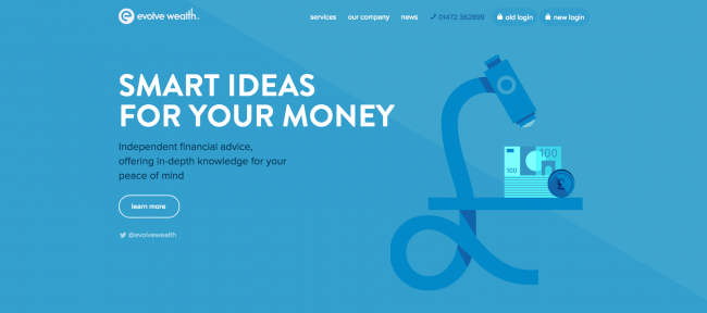
Darker blues tend to be more sombre, heightening the security aspects, which makes them an excellent choice for professionalism. Trust is essential for financial advisors such as Evolve Wealth, so most of its site is designed in varying hues of blue.
All this comes at a small price, though: blue shouldn't be used for food-related sites. Because blue foods aren't common in the wild, studies show that the color actually acts as an appetite suppressant.
6. Purple

Luxurious, mysterious, romantic
Long associated with royalty, purple creates an air of luxury, even decadence. Using a purple dominantly is a quick way to create a sense of elegance or high-end appeal, even if your product is budget-minded (an 'expensive' effect that's quite the opposite of orange).
Lighter shades of purple – especially lavender – bring to mind spring and romance. Darker shades add more mystery, and can even symbolize creativity. Darkening the shade will also turn the romantic elements more sensual.
With its ties to personal wealth, WooCommerce chose purple as the color to represent its WooView app, playing on themes like royalty and panache that fit the function of checking how much money you're making in real time.
7. Pink

Feminine, young, innocent
Pink is a specialist color that won't work for a lot of websites, but will work perfectly with the right audience. Because most people interpret pink as feminine, the color is popular for targeting female users. However, don't overdo the pink-femininity connection, or else you're walking a fine line between appealing to users and pandering to gender stereotypes.
Its links with childhood and with sugary treats give pink a sweet, sometimes innocent appeal (not surprisingly a self-perpetuating cycle). It is also traditionally used with love and romantic themes, alongside red and light purple.
Rental service Rentberry's website uses pink as its key color. In this case, it creates a soft, safe vibe, and intentionally distances itself from more corporate, traditional rental services.
8. Brown

Earthy, sturdy, rustic
While not a popular choice in web design, brown can, under the right circumstances, be effective nonetheless. As the color associated with the earth and trees, brown can add an outdoorsy feel, maximized by a pairing with green. The tree connotations also give a sturdy and reliable feeling.
In web design, brown is often used in conjunction with wood texturing, giving the same old-fashioned and rustic atmosphere of a wooden cabin.
While tech websites are typically dominated by stronger, bolder shades, the microsite for B&O Play uses brown to great effect. The muted tones suggest a classier, more human side to the technology on offer. Natural connotations also remain: wood and leather feature prominently in the hero video, while a marble effect is used in the background.
9. Black

Powerful, sophisticated, edgy
As the strongest of all colors, black is often used only sparingly – such as for text – but it works quite well as a primary color element (like for backgrounds). Much like purple, black adds an air of sophistication and elegance, and also mystery, though with much bolder confidence.
The heavy use of black for the Cartelle creative agency creates unquestionable impact on its homepage and subsequent animations.
10. White
Clean, virtuous, healthy
Literally the opposite of black, white pairs well with just about anything, making it ideal as a secondary color. In a supporting role, white draws out the elements of more stimulating colors, and can even guide your user's attention if you know how to use it (check out UXPin's Zen of White Space in Web UI Design guide to learn more).
As a primary color, though, white gives off an impression that is both clean and chaste. White has that 'spotless' feeling that, for the right site, feels completely effortless. Its association with purity can make it seem virtuous, but also sterile and cold.
To soften this feeling of sterility, some web designers will tend towards an ivory or cream instead. These offshoots of white are softer and even less noticeable, but with the same minimalist and complementary aspects. They are the more comforting and less stark alternatives to white.
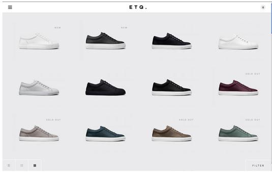
The shoe company ETQ uses a dominant off-white background to keep the users' attention where it belongs: on the shoes.
11. Grey

Neutral, formal, gloomy
As the intermediary between black and white, grey exudes neutrality, or a lack of any particular sensation. However, in the hands of an expert, this intermediary position can be a powerful tool.
By varying the vibrancy, grey can take on the properties of either black or white – attention grabbing or repelling – to specific degrees. That means if black is too powerful for your design, try dark grey. If white is too bland, try light grey.
On its own, though, grey is rich with individual characteristics. It is the color of formality, so sites aiming to look traditional or professional tend to favor it. It can also give a depressing vibe, as it's the color of gloomy, rainy days. When used dominantly, it can be somewhat subduing, for better or worse.
You can tell the Italian furniture company Galvan Mobili uses grey well because you don't even notice it. The grey background gives a professional air, and keeps attention on the pictures and bright red logo.
12. Beige

Accentuates surrounding colors
Beige may not be a primary color, but it's worth mentioning because of its accentuating effects: it takes on the characteristics of the colors around it. While dull on its own, its enhancing effects make it a powerful choice as a background or secondary color.
The use of beige for the aptly named Tokyo restaurant Beige Alain Ducasse creates a calming, comfortable backdrop to the more relevant elements such as clickable text and photos.